Hey,
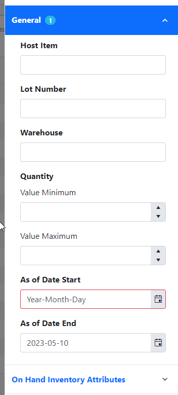
Just reporting this as an active bug. If I have a nullable DateTime object, and I erased the date on the date time picker, it treats the date time field as invalid. I would expect it to be treated as valid.
Related thread: https://feedback.telerik.com/blazor/1582282-datepicker-should-accept-null-value-as-valid-when-bound-to-nullable-datetime
This is the razor page:
<TelerikDatePicker Id="@Id"T="DateTime?"
Value="@Value"
ValueExpression="@ValueExpression"
ValueChanged="@ValueChanged"
OnChange="@OnChange"
Class="@($"{InputClass}")"
Enabled="@Enabled"
Format="@DateTimeFormat.DateOnly"
Min="@MinDateTime"
Max="@MaxDateTime"
Width="@Width"></TelerikDatePicker>
Add "OnOpen" event that fires when the DateTimePicker button is clicked but before the DateTimePicker dropdown is shown
=============
ADMIN EDIT
=============
You can currently achieve the desired behavior by wrapping the DateTimePicker in a container (for example span), add a handler on the on-click event of the span to catch the click event and perform the desired actions in that handler.
<span class="datetimepicker-span" @onclick="@OnOpenHandler">
    <TelerikDateTimePicker Class="my-date-time-picker" Value="@selectedTime"
                           Format="dd MMM yyyy HH:mm:ss" Width="250px"></TelerikDateTimePicker>
</span>

@code {
    public DateTime? selectedTime { get; set; }

    public bool isOpened { get; set; } = false;

    public void  OnOpenHandler()
    {
        isOpened = !isOpened;

        if (isOpened)
        {
            Console.WriteLine("DateTimePicker was opened.");
        }
        else
        {
            Console.WriteLine("DateTimePicker was closed.");
        }
    }
}
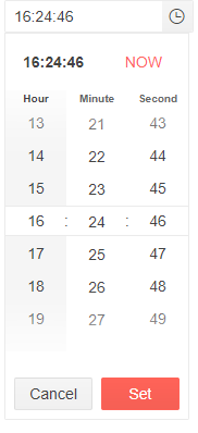
If you enter a format with a 24 hour time( Format="dd MMM yyyy HH:mm:ss") for the Timepicker
If you enter the same format for the DateTimePicker the TimePicker in the DateTimePicker looks like this:
It seems like this is a bug as the only way I can change the DateTimePicker time UI is to alter my language/culture whereas the TimePicker displays correctly based on my format.
With Blazor server, clicking the NOW button (obviously) sets the time to the time on the server since that's where the code is running. Is there a way to trap the NOW button click or somehow give it an offset or define the value that NOW means so NOW will mean the time that the user is sitting in?
---
TELERIK EDIT
In the meantime, here are a few possible workarounds:
1. Use the DateTimePicker's ValueChanged event to detect new values that are very close or match the server's current DateTime. In such cases, you can assume that the user has clicked on TODAY / NOW, and set the local user time as a component value.
Server Time on UI Refresh: @DateTime.Now.ToLongTimeString()
<br />
User Local Time on Page Load: @LocalTime?.ToLongTimeString()
<br />
User Local Time Offset: @LocalOffset
<br />
<br />

<TelerikDateTimePicker Value="@PickerValue"
                       ValueChanged="@( (DateTime? newValue) => PickerValueChanged(newValue) )"
                       ValueExpression="@( () => LocalTime )"
                       Format="yyyy-MMM-dd HH:mm:ss"
                       Width="240px" />

<!-- Move JS code to a separate JS file in production -->
<script suppress-error="BL9992">
    function getLocalTime() {
        var d = new Date();
        return d.getTimezoneOffset();
    }
</script>

@code {
    private DateTime? PickerValue { get; set; }
    private DateTime? LocalTime { get; set; }
    private int LocalOffset { get; set; }

    private void PickerValueChanged(DateTime? newValue)
    {
        DateTime serverNow = DateTime.Now;
        DateTime utcNow = DateTime.UtcNow;
        TimeSpan nowTolerance = new TimeSpan(0, 0, 10);

        if (newValue - serverNow < nowTolerance)
        {
            PickerValue = utcNow.AddMinutes(-LocalOffset);
        }
        else
        {
            PickerValue = newValue;
        }
    }

    protected override async Task OnAfterRenderAsync(bool firstRender)
    {
        if (firstRender)
        {
            LocalOffset = await js.InvokeAsync<int>("getLocalTime");
            LocalTime = DateTime.UtcNow.AddMinutes(-LocalOffset);
            StateHasChanged();
        }

        await base.OnAfterRenderAsync(firstRender);
    }
}
2. Use the DatePicker's HeaderTemplate with a custom TODAY / NOW button.
3. Hide the NOW button with CSS:
<style>
    .no-now-button .k-time-now {
        display: none;
    }
</style>

<TelerikDateTimePicker @bind-Value="@PickerValue"
                       Format="yyyy-MMM-dd HH:mm:ss"
                       PopupClass="no-now-button"
                       Width="240px" />

@code {
    private DateTime? PickerValue { get; set; }
}
I can't type AM or PM in the DateTimePicker to explicitly change to AM or PM.
For example:
1. Go to https://demos.telerik.com/blazor-ui/datetimepicker/overview.
2. Click on AM or PM in the DateTimePicker field.
3. Try to type "AM" or "PM".
4. If the time is "AM", notice that typing "PM" does not change "AM" to "PM", and visa-versa.
This causes our UI tests to fail when entering a date that has a different meridian time than the current time.
I expected the same behavior as the UI for ASP.NET Core: https://demos.telerik.com/aspnet-core/datetimepicker.
----------ADMIN EDIT----------
In the meantime, you can achieve the desired functionality by following the steps from the knowledge base article below.
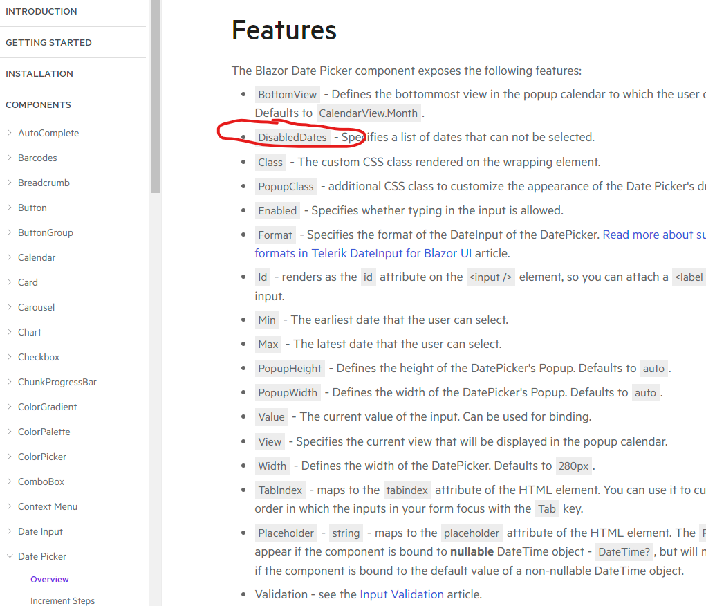
Disabled Dates are only available in Date or DateRange pickers. They need to be in the DateTime pickers as well.
Now I am going to have to split my components into a Date Picker and a Time Picker, which isn't a great user experience.
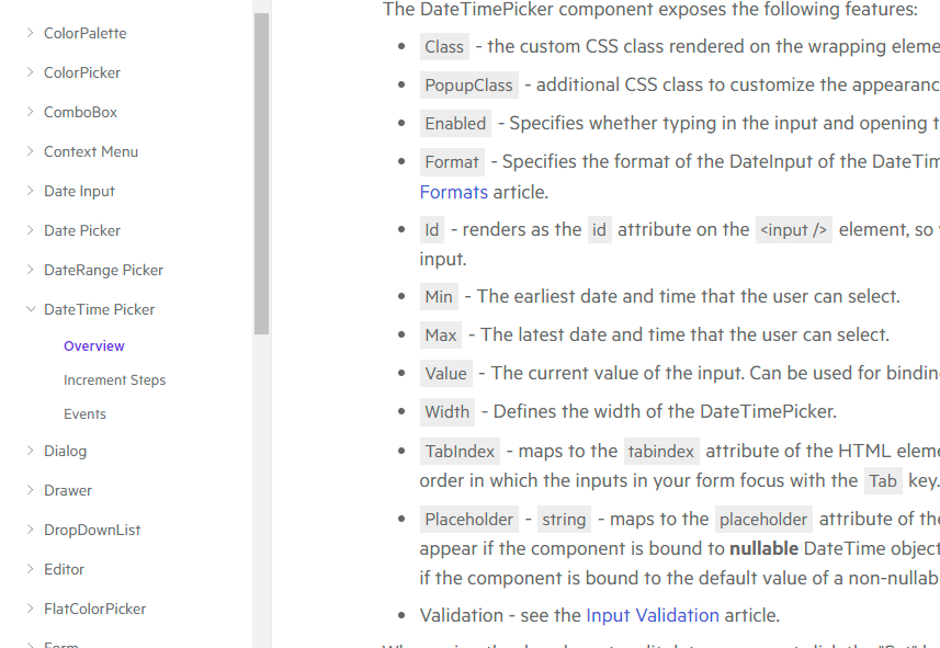
DateTimePicker
DatePicker
I want to to be able to catch the click of the Set button regardless of whether or not the value was changed.
==========
ADMIN EDIT
==========
For the time being, a possible workaround could be to use some JS Interop to catch the click of the Set button. You can create a custom OnOpen event for the DateTimePicker dropdown as per the admin edit example in this post. You can use the OnOpenHandler to invoke the JS responsible for catching the click event of the Set button. The example below demonstrates the described approach.
@inject IJSRuntime JSInterop

Selected time: @selectedTime
<br />
<span class="datetimepicker-span" @onclick="@OnOpenHandler">
    <TelerikDateTimePicker Min="@Min" Max="@Max" @bind-Value="@selectedTime"
                           Format="dd MMM yyyy HH:mm:ss" Width="250px">
    </TelerikDateTimePicker>
</span>

@code {

    public bool isOpened { get; set; } = false;

    public async Task OnOpenHandler()
    {
        isOpened = !isOpened;

        if (isOpened)
        {
            await JSInterop.InvokeVoidAsync("SetBtnClicked", ".k-time-accept");

            isOpened = false;
        }
    }

    private DateTime? selectedTime = DateTime.Now;
    public DateTime Min = new DateTime(1990, 1, 1, 8, 15, 0);
    public DateTime Max = new DateTime(2025, 1, 1, 19, 30, 45);

}
    <script>
        function SetBtnClicked(selector) {
            var element = document.querySelector(selector);
            element.addEventListener('click', function () {
                alert("Set button clicked");
            });
        }
    </script>
I'd like to have the ability to disable dates and times.
Just an idea would be awesome to Add a object with a max and min properties which you can pass as a collection to the component.Based on the current way how max and min work, but it disables ranges between each min and max of each object in that collection.
Is there any way to display the DateTimePicker and for the time picker to display time intervals of less than one second? For example every 15 minutes?
Select a time:
15:00
15:15
15:30
15:45
etc?
Based on the example https://demos.telerik.com/blazor-ui/datetimepicker/overview, on Cancel or Set, the Input gets focused. On the mobile, it causes the keyboard to appear as well, which is not an intuitive behaviour.
Is it possible for this behaviour to be removed?
---
ADMIN EDIT
This behavior is OS specific, in our tests iOS does not exhibit it. It is generally up to the OS to show the soft keyboard and the web app should not be able to alter that.
Also, generally speaking from an accessibility point of view, popups must have a default focus (we do that), and when they close, they must return the user to the flow of the application in the place where they took it from. In this case, that's an interaction with the picker component.
Nevertheless, if the focus went to the button rather than the input, it is highly likely that the behavior would be resolved. The only downside would be that Android users will need a second action to get the focus back in the input.
---


