I am using the Telerik TabStrip and am trying to make the tabs scrollable while also showing additional tabs once a button is pressed.
When the additional tabs are shown, the tabs are not scrollable. Notice that when you toggle the visibility of the tabs, the new tabs being shown do not make the tab list scrollable.
=====ADMIN EDIT=====
Here is a possible workaround for the time being - REPL link.
The TabStrip throws ArgumentOutOfRangeException if the first tab is not Visible.
<TelerikTabStrip>
    <TabStripTab Title="A" Visible="false">
        Tab A
    </TabStripTab>

    <TabStripTab Title="B" Visible="true">
        Tab B
    </TabStripTab>

    <TabStripTab Title="C" Visible="true">
        Tab C
    </TabStripTab>
</TelerikTabStrip>
I like the way Drawer is designed to support navigation.
It would be neat if TabStrip supported the same use-case. The basic idea would be that it would work like the Drawer navigation, but be presented as a tabbed interface. (Github's pull request UI works very much like this.) As this would require new syntax, I'm guessing it would be a new component such as NavTabStrip.
<TelerikRootComponent>

    <TelerikNavTabStrip Data="@NavigablePages">
        <NavTabStripContent>
            @Body
        </NavTabStripContent>
    </TelerikNavTabStrip >

</TelerikRootComponent>
Currently, I am running to a scenario where I would like to keep the tab content for only some of the tabs instead of all tabs in the TelerikTabStrip. It would be really helpful is there is a PersistTabContent for individual tabs.
Scenario - one of my tabs has upload component where I am uploading files. The user selects the file and then decides to move to the other tab instead of completing the upload process. On activetabindexchanged event, I have confirmation button that checks to see if the user wants to move to the other tab or not. If they confirm, then the active tab changes, if they cancel then the active tab remains at the current tab, though it loses all selected file. To resolve this situation, I am using PersistTabContent = true on TabStrip, which then retains tab content for all tabs, rather than just upload component tab. Having PersistTabContent for individual tab in this case will resolve the issue.
Thank you.
Beena.
ActiveTabIndex works as expected when tabs are always Visible, but when you set the Visible property to false, then back to true, the ActiveTabIndex does not work.
<TelerikTabStrip @bind-ActiveTabIndex="@ActiveTabIndex" PersistTabContent="true">
<TabStripTab Title="Tab 0 Always Visible"><TabStripTab Title="@TabTitle" Visible="@IsTabVisible" >
..
IsTabVisible = true;
ActiveTabIndex = 1;
I encountered this behavior in both v2.30.0 and v3.2.0
See attached screen shot.
Sample code:
<TelerikTabStrip>
<TabStripTab Title="Tab 0" Visible="true">
content 0
</TabStripTab>
<TabStripTab Title="Tab 1" Visible="false">
content 1
</TabStripTab>
<TabStripTab Title="Tab 2" Visible="true">
content 2
</TabStripTab>
<TabStripTab Title="Tab 3" Visible="true">
content 3
</TabStripTab>
</TelerikTabStrip>
.png)
G'day
Just wondering if we can get an;
AllowDragReorder="true"
And added bonus; "OnDragReorder" event.
Similar to Telerik WPF;
Cheers
Phil
Hi All,
I want to build a TabStip with many Tabs in multiline header like this:
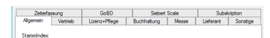
, but now all headers located in a long line as shows below:
I could not found any attribute or a HeaderTemplate example to do this.
Can you please help me to do this?
I have four tabs in my tab strip, and the content in each tab is of varying width. The tab item resizes to the width of the content as it changes. I want to be able to set a fixed width for all the tabs so they don't expand and contract all the time.
===========
ADMIN EDIT
===========
In the meantime, you can control the width of the TabStrip with some custom CSS. You can use its Class parameter to set a custom CSS class to the main wrapping container of the component and then apply the desired styles. Thus, you will be styling only this specific instance of the TabStrip and not all instances on the page/app (in case needed, you can of course add the same CSS class to all instances to have the same styles).
The sample below demonstrates the described approach. First instance of the TabStrip has the default setup, no additional styles added. Second instance has fixed width.
<TelerikTabStrip>
    <TabStripTab Title="First">
        First tab content. Go to the third tab to see the problem.
    </TabStripTab>
    <TabStripTab Title="Second tab heading longer than others">
        Second tab content. Go to the third tab to see the problem.
    </TabStripTab>
    <TabStripTab Title="Third">
        <div style="width: 2000px;">lorem ipsum</div>Third tab content.
    </TabStripTab>
</TelerikTabStrip>

<style>
    .tab-with-width {
        width: 600px;
    }
</style>

<TelerikTabStrip Class="tab-with-width">
    <TabStripTab Title="First">
        First tab content. Go to the third tab to see the behavior when the TapSrtrip has fixed width.
    </TabStripTab>
    <TabStripTab Title="Second tab heading longer than others">
        Second tab content. Go to the third tab to see the behavior when the TapSrtrip has fixed width.
    </TabStripTab>
    <TabStripTab Title="Third">
        <div style="width: 2000px;">lorem ipsum</div>Third tab content.
    </TabStripTab>
</TelerikTabStrip>
Support for adding Unicode characters (such as a warning sign, ⚠) to the Title of tab strips.
Our scenario is we require specific setup to be done on each tab strip. We would like to ability to add an indicator next to the title of the tab to denote that setup is required.
At the moment, if I have many tabs, their titles go off the screen (or the container of the tab strip). I want that they don't stretch my layout, or they don't become invisible.
---
ADMIN EDIT
For the time being, there are two workarounds you can consider:
- adding a scrollbar to the tabs list:
<style> /* sample settings for the parent of the tab strip to showcase how the rules below work */ .tab-container { border: 1px solid red; width: 30%; } /* tab titles will now produce a scrollbar when too wide */ .tab-container .k-tabstrip .k-tabstrip-items { flex-flow: inherit; max-width: 100%; overflow-x: auto; overflow-y: hidden; } /* just to showcase what happens when the content is wide - a separate scrollbar */ .wide-content { background: yellow; width: 1200px; } </style> <div class="tab-container"> <TelerikTabStrip> @foreach (var item in Enumerable.Range(1, 10)) { <TabStripTab Title="@( $"Item {item}" )"><div class="wide-content">Content for item @item</div></TabStripTab> } </TelerikTabStrip> </div> - making the tabs drop into multiple rows:
<style>
    /* sample settings for the parent of the tab strip to showcase how the rules below work */
    .tab-container {
        border: 1px solid red;
        width: 30%;
    }

        /* tabs will wrap on more than one row if there are too many to fit */
        .tab-container .k-tabstrip .k-tabstrip-items {
            flex-wrap:wrap;
        }
</style>

<div class="tab-container">
    <TelerikTabStrip>
        @foreach (var item in Enumerable.Range(1, 10))
        {
            <TabStripTab Title="@( $"Item {item}" )"><div class="wide-content">Content for item @item</div></TabStripTab>
        }
    </TelerikTabStrip>
</div>
---
I want to style my tab headers with something similar to this, but it does not compile:
 <h2>Telerik Tab Strip</h2>
    <TelerikTabStrip TabPosition="Telerik.Blazor.TabPosition.Top">
        <TabStripTab Class="WeirdTab" Title="First">
            First tab content.
        </TabStripTab>
        <TabStripTab Title="Second">
            Second tab content.
        </TabStripTab>
        <TabStripTab Title="Third">
            Third tab content.
        </TabStripTab>
    </TelerikTabStrip>
    <style>
        .WeirdTab {
            color: red;
        }
    </style>
While I can style the content of the tabs in the tabs themlselves (see below) I'd like to be able to style the headers too
<h2>Telerik Tab Strip</h2>
<TelerikTabStrip TabPosition="Telerik.Blazor.TabPosition.Top">
    <TabStripTab Title="First">
        <div class="WeirdTab">
            First tab content.
        </div>
    </TabStripTab>
    <TabStripTab Title="Second">
        Second tab content.
    </TabStripTab>
    <TabStripTab Title="Third">
        Third tab content.
    </TabStripTab>
</TelerikTabStrip>
<style>
    .WeirdTab {
        color: red;
    }
</style>
The ActiveTabIndex parameter can take a value -1 to denote that no tab should be selected. This can plug into the current two-way binding as well.
At the moment, when tabs hide their components are removed, so when you go back to a tab, it initializes again - for example, the OnInitializedAsync event fires where you fetch data, so you have to fetch the data again.
This behavior should be controlled through a property so one can keep the original behavior where the components are cleared from the DOM and memory.
Perhaps an option can be added where tabs are initialized not on initial load, but upon first activation only. Maybe the feature can become something like an enum - LoadMode="InitialRender|FirstRender|EveryRender" (working title off the top of my head).
At the moment, a solution you can use is to send the data to the tab from its contents through an event, and to pass it to them as a Parameter so you can check for it before fetching data.
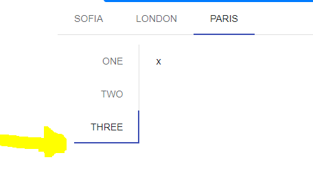
<TelerikTabStrip TabPosition="TabPosition.Top">
<TabStripTab Title="Sofia">
</TabStripTab>
<TabStripTab Title="London">
</TabStripTab>
<TabStripTab Title="Paris">
<TelerikTabStrip TabPosition="TabPosition.Left">
@foreach (var item in new string[] { "one", "two", "three" })
{
<TabStripTab Title="@item">x</TabStripTab>
}
</TelerikTabStrip>
</TabStripTab>
</TelerikTabStrip>