It seems that the issue appeared after upgrading to Telerik 5.0 from 4.6.
When using a Grid with a locked column and column virtualization enabled, focusing cell from that locked column breaks the layout on horizontal scrolling.
The Grid is supposed to show a loading animation when it detects a data operation that requires more than 600ms to complete. However, if this operation is triggered programmatically through the state and not through the UI, the loading indicator is not shown.
Reproduction: https://blazorrepl.telerik.com/mSuPQpvx498wHvV816.
===
ADMIN EDIT
===
A possible workaround for the time being is to use a LoaderContainer component when invoking programmatic data operation similar to how the initial loader is shown here: https://demos.telerik.com/blazor-ui/grid/loading-animation.
This works but when I add the TelerikMediaQuery in my page, the selected items always get reset on page load. Sorting and filters stay applied but the selected items unfortunately not.
The header cell includes the following inner elements when the Grid is sortable:
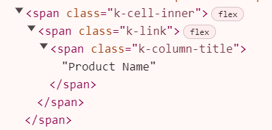
However, if I disable sorting all those elements are omitted which is not consistent.
Reproduceable example: https://blazorrepl.telerik.com/QSEganvg12BVw2ZU37
Steps to reproduce:
- Add a TelerikGrid to the page - most properties on the grid do not matter for this issue
- Implement the OnStateInit event
- Define the GridAggregates render fragment within the TelerikGrid, but leave it empty - do not put any components inside it
- When the page initializes, note that OnStateInit is never fired
If you remove the GridAggregates emtpy render fragment, or put at least one GridAggregate component in it, OnStateInit fires like expected.
In my project, I've created a component that wraps around the TelerikGrid that I use on all my pages, so that I can have many properties and functions set to reasonable defaults for my use case. My component has an option to conditionally include GridAggregate components within the inner TelerikGrid's GridAggregates render fragment based on separate configuration. If no separate configuration is provided, no GridAggregate components are included, and the GridAggregates render fragment is left blank. Since my component is built in razor markup, there isn't a great option for nulling out that render fragment if it's empty. I had no problems with this exact same code in UI for Blazor version 5.1, and I hope this can be fixed.
We have a grid with a GridCheckboxColumn that we have configured through a '.unselectable-row' style so that certain elements cannot be selected (those elements with a padlock in the second column cannot be selected).
The grid works correctly in isolation, but when we add a TelerikLoaderContainer that is displayed during data loading process, the grid doesn't working properly: it is possible to select all the enabled elements of the grid using the button in the header of the checkbox column. However it is not possible to deselect them from the button in the header of the checkbox column when there is any unselectable element.

Here it is a link to REPL with a reproducible example: https://blazorrepl.telerik.com/GyYhYXPI24gIYgIJ03
To reproduce the problem, you sholud select all grid elements from the checkbox column header button and try to deselect them. You will not be able to deselect all the elements.
Now comment the LoaderContainer component and repeat the test. You will see that now it is possible to deselect correctly all the elements.
How can we deselect all the elements from the header while keeping the loadercontainer?
Currently the GridSearchBox is able to search in all of the visible columns but when it comes to searching in multiple columns split by space it does not work. Or even two different strings in the same cell.
Example:
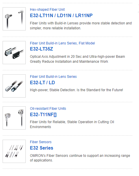
If from the above grid, I type in the search box, "LT" three products will be returned but if I type "LT LD" it should return two products but the results set comes with nothing.
I have implemented CustomSearchBox component as a solution in the interim to achieve this functionality. But it would be a worthwhile effort to have this functionality out of the box.
Thank you.
Sheraz
I am using InCell Grid editing. I want to prevent an edit cell from closing on certain condition. However, when I cancel the update with args.IsCancelled = true in OnUpdate, the user can still close the edited cell with Enter or Tab. This is inconsistent with inline or popup editing.
===
A possible workaround is to cancel both OnUpdate and the subsequent OnEdit.
https://blazorrepl.telerik.com/QykMHkks10APuDLQ47
@using System.ComponentModel.DataAnnotations

<TelerikGrid Data="@GridData"
             EditMode="@GridEditMode.Incell"
             OnEdit="@OnGridEdit"
             OnUpdate="@OnGridUpdate">
    <GridColumns>
        <GridColumn Field="@nameof(SampleModel.Name)" />
        <GridColumn Field="@nameof(SampleModel.Min)" />
        <GridColumn Field="@nameof(SampleModel.Max)" />
    </GridColumns>
</TelerikGrid>

<TelerikNotification @ref="@NotificationRef"
                     HorizontalPosition="@NotificationHorizontalPosition.Center"
                     VerticalPosition="@NotificationVerticalPosition.Top" />

@code {
    private TelerikNotification? NotificationRef { get; set; }

    private List<SampleModel> GridData { get; set; } = new();

    private bool ShouldCancelOnEdit { get; set; }

    private int LastId { get; set; }

    private void OnGridEdit(GridCommandEventArgs args)
    {
        if (ShouldCancelOnEdit)
        {
            ShouldCancelOnEdit = false;
            args.IsCancelled = true;
        }
    }

    private void OnGridUpdate(GridCommandEventArgs args)
    {
        var updatedItem = (SampleModel)args.Item;

        if (updatedItem.Min > updatedItem.Max)
        {
            NotificationRef?.Show(new NotificationModel()
            {
                ThemeColor = ThemeConstants.Notification.ThemeColor.Error,
                Text = "Min must be smaller than Max"
            });

            args.IsCancelled = true;
            ShouldCancelOnEdit = true;
        }
        else
        {
            var originalItemIndex = GridData.FindIndex(i => i.Id == updatedItem.Id);

            if (originalItemIndex != -1)
            {
                GridData[originalItemIndex] = updatedItem;
            }

            ShouldCancelOnEdit = false;
        }
    }

    protected override void OnInitialized()
    {
        for (int i = 1; i <= 5; i++)
        {
            GridData.Add(new SampleModel()
            {
                Id = ++LastId,
                Name = $"SampleModel {LastId}",
                Min = Random.Shared.Next(1, 10),
                Max = Random.Shared.Next(11, 20)
            });
        }
    }

    public class SampleModel
    {
        public int Id { get; set; }
        [Required]
        public string Name { get; set; } = string.Empty;
        public int Min { get; set; }
        public int Max { get; set; }
    }
}
The behavior is reproducible in server-side apps when using the Inline or Incell mode and editing numerical values.
When inputting into the field the first value input is either ignored or removed. The default is 0, when backspacing to clear it and then inputting a number, sometimes the number is shown and then immediately removed, and sometimes it's not shown at all and will only displayed when typed a second time.
===
ADMIN EDIT
===
Possible workarounds for the time being:
- Use EditorTemplate with a NumericTextBox component inside: https://blazorrepl.telerik.com/cyvOYBvc39Vnes2L43.
- Use Popup Edit mode.
My Grid uses a lot of data (more than 200 000 records). I noticed that only in Firefox the export fails if the file is large - approximately 60MB.
The export of such large files works well in Chrome and Edge.
I have a Grid with row selection and column virtualization. After selecting all rows and zooming out my browser to 80% or less, the column virtualization stops working - data is not loaded in the cells on vertical scroll.
I use a custom filter row for the Grid where I have added a custom component holding the filter cell content. I am saving the Grid state upon change and restoring it on initialization.
I noticed that the custom filter component is initialized before the Grid state. As a result, there is an applied filter but the input in the custom filter component does not show it.
This behaviour was new since version 6.0.0. With 5.1.1 it doesn't appear.
I have a grid that can have a large number of pages and is intended to be able to be viewed on a small width device.
The issue is that upon loading the grid and its data, the pager of the grid isn't changing how it's displayed even though it is supposed to be adaptive.
If the page is manually resized, only then does the pager correctly show as a dropdown.
I've reproduced this in a REPL, though it seems slightly inconsistent as opposed to my main project where it is able to be reproduced every time.
In the attached gif, notice that upon loading the page, the grid shows the pager as a list of numbers as it would if the page was a large width screen, but when resizing the page slightly, it is triggered to show the pages as a dropdown, which I believe is the intended behavior.
Is this issue known and is there a way to trigger the grid to redraw its pager after the data is loaded, or some other form of workaround for this without implementing a custom pager template?
Please consider adding built-in support for a TextTruncationWithAction or TruncateWithButton mode on GridColumn components. This feature would display long text as truncated with ellipsis (...) and a button or icon to reveal the full content, such as in a modal or popover.
Why This Is Needed
In enterprise applications like ERP, cutover planning, or audit logs, we often display descriptions, notes, or comments that can span multiple lines. However:
- Wrapping ruins compact grid layouts.
- Truncating with ellipsis alone hides valuable content.
- Users need quick, inline access to full text without leaving the grid.