If you create a second Grid on the page, it will clear the SearchBox input value of the first Grid.
<p><TelerikButton OnClick="@ToggleSecondGrid">Toggle Second Grid</TelerikButton></p>

<TelerikGrid Data="@GridData">
    <GridToolBar>
        <GridSearchBox />
    </GridToolBar>
    <GridColumns>
        <GridColumn Field=@nameof(Product.ProductName) Title="Product Name" />
    </GridColumns>
</TelerikGrid>

@if (ShowSecondGrid)
{
    <TelerikGrid Data="@( new List<Product>() )">
        <GridColumns>
            <GridColumn />
        </GridColumns>
    </TelerikGrid>
}

@code {
    List<Product> GridData { get; set; }

    bool ShowSecondGrid { get; set; }

    async Task ToggleSecondGrid()
    {
        ShowSecondGrid = !ShowSecondGrid;
    }

    protected override void OnInitialized()
    {
        GridData = new List<Product>();

        for (int i = 1; i <= 5; i++)
        {
            GridData.Add(new Product()
            {
                ProductId = i,
                ProductName = "Product " + i.ToString(),
                UnitPrice = (decimal)(i * 3.14),
                UnitsInStock = (short)(i * 1),
                Discontinued = false
            });
        }
    }

    public class Product
    {
        public int ProductId { get; set; }
        public string ProductName { get; set; }
        public decimal? UnitPrice { get; set; }
        public short? UnitsInStock { get; set; }
        public bool Discontinued { get; set; }
    }
}
I want to place the Pager on top of the Grid. I know it can be handled with a Pager component integration in the Grid Toolbar, but I want to use the Toolbar for other purposes/actions. Please allow control over the Pager position.
I have a Grid with Navigable="true" and FilterRow. If I focus a string filter input and press the left/right arrow keys, the focus moves away from the cell. This behavior also occurs when I press up/down arrows in numeric filter inputs.
Reproduction: https://blazorrepl.telerik.com/GcvPkekt36Mxgygv07.
When you zoom out, the span that displays the Grid pager's content has its style set to display: none, and it does not always reappear when you zoom in after that.
Reproduction
1. Run this REPL2. Enlarge the Preview Side of the REPL as much as possible
3. Zoom out so the pager is hidden
4. Zoom in again
5. Pager does not reappear
6. Video Example
See REPL sample (just use horizontal scroll): https://blazorrepl.telerik.com/wRPvclYX432myApT30.
When switching to Version 4.5 the Grid acts as expected.
It seems that the issue appeared after upgrading to Telerik 5.0 from 4.6.
When using a Grid with a locked column and column virtualization enabled, focusing cell from that locked column breaks the layout on horizontal scrolling.
The header cell includes the following inner elements when the Grid is sortable:
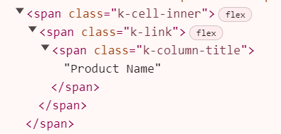
However, if I disable sorting all those elements are omitted which is not consistent.
Reproduceable example: https://blazorrepl.telerik.com/QSEganvg12BVw2ZU37
Steps to reproduce:
- Add a TelerikGrid to the page - most properties on the grid do not matter for this issue
- Implement the OnStateInit event
- Define the GridAggregates render fragment within the TelerikGrid, but leave it empty - do not put any components inside it
- When the page initializes, note that OnStateInit is never fired
If you remove the GridAggregates emtpy render fragment, or put at least one GridAggregate component in it, OnStateInit fires like expected.
In my project, I've created a component that wraps around the TelerikGrid that I use on all my pages, so that I can have many properties and functions set to reasonable defaults for my use case. My component has an option to conditionally include GridAggregate components within the inner TelerikGrid's GridAggregates render fragment based on separate configuration. If no separate configuration is provided, no GridAggregate components are included, and the GridAggregates render fragment is left blank. Since my component is built in razor markup, there isn't a great option for nulling out that render fragment if it's empty. I had no problems with this exact same code in UI for Blazor version 5.1, and I hope this can be fixed.
I am using InCell Grid editing. I want to prevent an edit cell from closing on certain condition. However, when I cancel the update with args.IsCancelled = true in OnUpdate, the user can still close the edited cell with Enter or Tab. This is inconsistent with inline or popup editing.
===
A possible workaround is to cancel both OnUpdate and the subsequent OnEdit.
https://blazorrepl.telerik.com/QykMHkks10APuDLQ47
@using System.ComponentModel.DataAnnotations

<TelerikGrid Data="@GridData"
             EditMode="@GridEditMode.Incell"
             OnEdit="@OnGridEdit"
             OnUpdate="@OnGridUpdate">
    <GridColumns>
        <GridColumn Field="@nameof(SampleModel.Name)" />
        <GridColumn Field="@nameof(SampleModel.Min)" />
        <GridColumn Field="@nameof(SampleModel.Max)" />
    </GridColumns>
</TelerikGrid>

<TelerikNotification @ref="@NotificationRef"
                     HorizontalPosition="@NotificationHorizontalPosition.Center"
                     VerticalPosition="@NotificationVerticalPosition.Top" />

@code {
    private TelerikNotification? NotificationRef { get; set; }

    private List<SampleModel> GridData { get; set; } = new();

    private bool ShouldCancelOnEdit { get; set; }

    private int LastId { get; set; }

    private void OnGridEdit(GridCommandEventArgs args)
    {
        if (ShouldCancelOnEdit)
        {
            ShouldCancelOnEdit = false;
            args.IsCancelled = true;
        }
    }

    private void OnGridUpdate(GridCommandEventArgs args)
    {
        var updatedItem = (SampleModel)args.Item;

        if (updatedItem.Min > updatedItem.Max)
        {
            NotificationRef?.Show(new NotificationModel()
            {
                ThemeColor = ThemeConstants.Notification.ThemeColor.Error,
                Text = "Min must be smaller than Max"
            });

            args.IsCancelled = true;
            ShouldCancelOnEdit = true;
        }
        else
        {
            var originalItemIndex = GridData.FindIndex(i => i.Id == updatedItem.Id);

            if (originalItemIndex != -1)
            {
                GridData[originalItemIndex] = updatedItem;
            }

            ShouldCancelOnEdit = false;
        }
    }

    protected override void OnInitialized()
    {
        for (int i = 1; i <= 5; i++)
        {
            GridData.Add(new SampleModel()
            {
                Id = ++LastId,
                Name = $"SampleModel {LastId}",
                Min = Random.Shared.Next(1, 10),
                Max = Random.Shared.Next(11, 20)
            });
        }
    }

    public class SampleModel
    {
        public int Id { get; set; }
        [Required]
        public string Name { get; set; } = string.Empty;
        public int Min { get; set; }
        public int Max { get; set; }
    }
}
The issue targets a Grid with cell selection and DragToSelect feature disabled where at least one column has Visible="false". With this configuration, when using Shift + Click to select multiple cells, the result is a mismatch in the cells that should be selected, after the position where the invisible column is placed.
Video reproduction attached. Reproduction code: https://blazorrepl.telerik.com/GyFuQwPf37H8riAM19.
I have a grid that can have a large number of pages and is intended to be able to be viewed on a small width device.
The issue is that upon loading the grid and its data, the pager of the grid isn't changing how it's displayed even though it is supposed to be adaptive.
If the page is manually resized, only then does the pager correctly show as a dropdown.
I've reproduced this in a REPL, though it seems slightly inconsistent as opposed to my main project where it is able to be reproduced every time.
In the attached gif, notice that upon loading the page, the grid shows the pager as a list of numbers as it would if the page was a large width screen, but when resizing the page slightly, it is triggered to show the pages as a dropdown, which I believe is the intended behavior.
Is this issue known and is there a way to trigger the grid to redraw its pager after the data is loaded, or some other form of workaround for this without implementing a custom pager template?
Please consider extending the GridColumn component to include fine-grained header presentation properties, such as:
- HeaderAlignment (e.g., Left, Center, Right)
- WrapHeaderText (bool)
- HeaderTooltip or HeaderAdornmentTemplate
These enhancements would dramatically improve clarity and usability in complex data grids.
Why This Is Important
In enterprise-grade applications — like ERP dashboards, financial reporting, or cutover schedules — grids are dense and loaded with meaning. Users rely heavily on headers to interpret the data beneath, especially when:
- Column headers are long or require abbreviations.
- Users need contextual guidance without clutter.
- Alignment improves visual scanning and aesthetics.
I discovered "incell" editing mode on the grid, I love it! It makes the UI very intuitive and quick to update individual fields. It also works great with a PATCH API endpoint.
One minor glitch with "incell editing". If I click on a cell in a different row, it immediately takes the previous cell out of edit and puts the new cell in edit with a single click -- VERY cool. But, if you click on a cell in the same row it takes the previous cell out of edit, but doesn't put the new cell in edit mode. It would be cool if it worked the same as the "clicking in separate rows" functionality.
Thanks,
Kenny
Repro steps:
- Go to https://demos.telerik.com/blazor-ui/grid/editing-inline
- Click Add
- Enter some data in all editable fields
- Click Update
- Go to the last page
Actual: The "Name" field is blank
Expected: All fields have the appropriate data