Please allow to set Group By fields at Design time, currently only user has control to Drag and drop to group.
we need feature to group by fixed set of columns and don't allow user to change the grouping, also need option to hide group collapse icons.
Grid column header and content alignment (horizontal +Vertical)
---
ADMIN EDIT
For the time being, this is possible through the CellRender event, see below in the thread for an example.
---
Hello,
I am new to your Blazor UI components. Please provide a link for exporting a grid to excel.
Thanks,
Earl
How would you remove the icon to expand a detail grid only for certain rows? Some rows will not have detail data and should not be expandable.
---
ADMIN EDIT
As suggested by Joel, you can use the RowRender event and a bit of CSS to hide the button. Here is a Knolwdge Base article that shows a fully runnable sample: https://docs.telerik.com/blazor-ui/knowledge-base/grid-conditional-expand-button.
in the main TelerikGrid node, add event hook OnRowRender="@OnRowRenderHandler"
that handler is something like:
    void OnRowRenderHandler(GridRowRenderEventArgs args)
    {
        OrgUnit item = args.Item as OrgUnit;

        args.Class = item.Children.length ? "has-children" : "no-children";
    }
Then in the site.css I override display of the hierarchy sign
tr.no-children .k-hierarchy-cell *{
    display:none !important;
}
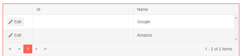
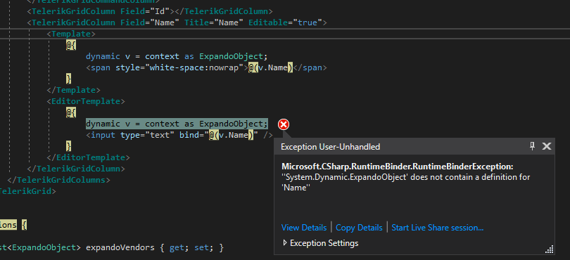
Because the shape of our business objects is not something your grid is easily bound to, we are attempting to generate ExpandoOjbects on the fly and bind to them. In the picture below you can see that Id is not binding correctly. Name is showing up because a column Template was used and that seems to work fine. However, when attempting to use an EditorTemplate we get the RuntimeBinderException shown below.
@page "/dynamic-vendor"
@using System.Dynamic
@using Telerik.Blazor.Components.Grid
<div style="width: 800px; overflow-x: auto; overflow-y:hidden; border: 1px solid red; height:400px">
<TelerikGrid Data="@expandoVendors" EditMode="inline" Pageable=true PageSize=10 SelectionMode="Telerik.Blazor.GridSelectionMode.Multiple">
<TelerikGridColumns>
<TelerikGridCommandColumn width="100">
<TelerikGridCommandButton Command="Edit" Icon="edit">Edit</TelerikGridCommandButton>
<TelerikGridCommandButton Command="Update" Icon="save" ShowInEdit="true">Update</TelerikGridCommandButton>
<TelerikGridCommandButton Command="Cancel" Icon="cancel" ShowInEdit="true">Cancel</TelerikGridCommandButton>
</TelerikGridCommandColumn>
<TelerikGridColumn Field="Id"></TelerikGridColumn>
<TelerikGridColumn Field="Name" Title="Name" Editable="true">
<Template>
@{
dynamic v = context as ExpandoObject;
<span style="white-space:nowrap">@(v.Name)</span>
}
</Template>
<EditorTemplate>
@{
dynamic v = context as ExpandoObject;
<input type="text" bind="@(v.Name)" />
}
</EditorTemplate>
</TelerikGridColumn>
</TelerikGridColumns>
</TelerikGrid>
</div>
@functions {
List<ExpandoObject> expandoVendors { get; set; }
protected override async Task OnInitializedAsync()
{
expandoVendors = new List<ExpandoObject>();
var v1 = new ExpandoObject();
v1.TryAdd("Id", "1");
v1.TryAdd("Name", "Google");
expandoVendors.Add(v1);
var v2 = new ExpandoObject();
v2.TryAdd("Id", "2");
v2.TryAdd("Name", "Amazon");
expandoVendors.Add(v2);
}
}
I need the ability to show or hide command buttons based on a row's property.
I am aware that I can just cancel commands, but in my opinion, a command button should not even be shown when the command can't or shouldn't be executed on a row.
Unfortunately, I was unable to find a way to access the "context" (the instance) in a TelerikGridCommandColumn the same way you're able to in a normal TelerikGridColumn.
---
ADMIN EDIT
You can Vote for and Follow this request for a follow up on providing the model as context to the command column: https://feedback.telerik.com/blazor/1461283-pass-the-model-context-to-command-button. At the moment, conditional command buttons are possible in a "normal" column through the grid state, the page above shows an example.
---
---
ADMIN EDIT: Check the source code and comments in it from the following demo to see how to bind the grid to a DataTable: https://demos.telerik.com/blazor-ui/grid/data-table. You can also examine it offline - the entire demos project is available in the "demos" folder of your installation
The sample code snippet below will let the grid show data, but will not enable complex operations like filtering and sorting. Review the demo linked above for more details on the correct approach.
---
I would like to be able to supply a DataTable with an arbitrary amount of columns to the grid and display them all without declaring them all. This should also allow paging, sorting, filtering. At the moment binding to a DataTable is not supported, only IEnumerable collections are.
At the moment, here's the closest I can get, sorting and filtering throw errors so they are disabled.
@using System.Data@using Telerik.Blazor@using Telerik.Blazor.Components.Grid<button class="btn btn-primary" @onclick="@LoadData">Load Data</button>@if (@d != null){ <TelerikGrid Data=@d.AsEnumerable() TItem="DataRow" Sortable="false" Filterable="false" Pageable="true" PageSize="3" Height="400px"> <TelerikGridColumns> @foreach (DataColumn col in d.Columns) { <TelerikGridColumn Field="@col.ColumnName" Title="@col.ColumnName"> <Template> @((context as DataRow).ItemArray[col.Ordinal].ToString()) </Template> </TelerikGridColumn> } </TelerikGridColumns> </TelerikGrid>}@functions { DataTable d = null; void LoadData() { d = GetData(); } public DataTable GetData() { DataTable table = new DataTable(); table.Columns.Add("Product", typeof(string)); table.Columns.Add("Price", typeof(double)); table.Columns.Add("Quantity", typeof(int)); table.Columns.Add("AvailableFrom", typeof(DateTime)); table.Rows.Add("Product 1", 10.1, 2, DateTime.Now); table.Rows.Add("Product 2", 1.50, 10, DateTime.Now); table.Rows.Add("Product 3", 120.66, 5, DateTime.Now); table.Rows.Add("Product 4", 30.05, 10, DateTime.Now); return table; }}
Sometimes, we just want a simple equal filter in grid, without operators options
---
ADMIN EDIT
If you want to modify the current behavior and layout of the filters, use the filter template (there is another example in this thread - in the post from 29 Jun 2020 that you can also use as base).
---
how to use Multiple Column Header in grid?
thanks
In my particular scenario we have an existing system which is very flexible and has user created entities. We already have the idea of "view definitions" which are used to define how a list of entities (for example companies or contacts) is displayed in a grid format. This view definition contains our own version of sort descriptors to tell us what the initial sorting should be.
I am getting the data using our existing API in the ReadItems method. Because I already have the view definition I can pass our sort descriptor to our API and it returns the data pre-sorted (it also handles paging). I would then like to be able to tell the grid which columns I have sorted by so it could be represented in the UI with the arrow. The grid doesn't actually have to sort the data.
Here is a more detailed description of the case: https://www.telerik.com/forums/grid-questions-07d1fe846889#RgZmmE2avUaSOsIcprdOMg.