I want to change the default Grid loading animation to a pulsing loader indicator.
.png)
Hello
The new adaptive toolbar I think doesn't follow the same style as other components, particularly scrollable tabs.
https://demos.telerik.com/blazor-ui/grid/adaptive
The UI scroll buttons shouldn't just disable, they just be hidden/removed from the UI altogether when they are not active (as it is pretty confusing to the user otherwise) - they should only appear when they need to appear. They also take up real-estate for no value.
Telerik already have the same concept in the UI for the scrollable-tabs seen here;
https://demos.telerik.com/blazor-ui/tabstrip/scrollable-tabs
So I see some inconsistency between the 2 UI's and think they should not appear as does on scrollable tabs.
I would like to add some custom actions into the popup window. I know I can implement a custom edit popup with an entirely custom content and actions. However, this requires a lot of custom work to just add one additional action in the popup. Please provide an easier option to add custom actions in the edit window.
Please add support for a right-side filter panel (sidebar) that dynamically renders filter controls based on the grid’s visible columns and their editor templates. The panel would allow users to apply multiple filters at once, similar to SharePoint’s column filter experience — in a tall, narrow layout with an “Apply Filters” button.
Why This Matters
While column-level filters are useful, in real-world business apps:
- Users often want to set multiple filters at once without interacting with tiny filter icons.
- They need to see all available filters in one place — especially in cutover task lists, audit views, or reporting grids.
- This UI pattern is familiar from tools like SharePoint, Power BI, and Microsoft Lists.
Please add a built-in way to define a list of predefined filters (filter presets) within the ToolbarTemplate of a grid. This would allow users to quickly select a filter configuration, which is then automatically applied to the grid’s DataSourceRequest.
Why This Is InvaluablE
In enterprise apps with dense, multi-column grids, users often need to:
- Filter to common scenarios (e.g., “My Tasks”, “Due This Week”, “Unassigned Only”).
- Avoid re-entering the same filters repeatedly.
- See role- or context-based presets applied consistently
Currently, implementing this requires custom filter logic, state management, and manual data reloading — even though the concept is straightforward from a user’s perspective.
Please add a ToolbarTitle property to grid components, with an optional ToolbarTitleTooltip or ToolbarTitleAdornmentTemplate. This would allow developers to display a title with optional help text directly in the toolbar — giving users immediate context on the data being displayed.
Why This Is Valuable
In enterprise apps — particularly in areas like dashboards, scheduling, and ERP grids — users are often viewing:
- Similar grids across multiple tabs or modules
- Role-specific data views (e.g., “My Open Tasks”, “Org View Only”)
- Filtered subsets or critical cutover lists
Providing a toolbar-level title with a subtle help icon improves discoverability and reduces confusion — especially when filters or dynamic data shaping is in play.
Please consider altering or providing configuration for how DateTime values are formatted in filter expressions generated by ToDataSourceRequest(). Currently, the format includes full precision (e.g., 2025-04-04T00:00:00.0000000), which causes issues when passed to Entity Framework Core with SQL Server, as SQL Server expects precision up to milliseconds (.fff), not ticks (.fffffff).
Why This Is a Problem
- When passing filter expressions from ToDataSourceRequest() directly into a LINQ-to-EF query, the resulting SQL query fails if the DateTime string has 0000000 (7 digits of precision).
- SQL Server’s datetime and datetime2 types don’t support nanosecond-level precision.
- EF Core attempts to translate it, but fails with SQL conversion errors
Please consider adding new grid-level properties to control visual styling and editing behavior more intuitively:
- HeaderThemeColor
- ShowGridLines
- EditModeDisplay (e.g., None, ValueOnly, All, Auto)
These options would provide teams with greater flexibility to align grids with branding, accessibility, and user interaction standards.
Why This Is Valuable
Grids are the centerpiece of most enterprise applications — and users rely on visual consistency and responsive interaction. Today’s grids need to:
- Match branding and accessibility guidelines (dark/light, color accessibility).
- Visually separate data (e.g., grid lines on for financial reports, off for dashboards).
- Clearly communicate edit state (inline, batch, or value-only editing).
These settings would empower developers to deliver purpose-built grids without deep CSS overrides or workarounds.
Please consider adding support for an optional header row indicator that can display a conditional icon + themed tooltip, used to show non-field-level validation or status messages — especially during inline or in-cell editing, and ideally in batch edit scenarios.
Why This Is Needed
In enterprise applications — especially those with batch entry workflows, cutover planning, or financial approvals — validation needs often extend beyond just field-level errors. Common use cases include:
- Rule-level messages (e.g., “Only one Primary Owner allowed per group”).
- Cross-row or cross-field issues (e.g., overlapping dates, missing dependencies).
- Batch edit feedback (e.g., conflict indicators before submit).
Currently, there’s no clean way to show column-specific validation or guidance in a visual, inline way that:
- Doesn’t clutter the cell.
- Surfaces at the column level (just like a header).
- Feels native to the grid.
Please consider extending the GridColumn component to include fine-grained header presentation properties, such as:
- HeaderAlignment (e.g., Left, Center, Right)
- WrapHeaderText (bool)
- HeaderTooltip or HeaderAdornmentTemplate
These enhancements would dramatically improve clarity and usability in complex data grids.
Why This Is Important
In enterprise-grade applications — like ERP dashboards, financial reporting, or cutover schedules — grids are dense and loaded with meaning. Users rely heavily on headers to interpret the data beneath, especially when:
- Column headers are long or require abbreviations.
- Users need contextual guidance without clutter.
- Alignment improves visual scanning and aesthetics.
Please consider adding built-in support for a TextTruncationWithAction or TruncateWithButton mode on GridColumn components. This feature would display long text as truncated with ellipsis (...) and a button or icon to reveal the full content, such as in a modal or popover.
Why This Is Needed
In enterprise applications like ERP, cutover planning, or audit logs, we often display descriptions, notes, or comments that can span multiple lines. However:
- Wrapping ruins compact grid layouts.
- Truncating with ellipsis alone hides valuable content.
- Users need quick, inline access to full text without leaving the grid.
Please consider adding a TooltipTemplate parameter to the GridColumn component to allow developers to define custom tooltips for each cell using the same template logic available in CellTemplate.
Why This Matters
In enterprise applications — especially in ERP dashboards, cutover schedules, and KPI reports — data often needs contextual clarification. While tooltips are supported globally or via title attributes, there’s currently no clean, built-in way to customize tooltips per column using templating logic.
Currently, when a user exports the Grid to Excel/CSV/PDF, the export file is generated as a base64 string.
Please provide the file as a byte[] instead of a base64 string for better performance.
In many cases the header text of columns gets truncated to an ellipses if the columns aren't wide enough. It would be nice if there was a global way to display a tooltip for each column header that is made up of the header text. I know that I can do this using the column header template, but that will require that I create a template for every column in all of my grids. I'm looking for a way to have it work globally. This could be with a general header template that has context about the header Title, or just a Boolean flag to display column header tooltips.
Thanks,
Mike
Please add support for automatic Grid table layout, which will allow column widths to be set by the browser, based on the cell content.
===
TELERIK EDIT:
This is a huge task with many implications. We require large-enough customer demand before we start exploring or implementing it.
Everyone who is interested, please drop a few lines here and share:
- What problems are you trying to solve?
- What benefits you want to achieve?
- Why the current Grid capabilities and behavior don't work for you?
Here are some thoughts on the matter:
HTML tables have two layout modes: auto and fixed. In auto layout, the table column widths depend on the content. In fixed layout, all column widths are equal or obey the set styles, no matter the content.
The Blazor Grid renders separate tables for its header cells and data cells. This allows the data area to scroll, while the header area remains visible at all times. The only reliable way to ensure column alignment between the two tables is to apply a fixed table-layout style. This results in the behavior, which we have described in the documentation.
The only way to have auto table layout in the Blazor Grid is to render the component as a single <table>, which is currently not available.
Possible workarounds include:
- Set optimal fixed widths for all columns, or at least the ones with predictable content.
- Autofit the columns with non-predictable content, or simply set a bit larger widths to make sure the content doesn't clip or wrap.
Here is are a few links on the matter:
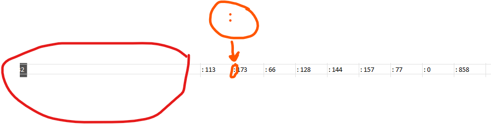
Cuando agrego GridAggregates el exportador de excel no me permite dejar limpia la fila de Totales (FooterTemplates) para unicamente dejar el Dato me coloca la siguiente estructura: "aggregate_sum: X" y al remover el aggregate_sum de los archivos de recursos me deja el texto ": X" por lo que la cadena sigue sin quedar limpia.
De igual manera en mi grid view tengo la columna de Totales y no la agrega al archivo que se exporta los totales como se ve en la imagen:

<ColumnMenu>
<ColumnMenuFiltering/>
<ColumnMenuSorting/>
....
</ColumnMenu>