Hi!
When i use combination of LINQ inside TelerikDropDownLists Data attribute and TelerikGrid 's GridEditMode.Popup mode, i get weird behavior when i try to select an item from TelerikDropDownLists - everything freezes. Please check the solution. Everything works fine if i don't use LINQ or GridEditMode.Popup mode.
Thank you!
I have two cascaded dropdownlists, in attached example car brands and selectable colors. The dependent dropdown has defaulttext option. After the parent dropdown has changed, in its event handler I reload the dependent data source and set a new valid value. If the data source does not contain the previous (!) value, the dropdownlist calls the valuechanged callback with default value. In next round when dependent dropdown holds the default value, after reloading datasource it works as expected. And parent changes again, if the updated datasource does not contain the previous dependent value the dropdownlist sets its value to default.
When I do not pass defaulttext parameter, the dependent dropdown selects the first element from the updated datasource. In my case it is not acceptable because I want to set a specific value (in this example the default color), not the first and not the default.
This feedback drives me to try setting value to default and wait for re-render the descendant dropdownlist before set the wanted value.
Is there any way to avoid this behaviour of the dropdownlist?
<TelerikDropDownList TItem="Brand"
			 TValue="int"
			 ValueField=@nameof(Brand.Id)
			 TextField=@nameof(Brand.Name)
			 Data="@BrandList"
			 Value="@Data.BrandId"
			 ValueChanged=@OnBrandChanged />

<TelerikDropDownList TItem="Color"
			 TValue="int"
			 ValueField=@nameof(Brand.Id)
			 TextField=@nameof(Brand.Name)
			 Data="@FilteredColorList"
			 Value="@Data.ColorId"
			 ValueChanged="@OnColorChanged"
			 DefaultText="select color ..." />
async Task OnBrandChanged(int brandId)
{
Data.ColorId = default;
await Task.Delay(5);
Data.BrandId = brandId;
Data.ColorId = GetDefaultColor(brandId);
FilteredColorList = GetFilteredColorList(brandId);
}
The drop down list component does not allow the user to associate a label with the underlying html select input control, which goes against accessibility standards. It appears that most, if not all, of the other components follow the accessibility standards. Please fix the drop down list and/or allow attribute splatting so that developers can apply their own attributes (like aria-label) to meet accessibility standards.
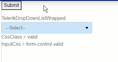
1. Submit the empty form to trigger validation. A validation message is displayed and the field shows a red border as expected.
2. Select a valid value. The validation message goes away as expected, but the red border remains.
3. Select an invalid value. The validation message appears, but now the red border disappears.
4. Select a valid value. The validation message goes away, but the red border remains.
Interestingly, this only happens when using the keyboard. Using the mouse, the border is displayed/hidden at the same time the validation message is displayed/hidden, as would normally be expected.
So to cause this: tab into the field, press one key (e.g., a letter or the down arrow) to select a value, then tab out of the field. If you change the value more than once, the red border will disappear the second time if it is also a valid value.
Animated demo:
I've encountered almost the exact same scenario with other fields when using async validation rules (which Blazor currently does not support), leading me to believe the DropDownList control may be using async somewhere that's resulting in this problem.
Additionally, I'm only experiencing this when I'm wrapping the DropDownList control in my own custom component. I'm not sure why this is.
---
I've included a page and components that demonstrate this problem. It's a little messy but hopefully sheds some light on when it does and doesn't occur. It shows:
1. The issue happens to the TelerikDropDownList when wrapped in a custom component but not otherwise.
2. The issue does not happen to Microsoft's built-in InputSelect even if wrapped in a custom component.
3. The issue does not happen to TelerikTextBox even if wrapped in a custom component.
4. The values of CssClass and InputClass differ, indicating that validation only completes after the value has been changed and OnParametersSet() has been called. (async issue?)
In the attached demo page, the issue only occurs in the last field ("TelerikDropDownListWrapped").
---
Seems like this is a bug with TelerikDropDownList. If not a bug, how can I avoid this issue and why does it not occur with other controls?
Hello,
If I scroll the page down and open a filterable DropDownList, the page will scroll up.
Here is a REPL test page
UI for Blazor 2.30 works as expected. This broke in version 3.0.0. The issue exists only in WebAssembly apps.
The DropDownList remains open after tabbing and does not fire. It also won't fire OnBlur and OnChange in this case. The problem occurs only if the component was opened by clicking exactly on its arrow.
Here is a test page: https://blazorrepl.telerik.com/cxEfFVPq042owTt616
The workaround is to wrap the component in a <span> that handles @onfocusout and closes the component programmatically: https://blazorrepl.telerik.com/cnafPCYL21aT3fpD05
Using DropDownList with Filter enabled will lost track of Focus when an item from dropdown is selected or tabbing away from filter input.
Steps to reproduce:
- Open a DropDownList with filter enabled
- Press TAB
Expected Behavior:
Focus in the next focusable element
Actual Behavior:
Focus is lost, and will go to the browser buttons
It is possible to reproduce in the demos:
https://demos.telerik.com/blazor-ui/dropdownlist/filtering
I am reaching out to suggest an enhancement to the existing filtering feature in the Telerik Blazor dropdown component. Currently, the filtering capability is quite useful, but it would be even more powerful if there was an event trigger during the filtering process. This event would allow developers to execute custom logic while a user is typing in the dropdown field. The ability to respond in real-time as the input changes would significantly enrich the interactivity and functionality of the dropdown, enabling more dynamic and user-tailored experiences. Implementing this feature could greatly enhance the flexibility and utility of the dropdown component. Thank you for considering this enhancement, and I eagerly anticipate its potential integration in future updates.
Kind regards,
Suryateja KONDLA
Hello,
i am trying to add a Clear Button inside the DropDownList-Component.
I tried to follow the instructions provided here: How do I add a Clear button to a DropDownList? in UI for Blazor | Telerik Forums respectiveley here: Telerik REPL for Blazor - The best place to play, experiment, share & learn using Blazor.
But unfortunateley, the button is never inside the component. It's always next to it or under the component.
In your example provided above, the button is inside the component.
I would love to have any solution for this one. A clear button is needed quite often.
I also have attached our custom component, where we use the Telerik DropDownList Component.
Thank you