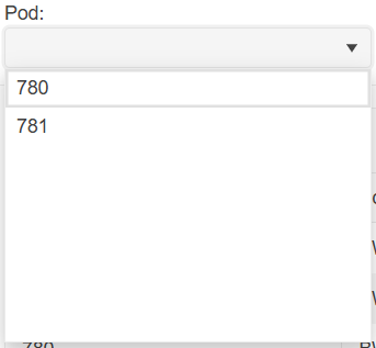
The scenario involves a DropDownList, which receives its data through OnRead at runtime asynchronously. The initial OnRead event that the component fires is not used, so the app calls Rebind() at some point. In this case, the component Value doesn't display until the user opens the dropdown. A possible workaround is to set the Value after the OnRead execution is complete.
Currently, if I set a zoom level to the body/html different than 1 the DropDownList's popup is not positioned correctly.
Please provide support for proper rendering on different zoom/scale levels.
===
ADMIN EDIT
===
The request applies to all components that incorporate popup elements - for example, ComboBox, MultiSelect, DatePicker, TimePicker and more.
The DropDownList is supposed to open the popup element when Alt-Down is pressed. This doesn't work if the page itself scrolls. Pressing alt-down scrolls the page instead. This is on macOS Safari and Chrome on a MacBook.
https://demos.telerik.com/blazor-ui/dropdownlist/keyboard-navigation
Hello,
i am trying to add a Clear Button inside the DropDownList-Component.
I tried to follow the instructions provided here: How do I add a Clear button to a DropDownList? in UI for Blazor | Telerik Forums respectiveley here: Telerik REPL for Blazor - The best place to play, experiment, share & learn using Blazor.
But unfortunateley, the button is never inside the component. It's always next to it or under the component.
In your example provided above, the button is inside the component.
I would love to have any solution for this one. A clear button is needed quite often.
I also have attached our custom component, where we use the Telerik DropDownList Component.
Thank you
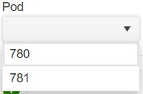
When using the DropDownList component with less than seven items, there is extra whitespace:
In terms of user experience, this extra whitespace is clutter as it takes up visual space yet serves no viable purpose to the user. Clutter gives an unfinished appearance and should be removed if possible.
You can remove the extra whitespace by specifying Height and MaxHeight in the DropDownListSettings render fragment:
<TelerikDropDownList Data="@_dropDownData" @bind-Value="@_selectedPod">
    <DropDownListSettings>
        <DropDownListPopupSettings Height="auto" MaxHeight="200px"/>
    </DropDownListSettings>
</TelerikDropDownList>
However, having to specify DropDownListSettings for every DropDownList component that has fewer than seven items is laborious and verbose. I would like there to be no extra whitespace in DropDownList components by default without having to specify DropDownListSettings.
When you select a date in DropDownList with dates in it (List<DateTime>), the @bind-Value is shaving off the milliseconds.
===ADMIN EDIT===
In the meantime, as a workaround for displaying milliseconds correctly, you can bind the DropDownList to a model. This way, you can use the "Id" to retrieve the selected item and display its precise milliseconds. Below is an example I've prepared to demonstrate this approach:
Selected value: @myDdlData.ToList().Where(x => x.Id == selectedValueId).FirstOrDefault()?.MyValueField.ToString("MM/dd/yyyy HH:mm:ss.fff")
<br />

<TelerikDropDownList Data="@myDdlData"
                     TextField="MyTextField"
                     ValueField="Id"
                     @bind-Value="selectedValueId">
</TelerikDropDownList>

@code {
    public class MyDdlModel
    {
        public int Id { get; set; }
        public DateTime MyValueField { get; set; }
        public string MyTextField => MyValueField.ToString("MM/dd/yyyy HH:mm:ss.fff"); // Display formatted DateTime
    }

    private int selectedValueId { get; set; } = 1;

    private IEnumerable<MyDdlModel> myDdlData = GenerateRandomDateTimes(20);

    private static IEnumerable<MyDdlModel> GenerateRandomDateTimes(int count)
    {
        Random random = new Random();
        DateTime startDate = DateTime.Now;

        return Enumerable.Range(1, count)
            .Select(x => new MyDdlModel
            {
                Id = x, // Unique integer Id
                MyValueField = startDate.AddDays(x)
                    .AddMinutes(random.Next(0, 60))
                    .AddSeconds(random.Next(0, 60))
                    .AddMilliseconds(random.Next(0, 1000))
            }).ToList();
    }
}
Here is the scenario:
- A select component is near the bottom of the screen and its dropdown shows above the component.
- Height="auto" is set in the PopupSettings
- Filtering is enabled.
- Component version 6.1.0 or later
In this case, reducing or increasing the number of visible dropdown items does not adjust the open dropdown's position. As a result, it may either float too high, or overflow the screen.
Possible workarounds are:
- Use a fixed height in the PopupSettings.
- Downgrade to version 6.0.2.
Here is a test page:
<div style="height:80vh;background:linear-gradient(white,orange)">
    <ol>
        <li>Open a ComboBox</li>
        <li>Type a character to filter and reduce the visible data items</li>
        <li>Observe incorrect popup position that leaves a gap</li>
    </ol>
    <ol>
        <li>Focus a closed ComboBox</li>
        <li>Type a character to filter and display a reduced list of data items</li>
        <li>Remove the filter string to increase the visible data item count</li>
        <li>Observe incorrect popup position that overflows the screen</li>
    </ol>
</div>

WORKS:
<TelerikComboBox Data="@ListItems"
                 @bind-Value="@SelectedValue"
                 TextField="@nameof(ListItem.Text)"
                 ValueField="@nameof(ListItem.Id)"
                 Filterable="true"
                 FilterOperator="@StringFilterOperator.Contains"
                 Width="300px" />

BROKEN:
<TelerikComboBox Data="@ListItems"
                 @bind-Value="@SelectedValue"
                 TextField="@nameof(ListItem.Text)"
                 ValueField="@nameof(ListItem.Id)"
                 Filterable="true"
                 FilterOperator="@StringFilterOperator.Contains"
                 Width="300px">
    <ComboBoxSettings>
        <ComboBoxPopupSettings Height="auto" MinHeight="50px" MaxHeight="60vh" />
    </ComboBoxSettings>
</TelerikComboBox>

<div style="height:80vh;background:linear-gradient(orange, white)">

</div>

@code {
    private List<ListItem> ListItems { get; set; } = new();

    private int SelectedValue { get; set; }

    protected override void OnInitialized()
    {
        ListItems = new List<ListItem>();

        for (int i = 1; i <= 50; i++)
        {
            ListItems.Add(new ListItem()
            {
                Id = i,
                Text = $"Item {i} {(char)Random.Shared.Next(65, 91)}{(char)Random.Shared.Next(65, 91)}{(char)Random.Shared.Next(65, 91)}{(char)Random.Shared.Next(65, 91)}"
            });
        }

        base.OnInitialized();
    }

    public class ListItem
    {
        public int Id { get; set; }
        public string Text { get; set; } = string.Empty;
    }
}
The OnClose event fires multiple times when the handler uses the DialogFactory.
The behavior occurs with all select components (AutoComplete, ComboBox, DropDownList, MultiColumnComboBox, MultiSelect)
Possible workarounds include:
- Use a boolean flag to prevent the OnClose handler from executing the second time, for example, if the second execution occurs less than 1-2 seconds after the first one.
- Use OnChange instead of OnClose.
- Use a <TelerikDialog> component instead of ConfirmAsync.
Here is a test page that reproduces the issue:
<div style="display: flex; gap: 2em;">
    <div>
        <TelerikButtonGroup SelectionMode="@ButtonGroupSelectionMode.Single">
            <ButtonGroupToggleButton @bind-Selected="@UseOnChange">Use OnChange</ButtonGroupToggleButton>
            <ButtonGroupToggleButton @bind-Selected="@UseOnClose">Use OnClose</ButtonGroupToggleButton>
        </TelerikButtonGroup>

        <TelerikDropDownList Data="@Data"
                             @bind-Value="@Value"
                             ValueField="@nameof(SampleModel.Text)"
                             OnChange="@OnDropDownListChange"
                             OnClose="@OnDropDownListClose"
                             Width="160px" />

    </div>
    <div>
        <TelerikButton OnClick="@( () => CloseLog = string.Empty )">Clear Event Log</TelerikButton>
        <p>
            <pre>@CloseLog</pre>
        </p>
    </div>
</div>

@code {
    private List<SampleModel> Data { get; set; } = new();

    private string Value { get; set; } = string.Empty;
    private List<string> Values { get; set; } = new();

    private string CloseLog { get; set; } = string.Empty;

    private bool UseOnClose { get; set; } = true;
    private bool UseOnChange { get; set; }

    [CascadingParameter]
    public DialogFactory? TelerikDialogs { get; set; }

    private async Task OnDropDownListChange(object currentValue)
    {
        CloseLog += $"OnChange {DateTime.Now.ToString("HH:mm:ss.fff")} \n";

        if (UseOnChange)
        {
            await TelerikDialogs!.AlertAsync("OnChange");
        }
    }

    private async Task OnDropDownListClose(DropDownListCloseEventArgs args)
    {
        CloseLog += $"OnClose {DateTime.Now.ToString("HH:mm:ss.fff")} \n";

        if (UseOnClose)
        {
            await TelerikDialogs!.AlertAsync("OnClose");
        }
    }

    public class SampleModel
    {
        public int Id { get; set; }
        public string Text { get; set; } = string.Empty;
    }
}
In TelerikSelectBase that the DropDownList inherits, the FieldIdentifier is set only in the OnInitializedAsync method and therefore the FieldIdentitier is never updated. This can cause issues with validation as seen in this example: https://blazorrepl.telerik.com/GyamPdlf37LXpPAW36.
To reproduce:
- Select the last item in the tree 7.Garden and change the value in the drop down list to Unsupported - the drop down list shows a red border.
- Select item 6.Garden from the tree. (Any item in the tree other than 1 will do) - I expect the drop down to not have the red border, yet is does.
For reference, in the TelerikInputBase, the FieldIdentifier is set in the SetParameterAsync and thus it is accordingly updated. See the TextBox behavior in the above sample.
Hi,
We are using the DropDownList component as an inline editor in the grid, for managing a product hierarchy. Previously we were using the DropDownList with grouping enabled, without virtualization, but due to volume of data we now need to use virtualization.
This does not work with grouping at the moment.
At the bottom of this page it is mentioned that 'Virtual scrolling with grouping will be supported in a future version.'.
Any timeline on this feature?
KR,
Lennert
Currently, a TextField value of empty string will produce a blank item in the dropdown.
On the other hand, a null TextField value will produce the fully qualified class name.
Here are possible workarounds: https://blazorrepl.telerik.com/myOlFpFb1465jW8E07
I am reaching out to suggest an enhancement to the existing filtering feature in the Telerik Blazor dropdown component. Currently, the filtering capability is quite useful, but it would be even more powerful if there was an event trigger during the filtering process. This event would allow developers to execute custom logic while a user is typing in the dropdown field. The ability to respond in real-time as the input changes would significantly enrich the interactivity and functionality of the dropdown, enabling more dynamic and user-tailored experiences. Implementing this feature could greatly enhance the flexibility and utility of the dropdown component. Thank you for considering this enhancement, and I eagerly anticipate its potential integration in future updates.
Kind regards,
Suryateja KONDLA
TlerikDropDownList keyboard navigation works differently from native html select.
In case we have a list with many similar options, for example:
011
021
211
....
In this case with native html select I can type 02 to select 021, but with TlerikDropDownList this would select 211.
If you type swiftly multiple printable characters, the DropDownList keyboard navigation will react only to the first character.
Using DropDownList with Filter enabled will lost track of Focus when an item from dropdown is selected or tabbing away from filter input.
Steps to reproduce:
- Open a DropDownList with filter enabled
- Press TAB
Expected Behavior:
Focus in the next focusable element
Actual Behavior:
Focus is lost, and will go to the browser buttons
It is possible to reproduce in the demos:
https://demos.telerik.com/blazor-ui/dropdownlist/filtering
When using the grouped DropDownList and performing a search for a specific element, the DropDownList incorrectly displays the initially shown group instead of the group containing the searched element.
To reproduce the issue:1. Open this REPL example: https://blazorrepl.telerik.com/QROrkouK40PFQCUU27
2. Open the DropDownList and type "v" in the filter input field.


