When using a DateTime? for input and a specific format, for example yyyy-MM-dd. If you just want to change the month part and type 03 the focus shifts to the start of the input and the month part gets replaced by MM.
Reproduce:
https://blazorrepl.telerik.com/QGYFEfPU52ceM2wL03
Select the month part and type 03 for example. If using a non nullable DateTime, this does not happen.
The normal InputDate in blazor has an @ondblclick event. The intellisense for TelerikDatePicker indicates that this should be available but gives the error "...does not have a property matching the name 'ondblclick'."
DateInput shows minvalue by default when bound to a nullable DateTime with value null. While this might not be a bug, in almost all cases, it would be much better to have the default value set to DateTime.Now rather than DateTime.Min which seem to be the case today.

When testing your datepicker control in NVDA, there are a number of accessibility issues.
- The dateinput portion of the control does not account for users entering full dates into the control, meaning if a person was to try to type 2/23/2022 into the input where they included the slashes, it would throw them into the year section when they thought they were entering the day section. My suggestion via this forum link (https://www.telerik.com/forums/ignore-forward-slash-allow-various-formats-when-using-date-input) is to alter your date entry logic to allow users to both enter the dates without the slashes (which is what you have now except under a few edge cases where a slash is needed to move to the next section like 2 2/ 2022) as well as include the slashes where if the user is on the first digit of the day section and the / is pressed, do NOT advance them to the year section. While this can be an annoyance for a sited user because they end up accidentally entering the day in the year section when they try to use the slashes, they can at least see what went wrong, and then go back and fix it. For a screen reader user, they are not notified of the auto advancement, and so they have no idea that they have entered an invalid date until the leave the control and then tab back to it, or if they were to try to submit the form and get an error.
- The dropdown portion of the control is not being read properly by NVDA. When you first drop it down via alt-down arrow, it will actually write all of the table text to the Speech Viewer window, but nothing is read.
- Then, once you try to arrow to a date, nothing is read at all. You can tab to the month and previous/next buttons and they are read.
- Opening the Month section of the dropdown doesn't read the month out when arrowing through the months.
- Tabbing to the previous or next buttons and then pressing them with enter reads all of the dates in the table.
- Arrowing up or down within the days reads all of the dates in the table when it advances to a new month, but reads nothing otherwise.
I am using the latest version of NVDA 2021.3.3 on Chrome Version 98.0.4758.82 (Official Build) (64-bit). I will note that Jaws and Chrome work properly regarding the dropdown issues, so it may be an NVDA thing, but maybe some research can be done to see if there are some different aria attributes that will work so that if functions properly with both screen readers. For example this Aria Best Practices Date Combo Box example at least reads where the user is with the arrow keys. https://www.w3.org/TR/wai-aria-practices-1.2/examples/combobox/combobox-datepicker.html It is not perfect, but it is better than not being read at all.
And even outside of the date dropdown stuff, the date input portion (#1) above is an issue across the board. I know that it is a design decision that you guys have made, and that you have provided documentation as to why and how to use it, but most users are going to type in the slashes of a date, and it's not reasonable to write up a half page of documentation within my app to let users know how to use the control. I can't even put a short label that says enter date without slashes, because under some circumstances a slash is necessary, so it becomes confusing to the user, and screen reader users will get lost if they make a mistake because they are not informed that they have just switched to a different section.
Thanks.
Currently, if the ReadOnly parameter value is set to 'true,' the user can modify the value of the DateInput by using the arrow keys.
Reproduction: https://blazorrepl.telerik.com/mxaiabvd178zy7p948
For some reason I'm unable to select the date 01/03/2000 when using the date picker to select the date. Only thing special about this date is its exactly 24 years ago today.
I was able to reproduce in repl. https://blazorrepl.telerik.com/QyYFkdbU34QbG0Te32
I also attached a video so you can review the steps followed and result.
When the user navigates between the views, the DatePicker currently fires a ViewChanged event. This event provides the new view (Decade, Month etc.) but there is no way to detect the selection that the user made in the previous view.
For example, if am in the Decate view, as soon as I select a year, the DatePicker will switch to Month view. The problem that I am facing is that I cannot get the year selected from the Decade view. I need that, so I can display it in my custom HeaderTemplate.
When dragging the mouse to select the whole input value, only the first segment on the left remains selected after releasing the mouse. The issue is reproducible in the DatePicker demo once you select a date. Video: https://app.screencast.com/Eoa6Xj2MzfOPN.
The problem is only reproducible in Firefox, the whole input is properly selected in Chrome and Edge.
We would like to get the datetime picker to autofill the year when entering just two digits for the year with a format of dd-MM-yyyy HH:mm:ss.
So when you enter 23-04-25 it changes to 23-04-2025. Currently it changes it to 23-04-0025, which isn't our desired result.
Something along the lines of how this works: https://jsfiddle.net/anbdwL0h/ but then with a 4 year digit format as result.
When I have a DatePicker and it's DateOnly value is default, the control displays 1/1/2001 instead of either nothing, a placeholder, or the correct value.
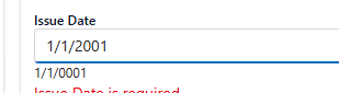
The image above shows the DatePicker value and the current value in the model underneath.
Please advise.
When you use the DisabledDates parameter of the picker and it is null, the component throws an error that it cannot Select from the IEnumerable:
<TelerikDatePicker @bind-Value="@theValue" DisabledDates="@DisabledDates" />

@code{
    DateTime theValue { get; set; }
    List<DateTime> DisabledDates { get; set; }
}
If I set a Min-Date like this:
<TelerikDatePicker @bind-Value="myDate"
Format="dd.MM.yyyy"
Min="@DateTime.Today.AddDays(1)">
</TelerikDatePicker>
clicking on the "Today" link in the calendar does not do anything!
If I don't set Min then a click on "Today" correctly sets the current date.
Regards,
René
In our application "Today" is NEVER a valid selection. But there is no way to turn it off.
Yes, we realize that we can create our own header template. But then we have to reproduce the next/previous functionality, for every single instance of the component -- and we have many dozens of them.
Description
Changing the "day" part of the DatePicker value is inconsistent.
Steps To Reproduce
Run this example: https://blazorrepl.telerik.com/QfOLwTvp03DVHJ4C35
- Click on the "day" part of the DatePicker input and enter 22032025. The result is: 22-03-2025.
- Click the "day" part again and enter 02.
Actual Behavior
The value changes to: 20-02-2025.
After the initial unsuccessful attempt to change the day to 02, subsequent attempts will work as expected. You may re-focus the "day" part and type 02.
Expected Behavior
The value should change to 02-03-2025.
Browser
All
Last working version of Telerik UI for Blazor (if regression)
No response