Steps to reproduce
- Add a DatePicker
- Bind it to nullable DateTime object
- Use the dd.MMM.yyyy format
- Select any date and when the popup is closed press any numeric key on the keyboard.
The problematic setup:
<TelerikDatePicker Min="@Min"
                   Max="@Max"
                   @bind-Value="@selectedDate">
</TelerikDatePicker>


@code  {
    public DateTime Max = new DateTime(2021, 3, 29);
    public DateTime Min = new DateTime(2021, 3, 1);
    private DateTime? selectedDate;
}
- See the DatePicker Validation Demo
- Highlight the year
- Start typing 2029
- See that even on the first input stroke the validation is triggered.
<Admin>
As a workaround, you can add the DebounceDelay parameter with a high number as in this REPL link.
</Admin>
TELERIK EDIT: This appears to be fixed in version 6.0.0
====
Hi
I have created a REPL here: https://blazorrepl.telerik.com/QHYGbTPk59IqOcEU51
to reproduce the issue I am talking about:
- click on the cell
- Press the 'Delete' Key
- Press the 'Enter' Key
you will notice that the value displayed below the table is what was previously in the cell
I would have expected the value to be null which can be achieved via
- click on the cell
- Press the 'Delete' Key
- Click outside the cell
When using a DateTime? for input and a specific format, for example yyyy-MM-dd. If you just want to change the month part and type 03 the focus shifts to the start of the input and the month part gets replaced by MM. Also applies to DateInput.
Reproduce:
https://blazorrepl.telerik.com/QGYFEfPU52ceM2wL03
Select the month part and type 03 for example. If using a non nullable DateTime, this does not happen.
This was marked as a duplicate for this issue: https://feedback.telerik.com/blazor/1468716-datepicker-loses-focus-when-the-input-date-starts-with-0
That issue is now "completed" but the issue I'm describing is not fixed.
When using an abbreviated month in the date format, the picker will not automatically move to the next element (year) after entering a month. If I enter 04 for example, the focus remains on the month.
When using a numeric month in the date format, the picker will automatically move to the year after entering a month.
See an example: https://blazorrepl.telerik.com/cmOzPgFc08d1woml09.
I have set both the Format and FormatPlaceholder. When I programmatically set the @bind-Value to null the Format is rendered.
I would like the FormatPlaceholder to take effect instead of the Format.
@using Telerik.Blazor.Components.DatePicker
<TelerikDatePicker Enabled="false" @bind-Value="@HireDate" Format="MMMM/dd/yyyy"></TelerikDatePicker>
@HireDate
<br/>
<TelerikDatePicker @bind-Value="@MeetingDate" Format="MM/dd/yyyy HH:mm:ss"></TelerikDatePicker>
@MeetingDate
@code {
DateTime HireDate { get; set; } = new DateTime(2018, 5, 6);
DateTime MeetingDate { get; set; } = new DateTime(2019, 3, 4, 15, 0, 0);
}
The picture says it all!
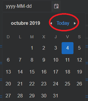
Setting Min and Max should also prevent the user from writing a date that is out of their range. At the moment, it only disables the dates in the calendar.
In the meantime, you can use validation to limit the user input.
Hello,
I'm trying to integrate a blazor datepicker, and i will only want to display the months and navigate bye years.
But it does not work.
<TelerikDatePicker View="@CalendarView.Year" BottomView="@CalendarView.Decade" Format="MM/yyyy" @bind-Value="@selectedDate" @ref="theDatePicker"></TelerikDatePicker>
Thank you.
I'm making a wrapper on top of TelerikDatePicker and this is how my component is working
<TelerikDatePicker T="TDate"
Value="@_value"
ValueChanged="@ValueChanged"
ValueExpression="@ValueExpression"
Enabled="@Enabled"
Class="@ClassMapper.AsString()"
Format="@Format" />
@code {
// ... the other properties
[Parameter]
public virtual string Format { get; set; }
}
But here is the problem. This component will give me the error
Error: System.AggregateException: One or more errors occurred. (Value cannot be null. (Parameter 'input'))
---> System.ArgumentNullException: Value cannot be null. (Parameter 'input')
at System.Text.RegularExpressions.Regex.Replace(String input, String replacement)
at System.Text.RegularExpressions.Regex.Replace(String input, String pattern, String replacement)
at Telerik.Blazor.Common.DateHelpers.FormatHelper.ExpandFormat(String format)
at Telerik.Blazor.Common.DateHelpers.FormatHelper.ConvertToKendoIntl(String format)
at Telerik.Blazor.Components.TelerikDateInputBase`1.GetDateInputOptions()
at Telerik.Blazor.Components.TelerikDateInputBase`1.OnAfterRenderAsync(Boolean firstRender)
So another solution would be set it to string.Empty, but than it will have a different result when I don't pass the Format property.
Here are the cases:
[Parameter]
public virtual string Format { get; set; } // gives the error
[Parameter]
public virtual string Format { get; set; } = ""; // doesn't give the default result
I had to make a walkaround to not pass Format to the component for it to work
@if (!string.IsNullOrEmpty(Format))
{
<TelerikDatePicker T="TDate"
Value="@_value"
ValueChanged="@ValueChanged"
ValueExpression="@ValueExpression"
Enabled="@Enabled"
Class="@ClassMapper.AsString()"
Format="@Format" />
}
else
{
<TelerikDatePicker T="TDate"
Value="@_value"
ValueChanged="@ValueChanged"
ValueExpression="@ValueExpression"
Enabled="@Enabled"
Class="@ClassMapper.AsString()" />
}
What should I set as a default value to my wrapper's Format property so it doesn't give me the error and also get's the default value of Format?
Please don't say that I should keep the @if (!string.IsNullOrEmpty(Format)), it's so bad and I don't want to use telerik and still have to make walkarounds.
When using DatePicker with Globalization the message that indicates that the component has an invalid date is still visible even after providing a correct date.
I would like to be able to disable a month or multiple months in the DatePicker/DateRangePicker or the Calendar.
<AdminEdit>
Currently, we look at this feature as an internal check if all dates in the month/months are disabled and if so to disable the entire month.
</AdminEdit>
Currently, when dates need to be disable in the DatePicker and DateRangePicker, a collection of induvial dates are provided. As a result, when I need to disable a 90 day or 180 day continuous range I need to add to the collection 90 or 180 day individual DateTime objects.
It would be more efficient to provide a range of dates to disable instead of induvial dates.
The DisabledDates should accept a collection of DisableDateItems that is similar to the below:
public class DisableDateItem
{
     public DateTime RangeBegin { get; set; }
     public DateTime RangeEnd { get; set; }
}
Using this collection I can disable an individual date by having the RangeBegin and RangeEnd dates be the same, as shown below:
var bankHoliday = new DisableDateTime
{
       RangeBegin = new DateTime(2021, 09, 01),
       RangeEnd = new DateTime(2021, 09, 01)
};
To disable a date range, for example the Eastern Good Friday Weekend, I would provide a DisableDateTime as:
var bankHoliday = new DisableDateTime
{
       RangeBegin = new DateTime(2021, 04, 30),
       RangeEnd = new DateTime(2021, 05, 02)
};
To disable a 90 day range, I would provide a DisableDateTime object as:
var bankHoliday = new DisableDateTime
{
       RangeBegin = new DateTime(2021, 05, 01),
       RangeEnd = new DateTime(2021, 07, 30)
};
I want to apply some custom CSS to hide the disabled dates. However, it appears that k-state-disabled class is not applied to all of them.
For example, if I set the Max parameter to October 15th 2021, the remaining dates of October have the k-state-disabled but the ones in November only have k-other-month class.
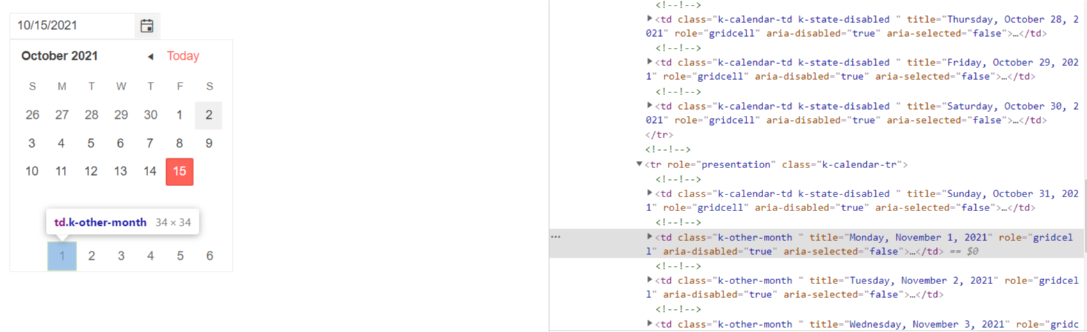
The same behavior occurs when I set the Min parameter - the dates from the previous month do not have k-state-disabled class.
===========
ADMIN EDIT
===========
Note: This bug also affects Calendar, DateRangePicker and DateTimePicker components.
As a workaround for the time being you might try another approach - all the disabled cells have aria-disabled = "true" attribute which you can use as a CSS selector to target the disabled cells:
<style>
    [aria-disabled="true"] {
        visibility: hidden;
    }
</style>

<TelerikDatePicker @bind-Value="datePickerValue" Max="@MaxValue"></TelerikDatePicker>

@code  {
    DateTime datePickerValue { get; set; } = new DateTime(2021, 10, 1);
    DateTime MaxValue { get; set; } = DateTime.Now;
}