When a Chart Series has a click handler defined, I think the cursor should be set to 'pointer' when the user is hovering over the series so the user knows its clickable. Currently the Chart Series Labels change to a pointer cursor when you hover them, however they are not clickable. Not sure if this was the intended functionality, but it seems backwards to me.
Like in Kendo (here and here) so I can change the cursor for the chart to a pointer when the user hovers the series - I want that to indicate they can click on it (through the SeriesClick event).
---
ADMIN EDIT
workaround that you can consider which uses CSS to traverse the chart rendering:
<style>
    /* this will work in the chart below with its settings, axes, title and so on */
    .k-chart g[clip-path] g g g path {
        cursor: pointer;
    }

    /* a very generic selector that will capture just about everything in the plot area of the chart */
    /* Try this if you cannot make a more specific selector like the one above by inspecting the rendered content */
    /*.k-chart path {
        cursor: pointer;
    }*/
</style>

<TelerikChart>
    <ChartSeriesItems>
        <ChartSeries Type="ChartSeriesType.Column" Name="Product 1" Data="@series1Data">
        </ChartSeries>
        <ChartSeries Type="ChartSeriesType.Column" Name="Product 2" Data="@series2Data">
        </ChartSeries>
    </ChartSeriesItems>

    <ChartCategoryAxes>
        <ChartCategoryAxis Categories="@xAxisItems">
        </ChartCategoryAxis>
    </ChartCategoryAxes>

    <ChartTitle Text="Quarterly revenue per product"></ChartTitle>

    <ChartLegend Position="ChartLegendPosition.Right">
    </ChartLegend>
</TelerikChart>

@code {
    public List<object> series1Data = new List<object>() { 10, 2, 5, 6 };
    public List<object> series2Data = new List<object>() { 5, 8, 2, 7 };
    public string[] xAxisItems = new string[] { "Q1", "Q2", "Q3", "Q4" };
}
---
I would like to be able to control the rendering of the Lines on the X and Y axis for the Chart. For example, I would like to be able to hide them, change their color, etc. Currently, such an option is available for the stock chart with the following nested tags: StockChartCategoryAxisLine and StockChartValueAxisLine.
The context DataItem is null for subsequent ChartSeries. It receives the correct object for the first ChartSeries, but for the rest is null.
<Admin Edit>
A workaround, for the time being, would be to remove the Template and let the Tooltip display the default value, which will be correct.
</Admin Edit>
Reproduction code:
<TelerikChart>
    <ChartTitle Text="Unrecoverable Errors Per Minute vs. Signal Level" />
    <ChartCategoryAxes>
        <ChartCategoryAxis Type="@ChartCategoryAxisType.Category" />
    </ChartCategoryAxes>
    <ChartValueAxes>
        <ChartValueAxis>
            <ChartValueAxisLabels Visible="true" />
        </ChartValueAxis>
    </ChartValueAxes>

    <ChartTooltip Visible="true">
        <Template>
            @{
                var data = context.DataItem as ModelData;
                <div class="card" style="font-size: 0.8rem; color: black">
                    <span>@($"{data.Value}")</span>
                    <span>@($"{data.Type}")</span>

                </div>
            }
        </Template>
    </ChartTooltip>

    <ChartSeriesItems>
        <ChartSeries Type="ChartSeriesType.Line"
                     Data="@ChartData1"
                     CategoryField="@nameof(ModelData.Type)"
                     Field="@nameof(ModelData.Value)">
        </ChartSeries>
        <ChartSeries Type="ChartSeriesType.Line"
                     Data="@ChartData2"
                     CategoryField="@nameof(ModelData.Type)"
                     Field="@nameof(ModelData.Value)">
        </ChartSeries>
        <ChartSeries Type="ChartSeriesType.Line"
                     Data="@ChartData3"
                     CategoryField="@nameof(ModelData.Type)"
                     Field="@nameof(ModelData.Value)">
        </ChartSeries>
    </ChartSeriesItems>

</TelerikChart>

@code {
    public class ModelData
    {
        public string Type { get; set; }
        public double Value { get; set; }
    }

    public List<ModelData> ChartData1 = new List<ModelData>() { new ModelData() { Type = "S1", Value = 1 } };
    public List<ModelData> ChartData2 = new List<ModelData>() { new ModelData() { Type = "S2", Value = 5 } };
    public List<ModelData> ChartData3 = new List<ModelData>() { new ModelData() { Type = "S3", Value = 9 } };
}
Hello support team,
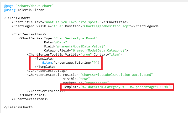
from the donut chart example under https://demos.telerik.com/blazor-ui/chart/donut-chart:
Is there a specific reason why all charts have a Template sub-property for the ChartSeriesTooltip construct but the Template field with the template syntax for the ChartSeriesLabels construct? I would favour a unified syntax for both of the properties, if this is possible somehow...
Is this planned for the future to be unified? Especially formatting like shown under https://docs.telerik.com/blazor-ui/knowledge-base/chart-format-percent is not as simple as I would have expected as nobody wants to touch JavaScript code literally :D (Also, localizing data seems quite difficult with that technique).
The best option in my opinion would be to remove those templates completely and just let the user decide what to show there while using a field called e.g. TooltipMappingName and LabelMappingName or something like that. This gives the chart the maximum of configuration possible.
Example:
<TelerikChart>
    <ChartTitle Text="What is you favourite sport?"></ChartTitle>
    <ChartLegend Visible="true" Position="ChartLegendPosition.Top"></ChartLegend>

    <ChartSeriesItems>
        <ChartSeries Type="ChartSeriesType.Donut"
                     Data="@Data"
                     Field="@nameof(ModelData.Value)"
                     CategoryField="@nameof(ModelData.Category)">
            <ChartSeriesTooltip Visible="true" Context="item" TooltipMappingName="@nameof(ModelData.Tooltip)"/>
            <ChartSeriesLabels Position="ChartSeriesLabelsPosition.OutsideEnd"
                               Visible="true"
                               Background="transparent"
                               LabelMappingName="@nameof(ModelData.Label)">
            </ChartSeriesLabels>
        </ChartSeries>
    </ChartSeriesItems>

</TelerikChart>

@code {
    public class ModelData
    {
        public string Category { get; set; }
        public int Value { get; set; }
  public string Tooltip { get; set; }
        public string Label { get; set; }
    }

    public List<ModelData> Data = new List<ModelData>()
    {
        new ModelData()
        {
            Category = "Football",
            Value = 35,
   Tooltip = "35%",
   Label = "Football: 35%"
        },
        new ModelData()
        {
            Category = "Basketball",
            Value = 25,
   Tooltip = "25%",
   Label = "Basketball: 25%"
        },
        new ModelData()
        {
            Category = "Volleyball",
            Value = 20,
   Tooltip = "20%",
   Label = "Volleyball: 20%"
        },
        new ModelData()
        {
            Category = "Rugby",
            Value = 10,
   Tooltip = "10%",
   Label = "Rugby: 10%"
        },
        new ModelData()
        {
            Category = "Tennis",
            Value = 10,
   Tooltip = "10%",
   Label = "Tennis: 10%"
        }
    };
}
Best regards,
Christian
Hi!
I'm building a Blazor Component using your TelerikChart. To build my chart, I'm dynamically inserting the series name and the series data, which is pulled from a list. I also have a button on the page that changes the dataset (last month, this month, next month, etc). The button will rebuild the list of names and data, and Blazor will build the chart with a 'foreach' entry in the ChartSeriesItems section of the Chart Component.
The problem is that the Items are not cleared each time. When I click the button, I'm getting previous values. In the example below, I have 3 data sets. The first has 4 items, the second has 8 and the third has 6. If the user clicks the second, showing all 8, then clicks the first, the chart will show the new 4, and the previous 5-8 from the second set.
My chart description in HTML is:
...
<ChartSeriesItems>
@foreach(Tuple<string, object[]> t in myData)
{
<ChartSeries Type="ChartSeriesType.Column" Name=@t.Item1 Data=@t.Item2 />
}
</ChartSeriesItems>
...
I have checked my data through debugging to ensure that the myData variable is correct (i.e. when I click the first data, it only has 4 items). However, when the chart displays, it shows 8 items.
Is there a CLEARDATA method or something I can call on the Chart to ensure that the data is reset each time? I see that there is a Clear() in JavaScript, but I'm writing in only Blazor and C#, with no JavaScript.
I've attached the .razor page for your reference. (As this is my test code, I'm using random number generation to get the data.)
Thank you so much for your help!!
-Cheryl Simpson
Hi!
I'm more than a little impressed with your Blazor efforts to-date, but there's one component lacking: a CandleStick chart.
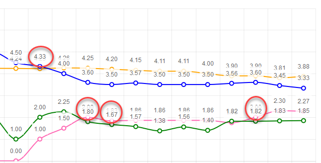
The idea is to ensure labels don't render on top of each other. If series values are close to each other, labels start overlapping. Having tooltips will let me remove the labels.
Example:
What we are looking for is really just a means to change the legend text color, and other text colors, as well as being able to set a background.
For instance:
Through the Telerik theme we would not be able to do this, maybe on one chart, but not different styles for each of the 3 charts.
Possibly also having the chart to resize as the browser resizes, with an included Delay of 20ms. Just a thought.
I have a page where I am displaying a chart and associated data in a grid below.
Being able to range select in the chart like in the asp.net core link below would offer a much better user experience.
That way the selected range could be specifically targeted in the grid data below the chart.
Hi,
We tried making the name property of our TelerikChartSeries dynamic by binding it to a string value. This however seems to completely crash startup, the browser tab freezes and the console doesn't show any errors. If we just put in a simple string in the Name property the application runs without a problem.
<TelerikChartSeries Type="ChartSeriesType.Column" Name="@Team1Name" Data="@Results" Field="@nameof(ChartViewModel.Team1Score)" CategoryField="@nameof(ChartViewModel.CategoryName)">
    <TelerikChartSeriesLabels Visible="true" />
</TelerikChartSeries>
As you can see in this example we're binding the Name property to Team1Name which can be changed whenever another team is selected from a dropdownlist.
Thank you in advance.