Hello,
I need to be able to set the colors of x-axis category labels conditionally. My current use case for this is that I'm displaying dates and need weekends and holidays to be their own colors. As far as I'm aware this cannot be accomplished in any way currently:
- ChartCategoryAxisLabels Color parameter cannot be conditional and applies to all labels
- ChartCategoryAxisLabels Template parameter must return plain text and cannot render styling or HTML
- The labels are drawn via canvas and therefore cannot be styled externally
The two solutions I could suggest are as follows:
- Make the ChartCategoryAxisLabels Color parameter able to be Kendo UI parsed like the Template Parameter
- In addition to the ChartCategoryAxis Categories parameter, support providing categories as render fragment children, with each having its own Color parameter
Thanks,
Robert
If a Chart is recreated at runtime and the mouse cursor is over the component, a JavaScript error may occur:
Error: Microsoft.JSInterop.JSException: null is not an object (evaluating 'e.top')
A possible workaround is to delay the Chart tooltip initialization a little:
<TelerikDrawer Data="@NavigablePages" Expanded="true" MiniMode="true" Mode="@DrawerMode.Push">
    <DrawerContent>
        <TelerikGridLayout>
            <GridLayoutItems>
                <GridLayoutItem Column="1">
                    <TelerikCard Width="300px" Height="400px">
                        <CardHeader>
                            <CardTitle>CARD 1</CardTitle>
                        </CardHeader>
                        <CardBody>
                            @if (IsLoading)
                            {
                                <span style="height:100%">...loading...</span>
                            }
                            else
                            {
                                <TelerikChart Transitions=@false>
                                    <ChartSeriesItems>
                                        <ChartSeries Type="ChartSeriesType.Donut" Data="@donutData"
                                                        Field="@nameof(MyDonutChartModel.SegmentValue)" CategoryField="@nameof(MyDonutChartModel.SegmentName)">
                                            <ChartSeriesTooltip Visible="@IsChartTooltipVisible" Background="#222731" Color="#FFFFFF">
                                                <Template>
                                                    @((context.DataItem as MyDonutChartModel)?.Tooltip)
                                                </Template>
                                            </ChartSeriesTooltip>
                                        </ChartSeries>
                                    </ChartSeriesItems>
                                </TelerikChart>
                            }
                        </CardBody>
                    </TelerikCard>
                </GridLayoutItem>
                <GridLayoutItem Column="2">
                    <TelerikCard Width="300px" Height="400px">
                        <CardHeader>
                            <CardTitle>CARD 2</CardTitle>
                        </CardHeader>
                        <CardBody>
                            <TelerikButton OnClick="@OnClickHandler">REFRESH CHART</TelerikButton>
                        </CardBody>
                    </TelerikCard>
                </GridLayoutItem>
            </GridLayoutItems>
        </TelerikGridLayout>
    </DrawerContent>
</TelerikDrawer>


@code{

    public bool IsLoading { get; set; } = false;
    public bool IsChartTooltipVisible { get; set; } = true;

    private async Task OnClickHandler()
    {
        IsLoading = true;
        IsChartTooltipVisible = false;
        // Simulate API call
        await Task.Delay(2000);
        IsLoading = false;
        // Force the Chart to render
        StateHasChanged();
        // Delay the Chart Tooltip initialization
        await Task.Delay(100);
        IsChartTooltipVisible = true;
    }

    List<DrawerItem> NavigablePages { get; set; } = new List<DrawerItem>
{
        new DrawerItem { Text = "Home", Icon = SvgIcon.Home }
    };

    public class DrawerItem
    {
        public string Text { get; set; }
        public ISvgIcon Icon { get; set; }
    }

    public class MyDonutChartModel
    {
        public string SegmentName { get; set; }
        public double SegmentValue { get; set; }
        public string Tooltip { get; set; }
    }

    public List<MyDonutChartModel> donutData = new List<MyDonutChartModel>
    {
        new MyDonutChartModel
        {
            SegmentName = "Product 1",
            SegmentValue = 2,
            Tooltip = "Tooltip 1"
        },
        new MyDonutChartModel
        {
            SegmentName = "Product 2",
            SegmentValue = 3,
            Tooltip = "Tooltip 2"
        },
        new MyDonutChartModel
        {
            SegmentName = "Product 3",
            SegmentValue = 4,
            Tooltip = "Tooltip 3"
        }
    };
}
The Chart tooltip template receives incorrect context for another data item when there is a missing data item for the current category and the series has MissingValues="@ChartSeriesMissingValues.Zero".
Test page: https://blazorrepl.telerik.com/QzOtFwln362xLl7q57
Compare with the Kendo UI jQuery Chart: https://dojo.telerik.com/qZCFVOPQ
Possible workarounds include:
- Check the FormattedValue property of the tooltip context. If it's "0", while the value in the DataItem is not zero, then there is a missing data item.
<TelerikChart Height="200px"> <ChartSeriesItems> <ChartSeries Type="ChartSeriesType.Line" Data="@Series1Data" Field="@nameof(SalesData.Revenue)" CategoryField="@nameof(SalesData.TimePeriod)" MissingValues="@ChartSeriesMissingValues.Zero"> <ChartSeriesLabels Visible="true"></ChartSeriesLabels> <ChartSeriesTooltip Visible="true"> <Template> @{ var point = context.DataItem as SalesData; } @if (point is not null && context.FormattedValue != "0") { <span>@point.Revenue</span> } else { <span>0 (no data item)</span> } </Template> </ChartSeriesTooltip> </ChartSeries> </ChartSeriesItems> <ChartCategoryAxes> <ChartCategoryAxis Min="@ChartCategoryAxisMin" Type="@ChartCategoryAxisType.Date"></ChartCategoryAxis> </ChartCategoryAxes> </TelerikChart> - Set MissingValues to Gap or Interpolate.
- Provide dummy data items with a zero or null value. These dummy items depend on the Min and Max axis values and can be appended after the Chart data is retrieved from the data source, so that they are not hard-coded there.
- Do not use a Chart tooltip template.
Currently the bubble sizes in the Chart are determined automatically, according to an internal algorithm.
Please add parameters for setting specific min and max bubble sizes by the application.
In the docs https://www.telerik.com/blazor-ui/documentation/components/chart/overview#styling-with-css-variables there is an example on using CSS variables to set colours of the Chart component. And yes, if I set the --kendo-chart-bg CSS variable to some colour, the chart background is coloured with it. But, I can't change the colour at runtime, for example for switching between light and dark themes at user request.
But, shouldn't this be possible as the SVG is rendered inline? I see the chart being rendered as elements like below where the fill propertys value comes from the --kendo-chart-bg variable. But if the fill was instead set to "var(--kendo-chart-bg)" I would be able to change --kendo-chart-bg at runtime and the chart would reflect the change without needing to be refreshed separately? Same should go for all the text and series' colours.
<svg>
<g>
<path d="M0 0 L 400 0 400 240 0 240Z" stroke="none" fill="#0f0"></path>
</g>
</svg>
I also saw this, but I think this is before you added the CSS colouring? https://feedback.telerik.com/blazor/1496389-using-custom-themes-changing-at-runtime-does-not-change-the-chart-component-style
Currently, the TelerikChartBreadcrumb does not allow specifying how the Breadcrumb items are visualized when their total width exceeds the width of the component.
A possible alternative to achieve the same result is to override the default theme styles with the following CSS rule:
.k-breadcrumb-container {
    flex-flow: row wrap;
}
Here is a REPL example to see the result of the above CSS approach - https://blazorrepl.telerik.com/GTOyPYbG23PugZBQ36
I am creating a Donut Chart and believe I have found a bug. On the initial load of the page, the donut chart element is not playing its animation when the label property "Visible=false". Instead, it pops on with no animation. The animations do play on the drilldown elements on their initial loads, but clicking the refresh chart button also causes this behavior even on drilldown levels. Resetting the drilldown also causes this behavior. The chart legend remains visible during the time when the chart is not. Setting the labels visible property to true causes the animations to play correctly. This proof of concept utilizes static data. The application was created using the telerik templates and is correctly injecting the telerik components as all other telerik components, including other chart components, are functioning as expected. I have isolated the code for the donut chart and posted it here.
<TelerikButton OnClick="@(() => DonutChart.Refresh())">Refresh Donut Chart</TelerikButton>
<TelerikButton OnClick="@(() => DonutChart.ResetDrilldownLevel(0))">Reset DrillDown</TelerikButton>
<!-- Donut Chart -->
<TelerikChart @ref="DonutChart">
<ChartTitle Text="Donut Chart" />
<ChartLegend Position="Telerik.Blazor.ChartLegendPosition.Right" />
<ChartSeriesItems>
<ChartSeries Type="ChartSeriesType.Donut"
Data="@donutData"
Field="@nameof(DonutModel.Number)"
CategoryField="@nameof(DonutModel.Category)"
ColorField="@nameof(DonutModel.SegmentColor)"
DrilldownField="@nameof(DonutModel.DrillDown)">
<ChartSeriesBorder Color="white" Width="2" />
<ChartSeriesLabels Position="ChartSeriesLabelsPosition.Above"
Visible="false"
Background="transparent">
</ChartSeriesLabels>
</ChartSeries>
</ChartSeriesItems>
</TelerikChart>
@code {
// Donut Chart
public TelerikChart DonutChart;
public class DonutModel
{
public string Category { get; set; }
public int Number { get; set; }
public string SegmentColor { get; set; }
public ChartSeriesDescriptor? DrillDown { get; set; }
}
public List<DonutModel> donutData = new List<DonutModel>
{
new DonutModel
{
Category = "Category 1 with Drilldown",
Number = 263,
SegmentColor = "#9d3cc7",
DrillDown = new ChartSeriesDescriptor
{
Name = "Drilldowns",
Type = ChartSeriesType.Donut,
Field = nameof(DonutModel.Number),
CategoryField = nameof(DonutModel.Category),
DrilldownField = nameof(DonutModel.DrillDown),
Data = new List<DonutModel>()
{
new DonutModel
{
Category = "Drill Down 1",
Number = 102,
SegmentColor = "#9d3cc7",
DrillDown = new ChartSeriesDescriptor
{
Name = "People",
Type = ChartSeriesType.Donut,
Field = nameof(DonutModel.Number),
CategoryField = nameof(DonutModel.Category),
Data = new List<DonutModel>()
{
new DonutModel
{
Category = "John Doe",
Number = 27,
SegmentColor = "#9d3cc7"
},
new DonutModel
{
Category = "David Smith",
Number = 45,
SegmentColor = "green"
},
new DonutModel
{
Category = "Mary Johnson",
Number = 63,
SegmentColor = "yellow"
},
new DonutModel
{
Category = "Robert Brown",
Number = 56,
SegmentColor = "orange"
}
}
}
},
new DonutModel
{
Category = "Drilldown 2",
Number = 67,
SegmentColor = "green",
DrillDown = new ChartSeriesDescriptor
{
Name = "People",
Type = ChartSeriesType.Donut,
Field = nameof(DonutModel.Number),
CategoryField = nameof(DonutModel.Category),
Data = new List<DonutModel>()
{
new DonutModel
{
Category = "John Doe",
Number = 15,
SegmentColor = "#9d3cc7"
},
new DonutModel
{
Category = "David Smith",
Number = 17,
SegmentColor = "green"
},
new DonutModel
{
Category = "Mary Johnson",
Number = 19,
SegmentColor = "yellow"
},
new DonutModel
{
Category = "Robert Brown",
Number = 16,
SegmentColor = "orange"
}
}
}
},
new DonutModel
{
Category = "Drilldown 3",
Number = 10,
SegmentColor = "orange",
DrillDown = new ChartSeriesDescriptor
{
Name = "People",
Type = ChartSeriesType.Donut,
Field = nameof(DonutModel.Number),
CategoryField = nameof(DonutModel.Category),
Data = new List<DonutModel>()
{
new DonutModel
{
Category = "John Doe",
Number = 3,
SegmentColor = "#9d3cc7"
},
new DonutModel
{
Category = "David Smith",
Number = 4,
SegmentColor = "green"
},
new DonutModel
{
Category = "Mary Johnson",
Number = 1,
SegmentColor = "yellow"
},
new DonutModel
{
Category = "Robert Brown",
Number = 2,
SegmentColor = "orange"
}
}
}
}
}
}
},
new DonutModel
{
Category = "Category 2 with no Drilldown",
Number = 31,
SegmentColor = "#fab933"
}
};
When OnAxisLabelClick is set, the ChartCategoryAxisLabels do not get 'cursor: pointer' which is confusing for users because it makes it appear as if the axis labels are not clickable when they actually are.
===ADMIN EDIT===
In the meantime add the cursor: pointer CSS style to the labels. Here is a REPL example:
https://blazorrepl.telerik.com/cyvEYNbP27vsCSLG28
For real-time data purposes, I need to update the data and add new items. If I drill down and then add a new item, the Chart refreshes and goes to the top page (resets the drill down level to 0).
Reproduction: https://blazorrepl.telerik.com/QeOtQaOD46j4I3Ih46.
I want to be able to dynamically enable/disable the Pan and Zoom functionalities at runtime. Currently, the Chart does not react to such changes.
===
ADMIN EDIT
===
A possible option for the time being is to dispose the component and re-initialize it after changing the Pan/Zoom properties: https://blazorrepl.telerik.com/mSuNQkEj10nSug2k22.
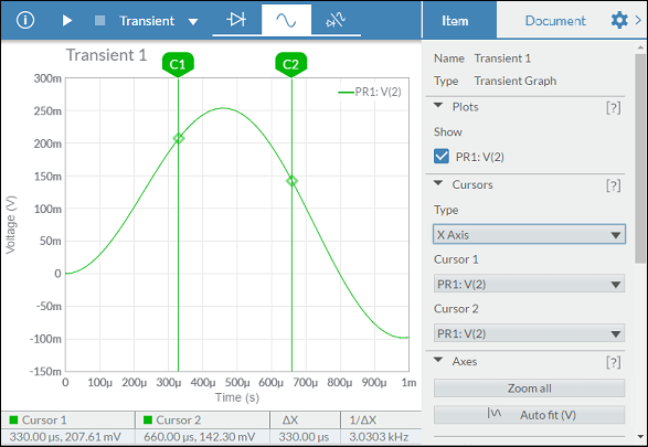
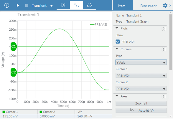
I would like to synchronize several Charts, so when I move the mouse through one of them, the other two Charts show crosshairs at the same position as the first hovered Chart.
===
ADMIN EDIT
===
Prerequisite: Chart Crosshair
This functionality would be very useful for data analysis.
Moving the cursors within the chart itself, allows to define a range within the series, being able to offer useful data.
Examples:
Hello,
I want to connector to be directly connected with the chart.
See https://dojo.telerik.com/AkEHuSiq/3 for reference.
Thank you.
I would like to be able to stack series on a range chart. Currently the best hack recommended by Telerik is to show two charts on top of one another, with no interactivity or legends, https://blazorrepl.telerik.com/wHPclTFm28WuoSOp57.
Source: Is it possible to 'stack' series in a Range Column Chart? in UI for Blazor | Telerik Forums
Thank you