I saw the FloatingActionButton Web control available in KendoUI and ASP.NET Core and I would like it in UI for Blazor: https://demos.telerik.com/kendo-ui/floatingactionbutton/index
Add support for DateOnly and TimeOnly properties to the ToODataString() method in the DataSourceExtensions namespace.
===
TELERIK NOTE
@Steven I forked this thread from the already complete feature request Provide support for DateOnly and TimeOnly structs for the respective pickers
Currently DateOnly and TimeOnly types are not supported by the ToODataString() method. As a result, they are serialized with the default ToString() method. Please use DateTime instead or implement a custom serialization method. Downloading our source code and using the built-in method as a base is also an option.
===
ORIGINAL POST
Would you have any updates regarding this support for early 2024?My main issue regarding this at the moment is:
- My Backend returns DTOs with DateOnly properties.
- I wish to use these properties in a grid
- So far... So good... We can see the items etc... But then...
- We want to filter these properties...
- When we get the OData query... Our DateOnly is not in the correct ISO format... As there's no support for those in DataSourceExtensions.cs
I already tried solving this by creating my own GridColumn type, but I'm afraid there's nothing I can do about the OData serialization without just writing our own DataSourceExtensions... At which point we're just making it confusing for other developers needing to include this...
public class DateOnlyGridColumn : GridColumn
{
private DateOnly? _filterValue;
public DateOnly? FilterValue
{
get => _filterValue;
set
{
if (_filterValue != value)
{
_filterValue = value;
StateHasChanged();
}
}
}
public DateOnlyGridColumn()
{
DisplayFormat = "{0:dd/M/yyyy}";
FilterMenuTemplate = FilterMenu;
FilterMenuButtonsTemplate = FilterButtons;
}
private RenderFragment<FilterMenuTemplateContext> FilterMenu => (context) => (builder) =>
{
builder.OpenComponent<TelerikDatePicker<DateOnly?>>(0);
builder.AddAttribute(0, "Value", FilterValue);
builder.AddAttribute(2, "ValueChanged", EventCallback.Factory.Create<DateOnly?>(this, (value) => FilterValue = value));
builder.CloseComponent();
};
private RenderFragment<FilterMenuTemplateContext> FilterButtons => (context) => (builder) =>
{
// Filter button
builder.OpenComponent<TelerikButton>(0);
builder.AddAttribute(1, "OnClick", EventCallback.Factory.Create<MouseEventArgs>(this, async () => await ApplyFilter(context)));
builder.AddAttribute(2, "ThemeColor", ThemeConstants.Button.ThemeColor.Primary);
builder.AddAttribute(3, "ChildContent", (RenderFragment)(childBuilder =>
childBuilder.AddContent(0, "Filter")));
builder.CloseComponent();
// Clear button
builder.OpenComponent<TelerikButton>(4);
builder.AddAttribute(5, "OnClick", EventCallback.Factory.Create<MouseEventArgs>(this, async () =>
{
FilterValue = null;
await context.ClearFilterAsync();
}));
builder.AddAttribute(6, "ChildContent", (RenderFragment)(childBuilder =>
childBuilder.AddContent(0, "Clear")));
builder.CloseComponent();
};
private async Task ApplyFilter(FilterMenuTemplateContext filterContext)
{
if (filterContext == null || string.IsNullOrEmpty(Field) || !FilterValue.HasValue)
return;
var filter = new FilterDescriptor
{
Member = Field,
MemberType = typeof(DateOnly),
Operator = FilterOperator.IsEqualTo,
Value = FilterValue.Value, //.ToString("o") Convert to ISO-8601 format
};
filterContext.FilterDescriptor.FilterDescriptors.Clear();
filterContext.FilterDescriptor.FilterDescriptors.Add(filter);
await filterContext.FilterAsync();
}
}
We need a formal, Accordion component. This is missing like a sore thumb !
The Accordion should be the first component in the component list.
Using the panel bar is not the same as the functionality of Accordion. So, do not mark this request as a duplicate of a panel bar enhancement request.
This is a simple component and I request you to prioritize and release it urgently in the next release.
Thanks.
This seems to be a regression in this version. I cannot find an open issue on it. I think it's the same as this issue.
Here is a REPL link with the issue recreated. The bug happens the second time you open the dialog. You can see on the first close of the dialog that the parent window z-index is increased by 2. Then the second time you open the dialog the z-index is less than it's "parent" component.
Please link me to the current issue if there is an open duplicate.
Kind regards,
Linda
After reading your documentation, it appears that the Pager Position enum only allows for the grid pager to be at the top OR the bottom of the grid.
It would be most excellent to allow it to be BOTH. For very large grids, it would be convenient for the user to see the grid at the very top, but if they do happen to need to scroll to the very bottom of the grid, seeing the pager component there would also be convenient for the user.
This is in regard to this page:
https://www.telerik.com/blazor-ui/documentation/components/grid/paging
Please add a .Both option to the PagerPosition enum that allows both Top and Bottom at the same time.
Thanks! :)
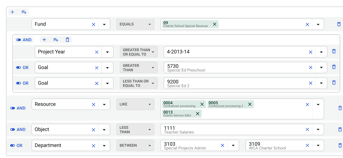
Within the grids, be able to filter and group using And & Or statements. The following is our design.
When enabling/disabling a form element that is defined in a child component, the element is successfully disabled, however a console error occurs. The error occurs whether the child component makes the update or the parent makes the update through a passed parameter. The error does not occur for form elements defined in the parent. The error does not occur for basic html input elements defined in the child.
Element definition:
<TelerikTextBox
Id="ElementMisc"
AutoComplete="new-password"
@bind-Value="@_searchModel.ElementMisc"
Enabled="!_elementSelectMode"
class="textbox-75"
DebounceDelay="0">
</TelerikTextBox>
Update Code defined in child:
if (results.Data.Count > 1)
{
_elementSelectMode= true;
StateHasChanged();
}
Console Error:
Uncaught (in promise) Error: Assertion failed - heap is currently locked
at mr (blazor.web.js:1:158963)
at Object.beginInvokeDotNetFromJS (blazor.web.js:1:157244)
at w.invokeDotNetMethodAsync (blazor.web.js:1:3978)
at C.invokeMethodAsync (blazor.web.js:1:5486)
at r.invokeMethodAsync (telerik-blazor.js:22:1272553)
at r.onBlur (telerik-blazor.js:22:1463592)
at ye.setOrRemoveAttributeOrProperty (blazor.web.js:1:28630)
at ye.applyAttribute (blazor.web.js:1:27574)
at ye.applyEdits (blazor.web.js:1:24601)
at ye.updateComponent (blazor.web.js:1:23606)
When a user hits the ENTER key at the end of their typing and expects the full text to be submitted, they potentially have partial text being submitted (depending on how quickly ENTER is hit). We know the general accepted solution is to set the DebounceDelay to zero, but we are using two-way binding with state management that results in a very laggy/delayed experience while typing is this is done.
Please allow pressing Enter or blurring the input to short-circuit the debouncing.
===
ADMIN EDIT
===
This request applies to all inputs - NumericTextBox, TextBox, TextArea, etc.
Please add group header template for the select components. There are two goals:
- Customize the group items' appearance.
- Implement custom behaviors, for example - batch select or unselect of all items in the group by clicking on the group header.
Good Morning,
I have recently started getting random and repeated Javascript errors when debugging my project using your controls for Blazor. It is completely random (sometimes happens immediately at project start, sometimes when navigating to a new page, sometimes when interacting with a control). It is ALWAYS the same error....
TypeError: Cannot read properties of undefined (reading 'visible')
Message=
Source=
StackTrace:
at __webpack_modules__.8219.constructor.onMouseEnter (https://localhost:44307/_content/Telerik.UI.for.Blazor/js/telerik-blazor.js?v=ITaQSsBTBmdJoUpPr2KiZ7JwhfKjwa7SGa6zvlv9kkU:50:1442661)
I am using the most current version of your product. I have gone through your "Javascript Errors" page and have worked through all the suggestions. Nothing resolves it.
This is becoming a giant time sink while trying to work on a project. What can we do to get appropriate error handling on your end to prevent these issues?
Thanks
I recently had a breakthrough moment in my journey learning and using Telerik Blazor that I believe highlights a crucial area for improvement in your documentation strategy. I believe that this will significantly help me learn and use your components, I suspect others may still fall into the same trap as me. I'm confident that implementing this suggestion will make the learning process considerably easier for all users.
As a developer with over 35 years of experience, my initial approach to learning new technologies is to rely heavily on official documentation. I expect to find comprehensive resources that facilitate a smooth learning curve. However, after years of struggling with Telerik Blazor components, I stumbled upon the Component Demos section (https://demos.telerik.com/blazor-ui). This discovery, triggered by a specific Google search for "telerik blazor drawer submenu," is a game-changer.
The Component Demos contain a wealth of practical examples for each component, offering invaluable "cut-and-paste" starting points. Before this, I primarily relied on StackOverflow and other online resources and until today, I finally landed on the Telerik Blazor Component demos. The fact that I have been unaware of this resource for so long represents a significant shortcoming in the current documentation. How easy it would be to add a link in the overview to the component's demos which would have saved me countless hours of trying to solve problems that have already been solved on the demos page, like the Drawer submenu mentioned above.
Integrating direct links to each component's respective demo page within the main documentation would dramatically improve the discover-ability of these demos and empower users to independently solve many common challenges. Currently, the limited examples within the documentation are insufficient for comprehensive understanding.
In summary, prominently featuring the Component Demos within the core Telerik Blazor documentation would vastly enhance the learning experience, reduce support requests, and empower developers to utilize the full potential of your components.
Peter
We would like the ability to customize the calendar's month header.
For instance, we would like to add a row displaying the month name and year, as shown in the attached screenshot.
Hi Telerik Support
This is related to the feedback portal item: The Grid header gets focus only for the first time when tabbing
I had raised the above issue, now I can see that the issue is fixed in 7.0.0. But the fix does not work when the TelerikGrid is inside a TelerikWindow.
Please find the REPL sample https://blazorrepl.telerik.com/QIvmPrlI39rZ4whP10
Is there a work around for the scenario where the grid is inside a popup window?
Regards
Bably
On a grid grouped by a field (using GroupDescriptors) where the amount of records exceed the page limit, therefore generating multiple pages, provide an option to keep the collapsed/expanded states of the groups when navigating through the pages.
In-house we implemented the following approach to mitigate this issue: when calling OnRead event, after processing the data (order, filter, group, etc) we're mapping the groups and subgroups to its corresponding indexes. When page changing, we then store the current state of the groups, alongside its keys (aka the label of the group). After page changing and mapping the groups and subgroups again, we just match the group names stored in this temporary state with the group names of the new page and restore the state.
For example: start with all groups initially collapsed, page 1 has groupA and groupB and user expanded groupB, changed to page 2, which has the remaining records of groupB and groupC. In this case it will restore groupB as expanded while groupC keeps collapsed.
Example to demonstrate the issue: https://blazorrepl.telerik.com/melmEeFi43owNZBe50
Hi,
Can I request that the Pdf Viewer:
- Load multiple pdf files on open. Maybe via an array of file names.
- We use a different viewer due to this capability. For Human Resource files you need the ability to load numerous files into one viewer to show a complete
document. The current one file option doesn't work for us.
- Display thumbnails of the loaded pages.
- Thumbnail onclick to move to a specific page.
Regards,
Graham O'Riley
Steps to reproduce:
- Insert a simple TelerikGrid on your page
- Add Columns with templates for each property
- Specify a Column Template
See https://blazorrepl.telerik.com/GyPvFMFr00zLEEdG00
Problem / Inconvenience
- Context has to be converted/cast before access to the each property is possible
- Grid columns are not generic which makes them hard to use sometimes
- Fields have to be specified by name (may lead to wrong names after changing)
Solution / Feature Request
- Provide new generic columns (to ensure no current implementations break)
- Add [CascadingTypeParameter(nameof(TItem))] to the TelerikGrid
- GridColumns automatically "inherit" the typeparam TItem
Idea from: Blazor QuickGrid
Benefits
- GridColumns can be specified with Expression
- Template context does not have to be cast anymore
- Renaming properties affect expression or an error is display (property does not exist)
<GridColumn For="@(t => t.Name)">
        <Template>
                <div>
                    @item.Name
                </div>
        </Template>
</GridColumn>
I generated a new project using the Telerik Blazor Template for server side.
In the _Host.cshtml file on line 27 it generates the following:
<a href class="reload">Reload</a>Should be
<a href="" class="reload">Reload</a>Have a nice day.
Peter
For example, selecting Bootstrap-Main-Dark theme in the Project Wizard does not apply the dark mode.
===ADMIN EDIT===
For the time being, a possible workaround is to manually add class="k-body" to the <body> tag of your application. This will ensure, that the dark mode is correctly applied. This is required because, by design, the Default theme does not enable the typography system. The "k-body" class is required for the typography system to work properly on the document level and apply the predefined typography values to the page. For more detailed information, refer to Design System Documentation.