I would like to be able to change the multiselect tags, mainly colors, forground and background, of both dropdown elements (shown in list) and selected values shown in textbox like the image bellow

Test Environment:
Windows 11 Pro Version 22H2 OS build 22621.674
Chrome Version 106.0.5249.119 (Official Build) (64-bit)
Edge Version 106.0.1370.52 (Official build) (64-bit)
NVDA Version 2022.3.1
- Hit the URL:Blazor Splitter Overview - Telerik UI for Blazor
- Turn on NVDA/Narrator
- Tab till Preview under Creating Splitter for Blazor
- Tab till separator
- Verify that NVDA/Narrator is separator along with value like "50 separator" or not
NVDA is announcing separator along with value like "50 ".
Narrator is announcing as "Seperator".
User Impact:
On applying aquatic and desert theme, Separator is not visible
Repro Steps:
- Hit the URL:Blazor Splitter Overview - Telerik UI for Blazor
- Turn on High contrast theme
- Tab till Preview under Creating Splitter for Blazor
- Tab till separator
- Verify that separator is visible on applying aquatic and desert theme or not
Actual Result: On applying aquatic and desert Theme, Separator is not visible.
Expected Result: On applying aquatic and desert Theme, Separator should be visible
User Impact:
Users who rely on the contrast themes may feel difficulty if the close buttons in Feedback popup are not completely visible.
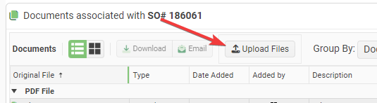
It is impossible to customize the Text and Icon for the Telerik Upload Blazor Component. It always sans "Select Files". This is not easy to see at a glance.
Requests:
- Add a Title attribute to the upload component that lets you change the text from the default "Select Files".
- Add the ability to set the Icon on the upload button.
Proposed Code:
<TelerikUpload Title="Upload Files" Icon="@SvgIcon.Upload" ... />I had to write some hacky JavaScript interop to accomplish this:
function setTelerikUploadButtonText(text) {
// Finds all the telerik blazor upload components on the page and changes the text of the upload button.
let replaced = 0;
const defaultText = "Upload";
// Find all the buttons with class "k-upload-button". There should be one for each upload component.
const buttons = document.getElementsByClassName("k-upload-button");
for (let i = 0; i < buttons.length; i++) {
// Find the span with class "k-button-text" and change its text.
const spans = buttons[i].getElementsByClassName("k-button-text");
if (spans.length > 0) {
// Add horizontal padding to the span.
spans[0].classList.add("px-2");
// Change the text.
spans[0].innerHTML = text ?? defaultText;
// Insert a font awesome icon.
spans[0].insertAdjacentHTML('afterbegin', '<i class="fas fa-upload"></i> ');
// Track how many buttons were updated.
replaced++;
}
}
console.info("setTelerikUploadButtonText: " + replaced + " buttons updated.");
return replaced;
}/// <summary>
/// Finds all the telerik blazor upload components on the page and changes the text of the upload button.
/// </summary>
/// <returns>The number of upload components button text that were found & replaced.</returns>
public static async Task SetTelerikUploadButtonText(this IJSRuntime jSRuntime,
string text = "Upload Files")
{
await jSRuntime.InvokeVoidAsync("setTelerikUploadButtonText", text);
}
Screenshot:
The Image Thumbnail Viewer Component should have features like:
- Face detection-based image cropping
- Overlay an image over detected faces [To hide faces]
- Blur or pixelate faces
- Thumbnail masking within different shapes like:
- Circle
- Square
- Rectangle
- Hexagon
- Star etc.
- Content Aware Padding of images to fix the container size
- Set transparent background
- Text overlay
- Image watermark overlays
- Recolor a picture
- Antic Effect
This Thumbnail Viewer can then be used within Data Grid, File Manager/Explorer, Card View, Drop down lists, List Views, Tiles etc.
Hi,
I'm looking to implement the Filter component (https://demos.telerik.com/blazor-ui/filter/overview ), but I would like to specify a custom editor for the value input field (e.g. for a custom dropdown or other input component for a complex value type).
Is it possible to provide a custom editor template for the value field of the Filter component?
Kind Regards,
I'd like to request a native Blazor Image Component that allows to provide different parameters to control the image.
This could also help to connect it to the upload component, for user to see the image while still in browser and make some changes, i.e resizing, cropping, Black/White, before sending it to server to be stored.
Thanks!
..Ben
Hi,
it would be nice to have a single button in the GridToolbar that opens the column chooser menu or something like that (popup?).
Often we need to save space in a grid and disable the menu option for the columns but then we lose the ability to choose which columns the user might want to disable. This also apply to very small columns with small header information, e.g. if you just need 2 or 3 letters to describe the column data then the menu with its three dotted button is to large.
Best Regards,
Thomas
In the Blazor DropDownList it would be great to provide custom text or template to replace the "no data" message when the Data property returns an empty collection. Often, in cascading dropdowns, an empty list occurs because a value up the hierarchy has not been chosen yet. For example, if you have dropdowns for County and City, the City dropdown will be empty until a County is selected. It would be nice if the City dropdown, in that case, could say "Please select a county first" instead of "no data".
Thanks.
<AdminEdit>
This is also applicable to the MultiSelect, ComboBox, AutoComplete.
</AdminEdit>
For example, I want to set the Sunday day to red or any other date to a special color.
<AdminEdit>
Here is a workaround that can be used until the feature is released
<style>
    .hide-calendar {
        display: none;
    }

    .special {
        color: red;
        font-weight: bold;
    }
</style>

<div style="width: 400px">
    <TelerikDateInput @bind-Value="@DateValue" Width="90%"></TelerikDateInput>
    <TelerikButton Icon="calendar"
                   OnClick="@( () => isClicked = !isClicked )">
    </TelerikButton>
</div>

<TelerikCalendar Class="@(!isClicked ? "hide-calendar" : "")"
                 @bind-Value="@DateValue"
                 OnCellRender="@OnCellRenderHandler"
                 Min="@(new DateTime(2000, 1, 1))"
                 Max="@(new DateTime(2090, 1, 1))">
</TelerikCalendar>

@code {
    private void OnCellRenderHandler(CalendarCellRenderEventArgs args)
    {
        if (args.View == CalendarView.Month)
        {
            args.Class = args.Date.Day % 3 == 0 ? "special" : "";
        }
        else if (args.View == CalendarView.Decade)
        {
            args.Class = args.Date.Year == 2020 ? "special" : "";
        }
    }

    private DateTime DateValue { get; set; } = DateTime.Today;

    private bool isClicked { get; set; }
}
</AdminEdit>
Hi,
Firstly, love what you're doing with your Blazor components. I'd like to be able to add custom style to your components. For example
<TelerikTextBox Style="margin-left: 20px" />
Now of course we should be using a class for this and I know your components have a Class parameter, however what I'd like to do is something like this
<TelerikTextBox Style="@CssHelper.Margin.Top(20)" />
where the style is generated at runtime. I'm experimenting with such an approach to apply all styles, however I can't do so with a lot of your controls. Having said that, I've noticed that your animation container does have something along these lines with its ParentInlineStyle parameter.
        <TelerikAnimationContainer @ref="@AnimationContainer"
                                   Top="-72px" Left="calc(100% - 280px)" Width="300px"
                                   AnimationType="AnimationType.SlideDown"
                                   Class="k-popup"
                                   ParentInlineStyle="@Style">
So just wondering if this is something you're looking at doing?
thanks
Michael.
I'm using a numeric textbox to handle a decimal value with the Format is set to "#,0" (which it needs to be since the client's specification is to have a whitespace as a decimal separator). While the entered value is less than a thousand then the entire value gets selected when tabbing into the component, but once it's large enough to display a group separator tabbing just puts the cursor at the end of the input without selecting the value.
I believe this to be a bug.
It would be very useful to have a control like a dropdown datagrid. Like the one radzen has. With multiple columns paging etc.
Also in addition to this a treegrid dropdown would be one thing that would sky rocketed the component suite.
Below issue was submitted 6 days ago. Currently developers are disabling/uninstalling Telerik extensions. I don't see any relies from Telerik so submitting another bug report hoping you'll reply to this one.
Please fix it!!!
Telerik UI for Blazor 3.6.0 breaks intellisense/typing in Visual Studio 2022 Version 17.3.4
My team is currently using animation containers as menu popups in our web app, which will need to work on both desktop and mobile devices in a web browser. For the mobile layout, I would like to be able to open animation containers via swipe gestures. I understand that animation containers are not strictly menus, however, I would love to see swipe action support in Telerik UI for Blazor, and then be able to bind that action to an animation container.
The only framework I have found by way of example is https://onsen.io/. Please observe how it is possible to open a panel by swiping close to the edge of the sample device on their homepage.
This feature would make it much easier to build dynamic web apps that perform well on desktop and feel native on mobile devices as well.
Thank you,
David
Hello.
I have a scenario where I need to make some nodes in a TreeView checkable and some not. It would be nice if there was an "IsCheckable" binding that determines whether a node should render a checkbox or not.
Although I've no use for it yet, the same could be done for "IsSelectable".
Is there some way to do this already, and I'm just not seeing it? I'd prefer not to use JavaScript interop, or recreate the checkbox functionality through an ItemTemplate.