The https://nuget.telerik.com/nuget/ is erroring when trying to restore the packages, it's currently breaking our main pipeline.
Retrying 'FindPackagesByIdAsyncCore' for source 'https://nuget.telerik.com/nuget/FindPackagesById()?id='runtime.native.System.Net.Http'&semVerLevel=2.0.0'.
Response status code does not indicate success: 500 (Internal Server Error).
  GET https://nuget.telerik.com/nuget/FindPackagesById()?id='runtime.native.System.Net.Http'&semVerLevel=2.0.0
  InternalServerError https://nuget.telerik.com/nuget/FindPackagesById()?id='Microsoft.Extensions.Hosting.Abstractions'&semVerLevel=2.0.0 290ms
  InternalServerError https://nuget.telerik.com/nuget/FindPackagesById()?id='Telerik.UI.for.Blazor'&semVerLevel=2.0.0 401ms
  InternalServerError https://nuget.telerik.com/nuget/FindPackagesById()?id='System.ServiceModel.Primitives'&semVerLevel=2.0.0 401ms
##[error]The nuget command failed with exit code(1) and error(Failed to retrieve information about 'Telerik.UI.for.Blazor' from remote source 'https://nuget.telerik.com/nuget/FindPackagesById()?id='Telerik.UI.for.Blazor'&semVerLevel=2.0.0'.
  Response status code does not indicate success: 500 (Internal Server Error).
Could you help with this?
When re-visiting a drop down each selected option is visually indicated, but not to a screen reader user. E.g.:
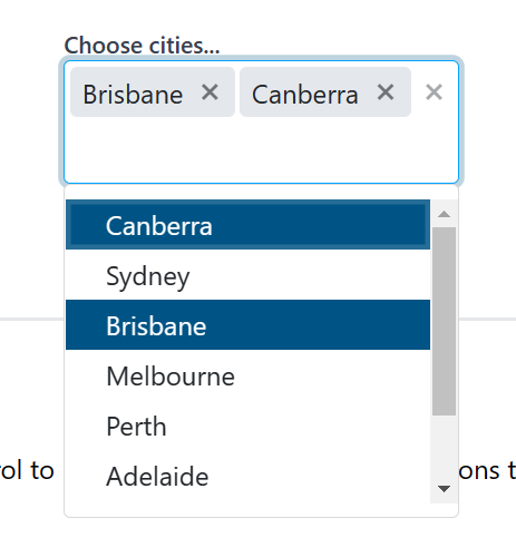
Figure: Selected options are highlighted but this is not indicated to a screen reader
When trying to create a treeview inside of another treeview template I get the following error
[2019-07-19T00:58:28.003Z] Error: System.InvalidOperationException: Object of type 'Telerik.Blazor.Components.TreeView.TelerikTreeView' does not have a property matching the name 'ChildContent'.
at Microsoft.AspNetCore.Components.ParameterCollectionExtensions.ThrowForUnknownIncomingParameterName(Type targetType, String parameterName)
at Microsoft.AspNetCore.Components.ParameterCollectionExtensions.SetParameterProperties(ParameterCollection& parameterCollection, Object target)
at Microsoft.AspNetCore.Components.ComponentBase.SetParametersAsync(ParameterCollection parameters)
at Telerik.Blazor.Components.TreeView.TelerikTreeViewBase.SetParametersAsync(ParameterCollection parameters)
at Microsoft.AspNetCore.Components.Rendering.ComponentState.SetDirectParameters(ParameterCollection parameters)
at Microsoft.AspNetCore.Components.Rende...
Dear Telerik support team.
Today I updated my blazor app from 2.26 to 2.27 and encountered the following display issue for DDLs and numeric textboxes.
I currently use the local css file from the nuget package, but also tried to use the CDN for the latest version. Switching back from 2.27 to 2.26 on the CDN css perspective, makes the DDLs and numeric textboxes appear properly. Please see my screenshots attached.
Thanks in advance for your support.
Kind regards,
Thomas
I would like to be able to override the No Data message in DropDownList component when there are no elements in the Data.
--
ADMIN EDIT
Until this feature is implemented, here is a workaround.
If you already have localization in your project, just set "DropDownList_NoData" key to an empty string in your resources.
If you don't have localization, here are the steps you should do (shortened version of the documentation):
1. Create a class for your localizer:
public class SampleResxLocalizer : ITelerikStringLocalizer
{
    public string this[string name]
    {
        get
        {
            return GetStringFromResource(name);
        }
    }

    public string GetStringFromResource(string key)
    {
        // this will override only DropDownList_NoData message and it will return other messages as they are
        if (key == nameof(Messages.DropDownList_NoData))
        {
            return string.Empty;
        }

            return Messages.ResourceManager.GetString(key, Messages.Culture); ;
        }
}
2. Override the existing Localizer. This step should be done when configuring your services after calling "AddTelerikBlazor()":
builder.Services.AddSingleton(typeof(ITelerikStringLocalizer), typeof(SampleResxLocalizer));--
We're using a Blazor grid with OData filtering on the server. To construct the url we're using ToODataString on the DataSourceRequest of the grid.
This is working fine as long as we don't add a '&' symbol to the filter. It seems that the ToODataString doesn't replace the & symbol to %26
Here is the reult of our ToODataString, note the red bold &.
$count=true&$filter=(Updated%20ge%202021-08-16T00:00:00.0000000Z%20and%20Updated%20le%202021-09-16T23:59:59.0000000Z%20and%20(contains(Barcode,%27&<-this%20should%20be%20escaped%27)))&$orderby=Cart%20desc&$skip=0&$top=50
Like the one in Kendo https://demos.telerik.com/kendo-ui/breadcrumb/index
With the ability to hook to the URL and URL change like this https://docs.telerik.com/kendo-ui/controls/navigation/breadcrumb/navigation
Steps to reproduce this are pretty simple. On the Blazor Wizard demo at this link:
- Enter a password on step 1
- Click 'Next' to bring you to the 'Shipping' step
- Set focus to the 'City' input box. I clicked to the end of the default string that is pre-populated as 'Torino'
- Press the left arrow key. This sends you back to Step 1 (Registration)
This is a pretty big stumbling block for using the Wizard component, but I may be missing some kind of setting or code that will resolve this.
Please add a "native" Carousel component for the Telerik UI for Blazor solution.
Currently, to implement a Carousel option in a Blazor application using Telerik components, you may need to leverage the Kendo UI widgets based on jQuery that rely on direct DOM manipulation. In a Blazor application, the software engineer should rely on Blazor to manipulate the DOM, instead of direct DOM manipulation required with tools such as jQuery.
Overlapping Telerik products in the same web application, such as Kendo UI and UI for Blazor, can create issues if releases are out of alignment between the solutions, use of CSS files, and other areas of complication.
Please consider adding a Carousel component as it offers a great experience for marketing to customers, business or consumer, on the home page of any website.
I cannot find an option of grid.SaveAsExcel() with blazor.
I can export the grid using the grid toolbar but I want to export it without using the toolbar. I have a button group which has a row of buttons and I want to export the grid within the OnClick() event of the button group button.
Could you please see if that is possible? Using .net core hosted blazor wasm
Thanks
There are some random bugs occurring after the latest version update (2.26.0)
- Styles evolving some buttons are broken
- Radio buttons are not working
Also, we're restoring the package on our automated CI/CD and the telerik nuget server does not have the previous versions available, we're are obligated to use the latest one, that's the main problem, you should have the previous version available, right now everything here is broken because of the latest version and we're creating a manual release to have the previous version in place
.png)
Hello
I have just received some feedback from a client re. the DateInput -Blazor control whereby they are describing the default behaviour as "strange" - and on having a closer look I tend to agree / believe there to be bugs with this.
Please see video and below notes - let me know if there are any workarounds to these things.
I do see there is an existing bug report which may partially cover these issues (DatePicker loses focus when used as data editor in the Grid and the input date starts with 0 (telerik.com)) , however, it seems this is "unplanned" ?
QA Telerik DateInput:
- Try entering in M = 1 then 1 SLOW = works ok
- Try entering in M = 1 then 1 FAST = focus moves to the end of the date
- Try entering 0 in the month or day = Whole date disappears
(Data loss - for in-cell edit mode this is a big deal) - Try entering DD = 11 then its ok for 1st edit, but 2nd edit of the DD,
then the focus moves to the end???? - Try entering M = 1, D = 8, Y=2021 without using the mouse
(its not possible as 01 would move focus to end of date)....
and if you choose to type 01 and its not fast enough, the whole date will disappear on entry of 0
Entering a date without using the mouse to move focus is quite important for big data-entry in grids where you are tabbing or clicking over from field to field in large quantities.
Cheers
Phil
A Gantt Chart is one big thing missing that is always high on my blazor UI wish list.
Kind regards,
Kay
---
ADMIN EDIT
For the time being, a workaround could be to wrap a JS widget, an example is available in this sample project, see the MyKendoGantt.razor component.
---
Blazor SSRS Report Viewer Component
There are third party SSRS reports that we are using in our application. There is no built in SSRS report viewer available for Blazor as it is available for ASP.Net Ajax. If Telerik can provide this important feature it would be a big deal.
There are SSRS Report Viewer's for blazor available from third party like
Please note, we are not the one creating the reports, Reports are created by third party for another application. This web application is just displaying those reports. So, creating new Telerik Reports or migrating to Telerik Reports is not an option.
Hi!
Im using a Grid component InCell Editing the OnDelete, OnUpdate handlers are working fine but OnCreate handler its not working. By the way im using a service to manage the CRUD operations as follows
Page Component
@page "/districts"
@using MVC.Services
@using MVC.Models
@using System.ComponentModel.DataAnnotations
@inject IDistrictService DistrictService
<h3>Districts</h3>
<TelerikGrid Data="@district" Sortable="true" EditMode="@GridEditMode.Incell"
             Height="500px"
             Pageable="true" PageSize=@PageSize
             OnUpdate=@UpdateItem OnDelete=@DeleteItem OnCreate=@CreateItem OnCancel="@OnCancelHandler">
    <GridToolBar>
        <GridCommandButton Command="Add" Icon="add">Add District</GridCommandButton>
    </GridToolBar>
    <GridColumns>
        <GridColumn Field="@(nameof(District.Id))" Editable="false" />
        <GridColumn Field="@(nameof(District.Description))" Title="Description" />
        <GridColumn Field="@(nameof(District.EnableApprovalWorkflow))" Title="Enable Approval Workflow" />
        <GridCommandColumn>
            <GridCommandButton Command="Delete" Icon="delete">Delete</GridCommandButton>
        </GridCommandColumn>
    </GridColumns>
</TelerikGrid>
@code {
    int PageSize = 15;
    IEnumerable<District> district;

    protected override async Task OnInitializedAsync()
    {
        await GetGridData();
    }
    async Task GetGridData()
    {
        district = await DistrictService.DistrictList();
    }
    async Task CreateItem(GridCommandEventArgs args)
    {
        District item = (District)args.Item;
        await DistrictService.DistrictInsert(item);
        await GetGridData();
    }

    void OnCancelHandler(GridCommandEventArgs args)
    {
        District item = (District)args.Item;
    }

    async Task DeleteItem(GridCommandEventArgs args)
    {
        District item = (District)args.Item;
        await DistrictService.DistrictDelete(item.Id);
        await GetGridData();
    }

    async Task UpdateItem(GridCommandEventArgs args)
    {
        District item = (District)args.Item;
        await DistrictService.DistrictUpdate(item);
        await GetGridData();
    }
}
Service Logic
using Dapper;
using Microsoft.Data.SqlClient;
using MVC.Models;
using System;
using System.Collections.Generic;
using System.Data;
using System.Linq;
using System.Text;
using System.Threading.Tasks;

namespace MVC.Services
{
    public class DistrictService : IDistrictService
    {
        private readonly SqlConnectionConfiguration _configuration;
        public DistrictService(SqlConnectionConfiguration configuration)
        {
            _configuration = configuration;
        }
        public async Task<bool> DistrictInsert(District district)
        {
            using (var conn = new SqlConnection(_configuration.Value))
            {
                var parameters = new DynamicParameters();
                parameters.Add("Description", district.Description, DbType.String);
                parameters.Add("EnableApprovalWorkflow", district.EnableApprovalWorkflow, DbType.Boolean);
                await conn.ExecuteAsync("spLookupDistrict_Insert", parameters, commandType: CommandType.StoredProcedure);
            }
            return true;
        }
        public async Task<IEnumerable<District>> DistrictList()
        {
            IEnumerable<District> districts;
            using (var conn = new SqlConnection(_configuration.Value))
            {
                districts = await conn.QueryAsync<District>("spLookupDistrict_List", commandType: CommandType.StoredProcedure);
            }
            return districts;
        }
        public async Task<IEnumerable<District>> DistrictSearch(string @Param)
        {
            var parameters = new DynamicParameters();
            parameters.Add("@Param", Param, DbType.String);
            IEnumerable<District> districts;
            using (var conn = new SqlConnection(_configuration.Value))
            {
                districts = await conn.QueryAsync<District>("spLookupDistrict_Search", parameters, commandType: CommandType.StoredProcedure);
            }
            return districts;
        }
        public async Task<District> District_GetOne(int @Id)
        {
            District district = new District();
            var parameters = new DynamicParameters();
            parameters.Add("@Id", Id, DbType.Int32);
            using (var conn = new SqlConnection(_configuration.Value))
            {
                district = await conn.QueryFirstOrDefaultAsync<District>("spLookupDistrict_GetOne", parameters, commandType: CommandType.StoredProcedure);
            }
            return district;
        }
        public async Task<bool> DistrictUpdate(District district)
        {
            using (var conn = new SqlConnection(_configuration.Value))
            {
                var parameters = new DynamicParameters();
                parameters.Add("Id", district.Id, DbType.Int32);

                parameters.Add("Description", district.Description, DbType.String);
                parameters.Add("EnableApprovalWorkflow", district.EnableApprovalWorkflow, DbType.Boolean);

                await conn.ExecuteAsync("spLookupDistrict_Update", parameters, commandType: CommandType.StoredProcedure);
            }
            return true;
        }
        public async Task<bool> DistrictDelete(int Id)
        {
            var parameters = new DynamicParameters();
            parameters.Add("@Id", Id, DbType.Int32);
            using (var conn = new SqlConnection(_configuration.Value))
            {
                await conn.ExecuteAsync("spLookupDistrict_Delete", parameters, commandType: CommandType.StoredProcedure);
            }
            return true;
        }
    }
}
Hi !,
I just installed and started to use Telerik Blazor , all controls are working fine but when trying to use the Dialog Component, after adding the cascading parameter in the code section i getting the following error :
Thank you for your support.
Regards,
Alberto
I wasn't sure if I should report this as a bug or not. With a modal window, you can tab beyond the modal window into the URL, and then continue on into the page behind the modal window itself. I was able to recreate this on the Modal demo, and fire a search, even though I couldn't click to get there. As I saw in another post that it is essentially a viewport modal (https://feedback.telerik.com/blazor/1510450-prevent-the-user-from-dragging-a-window-out-of-the-viewport), would it be possible to force modal to be system modal, as was available back in the ancient Winforms days?
---
ADMIN EDIT
That's how a web page behaves. Code in a web page cannot and should not prevent the user from using their OS. The browser chrome (address bar, buttons and so on) are part of the OS, and as such are beyond the sandbox of the web app. The web app is limited to the viewport, it cannot go out of it, or interact or control elements outside of it. Anything else would be a severe security issue.
A system-wide modal dialog is only possible though a native application, but not in a web application.
---
Hi. Still in the trial phase, and I was curious about this.
I'm trying to develop two apps, one in ASP.NET Core and the other in Blazor WASM.
I found the ASP.NET Core Bottom Navigation which is perfect for the ASP.NET Core project. Shown here.
However, I'd like to be able to show continuity as users transition to the Blazor project and I don't see a BottomNavigation component listed for Blazor.
Is this something that can be added to the Blazor UI tools, or is there an example someplace I can use to get started?
Thanks in advance.
Hi,
we are having a hard time to come up with a general application layout (menu/navigation).
We found PanelBar, Menu and Drawer... are there any other controls related to menu & navigation?
A more UX oriented documentation (and not only for the technical components individually) would be nice e.g. like they do it here: Overview | Clarity Design System
Kind regards
Steffen