Hi,
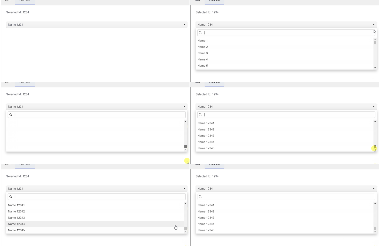
I am looking to use strongly-typed IDs in my project and it does not appear to be possible to achieve this with Telerik UI for Blazor. Instead, the popup does not go away on selection and the bound value does not update.
Note that this is not a request for binding to arbitrary complex types. I believe it would be sufficient to support value types that implement ToString / IParsable.
For example:
https://blazorrepl.telerik.com/QxvcQIPR55jFAGMF00
<h1>Hello, Telerik REPL for Blazor!</h1>
<h2>Selected Value: @SelectedValue</h2>

<TelerikDropDownList Data="@Data"
    @bind-Value="@SelectedValue"
    TextField="@nameof(SelectItem.DisplayName)"
    ValueField="@nameof(SelectItem.Value)"
    DefaultText="Select ...">
</TelerikDropDownList>

@code {
    public MyValue SelectedValue {get; set;}
    public SelectItem[] Data { get; } = new[] {
        new SelectItem(1),
        new SelectItem(2),
    };

    public readonly struct MyValue : System.IParsable<MyValue> {
        public int Value {get;}

        public MyValue(int value) {
            this.Value = value;
        }

        public override string ToString() {
            return Value.ToString();
        }

        public static MyValue Parse(string str, IFormatProvider provider) {
            return new(int.Parse(str, provider));
        }

        public static bool TryParse(string str, IFormatProvider provider, out MyValue value) {
            value = new(int.Parse(str, provider));
            return true;
        }
    }

    public class SelectItem {
        public SelectItem(int value) {
            Value = new(value);
            DisplayName = $"Item {value}";
        }

        public MyValue Value {get; set;}
        public string DisplayName {get; set;}
    }
}
Thanks,
Ben
The Ribbon Control (UI for ASP.NET AJAX) is totally superb.
Implementing this for Blazor would be a killer component.
Please!
The Theme Builder contains a really nice looking Popover control, and I was a bit disappointed to discover that this doesn't seem to be documented or supported in UI for Blazor.
I realize I can probably use the Tooltip to achieve a similar effect, with two caveats:
- Tooltip requires of substantial CSS hacking to appear as the Popover control.
- The Popover closes on an explicit event, whereas Tooltip closes when it loses focus.
Is there any chance a Popover control is planned for a future release?
Hi,
It would be VERY helpful if you integrated "Prevent the Grid from wrapping text in multiple lines and show ellipsis" into grid as an option (so we would not have to write separate code and style).
I think this is one of the most needed features since grids almost always have data that wraps line.
BR, Smiljan
Please Add DropDown Container so it will be possible to add Nested Custom Editors inside Grid Cell
Regards
Andrzej
---
ADMIN EDIT
A dropdown container we would create would be a popup that ties to its anchor and gives you a template to render your own content rather than render its own items based on Data. It cannot, however, be tied to a specific case for a grid or other editor, it will be up to the developer to use the container and tie it to the application logic.
It should also expose events like PopupShowing (preferred to also cater for keyboard navigation) or ExpandClick so you can know when it is going to be expanded and, for example, fetch fresh data for scenarios with highly volatile data (example here).
---
So, brand new machine (Win 11 pro 64bit), brand new install of Visual Studio & Telerik, use the Telerik templates to create a new Blazor Server project.
When I run the application (with changes or first run), it takes almost a minute to start the application.
Without changes it starts in 2 seconds.
The fix is to add the following to the application's csproj file.
  <PropertyGroup>
    <UseRazorBuildServer>false</UseRazorBuildServer>
  </PropertyGroup>
After the fix, it takes an just a little longer to run than without changes. Since I have not heard back on my support ticket, I wanted to report this as a bug so hopefully it can get upvoted and we can get an answer to this issue.
Original support ticket https://www.telerik.com/account/support-center/view-ticket/1621737
My Setup:
7950x, 32 gb DDR5 ram, WD Black SSD 850x SSD and slower internet 150mbit/s
Similar problem with my new laptop which is about 50% slower but exactly the same issue.
Peter
Since upgrading from 3.8 to 4.4 (including all new css) created dialogs from DialogFactory are sometimes behind an already opened modal window.
The reason for this seems to be an incorrectly, automatically calculated z-index of 10003 when the open dialog has 10006.
This does not always happen, there are scenarios where the first created dialog works fine, and the next called in the same method suddenly is behind the dialog, thus the error seems to be in telerik and not our side.
We could not yet find a proper workaround apart from creating custom dialogs.
Create a word style component.
Currently my wpf desktop app uses a editor style component and refreshes a crystal reports window component to show edits made to a pre created document. We use this to create quote letters using custom legal jargon.
I am in the process of moving that program to Blazor. A word component that i can wrap our custom texts around and buttons in the title bar for pasting our prefomatted text would be so much better than our current setup.
Could this be added to the roadmap?
Hi Support Team,
in our project we are using Telerik Chart and has required to update theme of chart from dark to light and light to dark.
telerik chart in child razor page and dark/light button in mainlayout.razor file but telerik chart updating theme when click on button exist telerik chart razor page. as below link it is an existing issue.
please advice how to resolve the issue.
Hi,
This kind of behavior causes duplicate OnRead calls for the same range. If the OnRead method invokes a request to the API it will result in duplicate requests with the same range.
https://demos.telerik.com/blazor-ui/form/templates
When you edit in Telerik Repl, you get a warning message:
What was weird though, is when I ran it from directly from the link in the documentation, I didn't get an error. I made one small change to the code (swapped line 54 and 55 (just seeing if I could change the rendering order, which I can) and then I saw this warning. But any change to the code generates the warning.
Peter
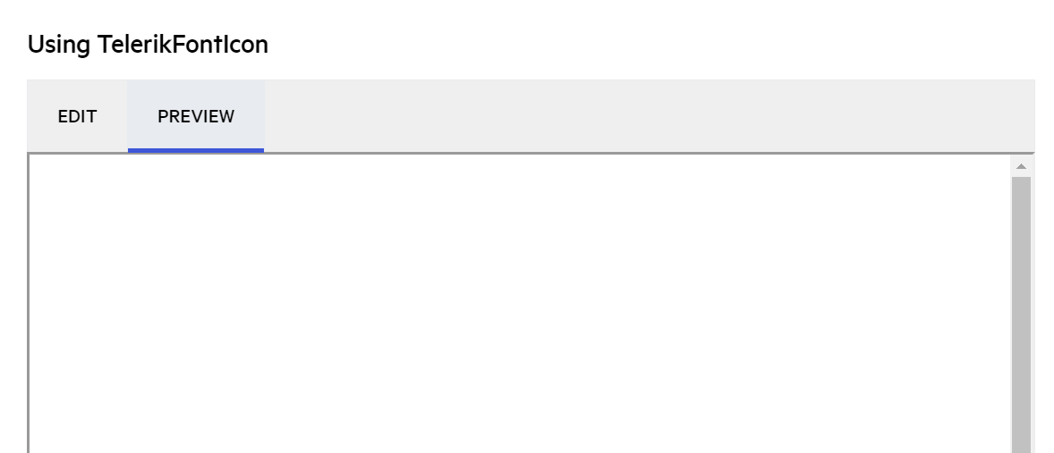
https://docs.telerik.com/blazor-ui/common-features/icons#icon-nuget-packages
When you click "Preview" under Using TelerikFontIcon, the preview is blank, even if I scroll to the top, still nothing.
Hi,
During grid initialization I have duplicate OnReadMethod call. I dynmaically set LoadGroupsOnDemand parameter. When LoadGroupsOnDemand is false and when I skip the second call (I shouldn't do any extra logic to calculate the call number anyway) it works fine. If LoadGroupsOnDemand is true I have to call it twice. With early ending of first call, second OnRender call won't be done. If I do "return" at the begining of second call it returns me an empty grid.
Similar issue to this one: https://feedback.telerik.com/blazor/1442276-onread-called-twice-on-initialization
I would like to be able to set the aria-required or the required HTML attribute to the input components in the Telerik UI for Blazor suite. This is needed because currently, the screen readers do not notify the users of the application that an input is required.
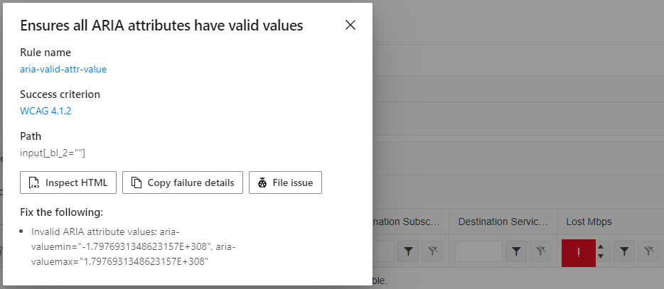
Tags: Accessibility, WCAG 4.1.2, aria-valid-attr-value
Issue: Ensures all ARIA attributes have valid values (aria-valid-attr-value - https://accessibilityinsights.io/info-examples/web/aria-valid-attr-value)
Target application: Hermes Home - https://localhost/TrafficLoss
Element path: input[_bl_2=""]
Snippet: <input tabindex="0" class="k-input-inner" role="spinbutton" aria-valuemin="-1.7976931348623157E+308" aria-valuemax="1.7976931348623157E+308" data-id="fe5748c4-0ddd-455e-ad61-aafc0e0367fb" _bl_2="">
How to fix:
Fix all of the following:
Invalid ARIA attribute values: aria-valuemin="-1.7976931348623157E+308", aria-valuemax="1.7976931348623157E+308"
Environment: Microsoft Edge version 105.0.1343.42
====
This accessibility issue was found using Accessibility Insights for Web 2.34.1 (axe-core 4.4.1), a tool that helps find and fix accessibility issues. Get more information & download this tool at http://aka.ms/AccessibilityInsights.
Is it possible to allow the adding of aria-label, aria-labelledby, and aria-describedby to the TelerikForm element?
I noticed that aria-labelledby and aria-describedby were added to input elements here: https://feedback.telerik.com/blazor/1531788-allow-setting-aria-labelledby-and-aria-describedby-attributes-to-the-telerik-inputs - so I assume they could be added to TelerikForm too?
Currently, there doesn't seem to be a way to add those attributes, whereas with the default EditForm we can, and so we're unable to leverage the TelerikForm if we want to provide better descriptive information to non-sighted users with a label and description of the form.
Ideally, we should be able to render any HTML element with global attributes: https://developer.mozilla.org/en-US/docs/Web/HTML/Global_attributes , which would include any of the aria-* tags.
I understand there's a desire to have a locked-down API for components and not allow arbitrary attributes, but I think certain attributes core to accessibility the users of the library should have some ability to manipulate.
Sorry for the long question/request...
I'm running into an exception during a TelerikScheduler Edit event when trying to initialize the model. I believe this is occurring because the models are complex objects with another object as a property inside it, where the "submodel" does not have a parameterless constructor. I'm receiving the following exception while debugging:
I read this ticket that discusses a similar issue as well as this ticket which describes the OnModelInit event that allows you to create an instance of the model to pass to the CUD event. However, after implementing the OnModelInit handler the error is still occurring because it is trying to clone that object before passing it to the edit event and is attempting to use a constructor with no parameters which does not exist.
To reiterate the ticket above, it would be nice if the clone process checks to see if the model implements the ICloneable interface. This will allow custom clone behavior which should resolve this issue. Or is there already a fix/workaround for this?
I added a few simplified code segments below as an example of the issue I'm having... (I'm using Blazor Server if that's relevant)
Index.razor:
@page "/"
@using TelerikBlazorTestApp.Models

<TelerikScheduler Data="@Appointments"
                  AllowCreate="true" AllowDelete="true" AllowUpdate="true"
                  OnModelInit="@ModelInitHandler">
    <SchedulerViews>
        <SchedulerDayView />
        <SchedulerWeekView />
        <SchedulerMonthView />
    </SchedulerViews>
</TelerikScheduler>

@code {
    public List<SchedulerAppointment<TestModel>> Appointments { get; set; }

    protected override async Task OnInitializedAsync()
    {
        Appointments = new List<SchedulerAppointment<TestModel>>()
        {
             new SchedulerAppointment<TestModel> { Title = "Test 1", Start = DateTime.Now, End = DateTime.Now.AddHours(1), IsAllDay = false, Model =  new TestModel("blah") },
             new SchedulerAppointment<TestModel> { Title = "Test 2", Start = DateTime.Now.AddHours(1), End = DateTime.Now.AddHours(2), IsAllDay = false, Model =  new TestModel("blah") },
             new SchedulerAppointment<TestModel> { Title = "Test 3", Start = DateTime.Now, End = DateTime.Now, IsAllDay = true, Model =  new TestModel("blah") }
        };
    }

    public SchedulerAppointment<TestModel> ModelInitHandler()
    {
        return new SchedulerAppointment<TestModel>("blah");
    }
}
SchedulerAppointment.cs:
namespace TelerikBlazorTestApp.Models
{
    public class SchedulerAppointment<TItem>
    {
        public Guid Id { get; set; }
        public string Title { get; set; }
        public string Description { get; set; }
        public DateTime Start { get; set; }
        public DateTime End { get; set; }
        public bool IsAllDay { get; set; }
        public string RecurrenceRule { get; set; }
        public List<DateTime> RecurrenceExceptions { get; set; }
        public Guid? RecurrenceId { get; set; }

        public TItem Model { get; set; }

        public SchedulerAppointment()
        {
            Id = Guid.NewGuid();
        }

        public SchedulerAppointment(string s)
        {
            Id = Guid.NewGuid();
            Model = (TItem)Activator.CreateInstance(typeof(TItem), s);
        }
    }
}namespace TelerikBlazorTestApp.Models
{
public class TestModel
{
public string PropA { get; set; }
public string PropB { get; set; }
public TestModel(string s)
{
// something using s here
}
}
}Thanks!
If you want to validate a form using FluentValidation right now you must rely on a third party validator like the ones suggested in the FluentValidation documentation.
We have noticed most of these libraries have not been updated in a long while despite issues being opened and pull requests pending:
- Blazored.FluentValidation - Last release: Dec 31, 2022
- Blazor-Validation - Last release: Jun 30, 2023
- Accelist.FluentValidation.Blazor - Last release: Nov 17, 2020
- vNext.BlazorComponents.FluentValidation - Last release: Sep 9, 2022
Also, we noticed that these libraries don't fully implement all the features that FluentValidation has to offer.
Ex: We wanted to use the Rulesets to validate fields partially when the input has changed (like maximum lenght or regexes) and then validate the more complex rules like "unique in DB" after the "submit" button of the form has been pressed but it seemed like it would run all validations ignoring the rulesets.
Other components libraries have already implemented FluentValidation natively, could Telerik consider implementing this aswell so we can stop relying on third party libraries and have a better implementation of the FluentValidation?
Can we get the Infinite Calendar feature that is part of Kendo Angular components? This design is brilliant. It makes it so much easy to get to the date you want. specially went they span over months or years. It find it makes the date picker so much more useful.
https://www.telerik.com/kendo-angular-ui/components/dateinputs/calendar/


