It would be very useful to have a control like a dropdown datagrid. Like the one radzen has. With multiple columns paging etc.
Also in addition to this a treegrid dropdown would be one thing that would sky rocketed the component suite.
The File Manager (exactly like https://www.telerik.com/aspnet-core-ui/file-manager) but for Blazor would be very nice.
There are no File Manager out there and this feature could support the purchase decision.
First of all, The team loves the product, and development is going 10x faster with a UI library with so many features.
But we're looking for making diagrams inside our application. Something like https://www.syncfusion.com/blazor-components/blazor-diagram
is it a feature currently in the backlog or is it possible to put it there?
That will make us possible to make a flowchart over what assets are connected to each other in our data center
Hi Telerik,
I have been using MudBlazor for my latest project (smaller one), but we are scaling up for another larger project now and are looking at the Telerik UI for Blazor.
Does Telerik UI for Blazor have an equivalent to the MudBlazor AppBar, an application wide top bar which is persistent through out the application life cycle?
Its able to contain other controls ie drawer icon, login/out button, spacers etc.
PS: See attached screen dump of the app bar.
Best regards
Ulrik
Hi,
Firstly, love what you're doing with your Blazor components. I'd like to be able to add custom style to your components. For example
<TelerikTextBox Style="margin-left: 20px" />
Now of course we should be using a class for this and I know your components have a Class parameter, however what I'd like to do is something like this
<TelerikTextBox Style="@CssHelper.Margin.Top(20)" />
where the style is generated at runtime. I'm experimenting with such an approach to apply all styles, however I can't do so with a lot of your controls. Having said that, I've noticed that your animation container does have something along these lines with its ParentInlineStyle parameter.
        <TelerikAnimationContainer @ref="@AnimationContainer"
                                   Top="-72px" Left="calc(100% - 280px)" Width="300px"
                                   AnimationType="AnimationType.SlideDown"
                                   Class="k-popup"
                                   ParentInlineStyle="@Style">
So just wondering if this is something you're looking at doing?
thanks
Michael.
I'd like to request a native Blazor Image Component that allows to provide different parameters to control the image.
This could also help to connect it to the upload component, for user to see the image while still in browser and make some changes, i.e resizing, cropping, Black/White, before sending it to server to be stored.
Thanks!
..Ben
Is there any scope to add a Blazor Ranged Bar/Column Chart component as seen in other products:
- Telerik Web Forms Range Column Chart - RadHtmlChart - Telerik UI for ASP.NET AJAX
- Demo of core features in jQuery Range Bar Charts widget | Kendo UI for jQuery (telerik.com)?
We attempted to work around this by adding an invisible stacked series underneath our dataset. However, without the Ability to customize the highlighted/hovered series item (telerik.com), we are not able to effectively hide the invisible series from the user. We will have to fall back into the jQuery Kendo UI components once again. Alternatively, are there any other known work arounds to achieve this in Blazor?
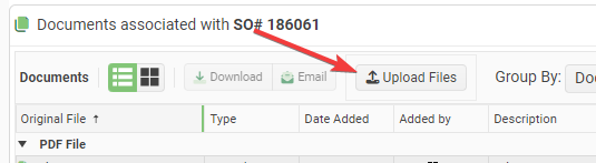
It is impossible to customize the Text and Icon for the Telerik Upload Blazor Component. It always sans "Select Files". This is not easy to see at a glance.
Requests:
- Add a Title attribute to the upload component that lets you change the text from the default "Select Files".
- Add the ability to set the Icon on the upload button.
Proposed Code:
<TelerikUpload Title="Upload Files" Icon="@SvgIcon.Upload" ... />I had to write some hacky JavaScript interop to accomplish this:
function setTelerikUploadButtonText(text) {
// Finds all the telerik blazor upload components on the page and changes the text of the upload button.
let replaced = 0;
const defaultText = "Upload";
// Find all the buttons with class "k-upload-button". There should be one for each upload component.
const buttons = document.getElementsByClassName("k-upload-button");
for (let i = 0; i < buttons.length; i++) {
// Find the span with class "k-button-text" and change its text.
const spans = buttons[i].getElementsByClassName("k-button-text");
if (spans.length > 0) {
// Add horizontal padding to the span.
spans[0].classList.add("px-2");
// Change the text.
spans[0].innerHTML = text ?? defaultText;
// Insert a font awesome icon.
spans[0].insertAdjacentHTML('afterbegin', '<i class="fas fa-upload"></i> ');
// Track how many buttons were updated.
replaced++;
}
}
console.info("setTelerikUploadButtonText: " + replaced + " buttons updated.");
return replaced;
}/// <summary>
/// Finds all the telerik blazor upload components on the page and changes the text of the upload button.
/// </summary>
/// <returns>The number of upload components button text that were found & replaced.</returns>
public static async Task SetTelerikUploadButtonText(this IJSRuntime jSRuntime,
string text = "Upload Files")
{
await jSRuntime.InvokeVoidAsync("setTelerikUploadButtonText", text);
}
Screenshot:
All I ask is to give a way to have a proper working datepicker. Like your javascript datepickers. That doen't care only for right values but for the person that uses it. Telerik was an early adopter in the Blazor ecosystem, I don't know how they haven't yet fixed their datepickers.
You can do this with many ways. I don't know them all but I will propose some here.
- Create a second datepicker component that works properly.
- Put an attribute in the component to work with free-text
- Maybe if this attribute is on you can switch behind between 2 different components
- Find a other solution of your own.
In the end behind the scenes you shouldn't bind the datepicker input in the datetime property but to a sting one. DevExtress has done this right.
This will solve
- Proper user expirience when a user uses the keyboard to edit dates
- Copy-Paste issue
- Clear date parts issue
- all from 30/4/2022 to edit to 31/5/2022 with out having to clear the input
- Strange editing of years (I have an example in the end)
- Allow to have dots or what ever the users want between dates numbers. (e.x. 13.3.2022 )
I this is a trade-off and you will have senarios with wrong inputs and other things, but you already know them from the javascript world, and it's less importand than the aboves.
*Strange editing of years
Lets say that we have the year 1998 19and we want to put 2014.
the users See
-> 1/1/1998
-> 1/1/9982
-> 1/1/9820
-> 1/1/8201
-> 1/1/2014
That's not user friendly, and is very disturbing.
I saw that DropDown TreeList is already in the to-do list, but I would like to even extend it by adding MultiSelect feature to it
So basically add MultiSelect but with TreeList inside
Regards
Andrzej