It would be very useful to have a control like a dropdown datagrid. Like the one radzen has. With multiple columns paging etc.
Also in addition to this a treegrid dropdown would be one thing that would sky rocketed the component suite.
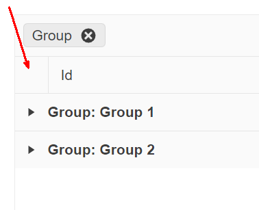
On a grid grouped by a field (using GroupDescriptors) where the amount of records exceed the page limit, therefore generating multiple pages, provide an option to keep the collapsed/expanded states of the groups when navigating through the pages.
In-house we implemented the following approach to mitigate this issue: when calling OnRead event, after processing the data (order, filter, group, etc) we're mapping the groups and subgroups to its corresponding indexes. When page changing, we then store the current state of the groups, alongside its keys (aka the label of the group). After page changing and mapping the groups and subgroups again, we just match the group names stored in this temporary state with the group names of the new page and restore the state.
For example: start with all groups initially collapsed, page 1 has groupA and groupB and user expanded groupB, changed to page 2, which has the remaining records of groupB and groupC. In this case it will restore groupB as expanded while groupC keeps collapsed.
Example to demonstrate the issue: https://blazorrepl.telerik.com/melmEeFi43owNZBe50
First of all, The team loves the product, and development is going 10x faster with a UI library with so many features.
But we're looking for making diagrams inside our application. Something like https://www.syncfusion.com/blazor-components/blazor-diagram
is it a feature currently in the backlog or is it possible to put it there?
That will make us possible to make a flowchart over what assets are connected to each other in our data center
Unexpected scroll behaviour is seen after selecting an item in a DropDownList/Multiselect with a scroll mode set to virtualise. We are unable to easily scroll upwards using the scroll bar in the control or using a mouse/trackpad. The scroll position immediately snaps back to the selected item. Sometimes we are able 'escape' this by rapidly scrolling but this does not feel like intended behaviour.
Downward scrolling seems okay and using the keyboard arrow keys also seems unaffected. This is reproducible on the demo page: Blazor DropDownList - Virtualization - Telerik UI for Blazor and https://docs.telerik.com/blazor-ui/components/multiselect/virtualization.
Reproduction steps on Chrome:
- Navigate to demo page and render local example preview
- Select item "Name 27"
- try to scroll up with the arrow buttons on the scrollbar or the mouse wheel
Minimal reproducible example: Blazor MultiSelect - Virtualization - Telerik UI for Blazor
Since upgrading from 3.8 to 4.4 (including all new css) created dialogs from DialogFactory are sometimes behind an already opened modal window.
The reason for this seems to be an incorrectly, automatically calculated z-index of 10003 when the open dialog has 10006.
This does not always happen, there are scenarios where the first created dialog works fine, and the next called in the same method suddenly is behind the dialog, thus the error seems to be in telerik and not our side.
We could not yet find a proper workaround apart from creating custom dialogs.
Hi,
Firstly, love what you're doing with your Blazor components. I'd like to be able to add custom style to your components. For example
<TelerikTextBox Style="margin-left: 20px" />
Now of course we should be using a class for this and I know your components have a Class parameter, however what I'd like to do is something like this
<TelerikTextBox Style="@CssHelper.Margin.Top(20)" />
where the style is generated at runtime. I'm experimenting with such an approach to apply all styles, however I can't do so with a lot of your controls. Having said that, I've noticed that your animation container does have something along these lines with its ParentInlineStyle parameter.
        <TelerikAnimationContainer @ref="@AnimationContainer"
                                   Top="-72px" Left="calc(100% - 280px)" Width="300px"
                                   AnimationType="AnimationType.SlideDown"
                                   Class="k-popup"
                                   ParentInlineStyle="@Style">
So just wondering if this is something you're looking at doing?
thanks
Michael.
I'd like to request a native Blazor Image Component that allows to provide different parameters to control the image.
This could also help to connect it to the upload component, for user to see the image while still in browser and make some changes, i.e resizing, cropping, Black/White, before sending it to server to be stored.
Thanks!
..Ben
The File Manager (exactly like https://www.telerik.com/aspnet-core-ui/file-manager) but for Blazor would be very nice.
There are no File Manager out there and this feature could support the purchase decision.
Hi Telerik,
I have been using MudBlazor for my latest project (smaller one), but we are scaling up for another larger project now and are looking at the Telerik UI for Blazor.
Does Telerik UI for Blazor have an equivalent to the MudBlazor AppBar, an application wide top bar which is persistent through out the application life cycle?
Its able to contain other controls ie drawer icon, login/out button, spacers etc.
PS: See attached screen dump of the app bar.
Best regards
Ulrik
Telerik.DataSource.Extensions ToDataSourceResultAsync (https://docs.telerik.com/blazor-ui/api/Telerik.DataSource.Extensions.QueryableExtensions) should support Cancellation token as well as https://docs.telerik.com/aspnet-mvc/api/Kendo.Mvc.Extensions/QueryableExtensions.
It would be useful.
On a grid grouped by one or more fields, provide an option for end users to expand/collapse all rows at will. The following image is a suggestion of where this option (most likely a button) should appear:
All I ask is to give a way to have a proper working datepicker. Like your javascript datepickers. That doen't care only for right values but for the person that uses it. Telerik was an early adopter in the Blazor ecosystem, I don't know how they haven't yet fixed their datepickers.
You can do this with many ways. I don't know them all but I will propose some here.
- Create a second datepicker component that works properly.
- Put an attribute in the component to work with free-text
- Maybe if this attribute is on you can switch behind between 2 different components
- Find a other solution of your own.
In the end behind the scenes you shouldn't bind the datepicker input in the datetime property but to a sting one. DevExtress has done this right.
This will solve
- Proper user expirience when a user uses the keyboard to edit dates
- Copy-Paste issue
- Clear date parts issue
- all from 30/4/2022 to edit to 31/5/2022 with out having to clear the input
- Strange editing of years (I have an example in the end)
- Allow to have dots or what ever the users want between dates numbers. (e.x. 13.3.2022 )
I this is a trade-off and you will have senarios with wrong inputs and other things, but you already know them from the javascript world, and it's less importand than the aboves.
*Strange editing of years
Lets say that we have the year 1998 19and we want to put 2014.
the users See
-> 1/1/1998
-> 1/1/9982
-> 1/1/9820
-> 1/1/8201
-> 1/1/2014
That's not user friendly, and is very disturbing.
Hello there,
I encountered an issue with the TelerikForm component after upgrading Telerik.UI.for.Blazor from version 4.0.1 to 4.4.0. In the code below I have placed the two form items in a Bootstrap grid:
<TelerikForm Model="@person">
    <FormValidation>
        <DataAnnotationsValidator></DataAnnotationsValidator>
    </FormValidation>
    <FormItems>
        <div class="row">
            <div class="col-md-6">
                <FormItem Field="@nameof(Person.Id)" LabelText="Id"></FormItem>
            </div>
            <div class="col-md-6">
                <FormItem Field="@nameof(Person.FirstName)"
                        EditorType="@FormEditorType.TextArea"
                        LabelText="First name">
                </FormItem>
            </div>
        </div>
    </FormItems>
</TelerikForm>
With version 4.0.1, the two fields were displayed in two columns within the form element. However, with version 4.4.0, I noticed that the HTML code, specifically the div elements, are now rendered outside of the form element. The HTML structure looks like this:
<div class="row">
	<div class="col-md-6">
	</div>
	<div class="col-md-6">
	</div>
</div>
<form class="k-form telerik-blazor k-form-md" dir="ltr" style="">
	<div class="k-form-field">
		<label class="k-label k-form-label" for="a6cc8103-4d52-4377-8656-169e4a3de33a">
            Id
		</label>
		<div class="k-form-field-wrap">
......
I wanted to check with you if this change is intentional or if it might be a bug with the TelerikForm component in the latest version.
Best regards,
Ivaylo