I would really like to see a flyout control. Something like the below

This would allow me to attach a popup dialog to a control instead of just doing a dialog at the center of the screen.
Hello,
I am using the TelerikSkeleton component for Blazor and noticed the pulse and wave animations are not working. It seems animation also does not work in your examples here, while it works in Telerik REPL (that's where I could identify the issue)
For my application, I made my custom theme with ThemeBuilder and then imported it into my project as instructed. Going through the css file, I found where the bug is:
How it was:
.k-skeleton-pulse .k-skeleton {
    animation:k-skeleton-pulse 1.5s ease-in-out .5s infinite
}
After my changes:
.k-skeleton-pulse.k-skeleton {
     animation:k-skeleton-pulse 1.5s ease-in-out .5s infinite
}
The only thing I did was I removed the space between the two classes and now it works.
Note: I selected "WebAssembly" as application type, but I am actually using it for both a Razor class library and a .NET MAUI Blazor application.
Currently we have 2 SelectionMode to select from in the ButtonGroup. I would like to have a third option that is a mix betwen Single and Multiple.
This third option should work like the Multiple mode but don't allow the user to deselect all ToggleButtons, like in the Single mode at least one button is allways selected. If the user clicks on the last selected Togglebutton he will not be able to deselect it.
Hi,
Could you expose the Print Command of Blazor PDF Viewer? I would like to call it from within my code.
Regards
Gerald Man
The Visible parameter removes the underlying render fragment when set to false.
Please expose APIs (maybe Show/Hide methods) to keep the DOM in tree but only modify visibility / display CSS attributes to hide/show the telerik window element. This would allow developer to retain content / state of the window which may need to be displayed very frequently.
Currently, the Splitbar of the TelerikSplitter is rather small.
It can be adjusted with CSS as shown here (https://blazorrepl.telerik.com/wnEfmyYp50ldIHsF13) but if the overall height of the page is large, the small arrow-icon that needs to be clicked in order to expand a collapsed SplitPane must be scrolled into view first.
It would be great to add alternative ways to expand a SplitPane, e.g. on a Double-Click on the Splitbar or maybe an additional Button.
https://demos.telerik.com/blazor-ui/form/templates
When you edit in Telerik Repl, you get a warning message:

What was weird though, is when I ran it from directly from the link in the documentation, I didn't get an error. I made one small change to the code (swapped line 54 and 55 (just seeing if I could change the rendering order, which I can) and then I saw this warning. But any change to the code generates the warning.
Peter
My grid bind to ExpandoObjects, and I would like to implement a Group Header.
So I referenced these two documents
https://docs.telerik.com/blazor-ui/knowledge-base/grid-binding-to-expando-object
https://docs.telerik.com/blazor-ui/components/grid/columns/multi-column-headers
From the first document, it make sense to me that we need to set FieldType for each column that binds to ExpandoObject, but it seems this restriction also applies to the group header column, which does not make sense.
Foe example:
<TelerikGrid Data="@GridData"
Pageable="true"
Sortable="true"
FilterMode="@GridFilterMode.FilterRow">
<GridColumns>
<GridColumn Title="Test Group Header">
<Columns>
<GridColumn Field="PropertyInt" Title="Int Column" FieldType="@typeof(int)" />
<GridColumn Field="PropertyString" Title="String Column" FieldType="@typeof(string)" />
<GridColumn Field="PropertyDate" Title="DateTime Column" FieldType="@typeof(DateTime)" />
</Columns>
</GridColumn>
</GridColumns>
</TelerikGrid>
I get error:

I need to set FieldType on the "Test Group Header" column to an arbitrary value to get rid of this error.
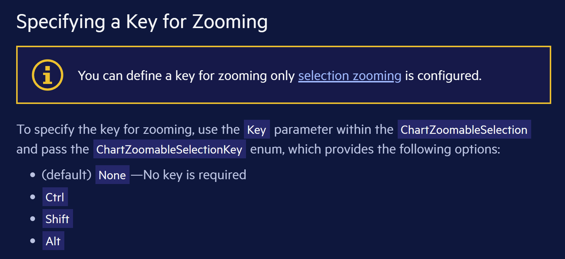
Hi
I don't understand the text in this yellow info box: "You can define a key for zooming only selection zooming is configured." Is there a word missing?
https://docs.telerik.com/blazor-ui/components/chart/pan-and-zoom/zoom#specifying-a-key-for-zooming
For example, selecting Bootstrap-Main-Dark theme in the Project Wizard does not apply the dark mode.
===ADMIN EDIT===
For the time being, a possible workaround is to manually add class="k-body" to the <body> tag of your application. This will ensure, that the dark mode is correctly applied. This is required because, by design, the Default theme does not enable the typography system. The "k-body" class is required for the typography system to work properly on the document level and apply the predefined typography values to the page. For more detailed information, refer to Design System Documentation.
Describe the bug
The class 'k-tabstrip' item is missing in the rendering of the TabStrip component.
To Reproduce
1. Go to the following demo and open the DevTools:
https://demos.telerik.com/blazor-ui/tabstrip/overview
2. Check the source of truth:
https://github.com/telerik/kendo-themes/blob/develop/tests/tabstrip/tabstrip.html
Actual results
The class 'k-tabstrip-item' is missing.
Expected behavior
The class 'k-tabstrip-item' to be present.
Additional context
ThemeBuilder generates styles for the items of the TabStrip component with selectors like these:
.k-tabstrip .k-tabstrip-items-wrapper .k-tabstrip-items.k-reset.k-tabstrip-items-start .k-item.k-tabstrip-item.k-active .k-linkThis works in other technologies, such as Kendo React, but it doesn't take effect in Blazor applications because of the issue.
Reported through t.1672526.
=== EDITED BY TELERIK ===
When using nullable enums, their DisplayNameAttrute doesn't show in the Grid.
https://blazorrepl.telerik.com/QTOlwiaM456Yh9Xp33
The bug is related to Enum DisplayName attributes are ignored in view mode of the Grid
=== ORIGINAL POST CONTENT ===
Sample Code to reproduce the error:
https://blazorrepl.telerik.com/QzYPGLFj11s0rZwp47
If you change line 44 to a non-nullable field type, it crashes the grid with an error message in the CSS file. I have included the error message I get in my blazor app with the same code above, console then sources:
After reading your documentation, it appears that the Pager Position enum only allows for the grid pager to be at the top OR the bottom of the grid.
It would be most excellent to allow it to be BOTH. For very large grids, it would be convenient for the user to see the grid at the very top, but if they do happen to need to scroll to the very bottom of the grid, seeing the pager component there would also be convenient for the user.
This is in regard to this page:
https://www.telerik.com/blazor-ui/documentation/components/grid/paging
Please add a .Both option to the PagerPosition enum that allows both Top and Bottom at the same time.
Thanks! :)
Creating a new WebApp project template through the extension fails to build. This is caused by incorrect icon type in the MainLayout.razor file.
To make sure the app is correctly built, the Icon type should be FontIcon.
<TelerikButton Icon="@FontIcon.Menu"
               FillMode="@ThemeConstants.Button.FillMode.Clear"
               OnClick="@( () => DrawerExpanded = !DrawerExpanded )" />
On the demo page, when I hover over menu items "Overview" and "Demos" and "Roadmap" it changes background color to gray. When I load it into a project with the verbatim demo code no background color change occurs except on "Roadmap".
<TelerikMenu Data="@MenuItems"
ParentIdField="@nameof(MenuItem.SectionId)"
IdField="@nameof(MenuItem.Id)"
TextField="@nameof(MenuItem.Section)">
</TelerikMenu>
@code {
public List<MenuItem> MenuItems { get; set; }
public class MenuItem
{
public int Id { get; set; }
public int? SectionId { get; set; }
public string Section { get; set; }
}
protected override void OnInitialized()
{
MenuItems = new List<MenuItem>()
{
new MenuItem()
{
Id = 1,
Section = "Overview"
},
new MenuItem()
{
Id = 2,
Section = "Demos"
},
new MenuItem()
{
Id = 3,
Section = "Roadmap"
},
new MenuItem()
{
Id = 4,
SectionId = 3,
Section = "What's new"
},
new MenuItem()
{
Id = 5,
SectionId = 3,
Section = "Roadmap"
},
new MenuItem()
{
Id = 6,
SectionId = 3,
Section = "Release History"
}
};
base.OnInitialized();
}
}
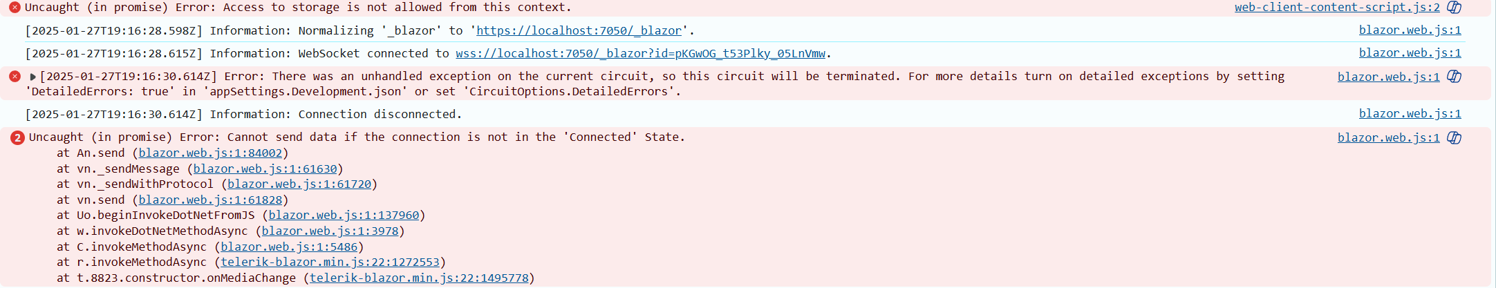
I have an animationcontainer which I in overridden OnAfterRenderAsync(bool firstRender) call:
await AnimationContainerSettings.ShowAsync();...since it is the only way to show the AnimationContainer from start. However, when I in some cases return to the page, the animationcontainer will only show itself if I delay the call with e.g. 1000 ms:
                await Task.Delay(1000);
                await AnimationContainerSettings.ShowAsync();
What could be possible reasons for this be? If I want my AnimationContainer to be visible as default when page is either Initialized or after rendering has occured, where and how should I call ShowAsync()?
Br,
Sten
According to the doc (https://docs.telerik.com/blazor-ui/components/grid/columns/width),
"When all column widths are explicitly set and the cumulative column width is greater than the available Grid width, a horizontal scrollbar appears and all set column widths are respected."
I have a grid with a width of 1500px and a cumulative column width of 1750 pixels:
<TelerikGrid Data="@datos"Class="ns-grid-fitxatges"
PageSize="10"
Pageable="true"
Sortable="true"
Width="1500px"
Height="60vh">
<GridColumns>
<GridColumn Field="@nameof(LlistaFitxatgesDto.CodiInternActivitat)" Title="Codi Intern" Width="150px" />
<GridColumn Field="@nameof(LlistaFitxatgesDto.CodiExternActivitat)" Title="Codi Extern" Width="250px" />
<GridColumn Field="@nameof(LlistaFitxatgesDto.Activitat)" Width="300px" />
<GridColumn Field="@nameof(LlistaFitxatgesDto.HoraFitxatge)" Title="@Loc["Fitxatge"]" Width="150px">
<Template>
@{
var hora = (context as LlistaFitxatgesDto).HoraFitxatge.DateTime;
<span>@hora.ToString("dd/MM/yyyy HH:mm:ss")</span>
}
</Template>
</GridColumn>
<GridColumn Field="@nameof(LlistaFitxatgesDto.Sessio)" Title="@Loc["Sessió"]" Width="180px" />
<GridColumn Field="@nameof(LlistaFitxatgesDto.Sentit)" Title="@Loc["Sentit"]" Width="80px" />
<GridColumn Field="@nameof(LlistaFitxatgesDto.TipusDocument)" Title="@Loc["DOC"]" Width="70px" />
<GridColumn Field="@nameof(LlistaFitxatgesDto.DocParticipant)" Title="@Loc["Document"]" Width="90px" />
<GridColumn Field="@nameof(LlistaFitxatgesDto.Nom)" Title="@Loc["Nom"]" Width="90px" />
<GridColumn Field="@nameof(LlistaFitxatgesDto.Cognom1)" Title="@Loc["Cognom1"]" Width="90px" />
<GridColumn Field="@nameof(LlistaFitxatgesDto.Cognom2)" Title="@Loc["Cognom2"]" Width="90px" />
<GridColumn Field="@nameof(LlistaFitxatgesDto.Metode)" Title="@Loc["Metode"]" Width="80px" />
<GridColumn Field="@nameof(LlistaFitxatgesDto.RutaXml)" Title="XML" Width="60px">
<Template>
@{
var ruta = (context as LlistaFitxatgesDto).RutaXml;
<a href="@ruta">XML</a>
}
</Template>
</GridColumn>
<GridColumn Field="@nameof(LlistaFitxatgesDto.Terminal)" Title="Terminal" Width="70px" />
</GridColumns>
</TelerikGrid>
The horizontal scroll bar appears all right, but the column widths are not respected. As shown in the image, the columns on the right are squeezed
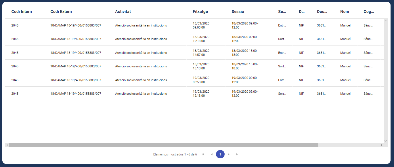
Any clues?
Thanks in advance