I would really like to see a flyout control. Something like the below
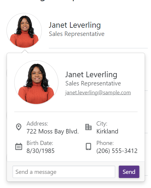
This would allow me to attach a popup dialog to a control instead of just doing a dialog at the center of the screen.
https://demos.telerik.com/blazor-ui/form/templates
When you edit in Telerik Repl, you get a warning message:

What was weird though, is when I ran it from directly from the link in the documentation, I didn't get an error. I made one small change to the code (swapped line 54 and 55 (just seeing if I could change the rendering order, which I can) and then I saw this warning. But any change to the code generates the warning.
Peter
Hello,
I am using the TelerikSkeleton component for Blazor and noticed the pulse and wave animations are not working. It seems animation also does not work in your examples here, while it works in Telerik REPL (that's where I could identify the issue)
For my application, I made my custom theme with ThemeBuilder and then imported it into my project as instructed. Going through the css file, I found where the bug is:
How it was:
.k-skeleton-pulse .k-skeleton {
    animation:k-skeleton-pulse 1.5s ease-in-out .5s infinite
}
After my changes:
.k-skeleton-pulse.k-skeleton {
     animation:k-skeleton-pulse 1.5s ease-in-out .5s infinite
}
The only thing I did was I removed the space between the two classes and now it works.
Note: I selected "WebAssembly" as application type, but I am actually using it for both a Razor class library and a .NET MAUI Blazor application.
Currently we have 2 SelectionMode to select from in the ButtonGroup. I would like to have a third option that is a mix betwen Single and Multiple.
This third option should work like the Multiple mode but don't allow the user to deselect all ToggleButtons, like in the Single mode at least one button is allways selected. If the user clicks on the last selected Togglebutton he will not be able to deselect it.
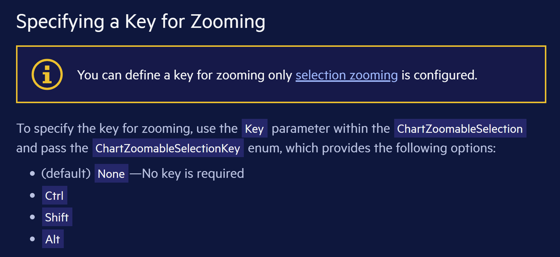
Hi
I don't understand the text in this yellow info box: "You can define a key for zooming only selection zooming is configured." Is there a word missing?
https://docs.telerik.com/blazor-ui/components/chart/pan-and-zoom/zoom#specifying-a-key-for-zooming
My grid bind to ExpandoObjects, and I would like to implement a Group Header.
So I referenced these two documents
https://docs.telerik.com/blazor-ui/knowledge-base/grid-binding-to-expando-object
https://docs.telerik.com/blazor-ui/components/grid/columns/multi-column-headers
From the first document, it make sense to me that we need to set FieldType for each column that binds to ExpandoObject, but it seems this restriction also applies to the group header column, which does not make sense.
Foe example:
<TelerikGrid Data="@GridData"
Pageable="true"
Sortable="true"
FilterMode="@GridFilterMode.FilterRow">
<GridColumns>
<GridColumn Title="Test Group Header">
<Columns>
<GridColumn Field="PropertyInt" Title="Int Column" FieldType="@typeof(int)" />
<GridColumn Field="PropertyString" Title="String Column" FieldType="@typeof(string)" />
<GridColumn Field="PropertyDate" Title="DateTime Column" FieldType="@typeof(DateTime)" />
</Columns>
</GridColumn>
</GridColumns>
</TelerikGrid>
I get error:

I need to set FieldType on the "Test Group Header" column to an arbitrary value to get rid of this error.
Currently, the Splitbar of the TelerikSplitter is rather small.
It can be adjusted with CSS as shown here (https://blazorrepl.telerik.com/wnEfmyYp50ldIHsF13) but if the overall height of the page is large, the small arrow-icon that needs to be clicked in order to expand a collapsed SplitPane must be scrolled into view first.
It would be great to add alternative ways to expand a SplitPane, e.g. on a Double-Click on the Splitbar or maybe an additional Button.
The Visible parameter removes the underlying render fragment when set to false.
Please expose APIs (maybe Show/Hide methods) to keep the DOM in tree but only modify visibility / display CSS attributes to hide/show the telerik window element. This would allow developer to retain content / state of the window which may need to be displayed very frequently.
Hi. VS 2022 version 17.2.4, C#, Windows 11
I thought I'd have a look at blazor and selected the Telerik version in the new projects window and ran through the wizard.
I selected the dashboard look, .net 6, teleric UI for blazor 3.4.0 (Dev) and to enable localization, which is what I assume to be the cause of the following error message. There were no other hints and as I've never tried blazor or telerik for
blazor I don't know if there's anything missing from the solution. If I ran another wizard without localization there was no error.
An error occurred while running the wizard.
Error executing custom action Telerik.Blazor.VSX.Actions.CopyBlazorLocalizationResourcesAction: System.Collections.Generic.KeyNotFoundException: The given key was not present in the dictionary.
at System.ThrowHelper.ThrowKeyNotFoundException()
at System.Collections.Generic.Dictionary`2.get_Item(TKey key)
at Telerik.Blazor.VSX.Actions.CopyBlazorLocalizationResourcesAction.Execute(WizardContext wizardContext, IPropertyDataDictionary arguments, IProjectWrap project)
at Telerik.VSX.WizardEngine.ActionManager.ExecActions()
Hi,
Could you expose the Print Command of Blazor PDF Viewer? I would like to call it from within my code.
Regards
Gerald Man
Hi,
I had to figure this out myself for the ComboBoxSettings because there is no documentation for this.
The MinWidth works from the Combobox width or greater extending the size of the popup and
MaxWidth only creates a popup width of the Combobox only.
Please document this feature and how to use it. And, is this intentional because it wasn't intuitive for me to figure out.
I created a REPL for you to test this out for yourself.
Create a general purpose component to allow dragging and dropping of other components or files from the filesystem. Expose events that let us get access to the files that were dropped so that we can access the contents of those files or send them off to be uploaded.
Currently in Blazor we can do this with the InputFile component. But I would like the ability to create a droppable UI and have any kind of child content in it. And also get at the file content of files dropped.
When re-visiting a drop down each selected option is visually indicated, but not to a screen reader user. E.g.:
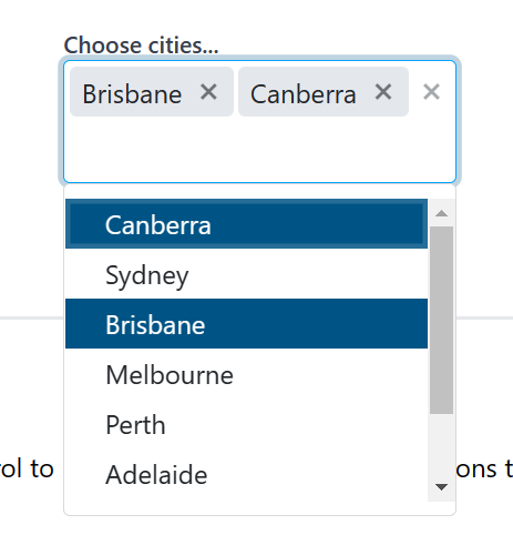
Figure: Selected options are highlighted but this is not indicated to a screen reader
Blazor first steps bug in documentation, Primary="true" gives an error.
https://docs.telerik.com/blazor-ui/getting-started/server-blazor
Step 3 - Add a Telerik Component to a View
<TelerikButton OnClick="@SayHelloHandler" Primary="true">Say Hello</TelerikButton>
Primary = "true" gives an error with version 3, sb different for .net 6 and use ThemeColor
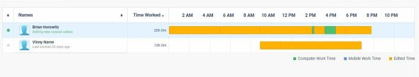
I need to track users activity per day like this, it is possible to do with any of the current components scheduler timeline? can you provide such option/component?
Need to include different colors in the bar. We were using google charts timeline but it is discontinued.
I have been playing with UI for Blazor a bit have have some minimal code working. I was wondering if is any rough documentation that at least lists the available attributes for KendoGrid, KendoGridColumn, RowTemplate, etc. Intellisense isn't popping up anything so I can't find what attributes are implemented. I know of KendoGrid: Data, Height, Sortable, Pageable, PageSize, and Page from the sample projects. For KendoColumn I am only aware of the Field attribute.
I'm not looking for detailed docs, as this is a very early preview, but if there is any way to at least find the names of the possible attributes, then I may be able to figure out how to use them myself.
Thanks and keep up the good work