Creating a new WebApp project template through the extension fails to build. This is caused by incorrect icon type in the MainLayout.razor file.
To make sure the app is correctly built, the Icon type should be FontIcon.
<TelerikButton Icon="@FontIcon.Menu"
               FillMode="@ThemeConstants.Button.FillMode.Clear"
               OnClick="@( () => DrawerExpanded = !DrawerExpanded )" />
(https://docs.telerik.com/devtools/wpf/controls/radgridview/filtering/basic)

(https://docs.telerik.com/devtools/winui/controls/raddatagrid/filtering/datagrid-overview)

Hello,
related to my previous bug report.
When Add / Edit is clicked in the Grid, it causes a Dialog to open.
The dialog has a Form, and if the model for that form is set through OnParametersSet, the method is called in an infinite loop, and the Dialog never gets shown.
I have come across a few instances where it would be awesome if the Data Collection on a MultiSelect, or even a DropDown could have a dynamic property to denote if the option in the collection is selectable. The use case is around items being disabled but remain intact on historical records. If I remove the item currently from the collection then the component no longer shows the item as selected because it isnt in the collection. If I leave the item in the collection, then it shows, but, can then be selected on future items, which I dont want. Would be awesome if I could pass a component parameter, similar to TextField, which is the bool property for if the option in the dropdown is selectable/disabled. This would then make it so that the item could be REMOVED, but not readded or selected on future records unless the value for the property was set back to true.
Please add a property (e.g., OpenOnFocus or AutoOpenOnEdit) to dropdown-based components (such as DropDownList, ComboBox, or inline grid editors) to automatically open the dropdown when the component gains focus or enters edit mode.
Why This Matters
In data-dense UIs — like inline grid editing, cutover task assignment, or status changes — users often need to:
- Quickly select from a known list, such as Status, Owner, or Type.
- Tab rapidly through form fields without needing extra clicks.
- Use keyboard-only navigation efficiently.
Currently, dropdowns often require an additional manual click to open — which slows down power users and disrupts workflows in editable grids.
I have a grid with inline-edit mode where the items have data annotations validation enabled.
When I click the grid command button "add", and then without typing in anything submit in some way, the validation jumps in as it should.
However, if I - without providing more input and still in the same item's edit mode - just click the "add" button again and then submit the item again, the incomplete item is submitted without any further validation.
This is fatal for my purpose, and I can even reproduce the issue here on the Telerik website's example repl: Blazor Grid Editing Inline Editing - Telerik UI for Blazor (after turning off the option "Confirm Cancel Commands").
I would very much appreciate any guidance on how to circumvent that bug while it ist being worked on, since I couldn't yet find a way how to do it.
(As implied above, the confirmation prompt does prevent the bug, however I don't want to use a prompt if possible.)
Here's a list with some cases concerning this bug:
- tap add, submit => validation
- tap add, tap add, submit => submitted!
- tap add, submit (=> validation), tap add, submit => submitted!
Greetings to the team!
Using the TelerikTabSrip, If the first tab is not visible when rendered, the tab content for all tabs doesnt render.
Replicated here https://blazorrepl.telerik.com/cpEWGOPk22VW8be254
If you change the code to make the first tab visible, all is well.
You can make other tabs invisible, and all is well.
namespace Telerik.Blazor.Components.Common;
TelerikGrid<T>
{
public virtual void Rebind()
{
ProcessDataAsync();
}
}
Rebind() doesnt use async/await, but ProcessDataAsync() does, which leads to race conditions.
Description
Affected components: those inheriting from TelerikSelectBase (e.g., TelerikDropDownList, TelerikComboBox, TelerikMultiSelect, TelerikAutoComplete). When an exception is thrown inside an async Task event handler for the OnChange, OnBlur, OnOpen, and ValueChanged events, the exception is completely and silently swallowed. The exception is not caught by ErrorBoundary.
Related: #6333
Steps To Reproduce
Steps to Reproduce
- Use a standard ErrorBoundary in MainLayout.razor.
<ErrorBoundary>
    <ChildContent>
        @Body
    </ChildContent>
    <ErrorContent>
        <p class="error">An unhandled error has occurred.</p>
    </ErrorContent>
</ErrorBoundary>
- Declare a TelerikDropDownList and bind an async Task method to the ValueChanged or OnChange event.
<TelerikDropDownList
    Data="@DropDownData"
    ValueChanged="@( (int newValue) => OnDropDownValueChanged(newValue))"
    TextField="@nameof(TestItem.Name)"
    ValueField="@nameof(TestItem.Id)" />

<TelerikButton OnClick="@(() => throw new Exception("Exception from button"))">Click to test ErrorBoundary</TelerikButton>

@code {
    private int? SelectedDropDownValue;

    private List<TestItem> DropDownData = new()
    {
        new() { Id = 1, Name = "Select me to throw exception" },
    };

    private async Task OnDropDownValueChanged(int newValue)
    {
        throw new InvalidOperationException("This exception should be caught by the ErrorBoundary!");
    }

    public class TestItem
    {
        public int Id { get; set; }
        public string Name { get; set; } = string.Empty;
    }
}
- Run the page and select the item in the DropDownList's list.
Actual Behavior
The exception thrown in the OnDropDownValueChanged event handler is not caught by ErrorBoundary.
Expected Behavior
The exception thrown in the OnDropDownValueChanged event handler is caught by ErrorBoundary.
Browser
All
Last working version of Telerik UI for Blazor (if regression)
No response
I realize we can build Blazor components to associate "label" to controls, but IMHO, this should come standard with any control tool set. Reasons:
1. Coding simplicity
2. Automatic theme inheritance
3. Flexibility in label positioning relative to the control (left, right, top, bottom)
Example:
<TelerikCheckBox Label="Is Chasssis" LabelPosition="left" @bind-Value="equipment.IsChassis"/>
I realize you folks put some effort into a "Floating Label", but my users have rejected this implementation because:
1. Having Text in a label as a means to identify the label makes them think a value is already provided (so they try to remove it or call for support).
2. When typing in the label and the appearance of the label identification appears above adds to their confusion as they are used to seeing validation errors appearing above a label.
After upgrading to 12.0.0, the Content does not change when clicking tabs. I always see the Content of the first tab.
My project targets .net8.
Image Collection Viewer / Selector Component
A flexible and accessible image viewer / selector for Blazor applications, similar to what popular eCommerce websites use to show products.
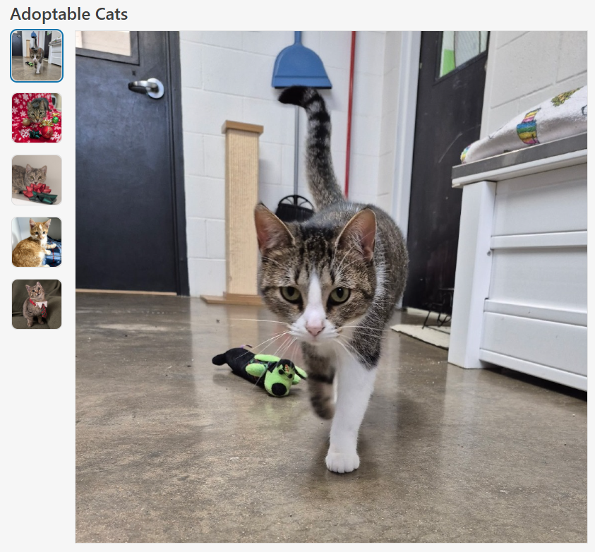
Features
- Accessibility: Uses ARIA roles and labels for screen reader support and keyboard navigation.
- Configurable Layout: Supports custom
HeightandWidthparameters to fit various UI needs. - Aspect Ratio Control:
ConstrainImageHeightandConstrainImageWidthparameters allow precise control over aspect ratio, whether to maintain aspect ratio and/or constrain height and width. - ImageInfo Model: Accepts a collection of
ImageInfoobjects, each with a required image source and optional alt text for accessibility. - Alt Text Support: Ensures all images have descriptive alt text for improved accessibility.
- Scrollbar Handling: Automatically displays a vertical scrollbar if the image list exceeds the constrained height, ensuring all images remain accessible.
- Visual Feedback: Selected and focused images are visually highlighted for clear user interaction.
Sample Code
ImageCollectionViewer.razor
@inject ITelerikStringLocalizer Loc

<LanguageTrackProvider OnInitializeEvent="provider => provider.RegisterComponent(this)" />

@if (Images.Any() && _selectedImage != null)
{
    <div class="d-flex @Class" style="height: @Height; width: @Width;">
        <ul aria-label="@Loc["ImageThumbnails"]" role="radiogroup" class="image-collection-button-container">
            @foreach (var image in Images)
            {
                <li>
                    <button @onclick="() => OnImageSelect(image)"
                            class="@($"image-collection-button{(image.Src == _selectedImage.Src ? " selected" : "")}")"
                            role="radio" aria-checked="@(image.Src == _selectedImage.Src ? "true" : "false")">
                        <img src="@image.Src" alt="@image.Alt" />
                    </button>
                </li>

            }
        </ul>
        <div class="image-collection-image-container">
            <MagnifiableImage Image="@(new ImageInfo(_selectedImage.Src, _selectedImage.Alt))" Class="image-collection-image" MagnifyScale="@MagnifyScale"
                              Height="@(ConstrainImageHeight ? "calc(100% - 2px)" : "auto")" Width="@(ConstrainImageWidth ? "100%" : "auto")" />
        </div>
    </div>
}
else
{
    <TelerikSkeleton ShapeType="@SkeletonShapeType.Rectangle" Height="@Height" Width="@Width" Class="@Class"/>
}

<style>
    .image-collection-button-container {
        flex: 0 0 auto;
        width: 10%;
        height: 100%;
        min-width: 90px;
        max-width: 110px;
        overflow-y: auto;
        padding: 2px;
        margin: 0;
        scrollbar-color: rgba(1, 1, 1, 0.25) rgba(0, 0, 0, 0);
        scrollbar-gutter: stable;
        list-style: none;
    }

    .image-collection-button {
        padding: 0;
        margin-bottom: 1rem;
        border: 1px solid var(--kendo-color-border, rgba(0, 0, 0, 0.08));
        border-radius: 0.5rem;
        width: auto;
        aspect-ratio: 1 / 1;
        display: block;
    }
    .image-collection-button:hover {
        filter: brightness(90%);
    }
    .image-collection-button:focus {
        outline: none;
        box-shadow: 0 0 0 2px color-mix(in srgb, var(--kendo-color-on-app-surface, #424242) 50%, transparent);
    }
    .image-collection-button.selected {
        box-shadow: 0 0 0 2px var(--kendo-color-primary, #1274AC);
    }
    .image-collection-button img {
        width: 100%;
        height: 100%;
        min-width: 70px;
        min-height: 70px;
        max-width: 90px;
        max-height: 90px;
        object-fit: cover;
        border-radius: 0.5rem;
        display: block;
    }

    .image-collection-image-container {
        flex: 0 0 auto;
        width: 90%;
        padding: 2px;
    }

    .image-collection-image {
        border: 1px solid var(--kendo-color-border, rgba(0, 0, 0, 0.08));
    }
</style>
ImageCollectionViewer.razor.cs
using Microsoft.AspNetCore.Components;
using Telerik.Blazor.Components;
namespace RazorLibrary.Components.Images;
/// <summary>
/// <para>
/// Displays a collection of selectable image thumbnails provided by <see cref="Images"/> and a main image display area.
/// If <see cref="Images"/> is empty, displays a <see cref="TelerikSkeleton"/> placeholder instead. Supports
/// accessibility, configurable height via <see cref="Height"/>, width via <see cref="Width"/>, aspect ratio control
/// via <see cref="ConstrainImageHeight"/> and <see cref="ConstrainImageWidth"/>, and alt text for images.
/// </para>
/// <para>
/// Usage:
/// <code>
/// @using RazorLibrary.Components.Images
///
///
/// <ImageCollection Images="myImages" Height="300px" Width="100%" />
///
///
/// @code {
/// private List<ImageInfo> myImages = new()
/// {
/// new ImageInfo("img1.jpg", "First image"),
/// new ImageInfo("img2.jpg", "Second image")
/// };
/// }
/// </code>
/// </para>
/// </summary>
public partial class ImageCollection
{
/// <summary>
/// The collection of images to display in the image collection.
/// </summary>
[Parameter] public IEnumerable<ImageInfo> Images { get; set; } = [];
/// <summary>
/// The overall height of the image collection component (e.g., "200px", "100%", or "auto"). Default is "auto".
/// </summary>
[Parameter] public string Height { get; set; } = "auto";
/// <summary>
/// The overall width of the image collection component (e.g., "200px", "100%", or "auto"). Default is "auto".
/// </summary>
[Parameter] public string Width { get; set; } = "auto";
/// <summary>
/// If true, sets the main image display height to 100%, which constrains it to the value specified by <c>Height</c>.
/// If false, height is auto. Maintains aspect ratio unless both <c>FixImageHeight</c> and <c>FixImageWidth</c> are true.
/// Default is false.
/// </summary>
[Parameter] public bool ConstrainImageHeight { get; set; } = false;
/// <summary>
/// If true, sets the main image display width to 100%, which constrains it to the value specified by <c>Width</c>.
/// If false, width is auto. Maintains aspect ratio unless both <c>FixImageHeight</c> and <c>FixImageWidth</c> are true.
/// Default is true.
/// </summary>
[Parameter] public bool ConstrainImageWidth { get; set; } = true;
/// <summary>
/// The magnification scale for the magnifier. Default is 3 (3x magnification).
/// </summary>
[Parameter]
public double MagnifyScale { get; set; } = 3;
/// <summary>
/// Applies additional CSS classes to the ImageCollection's root element for custom styling and visual modifications.
/// </summary>
[Parameter] public string Class { get; set; } = string.Empty;
private ImageInfo? _selectedImage;
/// <inheritdoc />
protected override void OnInitialized()
{
_selectedImage = Images.FirstOrDefault();
}
private void OnImageSelect(ImageInfo imageInfo)
{
_selectedImage = imageInfo;
}
}ImageInfo.cs
namespace RazorLibrary.Components.Images;

/// <summary>
/// Information about an image, including the source URL and alt text.
/// </summary>
/// <param name="Src">The image source URL. Required.</param>
/// <param name="Alt">The image alt text. Optional.</param>
public record ImageInfo(string Src, string? Alt = null);
Note
The sample code uses the MagnifiableImage component, which is another feature request. The MagnifiableImage component can be replaced with a img element.
Magnifiable Image Component
A Blazor component designed to provide an interactive image magnification experience, similar to popular eCommerce websites.
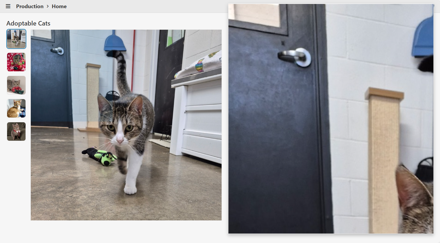
Features
- Interactive Magnifier: On mouse hover, a magnifier appears beside the image, following the cursor and displaying a zoomed-in portion of the image. At the same time an overlay appears on the image indicating the zoomed-in portion of the image.
- Screen Space Awareness: The magnifier dynamically stretches to fill the available space to the right or left of the image, ensuring optimal use of the viewport and consistent margins.
- Popover Integration: Utilizes Telerik's Popover for the magnifier, ensuring it appears above all other UI elements and avoids clipping or stacking issues.
- Configurable Magnification: The magnification scale is configurable via the
MagnifyScaleparameter. - Accessibility: The image is wrapped in a button for keyboard accessibility, and all images support alt text.
- Full-Size View: Clicking the image opens a modal window displaying the image at its actual size.
Sample Code
MagnifiableImage.razor
@inject IJSRuntime JS
@using Microsoft.JSInterop

@* Container *@
<div @ref="_containerRef" class="@($"magnifiable-image-container {Class}")" style="height: @Height;  width: @Width;">

    @* Image *@
    <button @onclick="@OnClick" class="magnifiable-image-button">
        <img src="@Image.Src" alt="@Image.Alt" style="height: 100%; width: 100%;"
             @onmousemove="@OnMouseMove" @onmouseenter="@OnMouseEnterAsync" @onmouseleave="@OnMouseLeave"/>
    </button>

    @* Magnifier *@
    <TelerikPopover @ref="_popoverRef" AnchorSelector=".magnifiable-image-container" Position="@(_showOnRight ? PopoverPosition.Right : PopoverPosition.Left)" Offset="@MagnifierMargin"
                    Width="@($"{_magnifierWidth}px")" Height="@($"{_magnifierHeight}px")" Class="popover-magnifier" Collision="PopoverCollision.Fit">
        <PopoverContent>

            @* Magnified Image *@
            <img src="@Image.Src" alt="@Image.Alt" class="magnified-image"
                 style="@($"width: {_magnifiedImageWidth}px; height: {_magnifiedImageHeight}px; transform: translateX({_magnifiedImageTransformX}px) translateY({_magnifiedImageTransformY}px); left: {_magnifiedImageLeft}px; top: {_magnifiedImageTop}px;")"/>

        </PopoverContent>
    </TelerikPopover>

    @* Magnifier Overlay *@
    @if (_isMouseOver)
    {
        <div class="magnifier-overlay"
             style="@($"width: {_magnifierOverlayWidth}px; height: {_magnifierOverlayHeight}px; transform: translateX({_magnifierOverlayTransformX}px) translateY({_magnifierOverlayTransformY}px);  left: {_magnifierOverlayLeft}px; top: {_magnifierOverlayTop}px;")))">
        </div>
    }

    @* Actual Image *@
    <TelerikWindow @bind-Visible="@_isClicked" Modal="true" CloseOnOverlayClick="true" Draggable="false" Resizable="false" Class="window-rounded">
        <WindowActions>
            <WindowAction Name="Close"/>
        </WindowActions>
        <WindowContent>
            <img src="@Image.Src" alt="@Image.Alt"/>
        </WindowContent>
    </TelerikWindow>

</div>

<style>
    .magnifiable-image-container {
        position: relative;
        display: inline-block;
        cursor: zoom-in;
    }

    .magnifiable-image-button {
        background: none;
        border: none;
        padding: 0;
        margin: 0;
        font: inherit;
        color: inherit;
        cursor: inherit !important;
        outline: none;
        box-shadow: none;
        appearance: none;
        -webkit-appearance: none;
        -moz-appearance: none;
        display: block;
        width: 100%;
        height: 100%;
    }
        .magnifiable-image-button:focus-visible {
            outline: none;
            box-shadow: 0 0 0 2px color-mix(in srgb, var(--kendo-color-on-app-surface, #424242) 50%, transparent);
        }

    .popover-magnifier {
        overflow: hidden;
        border-radius: 0;
        position: relative;
        top: @(_adjustForTelerikFit ? $"{(_showOnBottom ? "" : "-")}{MagnifierMargin/4}px" : $"{(_showOnBottom ? "" : "-")}{MagnifierMargin}px");
    }

    .magnified-image {
        position: absolute;
    }

    .magnifier-overlay {
        position: absolute;
        background: color-mix(in srgb, var(--kendo-color-primary, #1274AC) 15%, transparent);
        pointer-events: none;
        z-index: 5;
        box-sizing: border-box;
        display: block;
    }
</style>

@code
{
    [Parameter] public required ImageInfo Image { get; set; }

    /// <summary>
    /// The height of the image (e.g., "200px", "100%", or "auto"). Default is "auto".
    /// </summary>
    [Parameter]
    public string Height { get; set; } = "auto";

    /// <summary>
    /// The width of the image (e.g., "200px", "100%", or "auto"). Default is "auto".
    /// </summary>
    [Parameter]
    public string Width { get; set; } = "auto";

    /// <summary>
    /// The magnification scale for the magnifier. Default is 3 (3x magnification).
    /// </summary>
    [Parameter]
    public double MagnifyScale { get; set; } = 3;

    /// <summary>
    /// Applies additional CSS classes to the MagnifiableImage's root element for custom styling and visual modifications.
    /// </summary>
    [Parameter]
    public string Class { get; set; } = string.Empty;

    private const int MagnifierMargin = 24;

    // State for magnifier visibility and container reference
    private bool _isMouseOver;
    private bool _isClicked;
    private ElementReference _containerRef;
    private TelerikPopover? _popoverRef;

    // Image and magnified image dimensions
    private double _imageWidth;
    private double _imageHeight;
    private double _magnifiedImageWidth;
    private double _magnifiedImageHeight;

    // Magnifier position and size
    private bool _showOnRight = true;
    private bool _showOnBottom = true;
    private bool _adjustForTelerikFit;
    private double _magnifierWidth;
    private double _magnifierHeight;

    // Magnified image offset within the magnifier
    private double _magnifiedImageLeft;
    private double _magnifiedImageTop;

    // Mouse position clamping bounds
    private double _minMouseX;
    private double _minMouseY;
    private double _maxMouseX;
    private double _maxMouseY;

    // Mouse position and transform for magnified image
    private double _mouseX;
    private double _mouseY;
    private double _magnifiedImageTransformX;
    private double _magnifiedImageTransformY;

    // Magnifier overlay size and transform
    private double _magnifierOverlayWidth;
    private double _magnifierOverlayHeight;
    private double _magnifierOverlayLeft;
    private double _magnifierOverlayTop;
    private double _magnifierOverlayTransformX;
    private double _magnifierOverlayTransformY;

    private void OnClick()
    {
        _isClicked = true;
    }

    private async Task OnMouseEnterAsync()
    {
        _isMouseOver = true;
        _popoverRef?.Show();

        // Get layout info about the image container using getElementLayoutInfo from wwwroot/js/magnifiable-image.js
        var containerLayoutInfo = await JS.InvokeAsync<ElementLayoutInfo>("getElementLayoutInfo", _containerRef);

        // Store image size
        _imageWidth = containerLayoutInfo.Width;
        _imageHeight = containerLayoutInfo.Height;
        _magnifiedImageWidth = _imageWidth * MagnifyScale;
        _magnifiedImageHeight = _imageHeight * MagnifyScale;

        // Determine magnifier position based on available space
        _showOnRight = containerLayoutInfo.DistanceFromViewportRight >= containerLayoutInfo.DistanceFromViewportLeft;
        _adjustForTelerikFit = Math.Abs(containerLayoutInfo.DistanceFromViewportBottom - containerLayoutInfo.DistanceFromViewportTop) < 20;
        _showOnBottom = containerLayoutInfo.DistanceFromViewportBottom >= containerLayoutInfo.DistanceFromViewportTop;

        // Calculate magnifier size based on available space
        _magnifierWidth = _showOnRight
            ? containerLayoutInfo.DistanceFromViewportRight - MagnifierMargin*2
            : containerLayoutInfo.DistanceFromViewportLeft - MagnifierMargin*2;
        _magnifierHeight = containerLayoutInfo.ViewportHeight - MagnifierMargin*2;

        // Center the magnified image in the magnifier
        _magnifiedImageLeft = (_magnifierWidth / 2) - (_imageWidth / 2);
        _magnifiedImageTop = (_magnifierHeight / 2) - (_imageHeight / 2);

        // Calculate min and max mouse X/Y to prevent showing empty space in the magnifier
        _minMouseX = Math.Floor((_magnifierWidth / MagnifyScale) / 2);
        _minMouseY = Math.Floor((_magnifierHeight / MagnifyScale) / 2);
        _maxMouseX = Math.Ceiling(_imageWidth - ((_magnifierWidth / MagnifyScale) / 2));
        _maxMouseY = Math.Ceiling(_imageHeight - ((_magnifierHeight / MagnifyScale) / 2));

        // Calculate magnifier overlay size and position
        _magnifierOverlayWidth = Math.Floor(Math.Clamp(_magnifierWidth / MagnifyScale, 0, _imageWidth)) - 1;
        _magnifierOverlayHeight = Math.Floor(Math.Clamp(_magnifierHeight / MagnifyScale, 0, _imageHeight)) - 1;
        _magnifierOverlayLeft = -((_magnifierOverlayWidth / 2) + 1);
        _magnifierOverlayTop = -((_magnifierOverlayHeight / 2) + 1);
    }

    private void OnMouseLeave()
    {
        _isMouseOver = false;
        _popoverRef?.Hide();
    }

    private void OnMouseMove(MouseEventArgs e)
    {
        // Clamp mouse X/Y to prevent showing empty space in the magnifier
        if (_minMouseX > _maxMouseX) _mouseX = _imageWidth / 2;
        else _mouseX = Math.Clamp(e.OffsetX, _minMouseX, _maxMouseX);
        if (_minMouseY > _maxMouseY) _mouseY = _imageHeight / 2;
        else _mouseY = Math.Clamp(e.OffsetY, _minMouseY, _maxMouseY);

        // Calculate the transform for the magnified image
        _magnifiedImageTransformX = -Math.Round((_mouseX * MagnifyScale) - (_imageWidth / 2));
        _magnifiedImageTransformY = -Math.Round((_mouseY * MagnifyScale) - (_imageHeight / 2));

        // Calculate the transform for the magnifier overlay
        _magnifierOverlayTransformX = Math.Round(_mouseX);
        _magnifierOverlayTransformY = Math.Round(_mouseY);

        _popoverRef?.Refresh();
    }

    private record ElementLayoutInfo(
        double Width,
        double Height,
        double ViewportHeight,
        double DistanceFromViewportLeft, // distance from viewport's left edge to element's left edge
        double DistanceFromViewportRight, // distance from element's right edge to viewport's right edge
        double DistanceFromViewportTop, // distance from viewport's top edge to element's top edge
        double DistanceFromViewportBottom); // distance from element's bottom edge to viewport's bottom edge
}
magnifiable-image.js
// Returns width, height, and the space to the left and right of the element relative to the viewport
window.getElementLayoutInfo = (element) => {
    if (!element) return null;
    const elementRect = element.getBoundingClientRect();
    return {
        width: elementRect.width,
        height: elementRect.height,
        viewportHeight: window.innerHeight,
        distanceFromViewportLeft: elementRect.left, // distance from viewport's left edge to element's left edge
        distanceFromViewportRight: window.innerWidth - elementRect.right, // distance from element's right edge to viewport's right edge
        distanceFromViewportTop: elementRect.top, // distance from viewport's top edge to element's top edge
        distanceFromViewportBottom: window.innerHeight - elementRect.bottom // distance from element's bottom edge to viewport's bottom edge
    };
};
Note
Only tested in Blazor WebAssembly. The component may see performance issues in Blazor Server.
Hello
I notice that zoom on chart with numeric values make the axis values with a lot of decimal and didn't find a way to round them.
We can see it directly in the documentation here
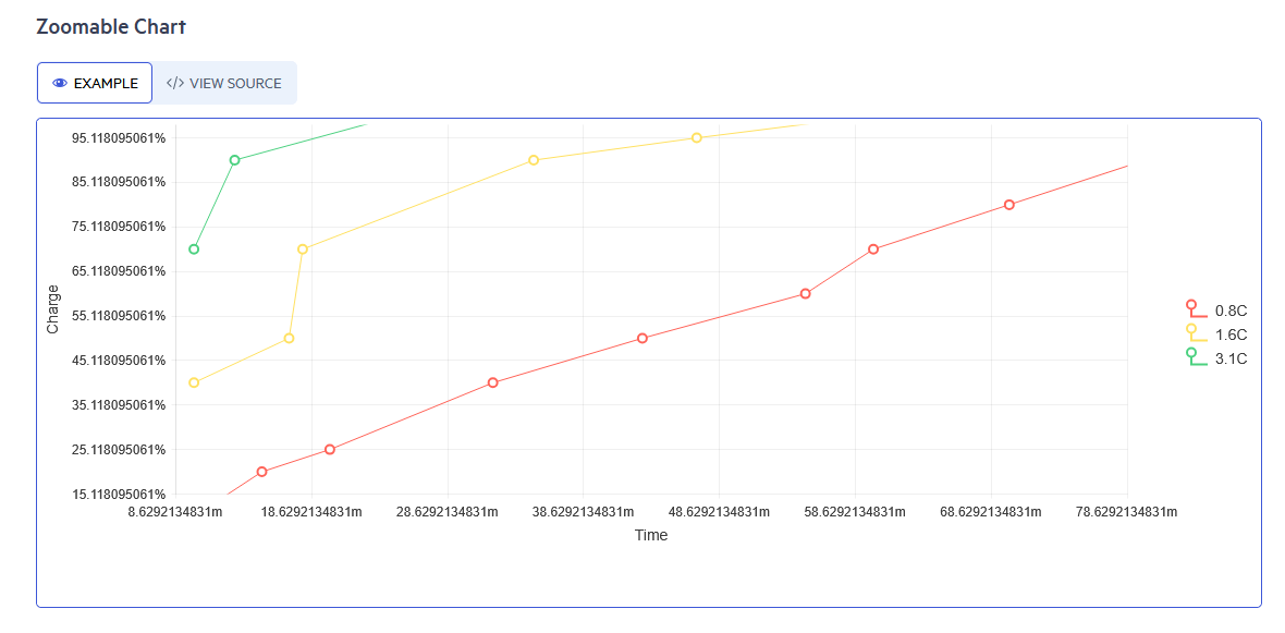
Is there a way to keep the axis to rounded value ?
Thank you
Regards,
Thomas
Hello,
We want the grid column chooser to have a search bar for the user to search what column they need to add/remove to the grid.
We use many non-visible columns in our grid and allow the user to customize what they want to see via the column chooser.
However, since the user cannot search the available columns they have to scroll with their mouse through a large list to find what they want.
(Notice the scroll bar in the following screenshot)
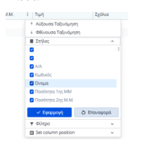
Thank you
Issue: Opening and closing a window will cause the window to reopen with each following OnClick. This seems to have been introduced with the upgrade to .net10
Code: Below is an example used on the basic Telerik Blazor template. Copy this and replace Home.razor with it.
@page "/"

<PageTitle>Telerik Blazor App | Home</PageTitle>

<div id="home-page">
    <HomeSvg />

    <h1>Hello, Telerik UI for Blazor!</h1>

    <p>Welcome to your new Telerik Blazor app.</p>

    <TelerikButton OnClick="OpenWindow1">Click Here First</TelerikButton>
    <TelerikButton OnClick="OpenWindow2">Click Here Second</TelerikButton>
    <TelerikButton OnClick="@(async () => {await Task.Delay(100);})">Unrelated OnClick</TelerikButton>


</div>

<TelerikWindow Visible="ShowWindow1">
    <WindowActions>
        <WindowAction OnClick="CloseWindow1" Name="Close"></WindowAction>
    </WindowActions>
    <WindowContent>
        <span>Moving window now will help find this window in next step, but not necessary to replicate bug.</span>
        <br />
        <span>Close window using 'X'.</span>
    </WindowContent>
</TelerikWindow>

<TelerikWindow Visible="ShowWindow2">
    <WindowActions>
        <WindowAction OnClick="CloseWindow2" Name="Close"></WindowAction>
    </WindowActions>
    <WindowContent>
        <span>Window 1 shouldn't be appearing now, but it it is. Window 1 may be behind this window if you didn't drag in previous step.</span>
        <br />
        <span>If you close these windows, and click the 'Unrelated OnClick' button, both of these windows will reappear, despite just firing Task.Delay(100)</span>
    </WindowContent>
</TelerikWindow>

<style>
    #home-page {
        margin-left: auto;
        margin-right: auto;
        max-width: max-content;
        text-align: center;
        font-size: var(--kendo-font-size-xl);
    }

    @@media (min-height: calc(56px + 50px + 400px)) {
        /* header + footer + home page container*/
        #home-page {
            margin-top: calc(50vh - 28px - 25px - 200px);
        }
    }
</style>

@code {
    public bool ShowWindow1 { get; set; }
    public bool ShowWindow2 { get; set; }

    public async Task OpenWindow1()
    {
        ShowWindow1 = true;
    }

    public async Task OpenWindow2()
    {
        ShowWindow2 = true;
    }

    public void CloseWindow1()
    {
        ShowWindow2 = false;
        StateHasChanged();
    }

    public void CloseWindow2()
    {
        ShowWindow2 = false;
    }
}