The OnRowClick event of the TelerikGrid is only triggered when clicking the row with the left mouse button as discussed on the following forum post:
https://www.telerik.com/forums/grid-onrowclick-event-for-middle-mouse-button-click
Please add support to the OnRowClick event to trigger it for a middle mouse button click (and pass the mouse button clicked in the eventargs) or add a separate OnRowClick event that is triggered on middle mouse button click.
Greetings,
I find input adornments very useful. However I noticed that when I click them, the control doesn't get the focus. E.g., with this code:
    <TelerikTextBox>
        <TextBoxPrefixTemplate>
            First name
        </TextBoxPrefixTemplate>
    </TelerikTextBox>
Clicking on First name doesn't do anything. I would expect the control to be focused when I do that.
You will find an image in attachment showing a green area that, when clicked, brings focus on the textbox. Input adornment is in dark gray. I'm using it as a label for the control but even if it was simply an icon, it would be strange to not be able to focus on the control when clicking it.
Need feature parity in the Blazor rich text editor similar to the Angular rich text editor. Need access to add custom schema elements and tag highlighted text with those new schema elements.
https://www.telerik.com/kendo-angular-ui/components/editor/schema/
currently am able to do this with custom Marks in the angular version.
Can a feature like this capability in the Winforms Radmap be added?
On Blazor filter field parameters, please consider adding
1/ Group options, eg using demo sample fields drop down looks like this
Id
Quantity
Freight
Country
Ship to
Ship Address
but it would be useful to allow groping fields by common categories?
Group-1
-Id
-Quantity
-Freight
Group-2
-Country
-Ship to
-Ship Address
2/ Related, can you also add sort index for group and fields so they can be sorted by index rather than field name. Sometimes groups and fields require different order that is not always alphanumerical and may change order based on other selections.
3/ Maybe consider feature parity with filter field options here querybuilder
On Blazor Filter, please consider option to drag and drop rules to re-order the rules. It's a common user request that when creating complex rules that user has ability to move rules around without having to delete and create again. User loses information and data when rules are deleted and can be difficult to relocate in long drop downs.
Ability to drag and drop move of existing rules would improve user experience. Any change to GUI should also reflect in updated FilterDescriptor.
===
ADMIN EDIT
===
The order of the filter rules in one group does not make a difference for the FilterDescriptor. Thus, the current request applies to dragging filter rules from one group to another.
Hi,
We use compact sized grid all the time in our application.
However, with sorting and filtering enabled, the icons take too much space in the header cell and make the actual header text hard to read.
Please consider scale down those icons and reduce padding.
Thanks and best regards,
Peili
Demo: https://blazorrepl.telerik.com/mSOIQZvO51cwrorJ49
===ADMIN EDIT===
To reduce the size of the icons and the font in a Compact Grid, you can follow the approach from the knowledge base article How to make Compact Grid elements smaller.
Hi Telerik Team,
when using the (currently) latest versions of VS (17.11.0) and Blazor 8.0.8 runtimes (and custom css theme version 8.2.0) I get the following error when running my project in debug mode:
TypeError: Cannot read properties of null (reading 'classList')
Stapelüberwachung:
> at e.addClass (https://localhost:7038/_content/Telerik.UI.for.Blazor/js/telerik-blazor.js:50:1122923)
> at v.resetCallout (https://localhost:7038/_content/Telerik.UI.for.Blazor/js/telerik-blazor.js:50:1372516)
> at v.adjustCalloutPosition (https://localhost:7038/_content/Telerik.UI.for.Blazor/js/telerik-blazor.js:50:1372355)
> at e.invokeComponentMethod (https://localhost:7038/_content/Telerik.UI.for.Blazor/js/telerik-blazor.js:50:1112736)
> at https://localhost:7038/_framework/blazor.webassembly.js:1:2878
> at new Promise (<anonymous>)
> at b.beginInvokeJSFromDotNet (https://localhost:7038/_framework/blazor.webassembly.js:1:2835)
> at Object.vn [as invokeJSJson] (https://localhost:7038/_framework/blazor.webassembly.js:1:58849)
> at https://localhost:7038/_framework/dotnet.runtime.8.0.8.80cvijctdx.js:3:178428
> at Ll (https://localhost:7038/_framework/dotnet.runtime.8.0.8.80cvijctdx.js:3:179262)
It looks like the problem has something to do with a function that wants to set the css "k-callout-e" class to some object.
The problem appears in js when e is null in the following method:
e.classList.add(t)
In this case e = null and t = "k-callout-e". It seems there's no null check for e and VS 2022 reports the problem.
The debugger in VS cannot be disabled for js content as it seems it's the same debugger for Blazor itself.
When hitting F5 to continue multiple times the projects keeps running until it hits the same problem again.
In my project I added a single "TelerikTooltip" component for Tooltips. I tried disabling it but still the same problem.
Maybe the js code is used for some other component.
If you need more information just let me know.
Regards,
Tom
We would like to have in our app Charts the same functionality that you have in StockCharts.
Navigator:
https://docs.telerik.com/blazor-ui/components/stockchart/navigator
Crosshairs:
https://docs.telerik.com/blazor-ui/components/stockchart/crosshairs
For example, selecting Bootstrap-Main-Dark theme in the Project Wizard does not apply the dark mode.
===ADMIN EDIT===
For the time being, a possible workaround is to manually add class="k-body" to the <body> tag of your application. This will ensure, that the dark mode is correctly applied. This is required because, by design, the Default theme does not enable the typography system. The "k-body" class is required for the typography system to work properly on the document level and apply the predefined typography values to the page. For more detailed information, refer to Design System Documentation.
Steps to reproduce:
- Insert a simple TelerikGrid on your page
- Add Columns with templates for each property
- Specify a Column Template
See https://blazorrepl.telerik.com/GyPvFMFr00zLEEdG00
Problem / Inconvenience
- Context has to be converted/cast before access to the each property is possible
- Grid columns are not generic which makes them hard to use sometimes
- Fields have to be specified by name (may lead to wrong names after changing)
Solution / Feature Request
- Provide new generic columns (to ensure no current implementations break)
- Add [CascadingTypeParameter(nameof(TItem))] to the TelerikGrid
- GridColumns automatically "inherit" the typeparam TItem
Idea from: Blazor QuickGrid
Benefits
- GridColumns can be specified with Expression
- Template context does not have to be cast anymore
- Renaming properties affect expression or an error is display (property does not exist)
<GridColumn For="@(t => t.Name)">
        <Template>
                <div>
                    @item.Name
                </div>
        </Template>
</GridColumn>
Describe the bug
The class 'k-tabstrip' item is missing in the rendering of the TabStrip component.
To Reproduce
1. Go to the following demo and open the DevTools:
https://demos.telerik.com/blazor-ui/tabstrip/overview
2. Check the source of truth:
https://github.com/telerik/kendo-themes/blob/develop/tests/tabstrip/tabstrip.html
Actual results
The class 'k-tabstrip-item' is missing.
Expected behavior
The class 'k-tabstrip-item' to be present.
Additional context
ThemeBuilder generates styles for the items of the TabStrip component with selectors like these:
.k-tabstrip .k-tabstrip-items-wrapper .k-tabstrip-items.k-reset.k-tabstrip-items-start .k-item.k-tabstrip-item.k-active .k-linkThis works in other technologies, such as Kendo React, but it doesn't take effect in Blazor applications because of the issue.
Reported through t.1672526.
Hi Telerik Support
This is related to the feedback portal item: The Grid header gets focus only for the first time when tabbing
I had raised the above issue, now I can see that the issue is fixed in 7.0.0. But the fix does not work when the TelerikGrid is inside a TelerikWindow.
Please find the REPL sample https://blazorrepl.telerik.com/QIvmPrlI39rZ4whP10
Is there a work around for the scenario where the grid is inside a popup window?
Regards
Bably
=== EDITED BY TELERIK ===
When using nullable enums, their DisplayNameAttrute doesn't show in the Grid.
https://blazorrepl.telerik.com/QTOlwiaM456Yh9Xp33
The bug is related to Enum DisplayName attributes are ignored in view mode of the Grid
=== ORIGINAL POST CONTENT ===
Sample Code to reproduce the error:
https://blazorrepl.telerik.com/QzYPGLFj11s0rZwp47
If you change line 44 to a non-nullable field type, it crashes the grid with an error message in the CSS file. I have included the error message I get in my blazor app with the same code above, console then sources:
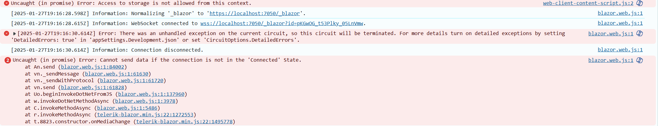
After reading your documentation, it appears that the Pager Position enum only allows for the grid pager to be at the top OR the bottom of the grid.
It would be most excellent to allow it to be BOTH. For very large grids, it would be convenient for the user to see the grid at the very top, but if they do happen to need to scroll to the very bottom of the grid, seeing the pager component there would also be convenient for the user.
This is in regard to this page:
https://www.telerik.com/blazor-ui/documentation/components/grid/paging
Please add a .Both option to the PagerPosition enum that allows both Top and Bottom at the same time.
Thanks! :)
We need a formal, Accordion component. This is missing like a sore thumb !
The Accordion should be the first component in the component list.
Using the panel bar is not the same as the functionality of Accordion. So, do not mark this request as a duplicate of a panel bar enhancement request.
This is a simple component and I request you to prioritize and release it urgently in the next release.
Thanks.
Creating a new WebApp project template through the extension fails to build. This is caused by incorrect icon type in the MainLayout.razor file.
To make sure the app is correctly built, the Icon type should be FontIcon.
<TelerikButton Icon="@FontIcon.Menu"
               FillMode="@ThemeConstants.Button.FillMode.Clear"
               OnClick="@( () => DrawerExpanded = !DrawerExpanded )" />