With the default templates for a blazor project there are options for security.
We really need this for the telerik blazor templates or a sample telerik blazor projects using the different types of security.
Hi,
It seems when using popup form editing with the DataGrid, the displayformat is lost even though it is displayed correctly in non edit mode. This seem to be true regardless if you specify it with Data Annotations of as DisplayFormat in markup.
DatePicker shows format string when no value is selected. If you have a form a DatePicker bound to a nullable DateTime, it will show the formatting string when no value is selected, instead of just showing an empty box. This is very confusing to the end user compared to just an empty box. We have not found a way to change this.

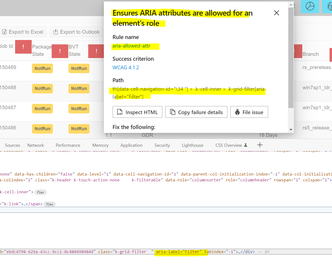
Accessibility Insights for Web extension is flagging the k-grid-filter icon in the Grid Header labels. Need workaround and remove the aria-label and replace with aria-role per guidance. Under each of the red explanation marks is the filter icon on the column. Running the Accessibility Insights for Web tool by Microsoft using Edge browser flags this code.
Please provide temporary workaround and permanent fix.
Blazor-UI 2.30 Release.
Blazor first steps bug in documentation, Primary="true" gives an error.
https://docs.telerik.com/blazor-ui/getting-started/server-blazor
Step 3 - Add a Telerik Component to a View
<TelerikButton OnClick="@SayHelloHandler" Primary="true">Say Hello</TelerikButton>
Primary = "true" gives an error with version 3, sb different for .net 6 and use ThemeColor
PopupHeight is no longer a valid property.
QueryableExtensions.ToDataSourceResult throws IndexOutOfRangeException if a DataTable contains deleted rows.
using System.Data;
using Telerik.DataSource;
using Telerik.DataSource.Extensions;

var dt = GetData();

var res = dt.ToDataSourceResult(new DataSourceRequest());

DataTable GetData()
{
    DataTable table = new DataTable();

    // Make sure you specify the correct types
    // If you have any nulls in your (database) Column, you should use nullable type (int?, DateTime?,...)
    table.Columns.Add("ProductId", typeof(int));
    table.Columns.Add("ProductName", typeof(string));
    table.Columns.Add("UnitPrice", typeof(decimal));
    table.Columns.Add("UnitsInStock", typeof(short));

    // You should set default values to the columns that could be skipped in Create/Edit.
    // The alternative approach is to set the default values in the UpdateHandler and/or CreateHandler.

    // Having a default value in this case will prevent having DBNull values in your DataTable, because
    // DBNull is not parsable to any other primitive type and if you pass it to the grid, some of the operations could be broken
    table.Columns["ProductName"].DefaultValue = default(string);
    table.Columns["UnitPrice"].DefaultValue = default(decimal);
    table.Columns["UnitsInStock"].DefaultValue = default(short);

    for (int i = 1; i < 50; i++)
    {
        table.Rows.Add(i, $"Product{i}", i * 5.2, i * 2);
    }

    table.AcceptChanges();

    var lastRow = table.Rows[table.Rows.Count - 1];

    lastRow.Delete();

    return table;
}
Create a general purpose component to allow dragging and dropping of other components or files from the filesystem. Expose events that let us get access to the files that were dropped so that we can access the contents of those files or send them off to be uploaded.
Currently in Blazor we can do this with the InputFile component. But I would like the ability to create a droppable UI and have any kind of child content in it. And also get at the file content of files dropped.
Hi,
I had to figure this out myself for the ComboBoxSettings because there is no documentation for this.
The MinWidth works from the Combobox width or greater extending the size of the popup and
MaxWidth only creates a popup width of the Combobox only.
Please document this feature and how to use it. And, is this intentional because it wasn't intuitive for me to figure out.
I created a REPL for you to test this out for yourself.
Hello,
I would love to see an auto sizing for a TileLayoutItem. Specifically, in my case, the RowSpan. I feel like this would make a great addition as a parameter in the future as (also AutoSizeColumn would be nice)
<TileLayoutItem AutoSizeRow="true"></TileLayoutItem>I am working on an application that has dynamic data displayed within the TileLayoutItem. In my current implementation, I'm going through a process of attempting to calculate for resizing the RowSpan. The calculations are based on an inner body div that holds an id, finds the parent k-tilelayout-item and then the the k-tilelayout itself. I can't positively say my math is perfect but it (mostly) gets the job done. Keeping in mind that I have created other altered other areas of the TileLayout as well, specifically setting the TelerikTileLayout grid to autofit.
For an idea of what I am currently doing as a means of possibly finding a (better) way to implement this in the future, this is the long ugly javascript code I have that is used to gather a minimum size and return it to blazor via JsInterop.
function (tileId, minSpanSize = 4) {
        try {
            var el = document.getElementById(tileId);
            var tileLayout = $(el).closest(".k-tilelayout")[0];
            var parentTile = $(el).closest(".k-tilelayout-item")[0];

            var headerHeight = $(el).parent().siblings(".k-tilelayout-item-header")[0].offsetHeight;

            var parentSpan = parseInt(parentTile.style.gridRowEnd.split("span ")[1]);
            var gap = parseInt(tileLayout.style.gap.replace("px", ""));
            var rowHeight = parseInt(tileLayout.style.gridAutoRows.split(",")[1].split("px")[0]);

            // cannot recall where I got 1.25 from
            var minSize = Math.ceil((headerHeight + el.offsetHeight) / ((gap / 1.25) + rowHeight));

            // if parent is less than minsize
            if (parentSpan < minSize) {
                parentTile.style.gridRowEnd = "span " + minSize;
                return { id: tileId, minSize: minSize };

                // Otherwise, if min size is greater than or equal to minSpanSie
            } else if (minSize >= minSpanSize) {
                parentTile.style.gridRowEnd = "span " + minSize;
                return { id: tileId, minSize: minSize };
            }

        } catch { }
        return { id: tileId, minSize: -1 };
The File Manager (exactly like https://www.telerik.com/aspnet-core-ui/file-manager) for Blazor is needed.
I see there is the File Select Blazor FileSelect Component | Telerik UI for Blazor, but not File Manager that is a more complete and richer control.
Hi,
I need the older version of CSS (2.9.0) for Blazor for telerik. I visited the site as follows but get error:
https://blazor.cdn.telerik.com/blazor/2.9.0/kendo-theme-default/all.css
An error occurred.
Sorry, the page you are looking for is currently unavailable.
Find CSS until 2.22.0. the following link works
https://blazor.cdn.telerik.com/blazor/2.22.0/kendo-theme-default/all.css
Could you fix the link or please provide me the CSS for 2.9.0 ASAP.
Regards
Shuvra
With an item selected, I want to reset the drop down list to the state it has when the page loads, i.e. populated with nothing selected.
Setting the backing filed to zero does not work. I have read Clear the selection, I know it works if you have a default text,
I dont't want to have a default text.
As you can see in the repl, there's some more experiments, since I thought I could maybe clear the content and re-populate
the list to reset it.
Setting the data source to null does nothing?!?!
Clearing the data source removes the items in it, but keeps the selected value!?!?
I've seen answers to this question that suggests using CSS to achieve this, but that's just stupid and shouldn't be necessary.
Finally, we have the hack solution, which is totally crazy but seems to work.
I leave it here for others to see, since it seems a lot of people also have this problem.
Please fix this.