ValueExpression="@(() => AttendanceDTO.WorkScheduleEndTime)"
AdaptiveMode="@AdaptiveMode.Auto"
ValueChanged="@( (DateTime d) => ChangeWorkScheduleEndTime(d) )"
Format="dd/MM/yyyy (dddd) HH:mm"
Id="selected-date"
Enabled="!ReadOnly">
</TelerikDateTimePicker>
For reasons unknown, our TelerikGrid rows all render with each <tr> element having the "k-alt k-table-alt-row" classes associated with them. This causes the background colour for each row to be the same, rather than alternating between two colours.
For example, the following block of code...
<TelerikGrid Id="@(Utility.CleanCssId("CrewGrid"))"
                 DetailTemplate="GridDetailTemplate"
                 EnableLoaderContainer="@ShowLoading"
                 Groupable="false"
                 Height="100%"
                 OnRead="@OnGridRead"
                 OnStateChanged="@OnGridStateChanged"
                 OnStateInit="@OnGridStateInit"
                 Pageable="true"
                 PageSize="@PageSize"
                 PageSizeChanged="@OnGridPageSizeChanged"
                 Reorderable="IsLargeScreen"
                 Resizable="IsLargeScreen"
                 SelectionMode="GridSelectionMode.Single"
                 ShowColumnMenu="IsLargeScreen"
                 Size="@GetGridSize"
                 Sortable="true"
                 SortMode="SortMode.Multiple"
                 TItem="CrewListItem"
                 @ref="Grid"
                 @bind-SelectedItems="@SelectedItems"
                 OnRowRender="OnRowRender">
    <NoDataTemplate>
        <strong>@RecordsMessage</strong>
    </NoDataTemplate>
    <GridSettings>
        <GridColumnMenuSettings Lockable="false" FilterMode="ColumnMenuFilterMode.None" />
        <GridPagerSettings InputType="PagerInputType.Buttons" PageSizes="@PageSizes" ButtonCount="5" Adaptive="false" Position="PagerPosition.Bottom" />
    </GridSettings>
    <GridColumns>
        <GridColumn Field="@nameof(CrewListItem.Color)"
                    Width="@(IsLargeScreen ? "40px" : "50px")"
                    Resizable="false"
                    ShowColumnMenu="false"
                    Groupable="false"
                    ShowColumnChooser="false"
                    Sortable="false"
                    HeaderClass="k-text-transparent"
                    OnCellRender="OnGridCellRender">
            <Template>
                @{
                    var item = (CrewListItem)context;
                    <M360ListColumnColor Color="@item.Color" IsLargeScreen="IsLargeScreen" />
                }
            </Template>
        </GridColumn>
        <GridColumn Field="@nameof(CrewListItem.Name)" Title="@TMessages.Crew" OnCellRender="OnGridCellRender" VisibleInColumnChooser="false">
            <Template>
                @{
                    var item = (CrewListItem)context;
                    <div class="k-d-flex k-h-full @(IsLargeScreen ? "k-align-items-stretch" : "k-align-items-center")">
                        <M360ListColumnLink Url="@string.Concat("crew/", item.Id)" Text="@item.Name" EntityType="Crew" IsPrimary="true" />
                    </div>
                }
            </Template>
        </GridColumn>
        <GridColumn Field="@nameof(CrewListItem.DivisionsJson)" Title="Division(s)" Sortable="true" Visible="IsLargeScreen" OnCellRender="OnGridCellRender">
            <Template>
                @{
                    var item = (CrewListItem)context;
                    <M360ListColumnList Items="@item.Divisions.ToList()" />
                }
            </Template>
        </GridColumn>
         .
         .
         .
    </GridColumns>
</TelerikGrid>
...results in markup like this...
<tbody class="k-table-tbody" role="rowgroup">
  <tr
    role="row"
    class="k-master-row k-table-row k-alt k-table-alt-row"
    data-render-row-index="0"
    aria-rowindex="1"
  >
    . . .
  </tr>
  <tr
    role="row"
    class="k-master-row k-table-row k-alt k-table-alt-row"
    data-render-row-index="1"
    aria-rowindex="3"
  >
    . . .
  </tr>
  <tr
    role="row"
    class="k-master-row k-table-row k-alt k-table-alt-row"
    data-render-row-index="2"
    aria-rowindex="5"
  >
    . . .
  </tr>
  . . .
</tbody>
I can see that the "aria-rowindex" increments by two, yet the "data-render-row-index" increments by one. Are we missing something simple, yet crucial here? What could cause the skipping of rows during render?
Many thanks,
Nem
I use TelerikMultiSelect as a component for custom filter:
<FilterMenuTemplate>
    <TelerikMultiSelect Value="@(AlreadySelectedFilterValues(context.FilterDescriptor))"
                        OnRead="@OnReadWrapper"
                        ValueMapper="@ValueMapperWrapper"
                        TItem="@FilterItemDto"
                        TValue="@TFilterValue"
                        ValueField="@nameof(FilterItemDto.Id)"
                        TextField="@nameof(FilterItemDto.Name)"
                        AutoClose="true"
                        Filterable="true"
                        ClearButton="true"
                        DebounceDelay="500"
                        OnChange="@((object newValue) => OnMenuFilterChange(newValue, context))"/>
</FilterMenuTemplate>
Trying to render already selected filters gives two "magic" items in context.FilterDescriptor in AlreadySelectedFilterValues:

These items appear only if TelerikMultiSelect is empty. If I select some from MultySelect these two items disappear and everything works as expected.
GridState has an empty list of FilterDescriptos.
AggregatedAccountNames - string? column.
TFilterValues can be int, int? or string, no matter, the same behavior.
TFilterItemDto - class with int? Id and and string Name fields.
As expected value I expect to have empty FilterDescriptos if nothing was selected.
Hi,
As the subject says, when our app is on the Chinese localization `zh-CN` it causes the date picker to default.
By default I mean the default date becomes 01 01 0001 and you cannot change it no matter what you select.
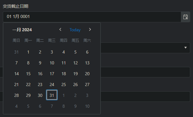
On any of our other localizations such as es-ES, en-US, fr-FR, etc. (zh-CN is the only one is what I'm getting at) we don't get this issue.
Hi,
When I use TelerikDatePicker in my own component and the I use this component in Form, the validation for this input on the UI side doesn't work. The k-invalid class is not added, the appriopriate aria-invalid value is not set. The value on the TelerikDataPicker CascadedEditContext side is ok, an error message for this field appears after validation.
Filter option switch back to default option (Contains) after entering value in the textbox.
Example -
- screenshot-1 - Select from filter option - Startswith ; Then, enter value in text box.
- screenshot -2 - After user enter first character , atomically filter option switch back to Contains (from startswith).
When I click on any item from the SplitButton dropdown list, it closes, until I release the key
Team,
Currently I am using Telerik UI Blazor with 3.7.0 version, few cases and intermittently TooltipShowEvent.Click is not working and tooltip is not getting displayed and unable to find root cause for it.
Could you please assist what is causing for this behaviour and feasible solution?
Below is sample code snippet where we use 3 tabs
<TelerikTabStrip Class="tmGraphTabStrip" ActiveTabIndex="@ActiveTab" ActiveTabIndexChanged="@ActiveTabChanged" @ref="@TabRef">
@for (var i = 0; i < 4; i++)
{
<TabStripTab Title="@TabName" Class="tmTabHeaderCellStyle">
<TelerikGridLayout RowSpacing="20px" ColumnSpacing="1px" Class="grid-CardlayoutNew">
@*
display data in gridlayout structure for each row/column along with tooltip, we are able to see div selector and target selector Ids from Dev Tools browser
*@
</TelerikGridLayout>
</TabStripTab>
}
</TelerikTabStrip>
Ex:
<TelerikTooltip TargetSelector="@ToolTipCurselector" ShowOn="@TooltipShowEvent.Click" Position="TooltipPosition.Top">
</TelerikTooltip>
After upgrading to Telerik Version 3.6.1 my CSS is messed up on my grids, the pagers look like the image below.
Hi, we are using a tile layout for charts and are having an issue where the tooltips for the second row of tiles are appearing at the bottom of the screen away from the chart or not at all. Then when we scroll back to the first row of tiles the tool tips are out of alignment as well. The following screen shot shows an example.
We have a component that has a tab strip and the tile layout with the following code
<TabStripTab Title="@tabName">
	@((MarkupString)tabHeading)

	<TelerikTileLayout Columns="6"
						RowHeight="225px"
						ColumnWidth="285px"
						Reorderable="true"
						Resizable="true"
						OnResize="@ItemResize"
						OnReorder="@ItemReorder"
						@ref="@TileLayout">
		<TileLayoutItems>
			@foreach (CustomChartViewModel chart in tab.Charts)
			{
				int colSpan = 2;
				int rowSpan = 2;

				<TileLayoutItem RowSpan="@rowSpan" ColSpan="@colSpan">
					<HeaderTemplate>
						<div style="text-align: right">
							<TelerikButton OnClick="@(() => onDeleteChart(chart.Id, tab.Id))">X</TelerikButton>
						</div>
					</HeaderTemplate>
					<Content>
						<ChartComponent ViewModel="@chart" @ref="@charts[chart.Id]" />
					</Content>
				</TileLayoutItem>
			}
		</TileLayoutItems>
	</TelerikTileLayout>
</TabStripTab>
And then a chart component that renders the individual charts with a tooltip
<TelerikChart @ref="@ChartRef" Height="100%" Width="100%" OnSeriesClick="@OnSeriesClickHandler">
	<ChartTooltip Visible="true">
		<Template>
			<TelerikIcon Icon="information" />
                    @(context.Percentage.ToString("P", nfi))<br />
					@((context.DataItem as MyDataModel).toolTip)
		</Template>
	</ChartTooltip>
	<ChartSeriesItems>
		<ChartSeries Type="ChartSeriesType.Donut" Data="@Data" Field="value" CategoryField="category" ColorField="color">
			<ChartSeriesLabels Position="ChartSeriesLabelsPosition.OutsideEnd"
							   Visible="@ViewModel.ShowLabels"
							   Background="transparent"
							   Template="#= category #: #= value#">
			</ChartSeriesLabels>
		</ChartSeries>
	</ChartSeriesItems>

	<ChartTitle Text="@ViewModel.Name"></ChartTitle>

	<ChartLegend Position="ChartLegendPosition.Bottom" Visible="@ViewModel.ShowLegend"></ChartLegend>
</TelerikChart>
Hello,
I'm using a numeric textbox and when I test my page for accessibility, Allyable reports the following:
Category: Ensure button or link have discernible text that is not repeated as image description
Selector: .k-form-field-wrap > .k-numerictextbox.k-widget > .k-numeric-wrap > .k-select > [role="button"].k-link-decrease
Severity: Critical
Here is my source code:
<TelerikNumericTextBox @bind-Value="@cardCleaner.Quantity" Id="cleanerQty" Width="100px" />
Is this really an accessibility issue?
Thanks,
Bernard