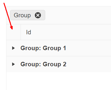
On a grid grouped by one or more fields, provide an option for end users to expand/collapse all rows at will. The following image is a suggestion of where this option (most likely a button) should appear:
On a grid grouped by a field (using GroupDescriptors) where the amount of records exceed the page limit, therefore generating multiple pages, provide an option to keep the collapsed/expanded states of the groups when navigating through the pages.
In-house we implemented the following approach to mitigate this issue: when calling OnRead event, after processing the data (order, filter, group, etc) we're mapping the groups and subgroups to its corresponding indexes. When page changing, we then store the current state of the groups, alongside its keys (aka the label of the group). After page changing and mapping the groups and subgroups again, we just match the group names stored in this temporary state with the group names of the new page and restore the state.
For example: start with all groups initially collapsed, page 1 has groupA and groupB and user expanded groupB, changed to page 2, which has the remaining records of groupB and groupC. In this case it will restore groupB as expanded while groupC keeps collapsed.
Example to demonstrate the issue: https://blazorrepl.telerik.com/melmEeFi43owNZBe50
Hi,
Can I request that the Pdf Viewer:
- Load multiple pdf files on open. Maybe via an array of file names.
- We use a different viewer due to this capability. For Human Resource files you need the ability to load numerous files into one viewer to show a complete
document. The current one file option doesn't work for us.
- Display thumbnails of the loaded pages.
- Thumbnail onclick to move to a specific page.
Regards,
Graham O'Riley
Steps to reproduce:
- Insert a simple TelerikGrid on your page
- Add Columns with templates for each property
- Specify a Column Template
See https://blazorrepl.telerik.com/GyPvFMFr00zLEEdG00
Problem / Inconvenience
- Context has to be converted/cast before access to the each property is possible
- Grid columns are not generic which makes them hard to use sometimes
- Fields have to be specified by name (may lead to wrong names after changing)
Solution / Feature Request
- Provide new generic columns (to ensure no current implementations break)
- Add [CascadingTypeParameter(nameof(TItem))] to the TelerikGrid
- GridColumns automatically "inherit" the typeparam TItem
Idea from: Blazor QuickGrid
Benefits
- GridColumns can be specified with Expression
- Template context does not have to be cast anymore
- Renaming properties affect expression or an error is display (property does not exist)
<GridColumn For="@(t => t.Name)">
        <Template>
                <div>
                    @item.Name
                </div>
        </Template>
</GridColumn>
Hi Team,
I am looking for captcha component to verify user as human like below screenshot. Please let me know if this feature is available

For example, selecting Bootstrap-Main-Dark theme in the Project Wizard does not apply the dark mode.
===ADMIN EDIT===
For the time being, a possible workaround is to manually add class="k-body" to the <body> tag of your application. This will ensure, that the dark mode is correctly applied. This is required because, by design, the Default theme does not enable the typography system. The "k-body" class is required for the typography system to work properly on the document level and apply the predefined typography values to the page. For more detailed information, refer to Design System Documentation.
Good Morning,
I have recently started getting random and repeated Javascript errors when debugging my project using your controls for Blazor. It is completely random (sometimes happens immediately at project start, sometimes when navigating to a new page, sometimes when interacting with a control). It is ALWAYS the same error....
TypeError: Cannot read properties of undefined (reading 'visible')
Message=
Source=
StackTrace:
at __webpack_modules__.8219.constructor.onMouseEnter (https://localhost:44307/_content/Telerik.UI.for.Blazor/js/telerik-blazor.js?v=ITaQSsBTBmdJoUpPr2KiZ7JwhfKjwa7SGa6zvlv9kkU:50:1442661)
I am using the most current version of your product. I have gone through your "Javascript Errors" page and have worked through all the suggestions. Nothing resolves it.
This is becoming a giant time sink while trying to work on a project. What can we do to get appropriate error handling on your end to prevent these issues?
Thanks
I get validation issues for the selection Checkboxes and the PageSizes dropdown as they do not have id or name attributes:
The behavior can be reproduced in the online demo: Blazor Data Grid - Overview
We would like to have in our app Charts the same functionality that you have in StockCharts.
Navigator:
https://docs.telerik.com/blazor-ui/components/stockchart/navigator
Crosshairs:
https://docs.telerik.com/blazor-ui/components/stockchart/crosshairs
Please expose the current data of the data bound select components when using OnRead. This will spare the need to cache data for the second time in-memory, or make a database request, or search by non-ID value when the app needs to obtain the full data item(s) for given component value(s).
This feature request is applicable to:
- AutoComplete
- ComboBox
- DropDownList
- MultiColumnComboBox
- MultiSelect
Using Microsoft Visual Studio Professional 2022 (64-bit) - Current Version 17.11.0
Trying to create a new Telerik for Blazor project using Telerik C# Blazor Application Template.
Visual Studio freezes after I Name the project and click create. Only way to exit out of Visual Studio is to kill it through task manager.
Trying your project walk through for Blazor, RpsTrackingBlazor, After I add the nuget packages and try to add the using statement to _imports.razor as in the tutorial I get the error that the type or namespace name telerik could not be found.
Your project uses <TargetFramework>netcoreapp3.1</TargetFramework>
I also tried framework net8.0
Hi, I just came accross a bug in the TelerikStepper.
I try to create a custom version that switches to a custom success icon after a step is completed.
It contains the following codesnippets:
<TelerikStepper Linear="true" ValueChanged="@HandleValueChanged">
    <StepperSteps>
        @for (int i = 0; i < IsValidArray.Length; i++)
        {
            <StepperStep Valid="@IsValidArray[i]"></StepperStep>
        }
    </StepperSteps>
</TelerikStepper>

@code {
    bool?[] IsValidArray = [null, null, null, null];

    public void HandleValueChanged(int index)
    {
        for (int i = 0; i < IsValidArray.Length; i++)
        {
            IsValidArray[i] = index > i ? true : null;
        }
    }
}
Forward it works like expected:
When moving backwards it behaves strange:


Except if you are debugging (Visual Studio debugger), then everything works as expected:

Same thing can be achived when not debugging but clicking on the step a second time.
This can not be solved by adding the @key parameter as suggested in https://feedback.telerik.com/blazor/1659827-bug-in-the-telerikstepper-in-blazor from Hristian Stefanov!
Nevertheless, it turns out that the Task.Delay(1); seems to solve the Issue somehow.
Is this intended?
Hi Telerik Team,
when using the (currently) latest versions of VS (17.11.0) and Blazor 8.0.8 runtimes (and custom css theme version 8.2.0) I get the following error when running my project in debug mode:
TypeError: Cannot read properties of null (reading 'classList')
Stapelüberwachung:
> at e.addClass (https://localhost:7038/_content/Telerik.UI.for.Blazor/js/telerik-blazor.js:50:1122923)
> at v.resetCallout (https://localhost:7038/_content/Telerik.UI.for.Blazor/js/telerik-blazor.js:50:1372516)
> at v.adjustCalloutPosition (https://localhost:7038/_content/Telerik.UI.for.Blazor/js/telerik-blazor.js:50:1372355)
> at e.invokeComponentMethod (https://localhost:7038/_content/Telerik.UI.for.Blazor/js/telerik-blazor.js:50:1112736)
> at https://localhost:7038/_framework/blazor.webassembly.js:1:2878
> at new Promise (<anonymous>)
> at b.beginInvokeJSFromDotNet (https://localhost:7038/_framework/blazor.webassembly.js:1:2835)
> at Object.vn [as invokeJSJson] (https://localhost:7038/_framework/blazor.webassembly.js:1:58849)
> at https://localhost:7038/_framework/dotnet.runtime.8.0.8.80cvijctdx.js:3:178428
> at Ll (https://localhost:7038/_framework/dotnet.runtime.8.0.8.80cvijctdx.js:3:179262)
It looks like the problem has something to do with a function that wants to set the css "k-callout-e" class to some object.
The problem appears in js when e is null in the following method:
e.classList.add(t)
In this case e = null and t = "k-callout-e". It seems there's no null check for e and VS 2022 reports the problem.
The debugger in VS cannot be disabled for js content as it seems it's the same debugger for Blazor itself.
When hitting F5 to continue multiple times the projects keeps running until it hits the same problem again.
In my project I added a single "TelerikTooltip" component for Tooltips. I tried disabling it but still the same problem.
Maybe the js code is used for some other component.
If you need more information just let me know.
Regards,
Tom
I just spent hours trying to understand why my grid did not work and threw a "source can't be null" exception at me when I set data to a 100% initialized - not null - list of a struct type.. Eventually I figured that the struct was the problem and turning it into a class fixed it, but that was just by chance.
Please for the sake of developer sanity give this a proper check.
We would like to see all the Blazor controls support the ability to show the time in the browser's local time as a feature that can be enabled. It should support converted from both UTC and server time.
A question on how to do this has been asked at least twice on the forums:
- https://www.telerik.com/forums/using-client-side-time-zone-for-time-columns-in-blazor-server-grid
- https://www.telerik.com/forums/utc-datetimes-as-local-datetimes-and-vice-versa
Some examples of how other's have implemented this as a control can be founde here:
- https://www.meziantou.net/convert-datetime-to-user-s-time-zone-with-server-side-blazor-time-provider.htm
- https://github.com/dustout/BlazorTime
Thanks
It stops working if you open it too fast. It goes into a state where no matter what you do (Rebind/changing data bound values etc.), it will not open and show items.
It can be reproduced easily by calling .Open() in OnInitializedAsync()
I have reproduced it without MS Playwright in REPL, so you can easily debug it.
https://blazorrepl.telerik.com/QIOUYoPc57iQKy6702
If you uncomment the await Task.Delay(3000); the code will work.
Expected behavior:
It is ok that Open() does nothing while the control is initializing. It is not ok that just because you called Open() once, then you are forever stuck without being able to open it later, no matter how long you wait or what you do with the items.
I do not want to insert random Delays in my code either as I expect the TelerikDropDownList to not malfunction just because I open it too early.
I hope you can prioritize this as right now the DropDownList is not usable for us.
Hi,
starting with version 6.0, dialogs used together with loading indicator are at wrong z-index order.
- None of hotfixes with "delay" helped.
- users are stucked and cant confirm anything
How to replicate
Click on "Show Confirm with loading indicator". Loading animation should be at BACK of confirm dialog(as at older versions, prior 6.0)
https://blazorrepl.telerik.com/GeOfQMkt56AMkdof43