Working with UI Blazor version 3.0.0
Setting a sort descriptor in the OnStateInitHandler.
Everything works, but I need to customize the sort. I need "A" and "a" to sort the same. I also need blanks to sort at the bottom. A custom sort method. Can't figure out how to implement a SortCompare, can't find an example.
Here's what I have
SortDescriptors = new List<SortDescriptor>(){
new SortDescriptor { Member = "lastname",
SortDirection = ListSortDirection.Ascending,
SortCompare=CustomCompare },
new SortDescriptor { Member = "lastname", SortDirection = ListSortDirection.Ascending }
},
This might not be considered a bug but since this behavior changed when we upgraded to 3.0, it might be considered as such unless there is no documentation about this (we have not been able to find it). I am still unsure where we are to just ask support questions, as the feedback portal seem to force us into either choosing feature or bug.
After upgrading to Telerik Blazor 3.0, the captions are suddenly above the fields and no longer to the left of them. This might be preferable in some cases, but it should then be something you enable/change yourself.
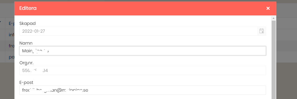
How can we control this behavior (probably via CSS)?
Is it perhaps a way we can also control so that the grids popup form gets more compact, like perhaps displaying the fields in two columns instead of the default of just one?
Thanks.
Dear Telerik!
As a developer I am very pleased with the UI components that you are providing for .NET Blazor systems.
Even though, we often update the datasource of an autocomplete field (e.g.: TelerikMultiSelect) using an HTTP request. And invoking this endpoint on every new character is not the most economic approach. We did some workaround with timers and etc. but this way the code become needlessly complicated and introduced new bugs also.
Please consider creating a component or enabling the existing ones with an event that is fired on every input changes. But it waits a little time after the last input change and keeps collecting the additional characters so the event can present batches of inputs.
Kind regards,
Balázs Koncz
Hi Telerik,
I have been using MudBlazor for my latest project (smaller one), but we are scaling up for another larger project now and are looking at the Telerik UI for Blazor.
Does Telerik UI for Blazor have an equivalent to the MudBlazor AppBar, an application wide top bar which is persistent through out the application life cycle?
Its able to contain other controls ie drawer icon, login/out button, spacers etc.
PS: See attached screen dump of the app bar.
Best regards
Ulrik
After the upgrade to 3.0 the auto size feature of TextArea when used inside the Window component no longer works.
PopupHeight is no longer a valid property.
After update to 3.0.0 TextArea autosize no longer works.
AutoSize is no longer one of the available properties.
Also Label is no longer an available property.
Blazor first steps bug in documentation, Primary="true" gives an error.
https://docs.telerik.com/blazor-ui/getting-started/server-blazor
Step 3 - Add a Telerik Component to a View
<TelerikButton OnClick="@SayHelloHandler" Primary="true">Say Hello</TelerikButton>
Primary = "true" gives an error with version 3, sb different for .net 6 and use ThemeColor
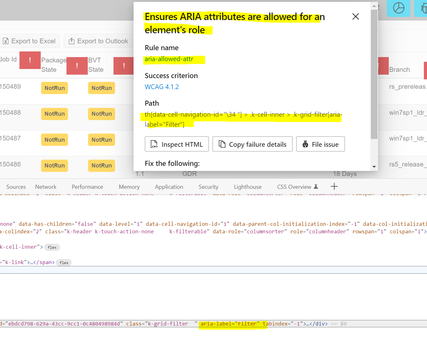
Accessibility Insights for Web extension is flagging the k-grid-filter icon in the Grid Header labels. Need workaround and remove the aria-label and replace with aria-role per guidance. Under each of the red explanation marks is the filter icon on the column. Running the Accessibility Insights for Web tool by Microsoft using Edge browser flags this code.
Please provide temporary workaround and permanent fix.
Blazor-UI 2.30 Release.
Is it possible to add to the carousel a thumbnail scrollable navigation below the "page/image"? I'm thinking this would be a nice addition, which would allow independent scrolling from that of the current page and also be clickable in the same way that the dots are in order to jump to the selected page.
----------ADMIN EDIT----------
The knowledge base article is now live - "Carousel Thumbnail Scrollable Navigation".
Thanks,
James
--- FOR FUTURE REQUEST ---
Could be very useful to scrolling tha grid to a specific item\row (in Normal Grd and also in Virtual Grid mode, both) programmatically. Whithout javascript.
For example after loading a grid that show 20 items, programmatically is it possible to go (and display in grid) not the first 20 rows but for example at row 100. So the vertical scrolling bar muso go dow sice arriving and show that row.
Best Regards
Paolo Leonesi
DatePicker shows format string when no value is selected. If you have a form a DatePicker bound to a nullable DateTime, it will show the formatting string when no value is selected, instead of just showing an empty box. This is very confusing to the end user compared to just an empty box. We have not found a way to change this.

In https://docs.telerik.com/blazor-ui/components/grid/manual-operations?_ga=2.192647914.1753502014.1641929648-330381368.1614276734
in the code section of Get Information From the DataSourceRequest you are using a @function instead of an @code. Still works, but so 2019.
The second issue, typo in https://github.com/telerik/blazor-ui/tree/master/grid/datasourcerequest-on-server readme, DataSourceRequet should be DataSourceRequest
In order to be able to easily work on mobile (tablet) and desktop browsers using touch it would be great if tree view supported multi select through a single click to select and click to unselect option without the need to hold down the ctrl key or anything like that
This can be worked around currently implementing a TreeView template and then the OnClick event to allow custom tracking of selected and unselected items but this feels like a common enough requirement for touch support that it would be great to support out of the box with the control
For example, I want to set the Sunday day to red or any other date to a special color.
<AdminEdit>
Here is a workaround that can be used until the feature is released
<style>
    .hide-calendar {
        display: none;
    }

    .special {
        color: red;
        font-weight: bold;
    }
</style>

<div style="width: 400px">
    <TelerikDateInput @bind-Value="@DateValue" Width="90%"></TelerikDateInput>
    <TelerikButton Icon="calendar"
                   OnClick="@( () => isClicked = !isClicked )">
    </TelerikButton>
</div>

<TelerikCalendar Class="@(!isClicked ? "hide-calendar" : "")"
                 @bind-Value="@DateValue"
                 OnCellRender="@OnCellRenderHandler"
                 Min="@(new DateTime(2000, 1, 1))"
                 Max="@(new DateTime(2090, 1, 1))">
</TelerikCalendar>

@code {
    private void OnCellRenderHandler(CalendarCellRenderEventArgs args)
    {
        if (args.View == CalendarView.Month)
        {
            args.Class = args.Date.Day % 3 == 0 ? "special" : "";
        }
        else if (args.View == CalendarView.Decade)
        {
            args.Class = args.Date.Year == 2020 ? "special" : "";
        }
    }

    private DateTime DateValue { get; set; } = DateTime.Today;

    private bool isClicked { get; set; }
}
</AdminEdit>