The 300ms default transition time for popups is too long for our app, and I would like an option to set it globally. It looks great on demos, but turns the interface into a sludge for doing real work.
The original solution to https://feedback.telerik.com/blazor/1469662-way-to-modify-default-values-of-animations-such-as-duration-and-delay-for-a-component-such-as-combobox (from 2020) allowed a default animation speed through css.
However, with the new PopupSettings approach, animation speed is hard coded into the style attribute on the .k-popup, thwarting any attempts to override it globally. Adding PopupSettings to all components in our app is hardly a workable solution. The only workaround I've figured out so far is to disable animations on .k-popups alltogether (by adding a "transition: none" to .k-input)
Currently we have 2 SelectionMode to select from in the ButtonGroup. I would like to have a third option that is a mix betwen Single and Multiple.
This third option should work like the Multiple mode but don't allow the user to deselect all ToggleButtons, like in the Single mode at least one button is allways selected. If the user clicks on the last selected Togglebutton he will not be able to deselect it.
Hello,
I am using the TelerikSkeleton component for Blazor and noticed the pulse and wave animations are not working. It seems animation also does not work in your examples here, while it works in Telerik REPL (that's where I could identify the issue)
For my application, I made my custom theme with ThemeBuilder and then imported it into my project as instructed. Going through the css file, I found where the bug is:
How it was:
.k-skeleton-pulse .k-skeleton {
    animation:k-skeleton-pulse 1.5s ease-in-out .5s infinite
}
After my changes:
.k-skeleton-pulse.k-skeleton {
     animation:k-skeleton-pulse 1.5s ease-in-out .5s infinite
}
The only thing I did was I removed the space between the two classes and now it works.
Note: I selected "WebAssembly" as application type, but I am actually using it for both a Razor class library and a .NET MAUI Blazor application.
One really nice feature MudBlazor UI has is the Dialog component. You can pass a component to the Dialog Service and it will display it in a modal dialog.
An example of this would be:
             var orderParams = new DialogParameters();
                orderParams.Add("SelectedOrderHeader", Item);
                orderParams.Add("EditMode", "Add");
                orderParams.Add("SelectedOrderDetail", new OMSOrderDetail());

                DialogService.Show<OrdersDetailForm>("Click on orders grid to continue", orderParams);
<OrderDetailsForm> is a custom Blazor component.
Does the Telerik Blazor dev team have any plans for implementing something like this?
Hi,
it would be nice to have a single button in the GridToolbar that opens the column chooser menu or something like that (popup?).
Often we need to save space in a grid and disable the menu option for the columns but then we lose the ability to choose which columns the user might want to disable. This also apply to very small columns with small header information, e.g. if you just need 2 or 3 letters to describe the column data then the menu with its three dotted button is to large.
Best Regards,
Thomas
I would really like to see a flyout control. Something like the below

This would allow me to attach a popup dialog to a control instead of just doing a dialog at the center of the screen.
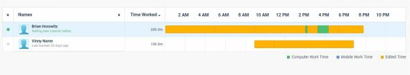
I need to track users activity per day like this, it is possible to do with any of the current components scheduler timeline? can you provide such option/component?
Need to include different colors in the bar. We were using google charts timeline but it is discontinued.
While using Safari browser, I am getting following exception message:
SyntaxError: Unexpected private name #a. Cannot parse class method with private name.
blazor.webassembly.js:1:35655crit: Microsoft.AspNetCore.Components.WebAssembly.Rendering.WebAssemblyRenderer[100]
Unhandled exception rendering component: Could not find 'TelerikBlazor.getLocationHost' ('TelerikBlazor' was undefined).
https://mywebsite.com/_framework/blazor.webassembly.js:1:337
forEach@[native code]
findFunction@https://mywebsite.com/_framework/blazor.webassembly.js:1:303
https://mywebsite.com/_framework/blazor.webassembly.js:1:3326
Promise@[native code]
beginInvokeJSFromDotNet@https://mywebsite.com/_framework/blazor.webassembly.js:1:3317
St@https://mywebsite.com/_framework/blazor.webassembly.js:1:59961
_mono_wasm_invoke_js_blazor@https://mywebsite.com/_framework/dotnet.6.0.9.6fcfkep18v.js:1:195318
wasm-stub@[wasm code]
<?>.wasm-function[219]@[wasm code]
<?>.wasm-function[167]@[wasm code]
<?>.wasm-function[166]@[wasm code]
<?>.wasm-function[2815]@[wasm code]
<?>.wasm-function[1619]@[wasm code]
<?>.wasm-function[1623]@[wasm code]
<?>.wasm-function[118]@[wasm code]
wasm-stub@[wasm code]
118@[native code]
https://mywebsite.com/_framework/dotnet.6.0.9.6fcfkep18v.js:1:219007
managed_BINDINGS_SetTaskSourceResult
https://mywebsite.com/_framework/dotnet.6.0.9.6fcfkep18v.js:1:154658
promiseReactionJob@[native code]
Microsoft.JSInterop.JSException: Could not find 'TelerikBlazor.getLocationHost' ('TelerikBlazor' was undefined).
https://mywebsite.com/_framework/blazor.webassembly.js:1:337
forEach@[native code]
findFunction@https://mywebsite.com/_framework/blazor.webassembly.js:1:303
https://mywebsite.com/_framework/blazor.webassembly.js:1:3326
Promise@[native code]
beginInvokeJSFromDotNet@https://mywebsite.com/_framework/blazor.webassembly.js:1:3317
St@https://mywebsite.com/_framework/blazor.webassembly.js:1:59961
_mono_wasm_invoke_js_blazor@https://mywebsite.com/_framework/dotnet.6.0.9.6fcfkep18v.js:1:195318
wasm-stub@[wasm code]
<?>.wasm-function[219]@[wasm code]
<?>.wasm-function[167]@[wasm code]
<?>.wasm-function[166]@[wasm code]
<?>.wasm-function[2815]@[wasm code]
<?>.wasm-function[1619]@[wasm code]
<?>.wasm-function[1623]@[wasm code]
<?>.wasm-function[118]@[wasm code]
wasm-stub@[wasm code]
118@[native code]
https://mywebsite.com/_framework/dotnet.6.0.9.6fcfkep18v.js:1:219007
managed_BINDINGS_SetTaskSourceResult
https://mywebsite.com/_framework/dotnet.6.0.9.6fcfkep18v.js:1:154658
promiseReactionJob@[native code]
at Microsoft.JSInterop.JSRuntime.<InvokeAsync>d__16`1[[System.String, System.Private.CoreLib, Version=6.0.0.0, Culture=neutral, PublicKeyToken=7cec85d7bea7798e]].MoveNext()
at Telerik.Blazor.Components.Dialog.DialogBuilder.OnAfterRenderAsync(Boolean firstRender)
at Microsoft.AspNetCore.Components.RenderTree.Renderer.GetErrorHandledTask(Task , ComponentState )
5blazor.webassembly.js:1:35655crit: Microsoft.AspNetCore.Components.WebAssembly.Rendering.WebAssemblyRenderer[100]
Unhandled exception rendering component: Could not find 'TelerikBlazor.initMediaQuery' ('TelerikBlazor' was undefined).
https://mywebsite.com/_framework/blazor.webassembly.js:1:337
forEach@[native code]
findFunction@https://mywebsite.com/_framework/blazor.webassembly.js:1:303
https://mywebsite.com/_framework/blazor.webassembly.js:1:3326
Promise@[native code]
beginInvokeJSFromDotNet@https://mywebsite.com/_framework/blazor.webassembly.js:1:3317
St@https://mywebsite.com/_framework/blazor.webassembly.js:1:59961
_mono_wasm_invoke_js_blazor@https://mywebsite.com/_framework/dotnet.6.0.9.6fcfkep18v.js:1:195318
wasm-stub@[wasm code]
<?>.wasm-function[219]@[wasm code]
<?>.wasm-function[167]@[wasm code]
<?>.wasm-function[166]@[wasm code]
<?>.wasm-function[2815]@[wasm code]
<?>.wasm-function[1619]@[wasm code]
<?>.wasm-function[1623]@[wasm code]
<?>.wasm-function[118]@[wasm code]
wasm-stub@[wasm code]
118@[native code]
https://mywebsite.com/_framework/dotnet.6.0.9.6fcfkep18v.js:1:219007
managed_BINDINGS_SetTaskSourceResult
https://mywebsite.com/_framework/dotnet.6.0.9.6fcfkep18v.js:1:154658
promiseReactionJob@[native code]
Microsoft.JSInterop.JSException: Could not find 'TelerikBlazor.initMediaQuery' ('TelerikBlazor' was undefined).
https://mywebsite.com/_framework/blazor.webassembly.js:1:337
forEach@[native code]
findFunction@https://mywebsite.com/_framework/blazor.webassembly.js:1:303
https://mywebsite.com/_framework/blazor.webassembly.js:1:3326
Promise@[native code]
beginInvokeJSFromDotNet@https://mywebsite.com/_framework/blazor.webassembly.js:1:3317
St@https://mywebsite.com/_framework/blazor.webassembly.js:1:59961
_mono_wasm_invoke_js_blazor@https://mywebsite.com/_framework/dotnet.6.0.9.6fcfkep18v.js:1:195318
wasm-stub@[wasm code]
<?>.wasm-function[219]@[wasm code]
<?>.wasm-function[167]@[wasm code]
<?>.wasm-function[166]@[wasm code]
<?>.wasm-function[2815]@[wasm code]
<?>.wasm-function[1619]@[wasm code]
<?>.wasm-function[1623]@[wasm code]
<?>.wasm-function[118]@[wasm code]
wasm-stub@[wasm code]
118@[native code]
https://mywebsite.com/_framework/dotnet.6.0.9.6fcfkep18v.js:1:219007
managed_BINDINGS_SetTaskSourceResult
https://mywebsite.com/_framework/dotnet.6.0.9.6fcfkep18v.js:1:154658
promiseReactionJob@[native code]
at Microsoft.JSInterop.JSRuntime.<InvokeAsync>d__16`1[[System.Boolean, System.Private.CoreLib, Version=6.0.0.0, Culture=neutral, PublicKeyToken=7cec85d7bea7798e]].MoveNext()
at Telerik.Blazor.Components.TelerikMediaQuery.InitMediaQueryWidget()
at Telerik.Blazor.Components.TelerikMediaQuery.OnAfterRenderAsync(Boolean firstRender)
at Microsoft.AspNetCore.Components.RenderTree.Renderer.GetErrorHandledTask(Task , ComponentState )
blazor.webassembly.js:1:35655crit: Microsoft.AspNetCore.Components.WebAssembly.Rendering.WebAssemblyRenderer[100]
Unhandled exception rendering component: Could not find 'TelerikBlazor.initDrawer' ('TelerikBlazor' was undefined).
https://mywebsite.com/_framework/blazor.webassembly.js:1:337
forEach@[native code]
findFunction@https://mywebsite.com/_framework/blazor.webassembly.js:1:303
https://mywebsite.com/_framework/blazor.webassembly.js:1:3326
Promise@[native code]
beginInvokeJSFromDotNet@https://mywebsite.com/_framework/blazor.webassembly.js:1:3317
St@https://mywebsite.com/_framework/blazor.webassembly.js:1:59961
_mono_wasm_invoke_js_blazor@https://mywebsite.com/_framework/dotnet.6.0.9.6fcfkep18v.js:1:195318
wasm-stub@[wasm code]
<?>.wasm-function[219]@[wasm code]
<?>.wasm-function[167]@[wasm code]
<?>.wasm-function[166]@[wasm code]
<?>.wasm-function[2815]@[wasm code]
<?>.wasm-function[1619]@[wasm code]
<?>.wasm-function[1623]@[wasm code]
<?>.wasm-function[118]@[wasm code]
wasm-stub@[wasm code]
118@[native code]
https://mywebsite.com/_framework/dotnet.6.0.9.6fcfkep18v.js:1:219007
managed_BINDINGS_SetTaskSourceResult
https://mywebsite.com/_framework/dotnet.6.0.9.6fcfkep18v.js:1:154658
promiseReactionJob@[native code]
Microsoft.JSInterop.JSException: Could not find 'TelerikBlazor.initDrawer' ('TelerikBlazor' was undefined).
https://mywebsite.com/_framework/blazor.webassembly.js:1:337
forEach@[native code]
findFunction@https://mywebsite.com/_framework/blazor.webassembly.js:1:303
https://mywebsite.com/_framework/blazor.webassembly.js:1:3326
Promise@[native code]
beginInvokeJSFromDotNet@https://mywebsite.com/_framework/blazor.webassembly.js:1:3317
St@https://mywebsite.com/_framework/blazor.webassembly.js:1:59961
_mono_wasm_invoke_js_blazor@https://mywebsite.com/_framework/dotnet.6.0.9.6fcfkep18v.js:1:195318
wasm-stub@[wasm code]
<?>.wasm-function[219]@[wasm code]
<?>.wasm-function[167]@[wasm code]
<?>.wasm-function[166]@[wasm code]
<?>.wasm-function[2815]@[wasm code]
<?>.wasm-function[1619]@[wasm code]
<?>.wasm-function[1623]@[wasm code]
<?>.wasm-function[118]@[wasm code]
wasm-stub@[wasm code]
118@[native code]
https://mywebsite.com/_framework/dotnet.6.0.9.6fcfkep18v.js:1:219007
managed_BINDINGS_SetTaskSourceResult
https://mywebsite.com/_framework/dotnet.6.0.9.6fcfkep18v.js:1:154658
promiseReactionJob@[native code]
at Microsoft.JSInterop.JSRuntime.<InvokeAsync>d__16`1[[System.Object, System.Private.CoreLib, Version=6.0.0.0, Culture=neutral, PublicKeyToken=7cec85d7bea7798e]].MoveNext()
at Telerik.Blazor.Components.TelerikDrawer`1.<InitDrawer>d__131[[eDubaiTaaruf2022.Shared.MenuItemModel, eDubaiTaaruf2022.Shared, Version=1.0.0.0, Culture=neutral, PublicKeyToken=null]].MoveNext()
at Telerik.Blazor.Components.TelerikDrawer`1.<OnAfterRenderAsync>d__121[[eDubaiTaaruf2022.Shared.MenuItemModel, eDubaiTaaruf2022.Shared, Version=1.0.0.0, Culture=neutral, PublicKeyToken=null]].MoveNext()
at Microsoft.AspNetCore.Components.RenderTree.Renderer.GetErrorHandledTask(Task , ComponentState )
6blazor.webassembly.js:1:35655crit: Microsoft.AspNetCore.Components.WebAssembly.Rendering.WebAssemblyRenderer[100]
Unhandled exception rendering component: Could not find 'TelerikBlazor.initMediaQuery' ('TelerikBlazor' was undefined).
https://mywebsite.com/_framework/blazor.webassembly.js:1:337
forEach@[native code]
findFunction@https://mywebsite.com/_framework/blazor.webassembly.js:1:303
https://mywebsite.com/_framework/blazor.webassembly.js:1:3326
Promise@[native code]
beginInvokeJSFromDotNet@https://mywebsite.com/_framework/blazor.webassembly.js:1:3317
St@https://mywebsite.com/_framework/blazor.webassembly.js:1:59961
_mono_wasm_invoke_js_blazor@https://mywebsite.com/_framework/dotnet.6.0.9.6fcfkep18v.js:1:195318
wasm-stub@[wasm code]
<?>.wasm-function[219]@[wasm code]
<?>.wasm-function[167]@[wasm code]
<?>.wasm-function[166]@[wasm code]
<?>.wasm-function[2815]@[wasm code]
<?>.wasm-function[1619]@[wasm code]
<?>.wasm-function[1623]@[wasm code]
<?>.wasm-function[118]@[wasm code]
wasm-stub@[wasm code]
118@[native code]
https://mywebsite.com/_framework/dotnet.6.0.9.6fcfkep18v.js:1:219007
managed_BINDINGS_SetTaskSourceResult
https://mywebsite.com/_framework/dotnet.6.0.9.6fcfkep18v.js:1:154658
promiseReactionJob@[native code]
Microsoft.JSInterop.JSException: Could not find 'TelerikBlazor.initMediaQuery' ('TelerikBlazor' was undefined).
https://mywebsite.com/_framework/blazor.webassembly.js:1:337
forEach@[native code]
findFunction@https://mywebsite.com/_framework/blazor.webassembly.js:1:303
https://mywebsite.com/_framework/blazor.webassembly.js:1:3326
Promise@[native code]
beginInvokeJSFromDotNet@https://mywebsite.com/_framework/blazor.webassembly.js:1:3317
St@https://mywebsite.com/_framework/blazor.webassembly.js:1:59961
_mono_wasm_invoke_js_blazor@https://mywebsite.com/_framework/dotnet.6.0.9.6fcfkep18v.js:1:195318
wasm-stub@[wasm code]
<?>.wasm-function[219]@[wasm code]
<?>.wasm-function[167]@[wasm code]
<?>.wasm-function[166]@[wasm code]
<?>.wasm-function[2815]@[wasm code]
<?>.wasm-function[1619]@[wasm code]
<?>.wasm-function[1623]@[wasm code]
<?>.wasm-function[118]@[wasm code]
wasm-stub@[wasm code]
118@[native code]
https://mywebsite.com/_framework/dotnet.6.0.9.6fcfkep18v.js:1:219007
managed_BINDINGS_SetTaskSourceResult
https://mywebsite.com/_framework/dotnet.6.0.9.6fcfkep18v.js:1:154658
promiseReactionJob@[native code]
at Microsoft.JSInterop.JSRuntime.<InvokeAsync>d__16`1[[System.Boolean, System.Private.CoreLib, Version=6.0.0.0, Culture=neutral, PublicKeyToken=7cec85d7bea7798e]].MoveNext()
at Telerik.Blazor.Components.TelerikMediaQuery.InitMediaQueryWidget()
at Telerik.Blazor.Components.TelerikMediaQuery.OnAfterRenderAsync(Boolean firstRender)
at Microsoft.AspNetCore.Components.RenderTree.Renderer.GetErrorHandledTask(Task , ComponentState )
It would be great if touch support could be added to the Blazor carousel component, to make it possible to swipe left and right on mobile devices. Presumably it would also drag left and right with a mouse on laptop/desktop machines.
At the moment the component isn't really usable on a modern website as it does not behave as users expect on mobile devices such as phones and tablets.
Please create clean formatting button. It should work similar to the clean formatting button in the "Send Email" window in this demo https://demos.telerik.com/reporting/dashboard.
When you click the new button, if the text has any formatting (bold, italic, etc.), the formatting will be removed (the text will no longer be bold, italic, etc).
After upgrading to Telerik Version 3.6.1 my CSS is messed up on my grids, the pagers look like the image below.

Telerik.Blazor.DialogFactory
User types in an input string, but they have to click 'ok' with the mouse to proceed - typing enter does nothing
I'm using a numeric textbox to handle a decimal value with the Format is set to "#,0" (which it needs to be since the client's specification is to have a whitespace as a decimal separator). While the entered value is less than a thousand then the entire value gets selected when tabbing into the component, but once it's large enough to display a group separator tabbing just puts the cursor at the end of the input without selecting the value.
I believe this to be a bug.
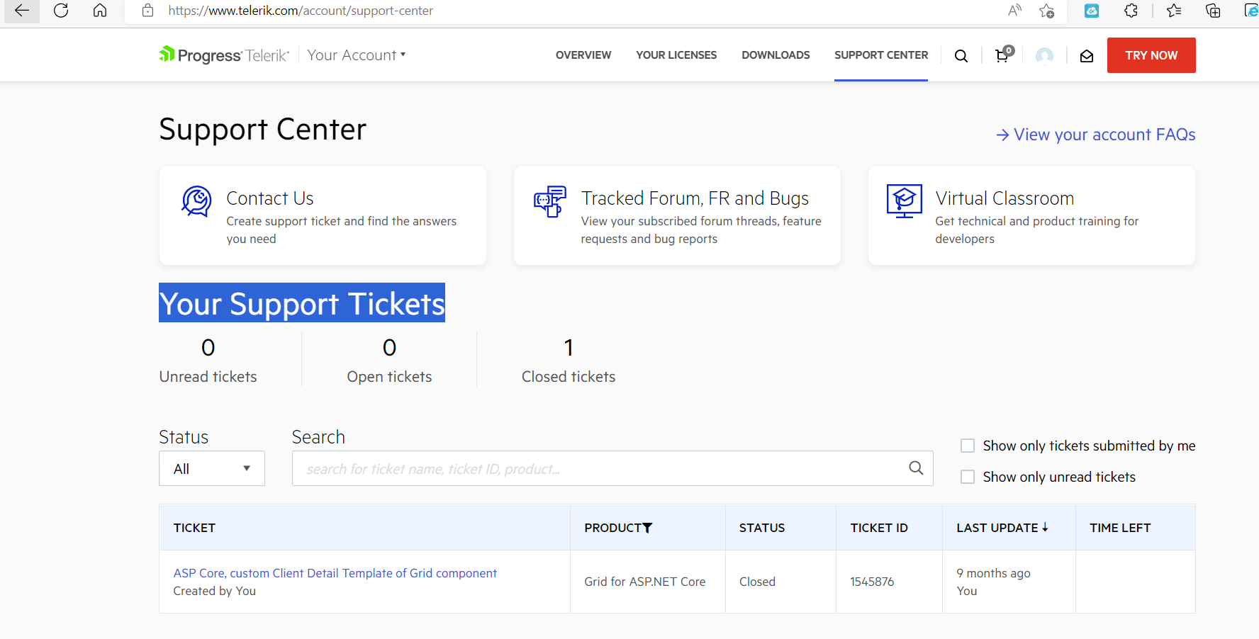
Today I submitted ticket Telerik VS 2022 Extensions break IntelliSense/typing in Visual Studio 2022 Version 17.3.4 but it doesn't show on Support Center under 'Your Support Tickets'. The only ticket that shows is from 9 months ago.
BTW, I'm reporting this thicket and previous ticket under UI for Blazor because I didn't see how to report it for the Extensions and for Support Center. Maybe that's another thing you need to look at?