Currently we have 2 SelectionMode to select from in the ButtonGroup. I would like to have a third option that is a mix betwen Single and Multiple.
This third option should work like the Multiple mode but don't allow the user to deselect all ToggleButtons, like in the Single mode at least one button is allways selected. If the user clicks on the last selected Togglebutton he will not be able to deselect it.
I would really like to see a flyout control. Something like the below
This would allow me to attach a popup dialog to a control instead of just doing a dialog at the center of the screen.
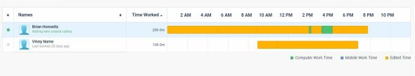
I need to track users activity per day like this, it is possible to do with any of the current components scheduler timeline? can you provide such option/component?
Need to include different colors in the bar. We were using google charts timeline but it is discontinued.
Pretty simple. With each release the product examples in the Github repo should be updated.
For example, I am looking at the drawer -> sidenav example. Before I can even run the example, I now need to go through all the code to make the updates from 2.14.1 to 3.4.0. Some of the changes that I have to make are:
- TelerikButton no longer supports the Primary attribute
- Drawer content needs now needs to be in a <DrawerContent> element not <Content>
I should not have to make these updates to look at an example, especially when it is referenced from a forum posting.
I should just be able to compile and run the example.
As a user, I would like to ability to pin one to many row(s) in a grid so that the pinned rows are always the first rows at the top of the grid.
If a filter is applied, the pinned records that match the filter should be displayed first. Non matching rows may be hidden.
If a column sort is changed, the pinned rows should be sorted then the unpinned rows should be sorted to ensure the pinned rows are always at the top of the grid.
As a developer, Pinning should be a optional feature configured when the grid is setup.
This essentially would only add a data populated "pin" column the user can toggle on or off, but the real effort in this request is around the sorting and filtering to ensure when the user clicks a column the event is captured, and the sort is submitted as pin column, then the selected column, to ensure the pin takes precedent.
.jpg)
We need this existing control in a Blazor based control:
https://www.telerik.com/aspnet-core-ui/skeleton-container
We'll need to fall back to MudBlazor who does support this control.
We are existing licensed users under AVEVA.
Hi,
I had to figure this out myself for the ComboBoxSettings because there is no documentation for this.
The MinWidth works from the Combobox width or greater extending the size of the popup and
MaxWidth only creates a popup width of the Combobox only.
Please document this feature and how to use it. And, is this intentional because it wasn't intuitive for me to figure out.
I created a REPL for you to test this out for yourself.
I saw the FloatingActionButton Web control available in KendoUI and ASP.NET Core and I would like it in UI for Blazor: https://demos.telerik.com/kendo-ui/floatingactionbutton/index
Create a general purpose component to allow dragging and dropping of other components or files from the filesystem. Expose events that let us get access to the files that were dropped so that we can access the contents of those files or send them off to be uploaded.
Currently in Blazor we can do this with the InputFile component. But I would like the ability to create a droppable UI and have any kind of child content in it. And also get at the file content of files dropped.
I'm using telerik UI for blazor and encoutering a problem. I'm displaying into line charts data (sometimes aggregated), I'd like to trigger an event when clicking on a specific point on the line, is that possible with ChartSeries ? I saw that onSeriesClicked works well for all other types of chart (Bar,Pie,etc.) But when displaying a Line chart nothing is triggered...
Could anyone help me ?
Working with UI Blazor version 3.0.0
Setting a sort descriptor in the OnStateInitHandler.
Everything works, but I need to customize the sort. I need "A" and "a" to sort the same. I also need blanks to sort at the bottom. A custom sort method. Can't figure out how to implement a SortCompare, can't find an example.
Here's what I have
SortDescriptors = new List<SortDescriptor>(){
new SortDescriptor { Member = "lastname",
SortDirection = ListSortDirection.Ascending,
SortCompare=CustomCompare },
new SortDescriptor { Member = "lastname", SortDirection = ListSortDirection.Ascending }
},
Is it possible to add to the carousel a thumbnail scrollable navigation below the "page/image"? I'm thinking this would be a nice addition, which would allow independent scrolling from that of the current page and also be clickable in the same way that the dots are in order to jump to the selected page.
----------ADMIN EDIT----------
The knowledge base article is now live - "Carousel Thumbnail Scrollable Navigation".
Thanks,
James
In order to be able to easily work on mobile (tablet) and desktop browsers using touch it would be great if tree view supported multi select through a single click to select and click to unselect option without the need to hold down the ctrl key or anything like that
This can be worked around currently implementing a TreeView template and then the OnClick event to allow custom tracking of selected and unselected items but this feels like a common enough requirement for touch support that it would be great to support out of the box with the control
Incremental Search A grid that can be searched incrementally as one types in the search box.
On-demand Sort It should have the ability to do a toggle between ascending and descending sort order when the user taps on a column header.
Pagination It should provide customizable pagination so only one page worth of data is fetched at any given time.
Did I describe the jQuery Datatable functionality? It is because it is so good and having the equivalent of its server-side implementation equivalent in Blazor will be awesome.
Implementation Thoughts The control sends a predefined model to an event bound function as parameter. The model has the information like requested page, column-sort request, letters the user typed into the search box etc. The function fetches data based on the model and the grid updates dynamically.