Hi,
I haven't been able to find this as a request or as a topic of discussion (If it iss feel free to point me to it and close this request) but I feel the Grouping feature is limiting. If I use the group field in say the DropDownList the grouping works fine but it orders it alphabetically.
I propose adding a number of features to enhance this. The first being a GroupAscending or GroupDescending tag. Takes a boolean value and allows you to change the order to ascending (default/True) or descending (False).
The second, and more complicated feature upgrade could be a GroupOrder tag. This would take a List of the group field names ordered in the way you require and apply that order to the grouping in the DropDownList. for instance if you had the list ordered as Category 1, Category 3, Category 2 it would display the items in each grouping in that order top to bottom.
Regards,
Luke
Currently, the Splitbar of the TelerikSplitter is rather small.
It can be adjusted with CSS as shown here (https://blazorrepl.telerik.com/wnEfmyYp50ldIHsF13) but if the overall height of the page is large, the small arrow-icon that needs to be clicked in order to expand a collapsed SplitPane must be scrolled into view first.
It would be great to add alternative ways to expand a SplitPane, e.g. on a Double-Click on the Splitbar or maybe an additional Button.
Can you update the templates that come with Telerik Blazor?
For example, you are using an EditForm control instead of the telerik Blazor Form control.
There is an expression, eat your own dog food. I often spin up template projects to play with new features or tweak existing ones. Be nice take full advantage of current state of blazor components and provide samples that people can use as a learning tool or launching point.
Peter
For Example, I have DTO like below, how on Form I will Display Lable for FormItem from value get from Display Name
public class DepartmentRequestDTO{
[Display(Name = "Department Id")]
[Required(ErrorMessage = "Department Id" + ErrorConstant.RequiredMsg)]
public int DepartmentId { get; set; }
[Display(Name = "Department Name")]
//[Required(ErrorMessage = "Department Name" + ErrorConstant.RequiredMsg)]
[Required]
[StringLength(50, MinimumLength = 3)]
public string Name { get; set; }
[Display( Name = "Remarks")]
//[Required(ErrorMessage = "Remarks" + ErrorConstant.RequiredMsg)]
[StringLength(250, MinimumLength = 3)]
public string Remarks { get; set; }
}
The Visible parameter removes the underlying render fragment when set to false.
Please expose APIs (maybe Show/Hide methods) to keep the DOM in tree but only modify visibility / display CSS attributes to hide/show the telerik window element. This would allow developer to retain content / state of the window which may need to be displayed very frequently.
Hi,
Could you expose the Print Command of Blazor PDF Viewer? I would like to call it from within my code.
Regards
Gerald Man
The Theme Builder contains a really nice looking Popover control, and I was a bit disappointed to discover that this doesn't seem to be documented or supported in UI for Blazor.
I realize I can probably use the Tooltip to achieve a similar effect, with two caveats:
- Tooltip requires of substantial CSS hacking to appear as the Popover control.
- The Popover closes on an explicit event, whereas Tooltip closes when it loses focus.
Is there any chance a Popover control is planned for a future release?
Currently we have 2 SelectionMode to select from in the ButtonGroup. I would like to have a third option that is a mix betwen Single and Multiple.
This third option should work like the Multiple mode but don't allow the user to deselect all ToggleButtons, like in the Single mode at least one button is allways selected. If the user clicks on the last selected Togglebutton he will not be able to deselect it.
I would really like to see a flyout control. Something like the below
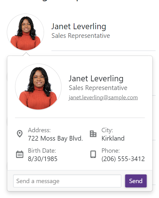
This would allow me to attach a popup dialog to a control instead of just doing a dialog at the center of the screen.
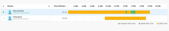
I need to track users activity per day like this, it is possible to do with any of the current components scheduler timeline? can you provide such option/component?
Need to include different colors in the bar. We were using google charts timeline but it is discontinued.
Pretty simple. With each release the product examples in the Github repo should be updated.
For example, I am looking at the drawer -> sidenav example. Before I can even run the example, I now need to go through all the code to make the updates from 2.14.1 to 3.4.0. Some of the changes that I have to make are:
- TelerikButton no longer supports the Primary attribute
- Drawer content needs now needs to be in a <DrawerContent> element not <Content>
I should not have to make these updates to look at an example, especially when it is referenced from a forum posting.
I should just be able to compile and run the example.
As a user, I would like to ability to pin one to many row(s) in a grid so that the pinned rows are always the first rows at the top of the grid.
If a filter is applied, the pinned records that match the filter should be displayed first. Non matching rows may be hidden.
If a column sort is changed, the pinned rows should be sorted then the unpinned rows should be sorted to ensure the pinned rows are always at the top of the grid.
As a developer, Pinning should be a optional feature configured when the grid is setup.
This essentially would only add a data populated "pin" column the user can toggle on or off, but the real effort in this request is around the sorting and filtering to ensure when the user clicks a column the event is captured, and the sort is submitted as pin column, then the selected column, to ensure the pin takes precedent.
.jpg)
We need this existing control in a Blazor based control:
https://www.telerik.com/aspnet-core-ui/skeleton-container
We'll need to fall back to MudBlazor who does support this control.
We are existing licensed users under AVEVA.
Hi,
I had to figure this out myself for the ComboBoxSettings because there is no documentation for this.
The MinWidth works from the Combobox width or greater extending the size of the popup and
MaxWidth only creates a popup width of the Combobox only.
Please document this feature and how to use it. And, is this intentional because it wasn't intuitive for me to figure out.
I created a REPL for you to test this out for yourself.