Not sure if this is already in the works but when building mvc grids it would be helpful to have the ability to prevent a column from getting too big when the screen size is larger than the grid needs. Right now if columns are turned off and there is more space for the unlocked columns, they expand to fill the page which is normally fine but in some instances it looks silly to have a column for example that you would enter a 2 digit number in to be 300 plus px wide.
Describe the bug
Column headers do not resize properly in IE11 when scrollable is set to false. Regression introduced in 2021.3.914.
To reproduce
Steps to reproduce the behavior:
The column headers are squished to the left side.
Expected behavior
Columns headers must have the same width as the respective columns.
Workaround:
.k-ie .k-grid-header {
  display: table-header-group;
}
Affected package (please remove the unneeded items)
- theme-default
- theme-bootstrap
- theme-material
Affected suites (please remove the unneeded items)
- Kendo UI for jQuery
Affected browsers (please remove the unneeded items)
- IE version: 11
Build system information (please remove the unneeded items)
- Not Applicable
Bug report
Error is thrown when using Kendo HTML Editor Control in Kendo Grid Popup EditorTemplate in IE only
Reproduction of the problem
Place Kendo editor in Grid popup template
@(Html.Kendo().Grid<TelerikMvcApp2.Models.Person>().Name("persons")
.DataSource(dataSource => dataSource
.Ajax()
.Model(model => model.Id(m => m.PersonID))
.Read(read => read.Action("GetPersons", "Home"))
.Update(up => up.Action("UpdatePerson", "Home"))
)
.Columns(columns =>
{
columns.Bound(c => c.PersonID).Width(200);
columns.Bound(c => c.Name);
columns.Bound(c => c.BirthDate).Format("{0:g}");
columns.Command(cmd => cmd.Edit());
})
.Pageable()
.Sortable()
.Editable(ed => ed.Mode(GridEditMode.PopUp).TemplateName("Person"))
)
Person.cshtml
@(Html.Kendo().EditorFor(model => model.Text))
1. Run and open in IE
2. Click edit, make a change in the popup and Save
2. Click again on Edit
https://www.screencast.com/t/kZFZ9hZNEp
Expected/desired behavior
No error is thrown
Environment
Kendo UI version: 2020.3.118
there seems to be a bug in your commands column and it's made worse when loading/saving grid layouts.
When i load a page with this grid column definition,
.Groupable()
                    .Columns(columns =>
                    {
                        columns.Command(cmd => cmd.Custom("Undelete")
                            .Click("undelete"))
                            .Width(60);
when you inspect the grid, the grid internally shows two classes for the command cell:
attributes: {class: 'k-command-cell k-command-cell'}
now, if i apply a grid layout, the problem gets worse. This sample code will cause the dom to end up with multiple k-command-cell classes on the grid's td element.
$("#UndeleteGrid").data("kendoGrid").setOptions($("#UndeleteGrid").data("kendoGrid").getOptions())<td class="k-command-cell k-command-cell k-command-cell k-command-cell k-command-cell k-command-cell k-command-cell k-command-cell k-command-cell" role="gridcell"><a role="button" class="k-button k-grid-Undelete" href="#" title="Undelete"><span class="k-icon k-i-undo"></span></a></td>I'd like to request to be able to merge cells and column filters with the built-in API for the Kendo UI Grid.
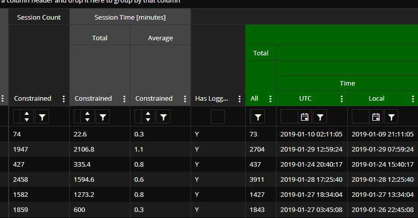
When the page first loads, everything looks okay...
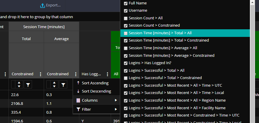
But if I show a hidden column...
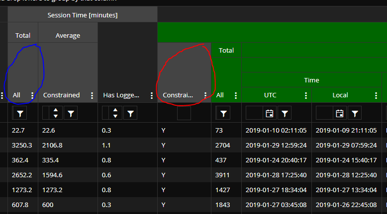
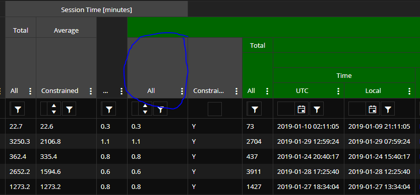
Here's what happens...
The newly shown column is circled in blue. The problem, as you can see, is that the position of the column circled in red should actually be swapped with the column to the left of it. And column #2 (ordering from left to right in the picture, starting from #1) now has an incorrect parent header ("Average") - it should be "Total". And column #4 (the one circled in red), "Constrained", should have a parent header of "Average" (that gray one in column #2).
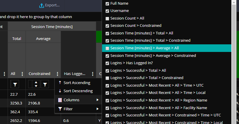
And just FYI, if I show another column (which should also be under "Session Time [minutes]")...
...then here's what we get...
(Newly shown column circled in blue.)
But, you can see that the data columns are placed correctly. Just not the headers.
I was try to upgrade Telerik UI for Asp.Net to 2020.2.513 form 2019.3.1023 ,but after I done the upgrade ,
the checkbox in the grid was disappeared with nothing change in my code.
I use the simple function columns.Select(), it seems the <label for='xxx#' class='k-checkbox-label k-no-text'></label> no been build.
Is there anything I need to do after upgrade ?
Hey,
I might have found another bug.
The "Change" Event isn't triggered for checkboxes if GroupPaging is set to true.
If it's disabled, the event gets caught as expected.
Html.Kendo().Grid<PlotWhitelistViewModel>()

.Name("whitelistGrid")

                   .Columns(c =>
                   {
                       c.Bound(x => x.Id).Hidden();
                       c.Select().Width(50);
                       c.Bound(x => x.ArticleNo);
                   })
                   .Events(x =>
                   {
                       x.Change("onWhitelistGridChange");
                   })
                   .Scrollable(s => s.Virtual(true))
                   .DataSource(dataSource => dataSource
                                   .Ajax()
                                   .Group(x => x.Add(y => y.ArticleGroup))
                                   .GroupPaging(true)
                                   .PageSize(50)
                                   .Read("GridRead_Whitelist", "Plot", new {plotId = Model})
                                   .Model(m =>
                                   {
                                       m.Id(f => f.Id);
                                       m.Field(f => f.ArticleNo);
                                       m.Field(f => f.ArticleGroup);
                                       m.Field(f => f.IsChecked);
                                   }))
Regards
Nils
It would be nice, if you can create a build-in property or function to create icon-only buttons/commands in a grid.
Actually it requires some workaround to realize this.
This Example create an edit button with the k-button-icontext class, but i want only an k-button-icon button. The destroy button gets the button name as default text.
@(Html.Kendo().Grid<WidgetDashboard.Models.Widget.WidgetData>()
    .Name("adminWidgetGrid")
    .Columns(columns =>
    {
        columns.Bound(p => p.Name).Width(150);
        columns.Bound(p => p.Active).Width(75);
        columns.Command(command => { command.Edit().Text(" "); command.Destroy().Text(""); }).Width(300);
    })
    //.ToolBar(toolbar => toolbar.Create())
    .Editable(editable => editable.Mode(GridEditMode.InLine))
    .Pageable(p => p.Refresh(true))
    .Sortable()
    .Scrollable()
    .Resizable(r => r.Columns(true))
    .HtmlAttributes(new { style = "height:450px; width: 100%" })
    .DataSource(dataSource => dataSource
        .Ajax()
        .PageSize(20)
        //.Events(events => events.Error("error_handler"))
        .Model(model => model.Id(p => p.ID))
        .Create(update => update.Action("Admin_Create", "Dashboard", new { id = Model.DashboardId }))
        .Read(read => read.Action("Admin_Read", "Dashboard", new { id = Model.DashboardId }))
        .Update(update => update.Action("Admin_Update", "Dashboard", new { id = Model.DashboardId }))
        .Destroy(update => update.Action("Admin_Destroy", "Dashboard", new { id = Model.DashboardId }))
    )
)
Alternative it would be ok if the correct css class is given when an empty string is specified.
Thank you
Christian
To whom it may concern,
I’m one of your subscribed customers. And I’m writing to seek help in order to realize a filter display I want KendoGrid to show.
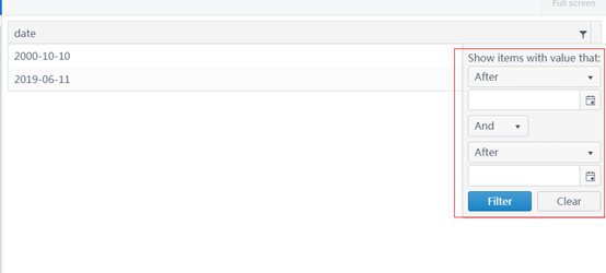
The following screenshot is the date filter display that KendoGrid has:
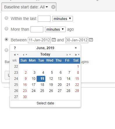
Can it be changed to the similar way as the following picture shows?
It is also acceptable if the filter can provide 3 different options to easily choose from for users:
- Before a certain date that the user can choose from a calendar just like the picture above
- After a certain date
- Between two dates
- In a certain date
Thanks.
Best Regards,
BLACK STREAM
If KendoGrid can not realize the above requirements, can you please provide an alternative plan?Unless I am missing it somehow, I do not think the Grid control ( I was specifically using the MVC Grid control) does not support
1. A search feature that searches all rows and columns for the supplied text. I know you can use the filter at the top of each column to search just that column but looking for ability to search the entire dataset.
2. Ability to set the column widths as a percentage of the total space available. It looks to me like it only allows a specific px setting.
These would be good adds. If either of these are currently possible and I missed it somehow, would appreciate response regarding how to achieve this.
Thanks,
David.

