### Bug report
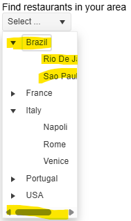
When setting autoWidth: true and expanding a node, the popup's width is not adjusted based on the displayed child nodes.
### Reproduction of the problem
1) Enable the autoWidth option and open the DropDownTree.
2) Expand an item. A horizontal scrollbar appears and the width of the popup is not adjusted as expected:
A Dojo sample for reproduction: https://dojo.telerik.com/faeuFFwb/2
### Expected/desired behavior
The width of the popup must be automatically adjusted when expanding an option and the "autoWidth" option is enabled.
### Environment
* **Kendo UI version: 2025.2.702
* **jQuery version: 3.7.1
* **Browser: [all]
### Bug report
When dragging and dropping a file into a specified FileManager folder, the Upload request triggers twice.
### Reproduction of the problem
1. Open the FileManager Demo: https://demos.telerik.com/kendo-ui/filemanager/index
2. Open the browser's Network tab.
3. Drag and drop a file into the FileManager.
4. Two Upload requests are triggered one after another.
### Expected/desired behavior
When uploading a single file with drag & drop, a single Upload request must trigger. When using the default upload button to upload a file, a single request triggers as expected.
### Environment
* **Kendo UI version: 2024.4.1112
* **jQuery version: 3.7.1
* **Browser: [all]
### Bug report
When defining custom editors in the OrgChart form by using EditorTemplateView() or EditorTemplateId() options, the editors are not initialized as expected.
### Reproduction of the problem
1) Define a DropDownList editor in a partial View and load it through the EditorTemplateView() option:
@(Html.Kendo().OrgChart<OrgChartEmployeeViewModel>()
                .Name("departmentsChart")
                .Editable(edit =>
                {
                    edit.Form(form => form
                      .Items(i =>
                      {
                         i.Add().Field(x => x.ParentDepartment).EditorTemplateView(Html.Partial("~/Views/Shared/EditorTemplates/ParentDepartmentDropDown.cshtml"));
                      }));
                })
                ...
)

// ~/Views/Shared/EditorTemplates/ParentDepartmentDropDown.cshtml
@model OrgChartEmployeeViewModel

@(Html.Kendo().DropDownListFor(m => m.ParentDepartment)
    .OptionLabel("-None-")
    .DataTextField("Text")
    .DataValueField("Value")
    .DataSource(source =>
    {
	    source.Read(read => read.Action("ReadDepartments", "Home"));
    })
)
2) The DropDownList is not initialized when opening the OrgChart form.
### Expected/desired behavior
The editors defined through the EditorTemplateView() or EditorTemplateId() options must be initialized correctly.
### Environment
* **Kendo UI version: 2025.2.520
* **jQuery version: 3.7.1
* **Browser: [all]
Bug report
TimeDurationPickerFor does not work in EditorTemplates scenarios.
Reproduction of the problem
- Create a TimeDurationPickerFor Helper within a standalone view within the
~/Views/EditorTemplate/folder.
@model double

@(Html.Kendo().NumericTextBoxFor<double>(m => m))- Use the Editor template within a more compound component. E.g the Grid
        .Columns(columns =>
        {
            columns.Bound(m => m.Duration).EditorTemplateName("TimeDurationPicker");
            columns.Command(command => command.Edit());
})- Notice that the application produces a server error.
Current behavior
The TimeDurationPickerFor Helper does not work in EditorTemplates scenarios.
Expected/desired behavior
The TimeDurationPickerFor Helper should work in EditorTemplates scenarios.
Environment
- **Kendo UI version: 2025.2.702
- **Browser: [all]
Bug report
Filterable configuration in ForeignKey is not serialized in TagHelper Grid.
Reproduction of the problem
Open this REPL example
Current behavior
Filterable configuration in ForeignKey is not serialized in TagHelper Grid.
Expected/desired behavior
Filterable configuration in ForeignKey should be serialized in TagHelper Grid.
TicketID:
1692361
Environment
- Kendo UI version: 2025.2.702
- Browser: [all]
The FileManager triggers two Read requests when double clicking a folder in the ListView/GridView. The behavior can be observed in the Basic Usage Demo.
When navigationg to a folder in the TreeView using a single click, the component triggers a single Read request.
Could you consider optimizing the request handling when navigating to nested folders, particularly in ListView/GridView, to reduce redundant Read calls and improve performance?
Hi,
I'm following this document to load data into the grid view control using local data binding.
https://demos.telerik.com/aspnet-core/grid/local-data-binding
I'm not sure this is an issue or expected grid view behavior when using local data binding. If loader-type and no-records are added. What happens is when there are no records, the Skeleton is still displayed and the no-records template is not displayed (see the attached image)
<kendo-grid mobile="Disabled" name="Grid" loader-type="GridLoaderType.Skeleton">
 <columns>
 <column field="ProductName" title="Product Name">
 </column>
 <column field="UnitPrice" format="{0:C}" title="Unit Price" width="130">
 </column>
 <column field="UnitsInStock" title="Units In Stock" width="130">
 </column>
 <column field="Discontinued" title="Discontinued" width="130">
 </column>
 </columns>
 <datasource type="DataSourceTagHelperType.Ajax" page-size="20" server-operation="false" data="@Model">
 </datasource>
 <filterable enabled="true">
 </filterable>
 <scrollable enabled="true" />
 <pageable enabled="true">
 </pageable>
 <sortable enabled="true" />
<no-records template="string HTML template, automatically centered" />
</kendo-grid>
Thanks
Bob
Currenty, when the Grid is in InCell edit mode, if a column binds to a boolean field, it is required a custom logic to display the field as a checkbox, which is always in edit mode and can be updated through a single click. Here is a REPL sample that shows the example:
https://netcorerepl.telerik.com/GJOhEIkj47P2xHf709
My opinion is that this functionality should work correctly out of the box without additional coding. If this is not available, then there should be an applicable sample code.
Is it possible to make an example where EF, Dirty works, no double click required and the checkbox always looks like a checkbox?
As stated in the title, the Save() action of a grid (with pagination, not endless scroll) does set the scroll position to the top instead of persisting it.
I tried to follow instructions from https://www.telerik.com/aspnet-core-ui/documentation/html-helpers/data-management/grid/scrolling/overview#restoring-the-scroll-position but without success. The scroll position is moved to the top after the DataBound event handler.
Starting with version 2025.2.520, the toolbar tools like "Save changes" and "Cancel changes" are hidden by default. When the ShowInactiveTools(true) option is set, the inactive tools are displayed as disabled until a change in the Grid's data is made (for example, the tools are active when the edited cell is closed).
Is it possible to create an option that enables the previous behavior of the inactive toolbar tools - to keep the tools always active and visible no matter if there is a change or not?
For example:
.ToolBar(toolbar =>toolbar
            .Items(itm =>
            {
                itm.Create();
                itm.Save();
            })
            .EnableInactiveTools(true)
)
Hello,
I have a treeview that is getting the first items which are locations, then it loads divisions as its children. I want to have the treeview load a top item called "Locations" that is static. It will need to be expanded and load all the locations under it. Then when I click on a location it loads the divisions. The locations and divisions will be populated by a call to the controller and action. I have yet figured out how to do this and is it even possible? Here is the code I have right now. You will see for now that I am loading a div with the location icon and "Locations" as the text, but I would like this to be the top root level of the treeview.
### Bug report
When using the default column checkbox filter menu and the data requested from the server takes time to load, the filter menu popup does not resize correctly when opening the menu for the first time.
The issue started to occur in version 2025.1.211.
### Reproduction of the problem
1) Enable the checkbox filter menu of a specified column. The Grid binds to remote data and the data operations are perfomed on the server.
2) Open the filter menu when the Grid is loaded.
3) The Read request triggers and a loader is displayed to indicate that the data is loading:
4) The options are loaded, but the popup container does not expand as expected:
5) Close the filter menu and opend it again:
### Expected/desired behavior
The filter menu popup must display all options when the data is loaded.
### Workaround
<style>
     .k-animation-container-shown {
        overflow: visible !important;
    }
</style>
### Environment
* **Kendo UI version: 2025.2.520
* **jQuery version: 3.7.1
* **Browser: [all]
The Kendo UI for jQuery TreeList provides options for configuring the settings of the Window when using Popup editing mode:
Currently, the Window options are not available for the HtmlHelper and TagHelper TreeList. Is it possible to implement the Window() configuration of the Editable() option, as per the example below?
        .Editable(e =>
        {
            e.Mode("popup");
            e.Window(w => w.AppendTo("..").Animation(false).Draggable(false).Title("..."));
        })
Bug report
The rowReorder event does not return the correct newIndex when dragging a row from a lower row index to a higher row index.
Reproduction of the problem
- Run this dojo https://dojo.telerik.com/omyPpaZb
- Drag
Chaiand drop afterChang. NoteoldIndexis 0,newIndexis 2, which is unexpected as indices are 0-based
- Re-run the dojo to start fresh and drag
Changand drop beforeChaiand the indices are correct -oldIndex: 1,newIndex: 0
Current behavior
The returned newIndex is incorrect.
Expected/desired behavior
The returned newIndex should be correct.
Environment
- Kendo UI version: 2025.2.520
- Browser: [all]
### Bug report
When the TreeList is set up for Popup editing, the "required" validation triggers immediately when the Popup form is opened.
### Reproduction of the problem
1) Create a Popup editable TreeList.
2) Add the DataAnnotation [Required] attribute to any of the Model properties.
3) Click the built-in "Add new record" command.
4) The editor of the required field is automatically focused and the validation triggers immediately.
The behavior can be observed in the TreeList Popup Editing demo: https://demos.telerik.com/aspnet-core/treelist/editing-popup
### Expected/desired behavior
The validation must trigger on blur, as in the jQuery demo.
### Environment
* **Telerik UI for ASP.NET Core version: 2025.2.520
* **Browser: [all]
Currently, if a PDFViewer is opened on a mobile device and we use two fingers to zoom its content, the file is zoomed but the more we zoom it, the blurrier its content becomes. The reason for this is the fact that when we use "pinch-zoom" to zoom the PDF file(in a PDFViewer) it is zoomed using the browser's zoom functionality and not the functionality provided by the PDFViewer component.
It will be a very useful feature if the built-in PDFViewer zoom functionality is used when the user zooms content with two fingers, on a mobile device
### Bug report
When adding a <select> element as a custom tool in the Editor, the dropdown does not open.
### Reproduction of the problem
1) Run the Dojo sample and try to open the dropdown in the toolbar:
https://dojo.telerik.com/VVPUopDw
The same example work as expected with version 2023.1.117.
2) When using version 2024.4.1112, if you remove the "ref-toolbar-tool" attribute from the <div class='k-toolbar-item'> element, the dropdown opens as expected.
### Expected/desired behavior
The <select> element must function correctly when added as a custom tool in the toolbar.
### Workaround
Handle the "click" event of the select and prevent the event bubbling:
<script>
    $(function () {
        const selectElements = $('select[id^="symbolSelect_"]');
        $(selectElements).each(function (index) {
            this.addEventListener("click", clickHandlerSymbolSelect);
        });
    });

    function clickHandlerSymbolSelect(e) {
        e.stopPropagation(); //Prevent event bubbling, so Kendo cannot swallow or cancel the event.
        const sendingElement = e.target;
        sendingElement.showPicker();
        return true;
    }
</script>
### Environment
* **Kendo UI version: 2025.1.227
* **jQuery version: 3.7.1
* **Browser: [all]
Description
File Manager refresh changes the selected item.
Refresh should not change the selected item if it is available after refresh.
If the selected item is not available after refresh, Preview pane should show No File Selected.
Reference
https://demos.telerik.com/aspnet-core/filemanager
Error
Select Documents folder in Tree View then Excel Document in List View. Excel Document is shown in the Preview pane.
Refresh the File Manager using jQuery in Console.
$("#filemanager").getKendoFileManager().refresh()Excel Document is not selected and Preview pane shows Documents.
Refresh changed the selected item.
Expected behavior
Selected file does not change after refresh.
Example Windows File Explorer. Select a file in the folder and press F5 to refresh the folder.
### Bug report
When integrating components into the ToolBar by using the TemplateId() or TemplateView() options, the ToClientTemplate() option throws a client-side error "SyntaxError: Failed to execute 'appendChild' on 'Node': Unexpected token '<'".
When the component is added to the template without the ToClientTemplate() option, the component is rendered as expected in the ToolBar.
### Reproduction of the problem
A REPL sample for reproduction: https://netcorerepl.telerik.com/cTYqlaPG12psetl157
Remove the ToClientTemplate() option to observe how the DropDownList is rendered as expected.
### Expected/desired behavior
When using an external Kendo UI Template, any nested components must be defined with the ToClientTemplate() option.
### Environment
* **Telerik UI for ASP.NET Core version: 2025.2.520
* **jQuery version: 3.7.1
* **Browser: [all]


