As stated in the title, the Save() action of a grid (with pagination, not endless scroll) does set the scroll position to the top instead of persisting it.
I tried to follow instructions from https://www.telerik.com/aspnet-core-ui/documentation/html-helpers/data-management/grid/scrolling/overview#restoring-the-scroll-position but without success. The scroll position is moved to the top after the DataBound event handler.
Bug report
The rowReorder event does not return the correct newIndex when dragging a row from a lower row index to a higher row index.
Reproduction of the problem
- Run this dojo https://dojo.telerik.com/omyPpaZb
- Drag
Chaiand drop afterChang. NoteoldIndexis 0,newIndexis 2, which is unexpected as indices are 0-based

- Re-run the dojo to start fresh and drag
Changand drop beforeChaiand the indices are correct -oldIndex: 1,newIndex: 0

Current behavior
The returned newIndex is incorrect.
Expected/desired behavior
The returned newIndex should be correct.
Environment
- Kendo UI version: 2025.2.520
- Browser: [all]
### Bug report
When the TreeList is set up for Popup editing, the "required" validation triggers immediately when the Popup form is opened.
### Reproduction of the problem
1) Create a Popup editable TreeList.
2) Add the DataAnnotation [Required] attribute to any of the Model properties.
3) Click the built-in "Add new record" command.
4) The editor of the required field is automatically focused and the validation triggers immediately.
The behavior can be observed in the TreeList Popup Editing demo: https://demos.telerik.com/aspnet-core/treelist/editing-popup
### Expected/desired behavior
The validation must trigger on blur, as in the jQuery demo.
### Environment
* **Telerik UI for ASP.NET Core version: 2025.2.520
* **Browser: [all]
Currently, if a PDFViewer is opened on a mobile device and we use two fingers to zoom its content, the file is zoomed but the more we zoom it, the blurrier its content becomes. The reason for this is the fact that when we use "pinch-zoom" to zoom the PDF file(in a PDFViewer) it is zoomed using the browser's zoom functionality and not the functionality provided by the PDFViewer component.
It will be a very useful feature if the built-in PDFViewer zoom functionality is used when the user zooms content with two fingers, on a mobile device
### Bug report
When adding a <select> element as a custom tool in the Editor, the dropdown does not open.
### Reproduction of the problem
1) Run the Dojo sample and try to open the dropdown in the toolbar:
https://dojo.telerik.com/VVPUopDw
The same example work as expected with version 2023.1.117.
2) When using version 2024.4.1112, if you remove the "ref-toolbar-tool" attribute from the <div class='k-toolbar-item'> element, the dropdown opens as expected.
### Expected/desired behavior
The <select> element must function correctly when added as a custom tool in the toolbar.
### Workaround
Handle the "click" event of the select and prevent the event bubbling:
<script>
    $(function () {
        const selectElements = $('select[id^="symbolSelect_"]');
        $(selectElements).each(function (index) {
            this.addEventListener("click", clickHandlerSymbolSelect);
        });
    });

    function clickHandlerSymbolSelect(e) {
        e.stopPropagation(); //Prevent event bubbling, so Kendo cannot swallow or cancel the event.
        const sendingElement = e.target;
        sendingElement.showPicker();
        return true;
    }
</script>
### Environment
* **Kendo UI version: 2025.1.227
* **jQuery version: 3.7.1
* **Browser: [all]
Hi,
I'm following this document to load data into the grid view control using local data binding.
https://demos.telerik.com/aspnet-core/grid/local-data-binding
I'm not sure this is an issue or expected grid view behavior when using local data binding. If loader-type and no-records are added. What happens is when there are no records, the Skeleton is still displayed and the no-records template is not displayed (see the attached image)
<kendo-grid mobile="Disabled" name="Grid" loader-type="GridLoaderType.Skeleton">
 <columns>
 <column field="ProductName" title="Product Name">
 </column>
 <column field="UnitPrice" format="{0:C}" title="Unit Price" width="130">
 </column>
 <column field="UnitsInStock" title="Units In Stock" width="130">
 </column>
 <column field="Discontinued" title="Discontinued" width="130">
 </column>
 </columns>
 <datasource type="DataSourceTagHelperType.Ajax" page-size="20" server-operation="false" data="@Model">
 </datasource>
 <filterable enabled="true">
 </filterable>
 <scrollable enabled="true" />
 <pageable enabled="true">
 </pageable>
 <sortable enabled="true" />
<no-records template="string HTML template, automatically centered" />
</kendo-grid>
Thanks
Bob
Description
File Manager refresh changes the selected item.
Refresh should not change the selected item if it is available after refresh.
If the selected item is not available after refresh, Preview pane should show No File Selected.
Reference
https://demos.telerik.com/aspnet-core/filemanager
Error
Select Documents folder in Tree View then Excel Document in List View. Excel Document is shown in the Preview pane.
Refresh the File Manager using jQuery in Console.
$("#filemanager").getKendoFileManager().refresh()Excel Document is not selected and Preview pane shows Documents.
Refresh changed the selected item.
Expected behavior
Selected file does not change after refresh.
Example Windows File Explorer. Select a file in the folder and press F5 to refresh the folder.
### Bug report
When integrating components into the ToolBar by using the TemplateId() or TemplateView() options, the ToClientTemplate() option throws a client-side error "SyntaxError: Failed to execute 'appendChild' on 'Node': Unexpected token '<'".
When the component is added to the template without the ToClientTemplate() option, the component is rendered as expected in the ToolBar.
### Reproduction of the problem
A REPL sample for reproduction: https://netcorerepl.telerik.com/cTYqlaPG12psetl157
Remove the ToClientTemplate() option to observe how the DropDownList is rendered as expected.
### Expected/desired behavior
When using an external Kendo UI Template, any nested components must be defined with the ToClientTemplate() option.
### Environment
* **Telerik UI for ASP.NET Core version: 2025.2.520
* **jQuery version: 3.7.1
* **Browser: [all]
Description
FileManager calls Create and Destroy instead of Update on move.
That is not what happens in the file system. Move is Update operation where the location of the item is updated. No files are copied or deleted.
Copying files and directories unnecessarily wastes the resources on the server and the cloud where computing and storage operations are charged.
If Destroy fails which might happen because Create and Destroy are executed separately then files are copied and not moved.
Expected behavior
Move calls Update.
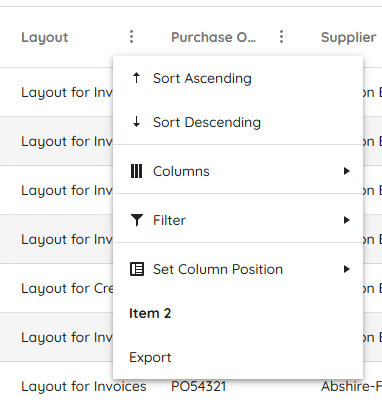
### Bug report
When using the sort" and "filter" toolbar commands, the "sort" and "filter" events do not trigger.
### Reproduction of the problem
A Dojo sample for reporduction: https://dojo.telerik.com/ySEQTSSS
### Expected/desired behavior
The "sort" and "filter" events must trigger when sorting and filterng the columsn through the respective toolbar commands.
### Environment
* **Kendo UI version: 2025.2.520
* **jQuery version: 3.7.1
* **Browser: [all]
### Bug report
The "Clear Sorting" and "Clear all filters" labels cannot be localized when using the "sort" and "filter" toolbar commands.
### Reproduction of the problem
A Dojo sample for reporduction: https://dojo.telerik.com/JHJGUaSH
### Expected/desired behavior
The "Clear Sorting" and "Clear all filters" messages should be exposed for localization.
### Environment
* **Kendo UI version: 2025.2.520
* **jQuery version: 3.7.1
* **Browser: [all]
### Bug report
When opening the filter menu of a specified column through the classic ColumnMenu, the filter container is displayed with scrollbars when the dropdown of the filter operator is opened.
### Reproduction of the problem
1) Define a Grid and enable its classic ColumnMenu.
2) Open the filter menu of a specified column and then open the dropdown to select a filter operator.
3) The filter container has scrollbars. The "k-menu-popup" element has "overflow: auto";
Use the following demo to test the case and select the "classic" type for the ColumnMenu: https://demos.telerik.com/kendo-ui/grid/column-menu
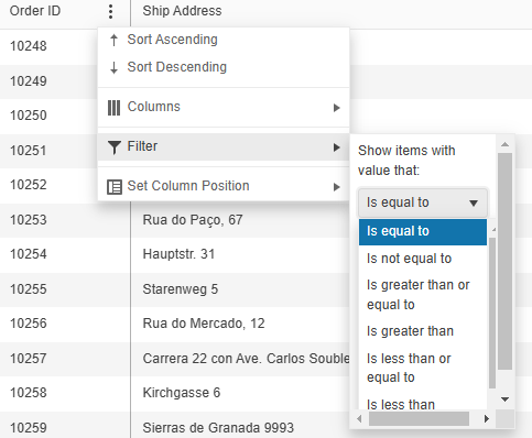
The issue does not appear when using version 2024.4.1112.
### Expected/desired behavior
The filter menu container must not change its appearance when the dropdown opens.
### Workaround:
<style>
.k-menu-popup {
    overflow: visible !important;
}
</style>* **Kendo UI version: 2025.1.211
* **jQuery version: 3.7.1
* **Browser: [all]
Currently, when dynamically appending menu items using the append() method, there is no built-in support to specify an icon via an icon, iconClass, or similar property — unlike other Kendo UI components such as kendo.ui.Button, which allow this directly.
To include an icon today, we must use inline HTML within the text property and set encoded: false, like so:
menu.append({
    text: '<span class="k-icon k-i-plus"></span> Add Item',
    encoded: false
});
While this workaround functions, it's not as clean or consistent as using a dedicated iconClass or icon option.
Please consider adding official support for an iconClass, icon, or similar property when using append() with kendo.ui.Menu, aligning it with how other Kendo components handle icons.
This would:
- Improve API consistency across Kendo components.
- Simplify code for dynamic menu updates.
- Eliminate reliance on raw HTML and manual encoding flags.
The Kendo UI for jQuery TreeList provides options for configuring the settings of the Window when using Popup editing mode:
Currently, the Window options are not available for the HtmlHelper and TagHelper TreeList. Is it possible to implement the Window() configuration of the Editable() option, as per the example below?
        .Editable(e =>
        {
            e.Mode("popup");
            e.Window(w => w.AppendTo("..").Animation(false).Draggable(false).Title("..."));
        })
### Bug report
When adding custom classes or styles to the TimeDurationPicker component, they are applied to the hidden input elenent rather than to the parent element.
### Reproduction of the problem
1. Create a TimeDurationPicker and add a class to its element:
<input id="timedurationpicker" class="testClass" />2. When you inspect the component's markup, the "testClass" is added to the hidden input element.
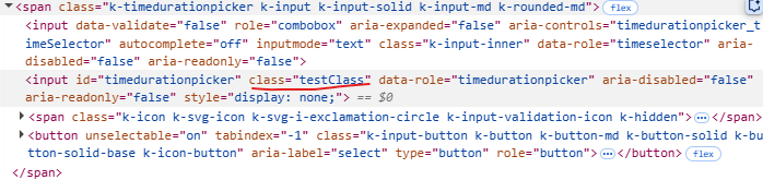
A Dojo sample for reproduction: https://dojo.telerik.com/IsTnGqsk
### Expected/desired behavior
Any custom attributes must be added to the parent element with class "k-timedurationpicker".
### Environment
* **Kendo UI version: 2025.2.520
* **jQuery version: 3.7.1
* **Browser: [all]
Bug report
The Core Grid throws an exception when setting its toolbar template through the ClientTemplateId option. The issue is a regression introduced in version 2025.2.520.
Reproduction of the problem
- Configure the toolbar of the Grid like this:
.ToolBar(toolbar => {
     toolbar.ClientTemplateId("myTemplate");
})
Current behavior
An exception is thrown:
NullReferenceException: Object reference not set to an instance of an object
Expected/desired behavior
The configuration works without throwing exceptions.
Wokraround
Use the alternative way of setting the toolbar template, on the Grid's root level:
@(Html.Kendo().Grid <MyModel>()
      .Name("grid")
      .ToolBarClientTemplateId("myTemplate")
Environment
- Kendo UI version: 2025.2.520
- Browser: [all]
Consider the use of TextWriter async methods for the HTML Helpers, for example the WriteInitializationScript methods. In certain scenarios the use of the synchronous methods causes an exception: System.InvalidOperationException: Synchronous operations are disallowed. Call WriteAsync or set AllowSynchronousIO to true instead.
This can be resolved by explicitly enabling synchronous operations
services.Configure<IISServerOptions>(options =>
    {
        options.AllowSynchronousIO = true;
    });
though synchronous operations have been disabled by default at framework level as of .NET 3.0.
- Installs both extensions ASP.NET Core and MVC without the latest MVC and ASP.Net Core product versions
- Create an ASP.NET Core project with an older version
- An Update Available Notification appears for ASP.Net Core
- Click on the "Update Now" button
- The Upgrade project wizard is launched
- Click on "Next" button, then the following error appears:
System.InvalidOperationException: Sequence contains no matching element
at System.Linq.Enumerable.First[TSource](IEnumerable`1 source, Func`2 predicate)
at Telerik.KendoUI.Mvc.VSX.Wizards.ViewModels.MvcDistributionChooserUpgradeViewModel.GetProjectWithLowestTargetFramework(List`1 projects)
at Telerik.KendoUI.Mvc.VSX.Wizards.ViewModels.MvcDistributionChooserUpgradeViewModel.GetDistributions()
at Telerik.VSX.ViewModels.DistributionChooserViewModelBase`1.get_Distributions()
at Telerik.VSX.ViewModels.DistributionChooserViewModelBase`1.get_CurrentDistribution()
at Telerik.KendoUI.Mvc.VSX.Wizards.UpgradeProjectWizard.TryGetDistributionToken(TargetMvcVersion mvcVersion)
at Telerik.KendoUI.Mvc.VSX.Wizards.UpgradeProjectWizard.GetPropertyValue(String propertyName)
at Telerik.VSX.WizardEngine.Controls.WizardControlBase.PopulateCollectedValues(IPropertyDataDictionary gatheredData)
at Telerik.VSX.WizardFramework.Pages.DynamicPageController.GetData()
at Telerik.WizardFramework.Wizard.GetCurrentPageData()
at Telerik.WizardFramework.Wizard.UpdateNavigation()
at Telerik.WizardEngine.Helpers.EventHelper.CatchExceptionAndSendReport(Action action)