Hi Team,
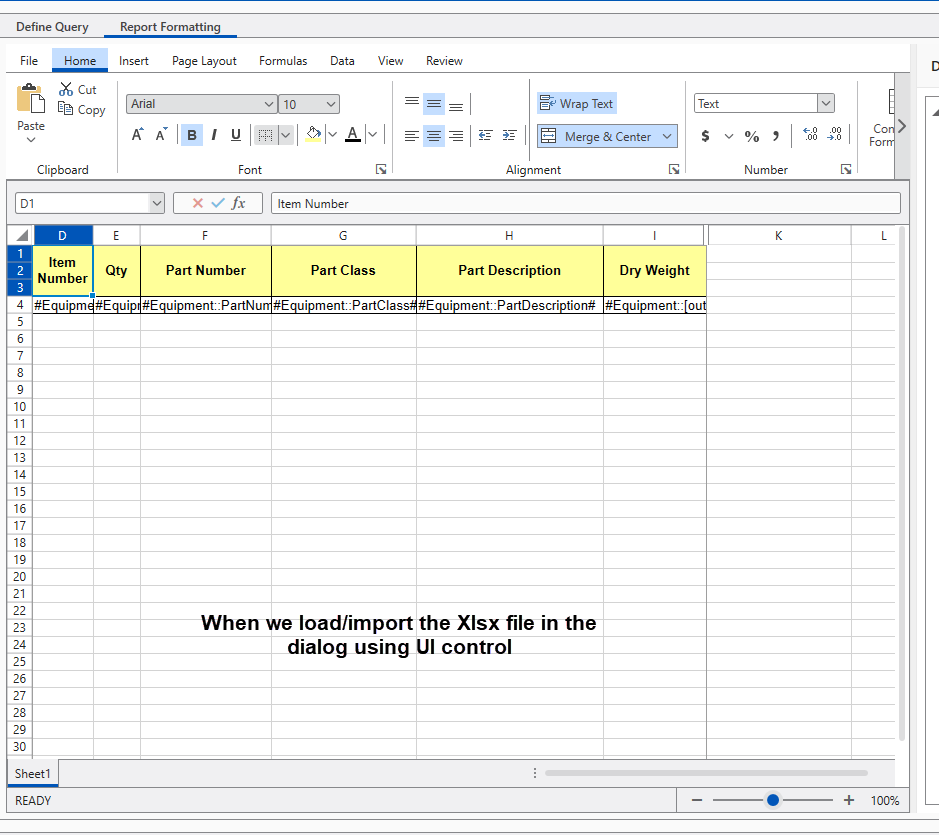
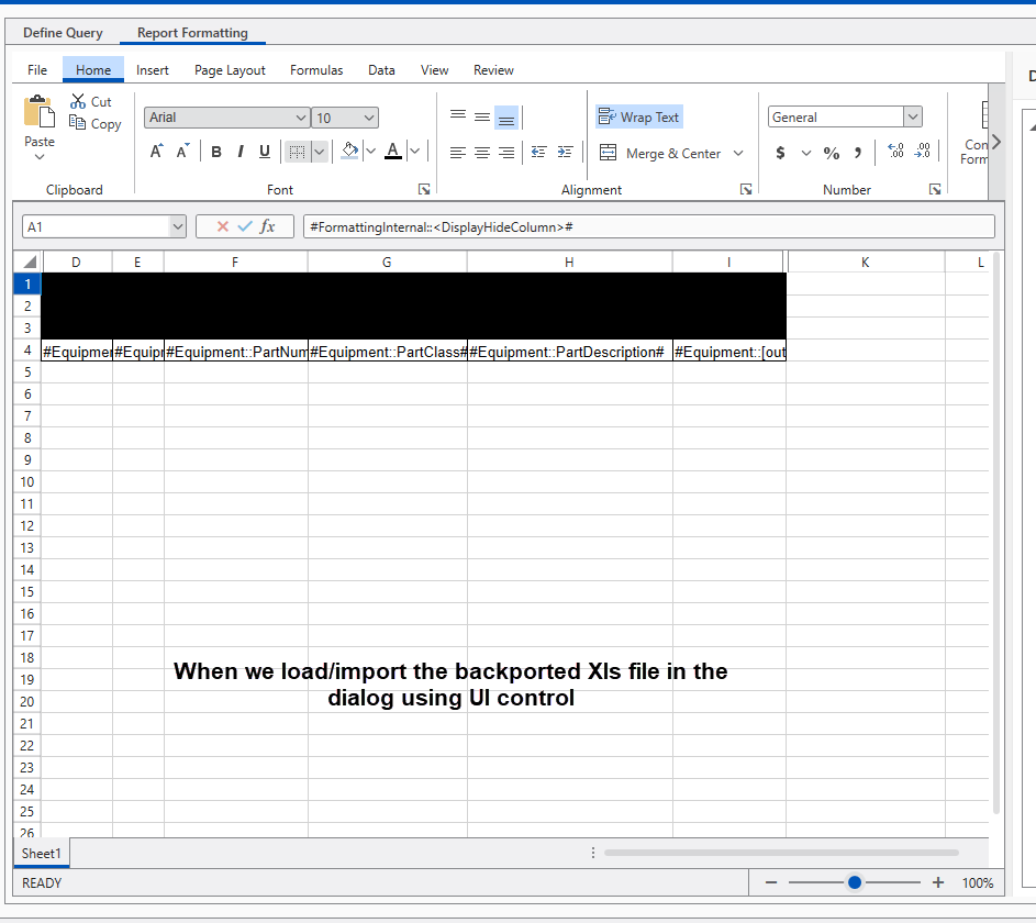
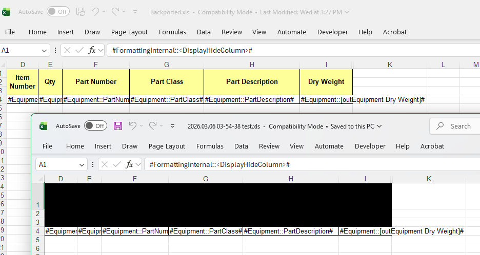
I have backported the Xlsx file to Xls format. When I am trying to import the backported file using the Radspreadsheet UI control, I find that it has lost the color formatting which was existing in the original Xlsx file. Where as when we open the back ported file with Excel application we find that all the data and formatting is maintained.
So the request is that after backporting and while importing the file, it should not loose the minimal xls supported features which Excel is able to support.
Attached is the InitialFile.xlsx and BackPorted.xls file
Note that Xlsx file if imported it maintains the data and formatting information of the workbbok when loaded via UI control.
Let us know in case of any more details or queries.
Exepct this to work
Regards,
Manish.
We have a document in XLS format produced by GemBox. The yellow cells get black once the document is imported and then exported (back to XLS or XLSX) with RadSpreadProcessing.
Custom column is defined in code with IsReadOnly False.
Runtime, user edits a cell from the column and then scrolls horizontally - this leads to UI freeze, endlessly.
Add a mechanism to control the number of rows and the row position of each appointments in the same group.
The SUMIFS function adds all of its arguments that meet multiple criteria.

A list of the supported functions is available at http://docs.telerik.com/devtools/document-processing/libraries/radspreadprocessing/features/formulas/functions

This function can be implemented as a custom function. Check the following resources for more details on how to achieve that:

- http://docs.telerik.com/devtools/document-processing/libraries/radspreadprocessing/features/formulas/custom-functions
- https://github.com/telerik/xaml-sdk/tree/master/Spreadsheet/WPF/CustomFunctions
We could add an option to allow the copying of the raw data instead.
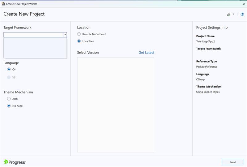
In the WPF Create New Project Wizard, the target framework versions dropdown is empty when no distribution is installed:

FormatException is thrown during the import of a table coming from a docx document when the application culture is "sv-SE". This happens when the column width in the document is a floating point number (ex: 120.65). The Swedish culture uses "," as decimal separator and " " as the number group separator, which makes any invariant decimal value (like 120.65) invalid during standard parsing (ex: float.Parse("120.65")).
Stacktrace:
FormatException: The input string '4514.5' was not in the correct format.
at System.Single.Parse(String s)
Telerik.Windows.Controls.RichTextBox.dll!Telerik.Windows.Documents.FormatProviders.OpenXml.Docx.Import.TableImporter.ImportTableGrid(Telerik.Windows.Documents.FormatProviders.OpenXml.Docx.Parsing.Style style)  Telerik.Windows.Controls.RichTextBox.dll!Telerik.Windows.Documents.FormatProviders.OpenXml.Docx.Import.TableImporter.Import(Telerik.Windows.Documents.FormatProviders.OpenXml.Docx.Parsing.Style parentStyle)  Telerik.Windows.Controls.RichTextBox.dll!Telerik.Windows.Documents.FormatProviders.OpenXml.Docx.Import.MainDocumentImporter.BuildTable(Telerik.Windows.Documents.FormatProviders.OpenXml.Docx.Parsing.Style parentStyle)  Telerik.Windows.Controls.RichTextBox.dll!Telerik.Windows.Documents.FormatProviders.OpenXml.Docx.Import.MainDocumentImporter.BuildBody()  Telerik.Windows.Controls.RichTextBox.dll!Telerik.Windows.Documents.FormatProviders.OpenXml.Docx.Import.MainDocumentImporter.BuildDocument()  Telerik.Windows.Controls.RichTextBox.dll!Telerik.Windows.Documents.FormatProviders.OpenXml.Docx.Import.MainDocumentImporter.Import()Telerik.Windows.Controls.RichTextBox.dll!Telerik.Windows.Documents.FormatProviders.OpenXml.Docx.Import.DocxImporter.ReadXmlContentFromPackage(Telerik.Windows.Documents.FormatProviders.OpenXml.Docx.Import.DocxPartImporterBase importer)  Telerik.Windows.Controls.RichTextBox.dll!Telerik.Windows.Documents.FormatProviders.OpenXml.Docx.Import.DocxImporter.ReadXmlContentAndRelationsFromPackage(Telerik.Windows.Documents.FormatProviders.OpenXml.Docx.Import.DocxPartImporterBase importer)
Telerik.Windows.Controls.RichTextBox.dll!Telerik.Windows.Documents.FormatProviders.OpenXml.Docx.Import.DocxImporter.Import()  Telerik.Windows.Controls.RichTextBox.dll!Telerik.Windows.Documents.FormatProviders.OpenXml.Docx.DocxFormatProvider.Import(System.IO.Stream input)
To work this around, switch to InvariantCulture during the import and return the original culture after that.
 var cultureCache = Thread.CurrentThread.CurrentCulture;
 Thread.CurrentThread.CurrentCulture = System.Globalization.CultureInfo.InvariantCulture;
 Thread.CurrentThread.CurrentUICulture = System.Globalization.CultureInfo.InvariantCulture;
 var provider= new DocxFormatProvider();
 rtb.Document = provider.Import(stream);
 Thread.CurrentThread.CurrentCulture = cultureCache;
 Thread.CurrentThread.CurrentUICulture = cultureCache;
The fill selection stops working, after a filtering is applied and the currently selected cell is filtered out (it gets hidden). This prevents from displaying the fill selection cross displayed when you hover the bottom right corner of a selected cell. Any further changes in the selection doesn't re-enable the selection fill feature.
To work this around, you can set the IsEnabled property of the FillSelection on selection changed.
private RadWorksheetEditor activeWorksheetEditor;

public MainWindow()
{
  InitializeComponent();

  this.spreadsheet.ActiveSheetEditorChanged += (s, e) =>
  {
 if (activeWorksheetEditor != null)
 {
 activeWorksheetEditor.Selection.SelectionChanged -= Selection_SelectionChanged;
 }

 activeWorksheetEditor = this.spreadsheet.ActiveWorksheetEditor;
 activeWorksheetEditor.Selection.SelectionChanged += Selection_SelectionChanged;
  };
}

private void Selection_SelectionChanged(object? sender, EventArgs e)
{
  this.spreadsheet.ActiveWorksheetEditor.Selection.FillSelection.IsEnabled = true;
}
Working with the RadContextMenu that comes from the RadRichTextBoxUI, when having analytics enabled, produces a NullReferenceException.
Manually set the Menu property on the PreviewMouseLeftButtonUp event of the RadMenuItem:
static MainWindow()
{
    EventManager.RegisterClassHandler(typeof(RadMenuItem), PreviewMouseLeftButtonUpEvent, new MouseButtonEventHandler(OnRadMenuItemPreviewMouseLeftButtonUp), true);
}

private static void OnRadMenuItemPreviewMouseLeftButtonUp(object sender, MouseButtonEventArgs e)
{
    RadMenuItem radMenuItem = (RadMenuItem)sender;

    RadContextMenu radContextMenu = radMenuItem.ParentOfType<RadContextMenu>();

    if (radContextMenu != null)
    {
        PropertyInfo menuPropertyInfo = radMenuItem.GetType().GetProperty("Menu", BindingFlags.Public | BindingFlags.Instance);
        if (menuPropertyInfo != null)
        {
            MethodInfo setMethod = menuPropertyInfo.GetSetMethod(true);
            if (setMethod != null)
            {
                Application.Current.Dispatcher.BeginInvoke(new Action(() =>
                {
                    setMethod.Invoke(radMenuItem, new object[] { radContextMenu });
                }), System.Windows.Threading.DispatcherPriority.Background);
            }
        }
    }
}
Exception when parsing degrees. From XML:
transform: rotate(180deg);


