Annotation (Grid line ) for the DateTimeContinuousAxis is not visualized on iOS. It works as expected on Android.
Add grid line annotation for the datetime axes. the grid lines are not visualized on iOS.
<telerikChart:RadCartesianChart x:Name="chart">
    <telerikChart:RadCartesianChart.BindingContext>
        <local:ViewModel />
    </telerikChart:RadCartesianChart.BindingContext>
    <telerikChart:RadCartesianChart.HorizontalAxis>
        <telerikChart:DateTimeContinuousAxis LabelFitMode="Rotate"
                                                x:Name="horizontal"/>
    </telerikChart:RadCartesianChart.HorizontalAxis>
    <telerikChart:RadCartesianChart.VerticalAxis>
        <telerikChart:NumericalAxis />
    </telerikChart:RadCartesianChart.VerticalAxis>
    <telerikChart:RadCartesianChart.Series>
        <telerikChart:SplineSeries ValueBinding="Value"
                                    CategoryBinding="Date"
                                    ItemsSource="{Binding Data}"
                                    ShowLabels="True"
                                    />
    </telerikChart:RadCartesianChart.Series>
    <telerikChart:RadCartesianChart.Annotations>
        <telerikChart:CartesianGridLineAnnotation Stroke="#0E72F6"
                                                StrokeThickness="2"
                                                Value="{Binding Threshold}"
                                                Axis="{x:Reference horizontal}">
            <telerikChart:CartesianGridLineAnnotation.DashArray>
                <x:Array Type="{x:Type x:Double}">
                    <x:Double>4.0</x:Double>
                    <x:Double>2.0</x:Double>
                </x:Array>
            </telerikChart:CartesianGridLineAnnotation.DashArray>
        </telerikChart:CartesianGridLineAnnotation>
    </telerikChart:RadCartesianChart.Annotations>
</telerikChart:RadCartesianChart>
Workaround:
Use CategoricalAxis.
Put several Pie charts in a StackPanel and set the WidthRequest and HeightRequest to let's say 60. You will notice that the circular pie itlsef appears much smaller than the expected 60. In Android and Windows Phone it appears as expected.
When having the following code on a button click
private void Button_Clicked(object sender, System.EventArgs e)
{
       this.chart.Zoom = new Size();
}
The chart zoom is reset first time, but when zooming again and pressing the button, the zoom level does not reset. You have to pan the chart, then zoom reset works.
This code resets the zoom:
private void OnResetZoomClicked(object sender, EventArgs e)
{
	this.chart.Zoom = new Size(1, 1); // This line is added as a workaround to reset the Zoom level
	this.chart.Zoom = new Size();
}
Add the ability to render points outside of the plot area when the data point value exceeds the explicitly set Min or Max values of the horizontal axis.

On Android and iOS, the line series will continue to extend off the plot area to a point that isn't rendered. Here's a screenshot, notice the line coming in from the left side of the plot area: https://www.telerik.com/clientsfiles/77e02115-6de0-4dd0-b572-5d5bc17a59b9_xamarin.jpg

On UWP, the beginning of the line series only starts on the first plot-able point. Here's a screenshot, notice the start of the line series: https://www.telerik.com/clientsfiles/d8c342e3-608b-40eb-95eb-8bd5e0dbc2e6_uwp.jpg
If you have a Chart with BarSeries and TooltipBehavior defined, the tooltip of each bar is shown only when the user taps in the area around the tip of the bar.
The expected behavior is the tooltip to be displayed when clicking anywhere on the bar.
If you have the following PieChart with donut series definition:
<telerikChart:RadPieChart HeightRequest="200"
                          WidthRequest="200">
    <telerikChart:RadPieChart.Series>
        <telerikChart:DonutSeries ShowLabels="True"
                                  ValueBinding="Value"
                                  ItemsSource="{Binding Data}" />
        <telerikChart:DonutSeries ShowLabels="True"
                                  RadiusFactor="0.45"
                                  ValueBinding="Value"
                                  ItemsSource="{Binding Data1}" />
    </telerikChart:RadPieChart.Series>
</telerikChart:RadPieChart>
On android works as expected:
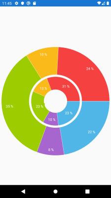
On iOS the series are overlapped and not visualized as expected. The radius factor is not respected
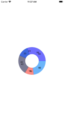
On UWP the second donut series in not visualized and the radius factor is not respected.
X-Axis labels are overlapped when new data points are constantly added.
on Android, the axis labels are replaced.
There is an inconsistency in the behavior on Android and iOS.
Workaround:
apply ChartPanAndZoomBehavior and set
PanMode to "Horizontal"
ZoomMode to "Horizontal"
And chart Zoom to "2,1"
<telerikChart:RadCartesianChart PaletteName="Light"
                                Zoom="2, 1">
    <telerikChart:RadCartesianChart.BindingContext>
        <local:ViewModel/>
    </telerikChart:RadCartesianChart.BindingContext>
    <telerikChart:RadCartesianChart.HorizontalAxis>
        <telerikChart:DateTimeContinuousAxis LabelFitMode="Rotate"
                                             MajorStepUnit="Day"
                                             PlotMode="OnTicks"
                                             LabelFormat="dd MMM"
                                             MajorStep="20"
                                             ShowLabels="True"/>
    </telerikChart:RadCartesianChart.HorizontalAxis>
    <telerikChart:RadCartesianChart.VerticalAxis>
        <telerikChart:NumericalAxis />
    </telerikChart:RadCartesianChart.VerticalAxis>
    <telerikChart:RadCartesianChart.Series>
        <telerikChart:LineSeries ValueBinding="Value"
                                 CategoryBinding="Date"
                                 DisplayName="Sales"
                                 ItemsSource="{Binding Data}"/>
    </telerikChart:RadCartesianChart.Series>
    <telerikChart:RadCartesianChart.ChartBehaviors>
        <telerikChart:ChartPanAndZoomBehavior ZoomMode="Horizontal"
                                              PanMode="Horizontal"
                                              HandleDoubleTap="True"/>
    </telerikChart:RadCartesianChart.ChartBehaviors>
</telerikChart:RadCartesianChart>
This is visible only with longer labels, check the attached image.
Bars are too thin in iOS when items are per day.
If the series is added after the page constructor, the vertical axis labels are not shown.

As a workaround, create the series in the constructor and set its ItemsSource at a later stage.
Series labels are not displayed for horizontal BarSeries in UWP.
DateTimeContinuousAxis displays incorrect labels when MajorStepUnit is Month. There are two labels for some months with 31 days.
If you have BarSeries with CombineMode set to "Stack" with zero values, the bars are placed to the maximum of the y-axis.
As a work-around, you would need to manually adjust the Maximum value of the vertical axis.