When placing and RadEntry in Popup, Object disposed exception is thrown.
The issue cannot be reproduced with Telerik UI for Xamarin version 2022.2.624.1
Workaround until a fix for this issue is provided:
1. Use Telerik UI for Xamarin version 2022.2.624.1
or:
2. Use Xamarin.Forms Entry instead.
Add a password strength indicator/meter for the Entry control similar to the one in ASP.NET AJAX TextBox:
Demos: Telerik Web UI TextBox Password Strength Checker Demo | Telerik UI for ASP.NET AJAX
Docs: Telerik Web Forms Password Strength Checker - RadTextBox | Telerik UI for ASP.NET AJAX
Also, the issue can be reproduced
when the Entry text is set in code behind, for example on button click:
private void Button_Clicked(object sender, System.EventArgs e)
        {
            this.radEntry.Text = "Lorem ipsum dolor sit amet, consectetur adipiscing elit, sed do eiusmod tempor incididunt ut labore et dolore magna aliqua. ";
        }
inside the AutoCompleteView control when select an item from the suggestion items list.
I would like to be able to invoke the Completed event from code. This request is to add a SendCompleted event like the Xamarin.Forms Entry has defined in the IEntryController.
Alternatively, you could make the RadEntry.InvokeCompletedEvent method public, but the SendCompleted approach is more aligned with existing code.
RadEntry control
Introduce a MaxLength property.

An example of such a feature is the Xamarin.Forms Entry control's MaxLength property:

https://docs.microsoft.com/en-us/xamarin/xamarin-forms/user-interface/text/entry#limiting-input-length
When setting a custom Font, the RadEntry falls back on the default platform font family.
On UWP, setting the RadEntry's TextColor has no effect.
Reproducible
<input:RadEntry Text="Hello" TextColor="Red" />Runtime
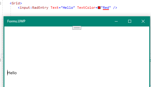
Environment Details
- VS 2019 16.8.3
- UWP Target SDK 19041
- Windows 10 2004
- Xamarin.Forms 4.8.1560
- Telerik UI for Xamarin 2020.1208
All entry fields are not aligned to Right when the RTL language is selected.
Steps to reproduce,1. Create a normal page with RadEntry with FlowDirection set to {x:Static Device.FlowDirection}
2. Change the flow direction of the app pragmatically using Device.SetFlowDirection(RTL).
3. Then the Entry is not aligning to RTL
I'm particularly wanting the "Assistive labels" features, which comes from Material design (click in the textbox, and the watermark becomes a floating label).  Like this:

https://www.syncfusion.com/xamarin-ui-controls/text-input-layout
My Rad Entry Doesn't Work in my Emulator but the other controls is working.
This is my Xaml:
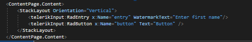
this is the my Emulator the Radentry is does doesn't Working.

Please Help me...
Advance Thank youu
Any version of Xamarin.Forms, the iOS version of the application crashes when attempting to apply a custom font "parameter descriptor cannot be null"
With this resource defined, and the OpenSans-Bold.ttf is in the Resources directory, marked as bundle resource...
<OnPlatform x:TypeArguments="x:String" x:Key="BoldFont">
    <On Platform="Android" Value="OpenSans-Bold.ttf#Open Sans" />
    <On Platform="iOS" Value="OpenSans-Bold" />
 </OnPlatform>
And using this code for the style (created from the Telerik login view template, with some modifications):
    <Style x:Key="LoginEntryStyle"
           TargetType="telerikInput:RadEntry">
        <Setter Property="TextColor"
                Value="{StaticResource DarkTextColor}" />
        <Setter Property="WatermarkTextColor"
                Value="{StaticResource LightBlueColor}" />
        <Setter Property="FontSize"
                Value="14" />
        <Setter Property="FontFamily"
                Value="{StaticResource BoldFont}" />
        <Setter Property="HeightRequest"
                Value="48" />
        <Setter Property="Margin"
                Value="0,0,0,16" />
        <Setter Property="BorderStyle">
            <Setter.Value>
                <telerikInput:BorderStyle BorderColor="{StaticResource LightBlueColor}"
                                          BorderThickness="1"
                                          CornerRadius="8" />
            </Setter.Value>
        </Setter>
    </Style>