Memory leak appears when exporting to Xlsx and Pdf formats.
To work this around, you can call one of the export methods GridViewDataControlExportExtensions with empty arguments.
Workbook workbook = this.gridView.ExportToWorkbook();
try
{
	GridViewDataControlExportExtensions.ExportToWorkbook(new RadGridView(), new GridViewDocumentExportOptions());
	GridViewDataControlExportExtensions.ExportToWorkbook(null);
}
catch (ArgumentException)
{
}
In this particular case, the DisplayIndex properties of the parent and child grid are bound to property from our ViewModel. When the parent grid columns are reordered runtime, the columns of the child grid are also reordered. But when sorting is performed by clicking on a column header, an exception is thrown.
Changing the TextAlignment property of the GridViewExpressionColumn doesn't refresh the cells, thus the change is not visible in the UI.
To work this around, remove and add again the corresponding column in the Columns collection of RadGridView. Or define a CellTemplate and use a TextBlock control with its TextAlignment bound to the column's property.
<telerik:GridViewExpressionColumn.CellTemplate>
	<DataTemplate>
		<TextBlock Text="{Binding}"
				   TextAlignment="{Binding RelativeSource={RelativeSource AncestorType=telerik:GridViewCell}, Path=Column.TextAlignment}"  />
	</DataTemplate>
</telerik:GridViewExpressionColumn.CellTemplate>
Hi,
as you can see in the screenshot below the new dark Material Theme has the bug, that the selected row is white if it's not focused.
I can not find in the code where this white color comes from.
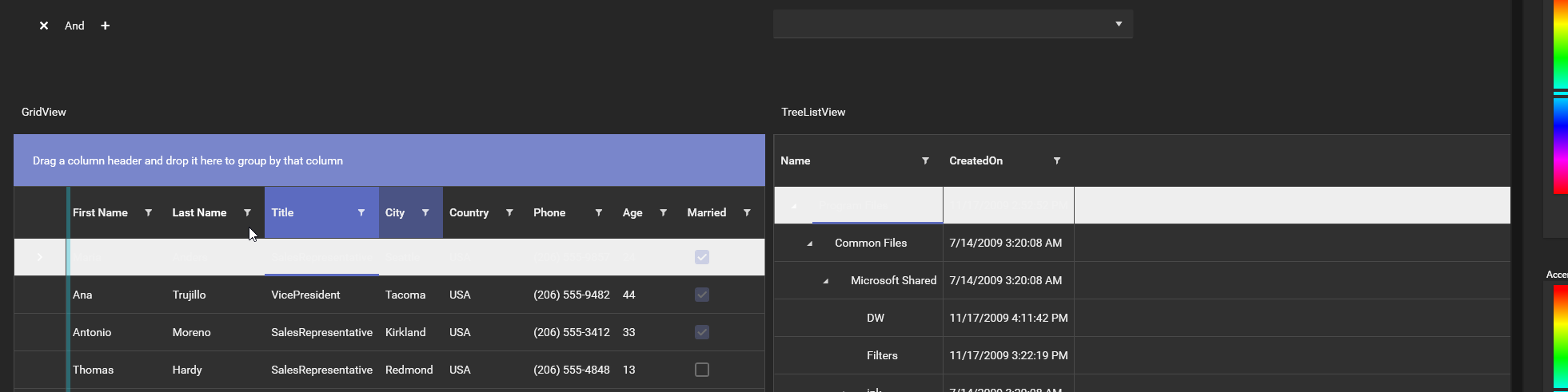
I encountered it only in the GridView and TreeListView yet.
Also I can say, that it wasn't like that before the new update. I made my own dark material theme and it didn't appear like this before.
Greetings Benedikt
Calling the BeginInsert() method of RadGridView, adds a new row at the bottom of the items and scrolls to the newly added row. However, if the vertical scrollbar is not visible and the newly added row makes the viewport so big that the scrollbar should display, the row gets clipped. Also, the vertical scrollbar that was just added is not scrolled to the bottom, which is actually why the row is clipped. Each next insert (after the scrollbar gets visible) will display the added row properly.
To work this around, you can scroll the vertical scrollbar manually to bottom.
private void BeginInsertRow()
{
	var scrollViewer = this.gridView.FindChildByType<GridViewScrollViewer>();
	bool requestScrollToBottom = false;
	if (scrollViewer.ComputedVerticalScrollBarVisibility == Visibility.Collapsed)
	{
		var panel = this.gridView.FindChildByType<GridViewVirtualizingPanel>();
		var sumHeight = (source.Count + 1) * this.gridView.RowHeight;
		requestScrollToBottom = sumHeight > panel.ActualHeight;
	}
	this.gridView.BeginInsert();

	if (requestScrollToBottom)
	{
		scrollViewer.ScrollToBottom();
	}
}
When selecting a Cell using the Mouse, the BorderColor is different to when navigating via ArrowKeys.
Also it seems that the Property IsSynchronizedWithCurrentItem does not work correctly when using ArrowKeys.
The issue with the Color can be observed in the Demo
Hi
I have a grid where some rows contain child rows. In order to control which rows have the "+" expander icon I use the IsExpandableBinding property. I also have a toolbar which contains a convenience button to collapse all the expanded rows.
This button is bound to a handler which called RasGridView.CollapseAllHierarchyItems(), but this does not have any effect. I've tried removing the IsExpandableBinding property, and the collapse mechanism then works (but I get unwanted expanders on every row).
Hi,
I am currently having issues with RadGridView's group footer: I am trying to add a button to the footer template which is supposed to trigger a command which in turn needs some info on the group it was triggered from*.
Since (unlike the header) there does not seem to be any info on the group available directly within the GroupFooterTemplate, I am pulling the group info from the parent GridViewGroupFooterRow:
                <telerik:GridViewDataColumn [...]>
                    <telerik:GridViewColumn.GroupFooterTemplate>
                        <DataTemplate>
                            <Button Command="{Binding DataContext.ShowFooterGroupCommand, RelativeSource={RelativeSource AncestorType=telerik:RadGridView}}"
                                    CommandParameter="{Binding Group.Key, RelativeSource={RelativeSource AncestorType=telerik:GridViewGroupFooterRow}}" />
                        </DataTemplate>
                    </telerik:GridViewColumn.GroupFooterTemplate>
                </telerik:GridViewDataColumn>
This is working great as long as the RadGridView does not use Row virtualization. However, when I turn on Row virtualization and scroll around for a bit, the value I get passed as the CommandParameter is more or less random and has nothing to do with the group my button is actually located in.
I attached a small example project (.Net 6 but our app uses 4.8 so I set that as the Framework below) for you to try it yourself. Just scroll around and click the buttons while watching the debug output window. You will see that the groups in the output window will not match the group where you actually clicked the button after some scrolling.
Expected Behavior
Even when virtualizing, the Group key returned when binding to GridViewGroupFooterRow.Group(.Key) should reliably return the key of the actual group my button is placed in. It would be even better if it was somehow possible to get the group directly, without having to resort to FindAncestor.
Regards
Simon Müller
Hofmann Fördertechnik GmbH
* Basically I am trying to give the user a possibility to add new items to the individual groups and I don't want to add the button to the group header since that makes it too easy to accidentally hit the header's RadToggleButton, collapsing the group.
The SelectedCells collection of RadGridView contains wrong cells in a scenario where the previous selection is cleared and then its items are filtered out of the view. This reproduces with SelectionMode set to Extended and SelectionUnit set to Mixed.
This happens if you call gridView.SelectedItems.Clear() or gridView.UnselectAll(). You can work around the issue if you clear the SelectedCells. To do so, call also gridView.SelectedCells.Clear().gridView.SelectedCells.Clear();
The issue appears when you have two adjacent columns - one resizable on the left and one not-resizable (IsResizing=False) on the right. If you hide the left column (IsVisible=False), the resize handle of the right column is still there and it can be used to resize it.
To work this around, you can remove the next column and add it again in the Columns collection, after you hide the previous column.
this.gridView.Columns[1].IsVisible ^= true;
var nextColumn = this.gridView.Columns[2];
this.gridView.Columns.Remove(nextColumn);
this.gridView.Columns.Add(nextColumn);