Recently Updated
Unplanned
Last Updated:
27 Mar 2025 14:05
by ADMIN
Created by:
CHEE HANG LIM
Comments:
1
Category:
Buttons
Type:
Feature Request
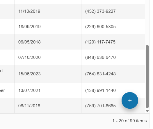
We can create a FloatingActionButton similar to the one in Telerik UI for ASP.NET Core.
Unplanned
Last Updated:
30 Jan 2025 11:47
by ADMIN
Created by:
Darren
Comments:
1
Category:
Buttons
Type:
Feature Request
Add support to handle mutual-exclusivity similar to RadRadioButtons.
Unplanned
Last Updated:
17 Apr 2024 14:41
by ADMIN
ADMIN
Created by:
Dimitar
Comments:
0
Category:
Buttons
Type:
Bug Report
To reproduce:
- Add RadDropDownButton to a blank form.
- Set its anchor property to top, right and its AutoSize property to true.
- At runtime set the button text to a long string, you will notice that the button is resized to the right when it should be resized to the left.

To workaround this you can subscribe to the SizeChanged event of the button change its location depending on the new size:
Size prevSize;

public Form1()
{
    InitializeComponent();
    radDropDownButton1.AutoSize = true;

    this.Shown += Form1_Shown;
}

void Form1_Shown(object sender, EventArgs e)
{
    prevSize = radDropDownButton1.Size;

    radDropDownButton1.SizeChanged += radDropDownButton1_SizeChanged;
}

void radDropDownButton1_SizeChanged(object sender, EventArgs e)
{
    RadDropDownButton button = sender as RadDropDownButton;
    button.Location = new Point(button.Location.X - (radDropDownButton1.Size.Width - prevSize.Width), button.Location.Y);
    prevSize = button.Size;

}

private void radButton2_Click(object sender, EventArgs e)
{
    radDropDownButton1.Text = "Very long button text set";
}
Unplanned
Last Updated:
17 Apr 2024 14:31
by ADMIN
Created by:
John
Comments:
1
Category:
Buttons
Type:
Bug Report
Please use the following code snippet and try to resize the button as it is illustrated in the attached gif file:
            this.radButton1.ButtonElement.ImagePrimitive.SvgImage = RadSvgImage.FromFile(@"..\..\image.svg");
            this.radButton1.TextImageRelation = TextImageRelation.TextBeforeImage;
            this.radButton1.ButtonElement.ImagePrimitive.ImageLayout = ImageLayout.Zoom;
            this.radButton1.ButtonElement.ImagePrimitive.StretchVertically = true;
            this.radButton1.ButtonElement.ImagePrimitive.StretchHorizontally = true;
Unplanned
Last Updated:
07 Apr 2023 10:11
by ADMIN
Created by:
Mark
Comments:
5
Category:
Buttons
Type:
Feature Request
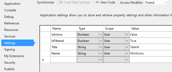
If there are boolean application Settings:
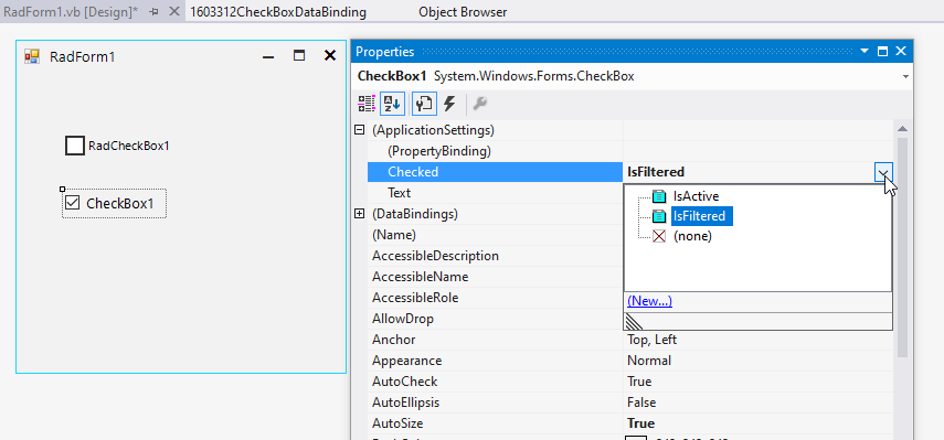
It is good to have the possibility to bind the Checked property for RadCheckBox in a similar way like the MS CheckBox offers:
RadCheckBox offers only the Text option:
Unplanned
Last Updated:
06 Nov 2018 09:13
by ADMIN
ADMIN
Created by:
Dess | Tech Support Engineer, Principal
Comments:
0
Category:
Buttons
Type:
Bug Report
Workaround: disable the default scaling and adjust the font and minimum size

        Me.RadRadioButton1.Font = New Font("Arial", 12, FontStyle.Regular)
        Me.RadRadioButton1.ButtonElement.CheckMarkPrimitive.MinSize = New Size(20, 20)
        Dim radioPrimitive As RadioPrimitive = Me.RadRadioButton1.ButtonElement.CheckMarkPrimitive.FindDescendant(Of RadioPrimitive)()
        radioPrimitive.MinSize = New Size(21, 21)

    Public Class CutsomRadioButton
        Inherits RadRadioButton
        Protected Overrides Sub ScaleControl(factor As SizeF, specified As BoundsSpecified)

        End Sub
    End Class
Unplanned
Last Updated:
19 Dec 2017 17:08
by ADMIN
ADMIN
Created by:
Hristo
Comments:
0
Category:
Buttons
Type:
Bug Report
How to reproduce: add several menu items displaying only images to the split button and set the MaximumSize property of the drop-down menu

Workaround:
public RadForm1()
{
    InitializeComponent();

    this.radSplitButton1.DropDownButtonElement.DropDownMenu.MaximumSize = new Size(30, 0);
    RadScrollBarElement element = this.radSplitButton1.DropDownButtonElement.DropDownMenu.PopupElement.FindDescendant<RadScrollBarElement>();
    element.Visibility = Telerik.WinControls.ElementVisibility.Collapsed;
    element.RadPropertyChanging += Element_RadPropertyChanging;
}

private void Element_RadPropertyChanging(object sender, Telerik.WinControls.RadPropertyChangingEventArgs args)
{
    if (args.Property.Name == "Visibility")
    {
        args.Cancel = true;
    }
}
Unplanned
Last Updated:
20 Nov 2017 15:21
by ADMIN
ADMIN
Created by:
Dimitar
Comments:
0
Category:
Buttons
Type:
Feature Request
Unplanned
Last Updated:
20 Nov 2017 12:55
by ADMIN
ADMIN
Created by:
Dimitar
Comments:
0
Category:
Buttons
Type:
Bug Report
Use attached video and project to reproduce.

Workaround:
Disable the animations:

 btnAdd.DropDownButtonElement.DropDownMenu.AnimationEnabled = false;
//or
ThemeResolutionService.AllowAnimations = false;
Unplanned
Last Updated:
20 Nov 2017 12:11
by ADMIN
ADMIN
Created by:
Dess | Tech Support Engineer, Principal
Comments:
0
Category:
Buttons
Type:
Bug Report
Workaround:

            this.radDropDownButton1.DropDownButtonElement.DropDownMenu.PopupElement.AutoSize = false;
            this.radDropDownButton1.DropDownButtonElement.DropDownMenu.PopupElement.Size = new Size(300, 300);
Unplanned
Last Updated:
14 Aug 2017 13:42
by ADMIN
ADMIN
Created by:
Martin Vasilev
Comments:
0
Category:
Buttons
Type:
Feature Request
Add DefaultItem property in the property grid and allow to set it in design time
Unplanned
Last Updated:
19 Jun 2017 10:48
by ADMIN
ADMIN
Created by:
Dess | Tech Support Engineer, Principal
Comments:
0
Category:
Buttons
Type:
Bug Report
Please refer to the attached sample project and gif file. The text gets clipped sometimes when resizing the form. It may become even blurry. This problem is observed with the MS Form, but it is not reproducible with RadForm.

Workaround: use a RadForm

UPDATED: a second project is attached (00393359CheckBoxDisabledUPDATED.zip). The MissingCheckBoxesText.gif illustrates the incorrect behavior. In this case, the UseCompatibleTextRendering property is set to false.
Workaround for the second case: instead of setting the RadCheckBox.Enabled property to false, disabled the check primitive and make the text gray as follows:

private void radButton1_Click(object sender, EventArgs e)
{
    for (int i = 0; i < 30; i++)
    {
        RadCheckBox cb = new RadCheckBox();
        cb.Text = "RadCheckBox " + i;
        cb.Location = new Point(10, i * 30);
        cb.ButtonElement.CheckMarkPrimitive .Enabled = false;
        cb.ButtonElement.TextElement.ForeColor = Color.Gray;
        cb.ButtonElement.ShouldHandleMouseInput = false;
        cb.UseCompatibleTextRendering = false;

        this.Controls.Add(cb);
    }
}
Unplanned
Last Updated:
08 Nov 2016 13:15
by ADMIN
ADMIN
Created by:
Dimitar
Comments:
0
Category:
Buttons
Type:
Bug Report
To reproduce:
- Add SplitButton to a ribbon bar and set its image.
- Disable the button.

Workaround:
this.radSplitButtonElement1.UseDefaultDisabledPaint = true;
Unplanned
Last Updated:
10 May 2016 10:58
by ADMIN
ADMIN
Created by:
Dess | Tech Support Engineer, Principal
Comments:
0
Category:
Buttons
Type:
Bug Report
The following themes have differences: ControlDefault, Office2010Silver, Office2013Dark, Office2013Light, TelerikMetro, TelerikMetroBlue, TelerikMetroTouch

To reproduce:

this.radSplitButton1.DropDownButtonElement.ArrowButton.Enabled = false;
this.radSplitButtonElement1.ArrowButton.Enabled = false;
Unplanned
Last Updated:
30 Mar 2016 14:20
by ADMIN
ADMIN
Created by:
George
Comments:
0
Category:
Buttons
Type:
Bug Report
To reproduce:

Add a RadTextBox and a RadButton to a form. On the Leave event of RadTextBox show a RadMessageBox. Start the application. Focus the textbox and click the button. The RadMessageBox will show, click the OK button and now you will see that the button is in its 'IsDefault' state (it is a bit more obvious with the Office2010 themes) and no other controls receive mouse input unless you click on the form.

Workaround:

Set the CausesValidation property of RadButton to false.
Unplanned
Last Updated:
30 Mar 2016 14:19
by ADMIN
ADMIN
Created by:
Stefan
Comments:
0
Category:
Buttons
Type:
Bug Report
To reproduce:


Add a RadButton to a form. Set an image, remove the text and set the shape of the ButtonElement to a new RoundRectShape. You will see that the image will not be painted with a shape.


Workaround:


Paint the image manually:


Image img = Image.FromFile(@"jpg.jpg");
RoundRectShape shape1 = new RoundRectShape(10);


protected override void OnLoad(EventArgs e)
{
    this.button = new RadButton();
    this.button.Parent = this;
    this.button.ButtonElement.Shape = shape1;
    this.button.Paint += button_Paint;
}


void button_Paint(object sender, PaintEventArgs e)
{
    e.Graphics.SetClip(shape1.CreatePath(new Rectangle(Point.Empty, this.button.Size)));
    e.Graphics.DrawImage(img, new Rectangle(Point.Empty, this.button.Size));
}
Unplanned
Last Updated:
30 Mar 2016 10:45
by ADMIN
ADMIN
Created by:
Dimitar
Comments:
0
Category:
Buttons
Type:
Bug Report
To reproduce:
- Add 3 radio buttons to a user control.
- Set the ToggleState of the second radio button to  On.
- Show the user control in a DockWindow.
- You will notice that the first toggle button is selected.

Workaround:
Set the toggle state after the window is added to the RadDock
void radDock1_DockWindowAdded(object sender, Telerik.WinControls.UI.Docking.DockWindowEventArgs e)
{
    if (e.DockWindow.Text == "UserControl11")
    {
        UserControl1 uc1 = e.DockWindow.Controls[0] as UserControl1;
        ((RadRadioButton)uc1.Controls[1]).ToggleState = Telerik.WinControls.Enumerations.ToggleState.On;
    }
}


