I would like to request that Telerik host all of the required nuget packages for Telerik.ui.for.Blazor on Telerik's nuget server.
Currently, all of the packages are there except for Telerik.FontIcons and Telerik.SvgIcons which are hosted on nuget.org instead. This is inconvenient when using Package Source mapping, where ideally all Telerik.* packages can be sourced direct from Telerik.
The Kendo-UI "Classic" SASS theme supports the $kendo-calendar-cell-border variable. However, its value is never applied. This also means that variables like $kendo-calendar-cell-selected-border etc. do not have any effect, because they only set the border-color, but not the border itself.
Kendo Theme Version 7.0.2
The Kendo-UI SASS themes support setting the amount of spacing between items using the $kendo-pager-item-spacing variable. However, no spacing is added between the next/previous buttons and the "number" section.
Also, spacing does not work properly if the "select" element is disabled and therefore not displayed.
Kendo Theme Version: 7.0.2
Some of our customers prefer a seamless design integration of their individual software solutions into the SAP ecosystem (e.g. in context of the BTP platform). So it would be nice to have a SAP Fiori theme like in Kendo UI for jQuery:
Using the latest Classic Kendo theme, when showing a grid with a pager, the button indicating the currently selected page has a background that's a function of the button's text color (opacity .2). This results in a background color that lacks sufficient contrast with the text color which is not compliant with WCAG contrast rules for display text.
https://webaim.org/resources/contrastchecker/?fcolor=F35800&bcolor=F1D2C0
#F35800 is the default primary button color in the default theme and F1D2C0 is the color that results from the interaction between a background with opacity .2 laid over the default background grey #F0F0F0. I've attached a screenshot of the PowerToys color picker showing the computed color of the button.
The button background color needs to pass all of the WCAG checks in the above link in our application and really should by default in my opinion.
We would like to use Kendo React to build a micro frontend UI but we did not found any relevant information that this is currently supported.
The main issue we are facing is how it isolate Kendo theme styling between different micro frontends.
Let's say we have 2 micro frontends A and B:
- A is using Kendo v6.
- B is using Kendo v7 (or some other future/past version).
Both of them will include their global Kendo styles which will collide.
After some investigation, we came up with 2 possible approaches:
- Isolating micro frontends using shadow DOM. This is the most common technique but unfortunately not supported by Kendo React yet.
- Prepend custom class to all Kendo CSS selectors (for example ".microfronend-a .k-button" instead of just ".k-button").
We have experimented with the second approach and it seems like a way to go. It also required to append all popups to root DOM node of a micro frontend which can be done easily using PopupPropsContext.
But adding a class to all Kendo CSS selector is technically not a trivial task. It would be nice if Kendo supported this out of the box, for example by providing some SCSS configuration variable.
Hello,
I'm adding sass-loader to my webpack build so that I can keep up to date with the latest theme builds more easily. We simply use the default theme.
Webpack is giving me the following warning, however ...
WARNING in ./node_modules/@progress/kendo-theme-default/dist/all.scss (./node_modules/css-loader/dist/cjs.js??ruleSet[1].rules[0].use[1]!./node_modules/postcss-loader/dist/cjs.js!./node_modules/sass-loader/dist/cjs.js!./node_modules/@progress/kendo-theme-default/dist/all.scss)
Module Warning (from ./node_modules/sass-loader/dist/cjs.js):
Deprecation Using / for division outside of calc() is deprecated and will be removed in Dart Sass 2.0.0.

Recommendation: math.div($a, $b) or calc($a / $b)

More info and automated migrator: https://sass-lang.com/d/slash-div

node_modules\@progress\kendo-theme-default\dist\all.scss 1039:15  k-math-div()
node_modules\@progress\kendo-theme-default\dist\all.scss 4138:21  root stylesheet

 @ ./node_modules/@progress/kendo-theme-default/dist/all.scss 8:6-188 22:17-24 26:7-21 52:25-39 53:36-47 53:50-64 57:6-67:7 58:54-65 58:68-82 64:42-53 64:56-70 66:21-28 77:0-158 77:0-158 78:22-29 78:33-47 78:50-64 55:4-68:5

1 warning has detailed information that is not shown.
Use 'stats.errorDetails: true' resp. '--stats-error-details' to show it.
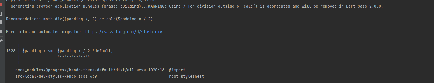
Are there plans to improve 2.0.0 compatibility with kendo themes? math/calc should still be backwards compatible.
When creating a custom build, it's highly impractical to trim down the theme css. The Less source breaks out common widget properties, but the primary themable file lumps all widgets together into a single massive file. It would be nice if this could be split apart further to trim out unused widget styles entirely.
It would be nice if Theme variables would be separated into a different file, to make it possible to import those variables into your own site.less.
This way colors etc can be re-used across the entire site.
Hi Kendo Team,
after we updated to version 2022.2.301 we decided to modify our theme by compiling the Metro theme from the source files and adjusting some of the variables provided.
When working on the multiselect styles however we noticed that changing the variable '@chip-solid-hover-text' in the 'type-metro.less' file did not lead to any change. The attached screenshot shows that the chip still keeps its black text color on hover even though the variable was set to white.
We inspected the _theme.less file in the folder Default/chip and noticed that the variable is not used by the theme (see screenshot). Looking at the code this also seems to be the case for the 'selected' styles.
We can add additional styles to fix that on our end but since there is a variable for both cases I am sure this is just an oversight and wasn't planned.
Thanks,
Markus
To reproduce, enable High Contrast mode in the OS and then go to any Splitter demo.
With the new changes, many variables were removed (like $primary-button-hovered-bg).
It is now generated through internal sass functions - but unfortunately, it only supports mixing color with black/white. resulting in washed-out colors if you want a lighter hover color.
I would expect to have an option to have a more linear lighten/darken sass functions.
Looking at the Kendo theme - try-lighten / try-darken exist that take the same input parameters.
There is also $kendo-solid-button-shade-function - but it is not marked as !default and cannot be overwritten.
Describe the bug
Starting from v2022.1.119 the scrollbar of the View Html tool of the Editor is missing.
To reproduce
- Run this Dojo or the All Tools Demo
- Click on the "View Html" Tool
Expected behavior
The textarea of the View Html's popup should be scrollable
Screenshots

Affected package (please remove the unneeded items)
- all themes
Affected suites (please remove the unneeded items)
- Kendo UI for jQuery
Affected browsers (please remove the unneeded items)
- All
Build system information (please remove the unneeded items)
- Not Applicable
Additional context
Bug also observed with Less Kendo jQuery Themes
In version 2.27 of Telerik UI for Blazor the following problematic behavior is observed with long labels in the Grid PopUp edit form:
- If no space is included, they are cut from the form
- If space is included, they are wrapped and not cut but are not matching the alignment of the other labels

When you have a button inside a MultiSelect Footer template (for example), it is different visualized compared to the same button outside of the component. This comes from the k-list-container that is applied when a button is inside a toolbar.
-------ADMIN EDIT---------
A possible workaround for the scenario is to use custom styles as shown below:
<div class="row">
    <div class="col-2">
        <TelerikButton ButtonType="Telerik.Blazor.ButtonType.Button"
                       Icon="k-icon k-i-add"
                       Primary="true">
            New Value
        </TelerikButton>
    </div>

    <div class="col-10">
        <TelerikMultiSelect Data="@(
                                            new List<SelectListItem>()
                                            {
                                                { new SelectListItem { Text = "Text 1", Value = "Value1" } },
                                                { new SelectListItem { Text = "Text 2", Value = "Value2" } },
                                                { new SelectListItem { Text = "Text 3", Value = "Value3" } },
                                                { new SelectListItem { Text = "Text 4", Value = "Value4" } }
                                            })"
                            FilterOperator="StringFilterOperator.Contains"
                            Filterable="true"
                            TItem="SelectListItem"
                            TValue="string"
                            TextField="Text"
                            ValueField="Value">
            <FooterTemplate>
                <TelerikButton ButtonType="Telerik.Blazor.ButtonType.Button"
                               Class="my-nested-button"
                               Icon="k-icon k-i-add"
                               Primary="true">
                    New Value
                </TelerikButton>
            </FooterTemplate>
        </TelerikMultiSelect>
    </div>
</div>

@code{
    public class SelectListItem
    {
        public string Value { get; set; }
        public string Text { get; set; }
    }
}

<style>
    .k-list-container .k-button.my-nested-button {
        background-color: #ff6358;
        align-items: flex-start;
        align-self: flex-start;
    }

    .k-list-container .k-button-primary.my-nested-button,
    .k-list-container .k-button.k-primary.my-nested-button {
        /*copy the colors from the basic button*/
        border-color: #ff6358;
        color: #ffffff;
        background-color: #ff6358;
        background-image: linear-gradient(rgba(0, 0, 0, 0), rgba(0, 0, 0, 0.04));
        /*change the flex alignment form the parent container*/
        align-items: flex-start;
        align-self: flex-start;
    }
</style>
Please add theme based on CSS variables. That would allow developers to change theme at run-time and offer our customers similar experience that most (large) web sites offers, like Gmail, Office 365 online ...

Also, in the long run, this could be the only theme that's needed. All others could be based on this one.