Currently, the ThemeBuilder application supports only major Kendo releases (like R1, R2, and R3) and the version of the theme that is interconnected with these release versions.
Consider the option to provide functionality to choose between newer versions of the Kendo themes that are released with service packs and patches. This way, the user will have the ability to test versions that contain theme fixes before the next major release.
For example, R2 2023 officially supports Kendo theme 6.4.0, and before R3 2023 is released the Kendo theme is already at version 6.7.0
Consider the option to support absolute paths for background-image in the Style Editor.
This will enable users to visualize the background-image changes directly in ThemeBuildeer (currently the only option is to export the theme and load the changes in the end application).
Alternatively, consider the option to provide a space for loading images with relative paths (fir fast preview in ThemeBuilder).
Consider exposing a template that will allow styling the (Optional) text span from ThemeBuilder.
Currently, as a workaround users must explicitly set the styles through the following selectors:
.k-stepper .k-step-label-optional {
    color: red;
    background-color: yellow;
    font-size: 18px;
    font-style: normal;
}
Requested through t.1648985
Currently, in ThemeBuilder, you can't style DropDownList, which uses groups.
https://demos.telrik.com/kendo-ui/dropdownlist/grouping
https://www.telerik.com/kendo-react-ui/components/dropdowns/combobox/grouping/
Consider the option to expose a template that will allow adding custom styles for DropDownList with grouping.
Requested through t.1645162
Consider providing public API endpoints for different ThemeBuilder functionalities, such as export options. This will allow users to provide automated distribution of the theme.
Requested through t.1644512
Allow customisation of frozen and locked columns & cells in Grid for more comprehensive component styling.
In ThemeBuilder Q1 2024 there are Grid templates for styling alternate rows and selected rows. However, there is no template for styling selected alternate row.
Consider providing templates for each rendering option.
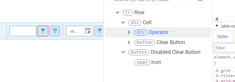
Currently, you can style only the Operator and the Clear buttons components inside the FilterRow Cell template. It would be great to have the ability to style the rest of the components (e.g. Inputs, NumericTextBox, etc.)
Request Feature...
Either: 1) Give Access To Common SASS modules/methods.
If I am using a primary color for my themebuilder customization and define it as
$my-primary-color = #2a3bd1,
give me the ability to use functions in sass like
- lighten($my-primary-color, 20%) or
- color.change($my-primary-color, $saturation: 50).
- However you do it
Or: 2) Provide swatches using the current theme colors on color picker.
Or create swatches from the current theme color in the color picker to use as starting points when picking another color representing hover or selected or disabled, etc.
ThemeBuilder only allows limited control over a specific set of exposed variables. Although these variables are constantly analyzed and updated, some, such as $base-gradient, cannot be modified through ThemeBuilder and require manual adjustments.
Example of variable that is not currently exposed: $base-gradient
The feature request is to explore the possibility of exposing more variables or providing a UI for selecting Kendo variables, bearing in mind that some Kendo themes may have over 2,000 variables.
So far the following variables were requested explicitly:
1623384: $base-gradient
1630912:
$kendo-grid-header-padding-y
$kendo-grid-padding-x
$kendo-grid-padding-y
$kendo-input-border
$kendo-input-hover-border
Consider having the option to trigger the automatic migration (for ThemeBuilder Ultimate and Enterprise) and Export options simultaneously for multiple projects.
Benefits as pointed out by a user:
""...
I'd rather start a batch job performing all of those tasks (it might even be a dry run just pointing out issues) and generate some "editor-readable" results)I can then review all of the outputs in a single step, adapt those with issues, or exclude them from the next batch run, which would automatically migrate all of the projects without issues. The workflow would boil down to those themes with issues (which is perfectly fine). Right now, I have to go through all of this manually, which takes a considerable amount of time... "
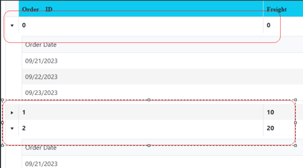
Consider the option to support the Telerik/Kendo hierarchical grids or grid grouping through separate component templates.
For example,
https://demos.telerik.com/aspnet-mvc/grid/hierarchy
https://www.telerik.com/kendo-angular-ui/components/grid/grouping/basics/
The hierarchical grids are visualized with a master row similar to the Grouping Row template. However, it is currently impossible to directly style the hierarchical master row.
Example for grid groups
https://stackblitz.com/run/?file=src%2Fapp%2Fapp.component.ts
Currently, in ThemeBuilder, the generated stypes for the Kendo/Telerik Grid component are for size "medium" (or "md").
However, in Kendo UI for JQuery and other Kendo/Telerik suites, the Grid size property supports other values like "small" and "large".
https://docs.telerik.com/kendo-ui/controls/grid/appearance/sizing
https://docs.telerik.com/kendo-ui/api/javascript/ui/grid/configuration/size
Consider providing ThemeBuilder templates to allow the generation of styles for other Grid sizes
Greetings,
I was trying to use the export/import metadata feature and noticed I couldn't import metadata in a given project if the exported metadata came from a theme whose type (Default, Bootstrap, Material, Fluent, Classic) doesn't match the target project's. Fair enough.
However, I couldn't find any easy way to find out which theme type a given project uses. Currently, I export the metadata and read the project.theme.id key in data.json file. It would be nice to add this piece of information on the ThemeBuilder home dashboard.
I also find it inconvenient to have to create a project first, choose the right theme type and then import. It would be much more efficient to create the project and import in a single operation, e.g. by adding an option to import metadata in the Create New Project modal.
Greetings,
I know it is possible to access these variables in SCSS given the right setup. However users might not always be in position to have that, for various reasons, e.g.:
- a person that doesn't have the time to setup that
- a person that doesn't want to setup that
- a person that doesn't know how to setup that
- a person that isn't authorized to setup that and has access only to the final CSS file
I think it would be nice to make ThemeBuilder available as CSS custom properties (aka "CSS variables"). Some info about this idea (I guess ThemeBuilder uses SASS behind the scenes?): Convert Sass variables to CSS variables · Issue #3091 · sass/sass (github.com)
Regarding the possibly large amount of variables, I think the ones visible in ThemeBuilder would cover the vast majority of cases.
Whether you intend on doing this or not, could you please document how the exported CSS file is generated behind the scenes? I tried reverse-engineering it since I originally wanted to be able to work on SASS code and then obtain the same result as ThemeBuilder. My guess:
- SASS generates a minified CSS file (with a sourcemap)
- minified CSS then go through Autoprefixer (PostCSS plugin)
- minified and autoprefixed CSS then go through calc (PostCSS plugin)
Thanks!
Consider providing a styling template for the Kendo/Telerik Grid with sticky columns
For example:
https://demos.telerik.com/aspnet-mvc/grid/sticky-columns
Note:
Currently, in Kendo UI for React a similar concept is the locked columns https://www.telerik.com/kendo-react-ui/components/grid/columns/locked/
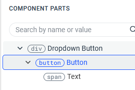
ThemeBuilder allows styling of Button focus outline (through ::after pseudo element).
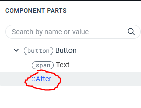
This is unfortunately not available for DropDownButton, although the component uses internally the same mechanism for focus outline as Button.
Consider the options for providing a ThemeBuilder template for Kendo Spreadsheet
https://demos.telerik.com/kendo-ui/spreadsheet/index