Hi,
I would like to offer some suggestions for a few new icons to be added to the Progress Design System. I am currently trying to replace other libraries with the Kendo UI for Vue components, and these are a few icons I use for which I could not find a suitable replacement in the ones you provide. Please see the attached image for examples.
- certificate/award/ribbon
- thumbs-up/thumbs-down
- flag
Also, it would be nice to have a "filled-in" version of some of the existing icons. For example, some current icons like "file-add" or "comment" are good, but they don't stand out at a smaller size. Having a solid color version (instead of just an outline) would provide options for bolder colors and make them more visible.
Thanks!
Hi.
The PDF Viewer component is something that is available in some of the other Kendo products like KendoReact, Kendo UI for jQuery, etc. Can you add the component also in the Kendo UI for Vue Native suite?
The PDF Viewer will be a nice feature that will make the Vue suite even better.
Describe the bug
Importing Kendo UI components results in our WebPack build producing the incorrect "dist" output.
Sometimes Webpack build adds additionalType.d.ts files and their directories to the dist folder
More information can be found in ticket:1602899
Describe the bug
The rowReorder event is missing in the Wrapper Grid component, while it is available in the Kendo UI for jQuery Grid. Currently, the only way the event can be used is by using a code like the below in the mounted hook of the Vue app:
    var grid = this.$refs.grid.kendoWidget();
    grid.bind('rowReorder', function (e) {
      console.log('row', e);
    });
Expected behavior
The rowReorder event should be available for usage as the other events of the Wrapper Grid
Hi, team.
The File Manager component is currently not available in the Kendo UI for Vue suite. Having the component available in Kendo UI for Vue will be a big improvement for the suite.
Describe the bug
By default, the Dialog component is a modal window. This means that once the Dialog appears, the page elements are the only ones the users can interact with.
Currently, if you use the keyboard navigation functionality of the Dialog, after pressing the Tab key multiple time, the focus will be on the "Open dialog" button below the modal. This should not happen.
To Reproduce
- Open this StackBlitz example
- Click on the "Open in new window" button to open the example in a separate window/tab
- In the new window, click on the "Open dialog" button
- Once the Dialog is opened, press the Tab button 8 times and press Enter
- The Dialog will be closed because, after the 8th Enter press, the focus will be again on the "Open dialog" button below the modal area.
Expected behavior
When using the keyboard navigation of the Dialog component, the focus shouldn't be transferred to the elements below the modal area. It should be kept among the elements that are displayed in the Dialog.
When entering a number with decimals in a Native NumericTextBox with a format it rounds up the number if you enter more decimals than the format allows. In this Stackblitz project you can see this behavior.
In the Wrapper NumericTextBox it is possible to add a round property with the value false which prevents the rounding of decimal numbers. Instead of rounding it truncates the number. By my knowledge and what I can find in the Vue documentation this property isn't available in the Native NumericTextBox.
Proposed solution
Add round property with related logic to the native component.
Steps to reproduce
- Copy and paste the value 12.345
- See that the value in the input becomes 12.35
- See that :round="false" does nothing.
We have a window hidden with v show and a DatePicker in it.
When we open the DatePicker and try to hide the Window the popup of the DatePicker stays opened
example and steps in ticket - 1562574
workaround - delay the hiding of the Window with 200 ms to ahve a default hiding of the popup executed:
const toggleDialog = (e) => {
e.preventDefault();
setTimeout(() => {
if (visible.value) {
showPopup.value = false;
}
visible.value = !visible.value;
}, 200);
};
Describe the bug
When binding the Scheduler Wrapper component to a remote datasource, there are two requests sent to the remote service.
To Reproduce
- Open this StackBlitz example and run it.
- Open the Network tab of your browser and see the requests
Expected behavior
Only one request should be sent to the remote service
Screenshots

Can you add the Badge component to the Kendo UI for Vue suite?
The Badge is available in the Angular and React suites but is not available for Vue.
.png)
When using the Drawer component in Kendo UI for Vue, it expands from the wrong side the first time is it toggled if expanded: false and overlay:true
This can be reproduced on the Display Modes example by clicking Edit in StackBlitz, changing the initial value of expanded from true to false (line 92), and toggling the drawer in overlay mode.
After it has been toggled once, it then expands in the correct direction.
It does work correctly if I use "rtl" direction instead of "ltr".
Describe the bug
When defining a custom editor Template for the Scheduler(wrapper) component we define the value passed to the editable-template property as follows:
editorTemplate(data: any): any {
  return {
    template: EditEventTemplateComponent,
    templateArgs: Object.assign({}, data, {
      parentComponent: schedulerRef.value,
    }),
  };
}
With the above definition, in the EditEventTemplateComponent, the templateArgs cannot be accessed inside the setup function, when the Composition API is used. In the mean time, the templateArgs are accessible in the template of the EditEventTemplateComponent.
To Reproduce
- Open this project: sample-scheduler-composition-api.zip
and install its NPM packaged(npm install) - Start the project(npm run serve)
- Double click on one of the events available inside the Scheduler.
- Check the console of your browser
-->
Expected behavior
The templateArgs should be accessible inside the setup function when using Composition API.
- Possible workaround: Use the classic Options API instead. When we use the Options API, the templateArgs are accessible inside the mounted hook.
Hi,
I need to fill and AcroForm PDF. I want to load the pdf and fill it from input fields in kendo vue, when I am done I need to send the pdf back to server or download/print the filled out pdf.
It will be a nice feature if the Native Grid can support a row selection through the keyboard.
Example scenario:
- Click on a checkbox in the Grid and select a row
- Hold the Shift or Ctrl key and press Arrow up or arrow down button
Targeted result: With the press of an arrow button, the row above or below gets selected
Here is a sample project that demonstrates an implementation similar to the targeted one.
Currently in Vue we don't provide the ability to share with the customers the source code before the compilation but just the already compiled code.
We need to provide the ability to fork the repository and build components from the Vue repository similarly to the way it is done in Angular and React.
Currently, Kendo UI for Vue suite provides export to Excel through the kendo-vue-excel-export package. The Excel export is a nice feature but the CSV export is another functionality that is often used.
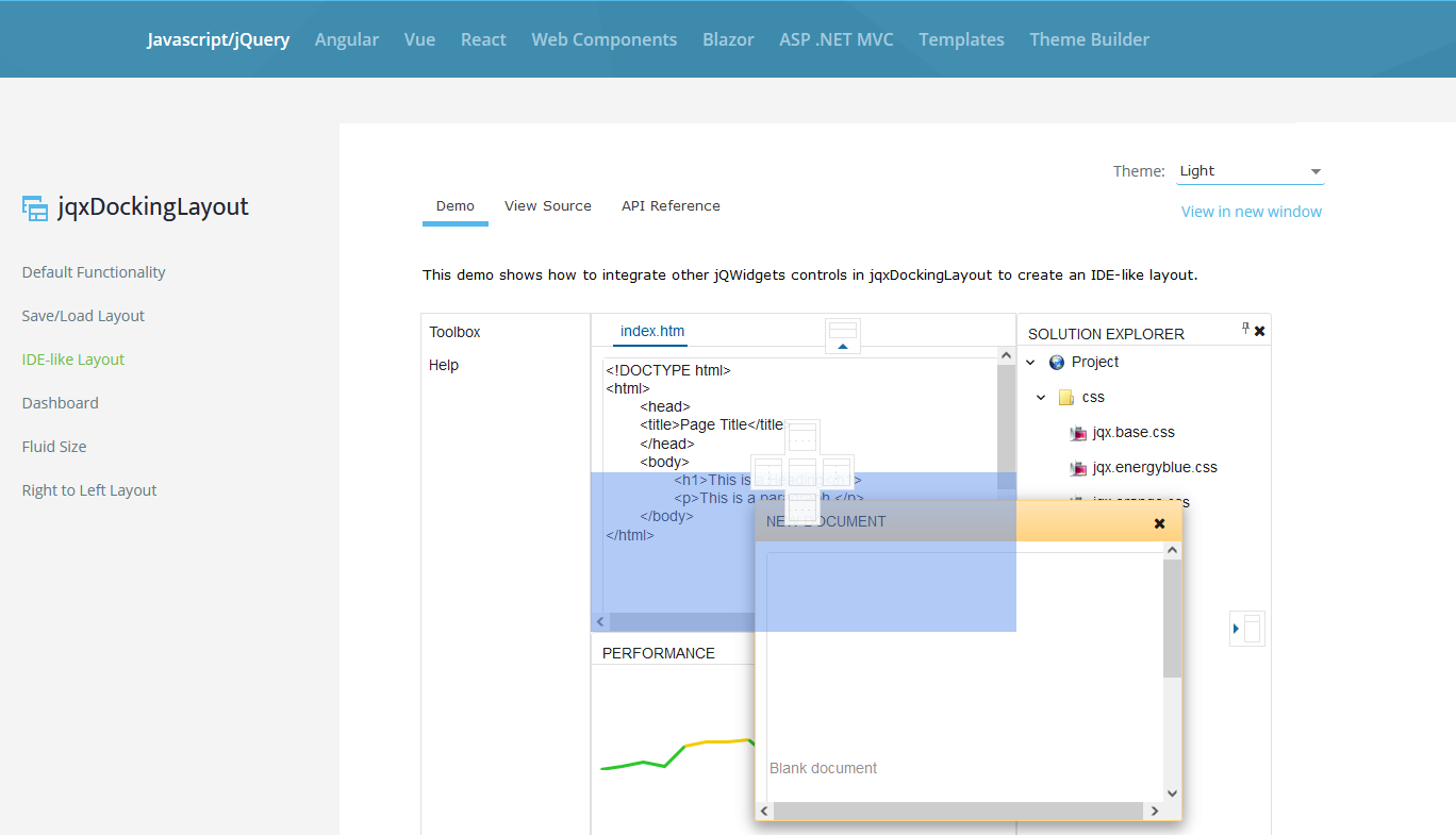
Any roadmap on creating the dock layout like this? I found the similar function for Telerik WPF component
Hi,
Please consider adding a better, native, way to handle the case as described in my post here.