https://www.jqwidgets.com/jquery-widgets-demo/demos/jqxgrid/index.htm#demos/jqxgrid/dropdowngrid.htm
As a follow on to this bug:
Steps to reproduce:
- The "General Info" column has width setted to 500px
See Image 1.png
- resize it in the grid to make wider
See Image 2.png
- lock the "General Info" column
- scroll horizontaly
I am requesting a new feature so that "that the locked prop is passed by default to the child columns"
Unfortunately, for KendoReact there is no such an option accessible for the "sortable" property of the data grid. We would really like to customize multi-column sorting fuctionality of our grids by the way that it is possible for Kendo UI for Angular, so we are requesting to add/make public option "multiSortKey" of the "sortable" property.
Unfortunately, for KendoReact there is no such an option accessible for the "sortable" property of the data grid. We would really like to customize multi-column sorting fuctionality of our grids by the way that it is possible for Kendo UI for Angular, so we are requesting to add/make public option "multiSortKey" of the "sortable" property.
I think this would be a great feature to have out-of-the-box, and hopefully it's something easy to add from your end. UX-wise, it's really difficult to wrap your head around a non-alphabetized list, especially when the list is used for the special purpose of filtering -- you now have to filter down the list before you can filter the grid itself, which adds more overhead for the user.
I understand that Excel is not the end-all and be-all, but Excel also sorts it by default:
Full discussion can be found here - https://www.telerik.com/forums/how-to-make-gridcolumnmenucheckboxfilter-be-alphabetical-order
The GridHelper is defined in a separate file, and this is the way we can use it - https://www.telerik.com/kendo-react-ui/components/grid/getting-started/gridhelper/
However, I prefer if it is exported from the Grid package, and is maintained from there.
I have one column that contains mix of boolean and string values. When I attempt to apply a filter function to that column, it generates an error for the boolean value true because indexOf cannot be performed on a boolean. When I have other formats along with strings and I use filter="text", I would like the value to be converted to string in the filter function rather than modifying the data on my end before calling the filter function, because that would actually be incorrect data.
Example
https://www.telerik.com/kendo-react-ui/components/grid/filtering/
If I change
<Column field="Discontinued" width="190px" filter="boolean" />
to
<Column field="Discontinued" width="190px" />
and then search for anything in that filter it throws error.
Maybe if you make the `filter="text"` always convert the all the values to string values that would help resolve the error
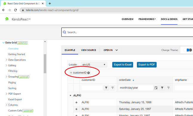
The issue can be seen on your demo at https://www.telerik.com/kendo-react-ui/components/grid/
Steps:
1) Load the demo from https://www.telerik.com/kendo-react-ui/components/grid/
2) Click on (x) in customerID grouping
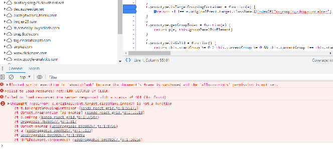
3) Look at the console and see the line with exception:
The problem is that `e.originalEvent.target` is an svg object and it's className property is an object, not a string. The object is `SVGAnimatedString {baseVal: '', animVal: ''}` and it doesn't have the method indexOf.
Please fix asap.
In our project we control column widths manually as we have complex logic on how wide each column should be, based on a number of external criteria. However, those widths are not fixed and might change during the lifetime of the data grid.
This was not causing any problems up to version 5.11.0 but after we upgraded the Kendo packages this controlled behavior of the column widths broke:
kendo-react-grid v5.11.0 example (working):
https://codesandbox.io/s/crazy-bird-ss7mgl?file=/app/main.tsx
kendo-react-grid latest example (broken):
https://codesandbox.io/s/dazzling-antonelli-wxsflj?file=/app/main.tsx
If we inspect the elements of the data grid, we can see that there is an inline style attribute on the header and body tables, setting the total width of those <table> elements to the sum of its columns. However, that value is not updating after the initial mount as it was prior to v5.12.0 which effectively makes the column widths uncontrollable.
Hello,
Seems the link to the GridColumnMenu accessibility page from the DataGrid accessibility page is broken.
Our tools are also warning us about empty links, caused by the GridColumnMenu button. How would we solve these?
Thank you,
Kristiyan Dimitrov
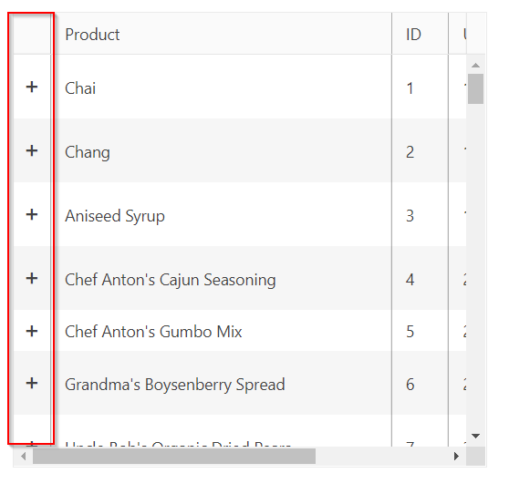
Similar to how you can specify a column for the selection, it'd be nice if you could specify a column for the expand / collapse column so that you can provide a header value and handle a header value click change event.
The idea being that I could mass expand or collapse master detail rows similar to how I can mass select rows.
We are using Kendoreact Data Grid with server side paging, sorting and filtering.
Due to server side nature of those operations DataGrid re-renders bringing the scrollbar position to 0,0 position.
Any div scrollbar position can be saved :
    const scrollEvent = (event) => {
        sessionStorage.setItem("facets_scrollY",event.target.scrollTop);
    }
and restored using reference an scrollTop/scrollLeft properties.
  ref.current.scrollTop = <value to set>
  ref.current.scrollLeft = <value to set>
Please provide this standard feature to be available on Kendo Data grid as well.
Thank you
Hi,
I would like to have 'isnullorempty' filter for text field on Data Grid. There are 'isnull' and 'isempty' filters but it is not straightforward for non-engineer guys. If we have 'isnullorempty' filter, I think it is very useful.
Other option, is there any way to customize filter operator by myself so that we can have any filter operation?
Thank you,
Tatsuro Matsumoto.
Currently (as visible in grid demos), touch drag scroll in mobile (responsive) mode is not working when rows selection is enabled.
There is no known workaround since the complexity of implementing custom row renderer with all the intricacies of the grid's behaviour would be a huge task.
The client's facing issue is that when using a KendoReact grid on mobile device, they can't easily scroll the grid rows data by touch drag scrolling the rows.
It would be great if there was the ability to lock the expand/collapse column that is rendered for master/detail grids.
Hello,
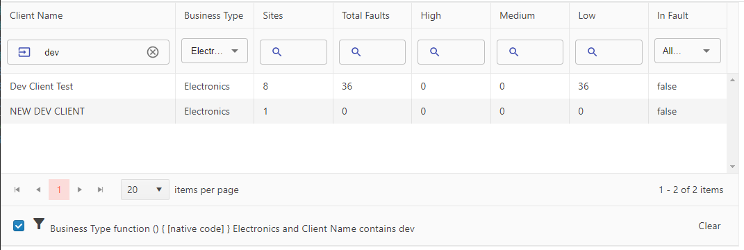
I was doing some research to see if you had a footer that would be for the entire grid instead of for each column. In this research I found an article that would place the GridToolbar as a footer by changing the order to a value of 1 on the .k-toolbar css style.
.k-toolbar {
  order: 1;
  border-top-style: inset;
  border-top-width: 1px;
}
I was wondering if you could create a feature request to add a property to the GridToolbar that would allow placing it as a footer? Or maybe a feature request that would allow for a footer for the entire grid?
I'm working on creating a footer that would allow my users to open the filter builder in a modal and then display the selected filter in text so they are aware of the current filtering of the grid. This would also be a nice feature to be included with the Grid. Included below is an example of the GridToolbar as the footer.
Hello,
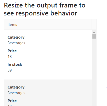
I am looking to start using the Kendo React grid control, but I need the grid to be responsive to support viewing on a phone. I noticed that your Angular grid has this functionality, but it is missing from your React grid.
I would like to have rows turn into individual cards when viewed on a phone. The closest thing I see in the react documentation involves hiding columns, which is undesirable. Is there a way to add this behavior to the React grid? If not, when will that be implemented?
Thank you,
Alex
Hi,
I know pageSizes options takes a Boolean or Array of Numbers, but Is there a way add an option to pagination dropdown which lists all rows of the grid like, 'All' option?
Can we set the options of the dropdown to like '10, 50, All', where option 'All' lists all rows of the grid?

