here's a simple repro project minimally tweaked from an original kendo demo:
https://codesandbox.io/p/sandbox/suspicious-lovelace-8nmzgj?file=%2Fpackage.json
just start dragging a column resize handle and you should see the "jitter" right away. in our experience, the jitter is so pronounced that resizing columns is no longer practically usable.
please note this bug is definitely related to putting the kendo grid inside of a css-grid, see that definition in the parent <div style>
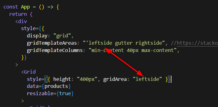
as you may imagine, we use css-grid for our overall page layout which i believe is still modern best practice and we really hope you can fix this regression within that usage context.
note, the bug manifests regardless of the gridTemplateAreas or gridTemplateColumns, you can eliminate those entirely and it's still present.
there seems to be an issue when changing the value of a DateTimePicker from null to a Date object and the specified format includes seconds.
Reproduction:
1. Open https://stackblitz.com/edit/react-hnfuerwc?file=app%2Fapp.tsx
2. Choose a value from the DateTimePicker
Actual Behaviour
The chosen value does not show up in the input box. Works OK in 8.5.0
Expected Behaviour
The chosen value should appear in the input box
Browser
Chrome, version 131.0.6778.205
OS
Windows 11
Hi,
Please see the following example of the Upload component being used to transfer a single file to a byte array:
https://stackblitz.com/edit/react-u2kbu9?file=app/main.tsx
Notice that all packages are latest including react 18 but I have not switched to the new createRoot API, and as per react documentation "Until you switch to the new API, your app will behave as if it’s running React 17" - this warning can be seen in the console window. When you upload a file, the FileReader onprogress and onload events result in the file being successfully uploaded with 100% progress. You can see current state and new state of all events in the console window.
Now please see the exact same example but switched to the new createRoot API:
https://stackblitz.com/edit/react-y8fuya?file=app%2Fmain.tsx
Notice that the warning is no longer visible in the console window. When you upload a file, the FileReader onprogress and onload events result in the file being successfully uploaded but the file progress is overwritten. You can see current state and new state of all events in the console window - the new state from the onProgress event is lost, and the new state in the onStatusChange event reports zero progress.
I believe this is because of automatic batching in React 18.
Kind regards,
David
Step by step instructions on how to reproduce the problem
Try entering a negative value in the filter column using the StackBlitz example here https://stackblitz.com/edit/react-dx7cna?file=app/main.jsx
This works using "ES" as locale (your example) https://stackblitz.com/run/?file=app/main.jsx
Github issue here https://github.com/telerik/kendo-react/issues/897
We have two issues with grid with virtual scroll.
Both are registered on github.
First one is really blocking us: https://github.com/telerik/kendo-react/issues/1010
Second one we found on Safari, it's also very critical for our customers: https://github.com/telerik/kendo-react/issues/1013
Version: 4.7.0. Please note that version specified in Additional information does not make sense as we use Kendo React not Kendo UI.
Can you help us somehow?
When a user focus an empty DatePicker input using tab, the caret starts at the end (right side) of the input.
We need it to start at the left side, so the user can type without having to go all the way back to the left.
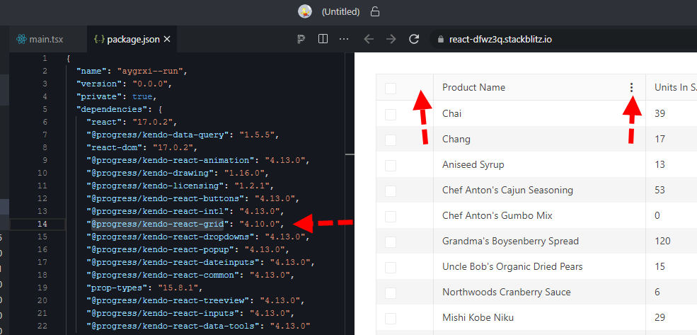
here is a quick repro: https://stackblitz.com/edit/react-dfwz3q?file=package.json
in package.json just switch @progress/kendo-react-grid from 4.10.0 back to 4.9.0 and the column menu renders.
bug still present up through 4.11, 4.12, and @latest 4.13
Dear Kendo,
I'm currently working on a data grid that has virtual scrolling enabled. When a user is scrolling fairly quickly, the screen will constantly flash white. See video in attachment.
I see this same behaviour in the example provided in the docs here: https://stackblitz.com/run/?file=app%2Fmain.jsx although it is slightly less noticeable.
What can we do to fix this?
Thanks in advance.
Kind regards,
Peter
How to reproduce (video attached):
1) open combobox
2) scroll to end of the item list
3) select last item 4999
4) open combobox again
Expected behavior: I would like to see the item list.
Actual behavoir: I see white area.
https://www.telerik.com/kendo-react-ui/components/dropdowns/combobox/virtualization/#toc-basic-configuration
https://www.telerik.com/kendo-react-ui/components/dropdowns/multiselect/virtualization/#toc-basic-configuration
https://www.telerik.com/kendo-react-ui/components/dropdowns/dropdownlist/virtualization/#toc-basic-configuration
Current Behaviour
When I lock columns In data grid with resizable columns - for example 1st and 3th and resize the 1st one - after we scroll horizontally the 3th column goes on top of the 1st column. This happens when we haven't set a width prop.
Expected Behaviour
Resized columns not overflowing on each other when scrolling horizontally and don't have width prop.
MInimal Reproduction
I'm providing a reproduction from Kendo React code examples.
https://stackblitz.com/edit/react-xvxy59?file=app%2Fmain.jsx
Hi,
Not sure what the preferred way to report a problem is. I have posted it on GitHub as well:
https://github.com/telerik/kendo-react/issues/1519
Could someone help me out with this issue?
Thank you in advance.
Hello,
when using the StrictMode we get an UncaughtError when using the PopupComponent. Fe. when using the Date/Time-Picker.
ERROR
Maximum update depth exceeded. This can happen when a component repeatedly calls setState inside componentWillUpdate or componentDidUpdate. React limits the number of nested updates to prevent infinite loops.
    at checkForNestedUpdates (webpack-internal:///./node_modules/react-dom/cjs/react-dom.development.js:27287:11)
    at scheduleUpdateOnFiber (webpack-internal:///./node_modules/react-dom/cjs/react-dom.development.js:25470:3)
    at Object.enqueueSetState (webpack-internal:///./node_modules/react-dom/cjs/react-dom.development.js:14067:7)
    at Component.setState (webpack-internal:///./node_modules/react/cjs/react.development.js:355:16)
    at PopupWithoutContext.componentDidUpdate (webpack-internal:///./node_modules/@progress/kendo-react-popup/dist/es/PopupWithoutContext.js:285:18)
    at commitLayoutEffectOnFiber (webpack-internal:///./node_modules/react-dom/cjs/react-dom.development.js:23328:30)
    at commitLayoutMountEffects_complete (webpack-internal:///./node_modules/react-dom/cjs/react-dom.development.js:24683:9)
    at commitLayoutEffects_begin (webpack-internal:///./node_modules/react-dom/cjs/react-dom.development.js:24669:7)
    at commitLayoutEffects_begin (webpack-internal:///./node_modules/react-dom/cjs/react-dom.development.js:24651:11)
    at commitLayoutEffects (webpack-internal:///./node_modules/react-dom/cjs/react-dom.development.js:24607:3)


The above error occurred in the <PopupComponent> component:
    at PopupWithoutContext (webpack-internal:///./node_modules/@progress/kendo-react-popup/dist/es/PopupWithoutContext.js:97:28)
    at eval (webpack-internal:///./node_modules/@progress/kendo-react-popup/dist/es/Popup.js:38:67)
    at div
    at AsyncFocusBlur (webpack-internal:///./node_modules/@progress/kendo-react-common/dist/es/hocs/AsyncFocusBlur.js:30:23)
    at TimePickerWithoutContext (webpack-internal:///./node_modules/@progress/kendo-react-dateinputs/dist/es/timepicker/TimePicker.js:87:28)
    at eval (webpack-internal:///./node_modules/@progress/kendo-react-common/dist/es/hocs/withPropsContext.js:28:95)
    at component
    at Field (webpack-internal:///./node_modules/@progress/kendo-react-form/dist/es/Field.js:37:22)
  ...
It would be ideal if toODataString could take an additional parameter that:
- Takes a collection of expressions,
- Each expression takes an Operator and Value,
- Each expression returns a string or undefined, where the latter suggests we wish to suppress this expression.
A json-file is needed to use localization in Kendo React. It's a lot of work to maintain these files when there are new versions. It's difficult to know which keys have been added, changed or removed.
Another better way might be that you collect the translation for different languages and let us download them. That way you can also keep them up to date.
Hello! Is it possible to not show a room if there is no meeting on that day while simultaneously showing it on a different person because they have a meeting on that day? In the image below, I edited the data so Peter no longer had a meeting in room 2. Is it possible to get it to show Peter with just the meeting room(s) that they has data for, while keeping Alex with all the rooms that they have data for?
Peter -> Meeting Room 1
Alex -> Meeting Room 1 AND Meeting Room 2
I think this would be a great feature to have. Lets say I have 100 students and/or 100 meeting rooms and all have a different days/times when they are needed. If there was a way to show ONLY what is being booked, or show ONLY what is free, that would be a fantastic feature for users and developers alike.
https://stackblitz.com/edit/react-fuflvh-dwgfvu?file=app%2Fapp.tsx
Hello,
Please add a feature to highlight areas of a PDF on specific pages. This feature is available in a different library - React PDF Viewer library - but that is apparently no longer supported, and has security vulnerabilities:
https://react-pdf-viewer.dev/examples/render-the-highlight-areas/
This is a critical feature for an application we are building. Thank you for any assistance.