The KendoReact MaskedTextBox value cannot be cleared once a value is set. See this forum post for examples and a proposed workaround: https://www.telerik.com/forums/maskedtextbox-cannot-be-cleared
I would like for a user to be able to clear the MaskedTextBox value without having to code it as a special case in the onChange event handler. I believe this should be done by default as per the Kendo jQuery MaskedTextBox, but it could also be optional via a prop or clear button.
Hey
Small question: it is exists some approach to make Tabs in TabStrip reordable ?
Best
Serge
I noticed that the value prop of the TextAreaChangeEvent is defined as string | number | string[].
When will this value be number or string[]?
Won't it always be string due to the fact that it's a text area input?
Similar to how a series is highlighted when clicked, the category can also be highlighted when the bar/column on that category is clicked.
Hello,
After taking a look at your example in the documentation here (which doesn't seem to be working) https://www.telerik.com/kendo-react-ui/components/charts/chart/elements/selection/#using-selection-as-navigator
I fixed the onSelectEnd function and got it working. However, the selection chart is reloading the data every time onSelectEnd changes this.state.min and this.state.max.
Here is the example:
https://stackblitz.com/edit/react-nub1sc?file=app/main.jsx
As you can see, this makes for a clunky UI.
If this isn't a bug, do you have suggestions on how to fix this?
Thanks,
Orla
The className prop on the ChipList component is ignored in version 3.18.0. A simple addition of class strings does not appear in the compiled product, e.g.
  return (
    <ChipList
      className='flex-layout --wrap --end'
      data={chipData}
      onDataChange={onDataChange}
      chip={props => (
        <Chip removable removeIcon='k-i-close' {...props} />
      )}
    />
  )
I've looked through the transpiled source in node_modules, and it seems the className property passed to the React.createElement() function totally ignores the prop class names.
i am using KendoReact Drawdom version 1.5.12
I have some input elements for uploading images, and showing the a preview of uploaded image.
I want to export a PDF version of the form, but drawDom.cloneNodes() throws an exception when handling input elements of type file. that is because these type of input elements can not have value attribute.
Hello,
I have two Menus and I need to customize their popups differently. Can I specify somehow Menu Popup id or className?
As I can see Popup component has className property, but it is hard-coded in MenuItemInternal.prototype.getPopupClassName and neither Menu nor MenuItem classes are used in popup.
Any suggestions?
Thanks.
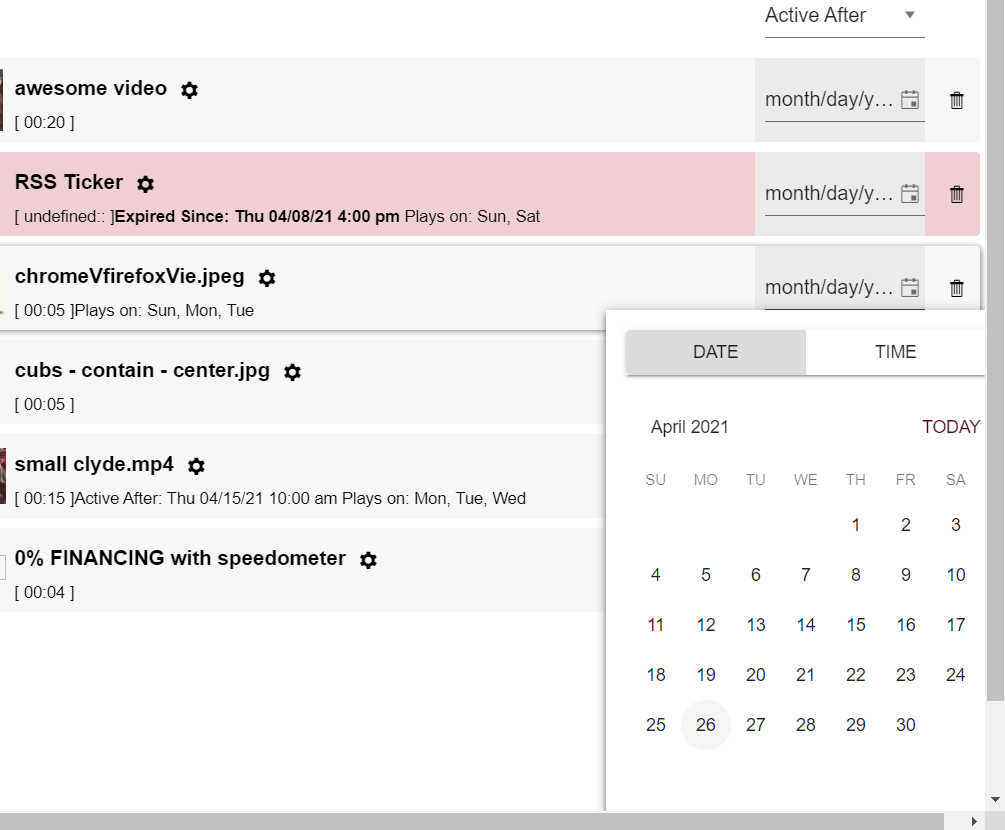
DateTimePicker opens above or below the link to open it, however when it's in the middle of a page, it will choose to open below and sometimes require scrolling to see all the buttons.
Would be better, if it were to open offscreen, it should be "pinned" to the bottom edge. Same for right/left/top borders of the screen.
Certain containers also make it impossible to scroll down to see the buttons, so that creates a real problem. The above proposal would fix this.
using fairly vanilla implementation of the component:
<DateTimePicker
      defaultValue={new Date(ActivationDate.toString())}
      onChange={handleActivationChange}
      width={'8rem'}
 />
Description:
When the NumericTextBox is set to "c0" format and has a value of 0 ($0), it doesn't capture the first digit entered.
Reproduction Steps:
- Set the field value to 0 ($0)
- Hit "Tab" to blur the field
- Hit "Shift-Tab" to focus the field (field contents will be highlighted)
- Enter "123"
- Repeat steps 2 through 4
Browser:
Chrome -- Version 89.0.4389.114 (Official Build) (64-bit)
Expected Behavior:
- After step 4, field shows "$123"
- After step 5, field shows "$123"
Observed Behavior:
- After step 4, the field shows "$230"
- After step 5, the field (correctly) shows "$123"
Notes:
- This bug seems to occur when the field has a value of 0 ($0) before gaining focus
- This doesn't occur when the specified format is "c2" or "n0"
Code Snippet:
<NumericTextBox format="c0" />
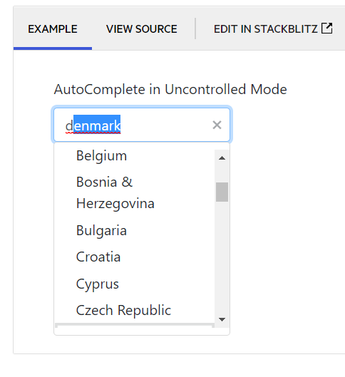
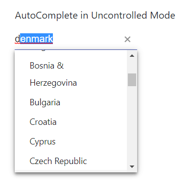
Description:
When typing into a React autocomplete with the "suggest" prop, the component does not always display the suggestion in the dropdown. It appears that in Chrome, only the very top of the suggestion is visible in the dropdown, while in Edge, it isn't at all.
Reproduction Steps:
- Navigate to https://www.telerik.com/kendo-react-ui/components/dropdowns/autocomplete/suggestions/
- Type "d" into the AutoComplete in Uncontrolled Mode example
Browser:
- Chrome -- Version 89.0.4389.114 (Official Build) (64-bit)
- Edge -- Version 89.0.774.68 (Official build) (64-bit)
Expected Behavior:
- The suggestion is fully visible in the dropdown
Observed Behavior:
- The suggestion is either not visible, or only partially visible
Screenshots:
Chrome:
Edge:
Hi,
Currently, we're facing a performance issue in react scheduler, when it has more grouping items(i.e. browser hangs indefinitely). I'm requesting the feature based on the below ticket
https://www.telerik.com/account/support-tickets/view-ticket/1513927
Hi Team,
We are trying to implement infinite scrolling for server data to our combobox based on virtual.
Do you have any event in combobox to handle on scroll.
Please help us with any examples you have on this topic. preferably using hooks.
Within the jQuery samples, there is a way to have the MonthView for Scheduler to have 'adaptive' height.
https://demos.telerik.com/kendo-ui/scheduler/adaptive-slot-height
Is this available for the <MonthView> part of the REACT components ? How would this work ?? [adaptiveSlotHeight=true] isn't valid...
The same issue exists for the 'autoeventheight' - is this planned for the REACT component/s ??
https://demos.telerik.com/kendo-ui/scheduler/auto-event-height
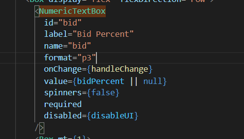
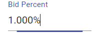
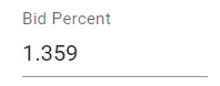
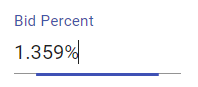
Hi,
I'm using the NumericTextBox to receive a value stored in a state, it has a percent "p3" format so it display numbers like this "0,000 %". When the state change, the value displayed in the NumericTextBox loses its format. If I click in the field and press space or any other key, the format comes back. The expected result was the NumericTextBox always keeping the format, what can be done in this situation?
NumericTextBox code
This is the textbox when I change the value direct in the field, it works fine
The state is shared between 2 NumericTextBox. if I change the value in the other textbox, it loses the format in this textbox
If I go in this textbox and just hit space, the format comes back
What can be done to keep the textbox format?
Thank you