Hi,
The Telerik example for Inline Editing with Custom Editors uses a dropdown list with reference data hardcoded into the custom dropdown cell. This isn't a realistic scenario for for production code with dynamic reference data. If you pass the reference data for the dropdown to the custom cell then the dropdown loses focus every time you change the selected value. This can be seen by shifting the localizedData in the Telerik example referenced earlier from myDropDownCell.tsx to main and passing it as a parameter: https://stackblitz.com/edit/react-9ycz1i?file=app/main.tsx
Is there a workaround for this issue?
Kind regards,
David
Hi,
I'm using GridColumnMenuCheckboxFilter in column that holds dates, but the dates shown within the GridColumnMenuCheckboxFilter are not formatted.
Is there a way to format the dates like dd/mm/yyyy?
Here is an axample: https://stackblitz.com/edit/react-4cxw2e?file=app/main.jsx
Thank you!
Hello
Currently, the KendoReact Grid can only select all columns as shown in this demo:
https://www.telerik.com/kendo-react-ui/components/grid/selection/#toc-customizing-the-selection
We wish to be able to select only specific columns programmatically.
Hi,
I am using Kendo react richtext editor and insert image plugin as it is shown in this page
https://www.telerik.com/kendo-react-ui/components/editor/images/
I am able to insert/upload image, but not able to resize image after adding it, similar to MS word.
After inserting image it should be resizable, so that user can easily resize the image as required.
Please let me know how can I achieve image resizing through mouse in above example.
Thanks
Vikram E
A few suggestions for the React Grid (as of v5.0.1) to help devs conform to accessibility compliance...
1) Standard HTML tables can contains a <caption> element, which screenreaders will use as the descriptive name of the table. Kendo Grid does not appear to have any way to name the table.
2) Related to number 1, other ways to assign a descriptive name to a table may be to include a `title`, `aria-label` or `aria-describedby` attributes, but none of these work on <Grid>. They are not rendered into the HTML if passed as props.
3) Allow GridCell and other Cell components to take `children` to render. The current documentation generally advises us to override the `cell={}` prop on a GridColumn for custom cell rendering. What is not listed in the docs is that doing what seems like the obvious thing:
<GridColumn cell={() => <td>myContent</td>} />
actually breaks accessibility. At a minimum the cell MUST get the attributes
role={'gridcell'}
aria-colindex={props.ariaColumnIndex}
to have the table actually be represented correctly in most screen readers. The Kendo <GridCell> component would normally add these, but only renders the field from the dataItem. It can only render custom data if the `render` prop is set, in which case it yet again does not render the `<td role= aria-colindex=` portions on it's own.
What I'm getting at is, everyone who ever wanted to render a custom cell in Keno Grid always had to make their own cell component that added at least the `role` and `aria-colindex` attributes, and if they didn't, they probably unknowingly broke accessibility.
Kendo could make this clearer in the docs (including the accessibility page for the Grid), and could easily alter GridCell to render `children` if they are passed. Then we could do:
<GridColumn cell={<GridCell><button>yay</button></GridCell>} />and have the rendered HTML:
<td colSpan="1" style="" class="" role="gridcell" aria-colindex="1" aria-selected="false"><button>yay</button></td>I think in GridCell this would be as easy as changing:
        defaultRendering = (
          <td
            colSpan={props.colSpan}
            style={props.style}
            className={className}
            role={'gridcell'}
            aria-colindex={props.ariaColumnIndex}
            aria-selected={props.isSelected}
            {...{[GRID_COL_INDEX_ATTRIBUTE]: props.columnIndex}}
            {...navigationAttributes}
          >
            {dataAsString}
</td> defaultRendering = (
<td
colSpan={props.colSpan}
style={props.style}
className={className}
role={'gridcell'}
aria-colindex={props.ariaColumnIndex}
aria-selected={props.isSelected}
{...{[GRID_COL_INDEX_ATTRIBUTE]: props.columnIndex}}
{...navigationAttributes}
>
{children || dataAsString}
</td>
Hello Team,
We have got this requirement to open date range picker using a single button input. Is there any way I can achieve this. I can see there is endDateInput and startDateInput available but it still renders 2 different inputs. But we want single button to control whole thing.
Thanks,
Gaurav
Issue #1
Given:
Controlled TextaArea componenet with autoSize and rows properties.
const App = () => {
  const [state, setState] = useState();

  return (
    <TextArea
      value={state}
      onChange={(e) => setState(e.value)}
      autoSize={true}
      rows={2}
    />
  );
};
When:
Add couple text lines to extend TextArea size and remove these empty lines in any way.
Then:
Content from TextArea field is removed but TextArea height stays the same, doesn't come back to it's initial value. It's different comparing to example from your docs where example contains uncontrolled component.
Issue #2
Given:
Controlled TextaArea componenet with autoSize and rows properties.
const App = () => {
  const [state, setState] = useState();

  return (
    <TextArea
      value={state}
      onChange={(e) => setState(e.value)}
      autoSize={true}
      rows={4}
    />
  );
};
and styles like these
.k-textarea textarea {
  border: 1px solid blue;
}
When:
Start typing anything
Then:
Height of textarea component is decreasing
We'd like the sorting to be correct and not based on the browser settings.
From support ticket:
We've noticed that our grid is not sorting correctly in our local language (Swedish). I've added LocalizationProvider and IntlProvider around it. The translation works fine.
In Swedish it would be sorted: A, B, Å
It's common in software that A and Å is sorted next to eachother but this is wrong.
I've tried using locale "sv" (language) and "se" (country) but neither sorts it correctly.
Reply on support ticket
We are internally using the built-in JavaScript method localeCompare to compare the values:
if (a.localeCompare) {
return a.localeCompare(b);
}
That means that we will compare the data based on the current browser locale. Still, the result can vary based on the machine. In cases, like this one, we can recommend using server filtering the ensure that the results are specific to the Swedish culture regardless of where this is loaded.
Another option can be to log a feature request that will take the culture parameters from the IntlProvider and pass it as a second parameter to the localeCompare function.
Imaging a GridColumn field that is a simple object {name:"My Item", value: 123}. It would be great to be able to define properties of the object as what to display without having to build a custom renderer.
displayField/displayFunction as a callback function with the fieldName of the columns and the dataItem of the row as parameters
const nameDisplay = (field, dataItem) => {
return "some value"
}
...
<GridColumn field={"name"} displayFunction={nameDisplay}
For now we have had to add a settings option for the user to turn the reorderable feature on and off depending on how they want to use the UI.
It would be a lot better user experience if there was on option to only drag the tile by the header, therefor allowing the user to still highlight and copy text areas and such.
I am already using the KendoReact library and consider the scheduler for a new feature. I am confused with the functionality to add new events. Most other calendars I am used to (Google, Teams, ...) work like this: You select a time range and then a new entry is added from the start to the end. But in KendoReact scheduler I have to double click to add a new event.
Is it possible to get the feature I am looking for? Some kind of setting or so.
Sebastian
Looking for callback for what item was dragged or resized.
coz we have as well Charts(HighCharts) inside not automatically resizing and we need to determine what item was resized to be able to trigger charts inside to redraw.
https://github.com/telerik/kendo-react/issues/865

we have X(cross) for combo box but it is not coming for datetime picker
Hi,
we are currently using the Kendo jQuery PivotGrid in our application. We have already migrated some controls to React in our application and would like to switch the PivotGrid to React as the next control.
In the jQuery PivotGrid there is the possibility to export the configured PivotGrid to Excel. You can see the feature here: saveasexcel
Is this functionality also available with the React PivotGrid? And can you show us an example how to use this feature to export the pivot grid data to excel?
If this functionality doesn't exist yet, when can we expect it? Are there already plans for this or can you already vote for it somewhere?
Regards,
Oliver
We are migrating our legacy application which uses Telerik for Silverlight to react application with KendoReact controls. I am converting one screen which uses RadTreeView which gives us Drag and Drop with Reordering feature. Now, in KendoReact, TreeList control does not provide both the features.
Here is what we get when we start dragging item in Silverlight control:
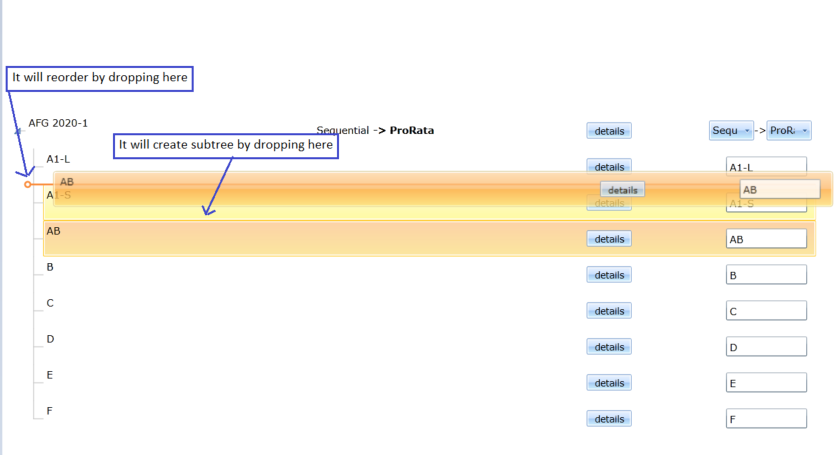
I am expecting the same behavior in KendoReact: TreeList as we have to achieve the same behavior in our react application. This link has some discussion with support team.
Thanks,
What I would like to see is a full height Panel anchored to the body tag similar to a drawer, but the panel would allow me to set the Title, Close Button, and Content manually. My intent is to create forms in the panel or to use the panel to display details of a single row of data. What you have appears to be geared towards navigation or the display of discrete data only.
<Panel
isOpen={boolean}
hasCloseButton={boolean}
isBlocking={boolean}
footerIsSticky={boolean}
titleIsSticky={booelan}
width={number or string}
panelPosition={"start", "end" - similar to flex positions
header={JSX.Component or string}
title={JSX.Component or string}
/>
<Content>{Placeholder for Content}</Content>
<Footer>{Placeholder for Footer Content}</Footer>
</Panel>
The layout would be
------- Top Sticky
Header Close Icon
</hr>
Title (could be in the sticky or not)
------ End Top Sticky
Content - Scrollable
Footer
Right now you have the ability to mark a field "Optional" in the label component. This is fine unless you have a large form and almost everything is optional. It will then look cluttered.
On the other hand, you don't have a "Required" option.
I would like to add a prop for subtext so that I can change the subtext from "optional" to anything I would like such as * or (Required).
I'm trying out the KendoReact Conversational UI and there are two things that I would expect to exist in the API that I can't seem to find.
1. Unread indicator - I'd like to mark where the last unread message was but there doesn't seem to be a way to do that with the API.
2. Load more messages - I'd like to be able to only load a certain number of messages from the chat history on initial load and then load more messages as the user scrolls (or possibly have a "load more" button) but there doesn't seem to be any callback for that.
I already have ideas to work around both of these with the "messageTemplate" but I wanted to check if I might be missing something obvious first.
-- Erik Sandberg
Hello!
I use DateRangePicker to filter data in some period in the past.
Now, when I open DateRangePicker, it renders a calendar with current and future month. Therefore our users always have to click on the "left arrow" to select previous month.
Is it possible to open DateRangePicker with calendar, that renders previous and current month? I tried propfocusedDate, but it is not suitable in this case, because the component is "controlled" (it always has some value, by default it is current date).
It would be great, if you will add some settings to do this.
We use "@progress/kendo-react-dateinputs": "3.10.1"
How we use it:
<DateRange
  onChange={handleDateChange}
  value={selectedDates}
/>
Actual result: April and May month in view.
Expected result: March and April month in view.
Thanks for your attention. I’m looking forward to your reply.
Is it possible to add a target line to the ArcGauge? I have attached a picture of what I would like to accomplish using the ArcGauge component.