The KendoReact `Upload` component displays a "file validation message" when an upload/save attempt fails, as can be seen in the following screenshot.
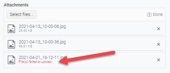
This message is provided by the `getFileValidationMessage()` method of the `UploadListSingleItem` class and is triggered when the passed parameter, `isUploadFailed` is `true`.
`isUploadFailed` is determined by the method `getFileStatus()` provided by the local-to-the-Upload-component utils file. This method is returning `isUploadFailed` as true only when the compared file status is set to `UploadFileStatus.UploadFailed`.
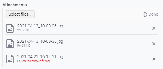
This is wonderful when uploading/saving - and it's great to show the user that something failed during the attempted upload/save.
I request similar functionality when performing file removal so we could similarly alert the user that the attempted removal of the file failed. Something similar to the below:
1) Drag a window to a tabstrip and drop the window on the tab area.
2) The window should dock into the tabstrip as extra tab.
Hi Team,
This feature request follows on from my Forum post (https://www.telerik.com/forums/scheduler-support-to-multiple-slot-selection).
It would be great if we had more control over slot selection, like:
- Turn off selection;
- Select multiple slots;
- Being able to Access the selected slots to use as start and end date/time in EditSlot.
Kind Regards,
Grant
Add a disabled property to ListBox and ListboxToolbar.
Listbox
- onItemClick should be disabled.
- onHover should be turned off.
ListBoxToolbar
- All tool-buttons should be disabled.
- onToolClick should be disabled.
It would be nice if ListView could have the option of actually being a list (ul, ol or dl) element. In many cases, I believe this would be more semantically correct and it would help screen readers understand more about the content. My suggestion would to make this configurable if possible. I've seen some libraries allow you to pass in the element type so you can override / change the markup and I think this would be nice to have here (and possibly other places).
Hi Team,
We need a break (<br>) tag on pressing enter key instead of paragraph tag in React Editor. Currently break tag comes on pressing Shift + Enter keys. We want a mechanics to override default functionality of enter from paragraph to break tag.
Regards,
Abhinav
Hi,
I would like to request a feature for the hovering to show tooltip behaviour in Kendo React Charts.
Currently, the tooltip on hover behavior for most or almost all Kendo React Charts is that it shows the tooltip only if you hover directly on a point or bar. This means that upon hovering on tiny data representation like dots or bars will be very difficult for the user to show a tooltip for.
For example the following sandboxes:
Bar graph with small and large data: https://stackblitz.com/edit/react-xtmkdz?file=app%2Fmain.jsx
Line graph with small data dots and large data dots: https://stackblitz.com/edit/react-wg75ag?file=app%2Fmain.jsx
In these sandboxes, hovering over the smallest bar is very difficult and is also the same for the line graph for tiny "marker" sizes.
I am requesting a feature where Kendo React Chart tooltip can:
- Hovering anywhere in chart plot area will show a tooltip, not only on point.
- Tooltip shown will the the nearest data to the point. Ie: on line graph would be closest point. On Bar graph will be nearest bar vertically.
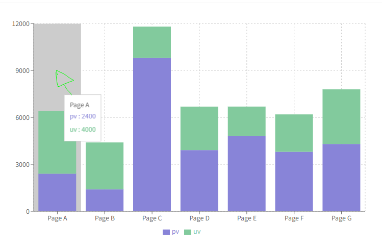
I have seen this feature in other popular React Chart libraries like Recharts https://recharts.org/en-US
Bar chart:
https://recharts.org/en-US/examples/StackedBarChart
In this example, hovering anywhere inside that grey box area with mouse will show tooltip for that Page A:
For line charts in Recharts: https://recharts.org/en-US/examples/SimpleLineChart
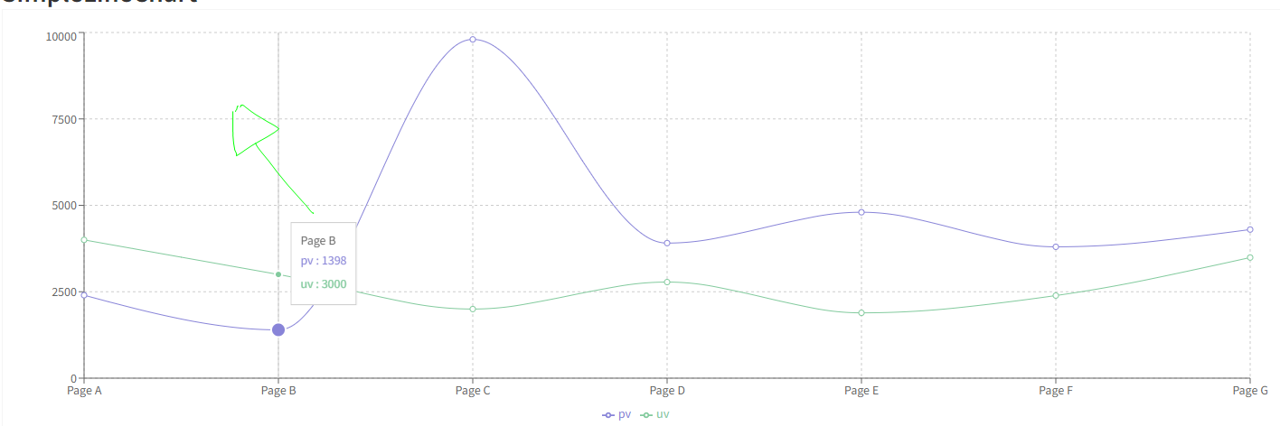
Hovering at the drawn mouse location in this chart shows tooltip for the point below.
I am hoping Kendo React in the future supports this feature as the current implementation of the tooltip is very rigid and clunky.
Data-attribute is missing on a NumericTextbox. Add it in a similar way as for example TextInput and Checkbox.
import * as React from 'react';
import * as ReactDOM from 'react-dom';
import {
  NumericTextBox,
  Checkbox,
  TextBox,
} from '@progress/kendo-react-inputs';

const App = () => {
  return (
    <div>
      <label>
        <TextBox data-test="5" />
      </label>
      <br />
      <label>
        <NumericTextBox data-test="5" />
      </label>
      <br />
      <label>
        <Checkbox data-test="5" />
      </label>
    </div>
  );
};

ReactDOM.render(<App />, document.querySelector('my-app'));
Hi Team,
While browsing i came across a feature called social control+login+singup in 1 place. Does Kendo react has anything like below
exportdefaultLogin
and profile template like below:
Hi,
I would like to request a feature for the Kendo React Chart Zoomable feature to be able to set a zoom level.
For example, an exposed API function to set graph's current zoom level to exactly 50% or 25% that I can use with a button maybe.
Currently the API only supports setting "zoom rate", but I would like a set Zoom function, so maybe I can save the current zoom level upon load of the chart again.
Thanks!
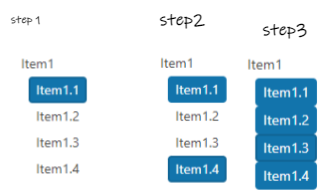
Hi,
I would like to be able to select all items from the treeview using a keyboard combination, I mean something like select an item +press and hold shift key and select another item and all items in between get selected.I know there is a way to select all items using a button but the user does not want this approach.
Next image is the functionality that we want and we want to know if there is a way to achieve it
We have the requirement to have a data grid with drag and drop configured to support auto scroll when the data grid has no fixed height set and overflow/scrollbar is enabled on the a parent element (div or body).
Full details as per support ticket 1571735.
Hi,
I would like to request a feature for the scatter line type chart for the crosshair line depending on axis to snap to points on the scatter chart.
An example of this would be like showing X axis crosshair only and having on hover of mouse to snap to nearest dot. (not showing crosshair between points, but always on a point.)
The closest working example I can find of this on kendo react is the bar chart for crosshair tool tip first example https://www.telerik.com/kendo-react-ui/components/charts/chart/elements/crosshairs/ but after talking to support it does not support scatter line chart.
but only with category axis(X axis).
The desired behavior would be the above but on a scatter line chart using separate axis y or x crosshair only and having them to snap to points instead of hovering between points. If you do hover between points, it should snap to nearest point to mouse cursor.
This sandbox has the behavior but only for a bar chart. https://stackblitz.com/edit/react-qnn9h4?file=app%2Fmain.jsx
We'd liked to have a wrapped loader similar to other third party loaders.
The code should be something like this:
<Loader show={props.isLoading} message={'loading'}>
  <SomeComponent />
</Loader>
Other solutions are also acceptable. The requirement is that the loader is positioned above the main component without having it rerender or reposition.
Set the default width of the MultiColumnComboBox columns based on the input width.
In order to position the Popup of the MultiColumnComboBox correctly, we need each column to have fixed width.
Currently, we are setting the default width to 200px for each column that has not width set from the options.
We can add a second option to take the width of the input, subtract the width of the columns with fixed width and divide the remaining space between the other columns.
Just as a first note, the documentation on how to write a custom `messagesMap` function for use in the `Pager` component is extremely vague. Without access to the KendoReact source code, it would have been near impossible.
First request: on the `GridProps` API page, the `pager` prop is defined as being the type "null" or `ComponentType<PagerProps>`. Please convert the text "ComponentType<PagerProps>" into a link to the `PagerProps` page. This will greatly aid in quickly linking to the appropriate documentation.
Second request (and the bulk of the feature request): please make (at least) the pager-related constants and default messages (string templates) available to consuming components. As of v5.4.0 of `@progress/kendo-react-data-tools`, the constants are exported from {kendo-react-private}/packages/datatools/src/messages/index.ts and they are consumed within the `Pager` (and subcomponents), but are not re-exported.
Not having access to the pager-related constants (`pagerInfo`, `pagerFirstPage`, `pagerPreviousPage`, `pagerNextPage`, `pagerLastPage`, `pagerItemPerPage`, `pagerPage`, `pagerOf` and `pagerTotalPages`) means it's a complete shot in the dark at how to write an override function to supply as the `messagesMap` prop. Not only that, but without access to the pager-related default messages (string templates) and given the way the `Pager`'s `render` method is written, we are unable to change just one or just a couple messages; we have to address all nine.
Right now in v5.4.0, the way the `Pager`'s `render` method is written, it simply checks to see if `messagesMap` is non-null (lines 214 through 223 of Pager.tsx, lines 38-43 of PagerInput.tsx and lines 36 and 37 of PagerPageSizes.tsx). This means that if we pass in a custom function for `messagesMap`, the custom function will be used to evaluate the message/string-template for `pagerFirstPage`, `pagerPreviousPage`, `pagerNextPage`, `pagerLastPage`, `pagerInfo`, `pagerPage`, `pagerOf`, `pagerTotalPages` and `pagerItemPerPage` (just in those three, aforementioned files). This means that we have to somehow know that `pagerInfo`, for example, will come through to the custom function as the string "pager.info" or that `pagerPage` will come through as "pager.page" so that the custom function knows which `messageKey` it's being passed so it can send out the object with the appropriate message/string-template as the object's `defaultMessage` property.
Instead, if the pager-related constants and default messages were exposed, we could very easily write a custom `messagesMap` function that could address any number of the nine default messages.
As an example, the Telerik/Kendo default string template for `pagerInfo` is "{0} - {1} of {2} items" that could be better scoped to the type of data the grid shows. Let's say the grid displays products and we'd like the pager to show "Displaying products 5 - 10 of 302" in the bottom right. If the pager-related constants and messages were exposed, this becomes a very simple task while not disturbing all other Telerik/Kendo default messages:
import React from 'react';
import { Grid, GridColumn, GridNoRecords, GridColumnMenuFilter } from '@progress/kendo-react-grid';
import { pagerInfo, pagerOf, messages as defaultPagerMessages, Pager } from '@progress/kendo-react-data-tools';

export default function MyComponent() {
    const customMessagesMap = messageKey  => {
        switch (messageKey) {
            case pagerInfo: return { messageKey, defaultMessage: 'Displaying products {0} - {1} of {2}' };
            default: return { messageKey, defaultMessage: defaultPagerMessages[messageKey] };
        }
    };

    const CustomPager = () => (
        <Pager
            skip={...}
            take={...}
            total={...}
            buttonCount={...}
            type="numeric"
            info={true}
            pageSizes={[...]}
            messagesMap={customMessagesMap}
    );

    return (
        <div className='my-component'>
            <Grid data={[...]} pager={CustomPager}>
                <GridColumn ... />
            </Grid>
        </div>
    );
};
Pager now:

What i want to achieve:

Will you consider supporting such an option in the future?
Allow the Grid to update its data without remounting the whole component, so the current selection of the filtering menu would be persisted.
We have scenarios where the data is constantly updating the filter selection is lost if the Grid is updated before pressing the `Filter` button.
Test Environment:
OS: Windows_11Browser: Version 103.0.1264.71 (Official Build) (64-bit)
Prerequisite steps:
1. Go to system settings.
2. Navigate to 'Accessibility' and activate it.
3. Navigate to 'Contrast theme' and activate it.
4. Select 'Desert/Aquatic' High Contrast theme in the combo box.
Repro Steps:
1. Open given URL https://canvasjs.com/docs/charts/chart-options/axisx/viewport-minimum/ in Edge.
2. Graph page will be open.
3. Turn on High contrast theme.
4. Verify that Graphs are not adapting high contrast Aquatic and Desert modes or not.
Actual Behavior:
Graphs are not adapting high contrast Aquatic and Desert modes. They remain same as in normal mode.
Expected Behavior:
Graphs should adapt high contrast Aquatic and Desert modes as defined. All elements should adapt to respective modes properly.