Hello,
Currently, it is possible to switch between both numeric and input types in Kendo grid pagination but in our application we have design to display both numeric and input control types on load. so request to please help with that feature.
Thanks
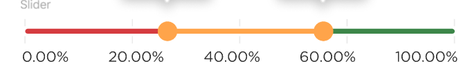
Request to have the sliderbar have different colors. It is for user experince, knowing that the slider is going either to the sucess or fail.
I am using kendo react; how should I convert from a search query string into grid data state object? I am trying to get a query from URL and convert it into json object and pass it to the grid so it can do filtering, sorting, etc.
input can be the query strings below or URLSearchParams object.
const queryString = "sort=triggerAt-desc&page=1&pageSize=10";
?filter=(notes~contains~%27te%27~and~status~contains~%27up%27)&sort=triggerAt-desc&page=1&pageSize=10
The output should be:
{
    sort: [
      { field: "triggerAt", dir: "desc" }
    ],
    skip: 0,
    take: 10,
  }
https://stackblitz.com/edit/react-haejnu?file=app%2Fmain.tsx%3AL115
It is a common use case to provide Grid's dataItemKey property to make sure changes are properly reflected per documentation - https://www.telerik.com/kendo-react-ui/components/grid/api/GridProps/#toc-dataitemkey
However, when this accessor property is provided (usually a unique ID on all groups and items), Kendo uses it instead of its default auto-incremented `'ai' + absoluteIndex` key to index the <GridRow /> for each group's header and footer - giving them the same value and causing React to throw multiple warning about duplicate keys. This makes it unreliable to specify dataItemKey property when using the grouping feature with aggregate footers as it messes up with React's reconciliation mechanism.
After significant amounts of negative feedback we have now stopped using the KendoReact DatePicker as the calendar part of the control doesn't make it clear how to change the month/year. I am aware that you click on the {Month Year} label at the top, but this is obviously not intuitive at all based on the extensive user feedback (it took me a while to figure out the first time as well).
When you start using the control for older dates (e.g. Date of Birth), scrolling is just not feasible particularly on mobile and so users get incredibly frustrated as they just want to change the month/year in a more manual manner to go back in time significantly. Many other date picker controls use visual cues such as up/down carets next to the Month/Year to suggest it can be adjusted.
Please get your UX experts to look at improving this as it could be a really simple fix that would make a massive difference to users
There is an issue with ComboBox remote virtualization. This is reproducible on https://www.telerik.com/kendo-react-ui/components/dropdowns/combobox/filtering/#toc-filtering-with-remote-data-and-virtualization
Scroll slowly till almost the end of the list. Pay attention to the name: Paula Parente
Notice that the name keeps repeating after scrolling as the scroll goes back and forth. You'll need to scroll a few times more before the scroll continues to load
other items.
Hi,
Please see the following example of the dropdownlist with bootstrap theme applied:
https://stackblitz.com/edit/react-ejxe44?file=index.html
I have updated the bootstrap cdn to latest. Notice that bootstrap styling is applied to the dropdowns including focus shadowing.
Now please see the exact same example but with theme customisation using a custom scss file:
https://stackblitz.com/edit/react-tuq49c-g6ofwn?file=index.scss
Notice that bootstrap styling is no longer applied to the dropdowns, which do not have focus shadowing.
Kind regards,
David
We are currently passing a React.Node which contains both text and custom icons to the DropDownButton text property. The automatically generated aria-label of the DropDownButton returns [object Object] instead of any recognizable text.
Steps to Reproduce:
- Create a DropDownButton with text property set to a React.Node - eg:
<DropDownButton text={<div>test text</div>}>- Inspect the DropDownButton aria-label value using the developer console
Expected Result:
aria-label contains the text inside the React.Node
aria-label="test text dropdownbutton"Actual Result:
aria-label contains [object Object]
aria-label="[object Object] dropdownbutton"
Hi,
The KendoReact NumericTextBox responds to mousewheel events when in focus. It is very easy to focus on the textbox, type in a value, scroll up or down and inadvertently change the value just entered. This behaviour can be seen clearly on any of the Telerik example pages e.g. https://www.telerik.com/kendo-react-ui/components/inputs/numerictextbox/predefined-step/
I think this behaviour should be disabled by default if spinners are set to default, but otherwise I would like a property to disable it. The normal event handlers which could be used to disable this behaviour are not available on the NumericTextBoxProps.
Kind regards,
David
Not only would I like control over the group order (like from this thread https://feedback.telerik.com/kendo-react-ui/1523636-need-to-be-able-to-have-more-control-over-the-order-of-groups-in-the-kendo-grid-sort-on-the-text-is-insufficient), it would be awesome if we could sort groups themselves.
I understand that the current set up sorts children within groups but not the groups themselves. However, sorting within and between groups is a bit more intuitive to the user when they see visually-grouped information and try to sort on it => most of our users expect the groups to get sorted as well.
Although I can write my own sorting functionality, it can get out of hand quickly with ascending/descending, numeric vs alphabetic columns, and multi-sort vs single sort, but KendoReact already has the capability to sort in these three ways with its non-grouped grid functionality.
A little thing, but users remember position of UI elements more than anything else. The filter buttons on the grid by default are not in the same place though for all filter types.
It would be preferable if the filter buttons were all on the same side, regardless of the filter type (e.g., some types put it on the left, while others put it on the right). Pictures below for context.
Having the endTime set to the next day (in regards to the startTime) for example, should allow the Day view to show the entire period.
The same functionality is available in Kendo UI for jQuery Scheduler:
Currently, the Scheduler accepts only "HH:MM" format as string values.
I've already log an issue on Github -> https://github.com/telerik/kendo-react/issues/1303
Submitting here as it is an important regression with React 18 and ReactDom.createRoot breaking Time picker.
In our unit tests, we sometimes want to be able to use the ByTestId methods of the React Testing Library to find bits of DOM created by a Kendo component. However, setting a data-testid attribute (or really any data- attribute) on a Kendo component does not always result in the attribute appearing anywhere in the final DOM.
To demonstrate, below is a test suite (also included in the zip) where I tried putting a data-testid attribute on the Kendo components Input, TextArea, Checkbox, Slider, SliderLabel, MultiSelect, and DatePicker, then checked if the attribute appeared in the rendered DOM. The tests for Input, TextArea, and Checkbox are successful. The ones for Slider, SliderLabel, MultiSelect, and DatePicker are not.
import { render, screen } from '@testing-library/react';
import { Input, TextArea, Checkbox, Slider, SliderLabel } from '@progress/kendo-react-inputs';
import { MultiSelect } from '@progress/kendo-react-dropdowns';
import { DatePicker } from '@progress/kendo-react-dateinputs';

// SUCCEEDS
describe('Kendo Input', () => {
    it('supports data attributes', () => {
        render(
            <Input data-testid="the-input" />
        );

        const input = screen.queryByTestId('the-input');
        expect(input).toBeTruthy();
    });
});

// SUCCEEDS
describe('Kendo TextArea', () => {
    it('supports data attributes', () => {
        render(
            <TextArea data-testid="the-text-area" />
        );

        const textarea = screen.queryByTestId('the-text-area');
        expect(textarea).toBeTruthy();
    });
});

// SUCCEEDS
describe('Kendo Checkbox', () => {
    it('supports data attributes', () => {
        render(
            <Checkbox label={"Chad"} data-testid="the-checkbox" />
        );

        const checkbox = screen.queryByTestId('the-checkbox');
        expect(checkbox).toBeTruthy();
    });
});

// FAILS
describe('Kendo Slider & SliderLabel', () => {
    it('supports data attributes', () => {
        render(
            <Slider min={1} max={2} data-testid="slider-root">
                <SliderLabel position={1} data-testid="slider-label-1">One Fish</SliderLabel>
                <SliderLabel position={2} data-testid="slider-label-2">Two Fish</SliderLabel>
            </Slider>
        );

        const sliderRoot = screen.queryByTestId('slider-root');
        const sliderLabel1 = screen.queryByTestId('slider-label-1');
        const sliderLabel2 = screen.queryByTestId('slider-label-2');

        // test them all at once so we can know the full scope of our failure/success
        expect({
            sliderRoot,
            sliderLabel1,
            sliderLabel2
        }).toMatchObject({
            sliderRoot:   expect.anything(), // don't be null or undefined
            sliderLabel1: expect.anything(), // don't be null or undefined
            sliderLabel2: expect.anything()  // don't be null or undefined
        });
    });
});

// FAILS
describe('Kendo MultiSelect', () => {
    it('supports data attributes', () => {
        render(
            <MultiSelect data-testid="the-multi-select" />
        );

        const multiselect = screen.queryByTestId('the-multi-select');
        expect(multiselect).toBeTruthy();
    });
});

// FAILS
describe('Kendo DatePicker', () => {
    it('supports data attributes', () => {
        render(
            <DatePicker data-testid="the-date-picker" />
        );

        const datepicker = screen.queryByTestId('the-date-picker');
        expect(datepicker).toBeTruthy();
    });
});
Hi there,
I can see there is a column chooser component for the Angular Data Grid e.g. https://www.telerik.com/kendo-angular-ui/components/grid/columns/menu/#toc-column-chooser-item but there is not an equivalent for the React Data Grid (unless you code it yourself).
The DevExpress React Grid does have this feature https://devexpress.github.io/devextreme-reactive/react/grid/docs/guides/column-visibility/ so we were wondering if such a thing is planned React Data Grid?
Thanks very much,
James
The `Surface` component, in the drawing module, has a few exposed event handlers. It exposes click, mouse enter and mouse leave. It does not expose a handler for mouse scroll wheel movement.
You can see the exposed handlers in the `SurfaceOptions` type ...
SurfaceOptions - React Drawing Component | KendoReact API (telerik.com)
Can you please expose the mouse scroll event handler?
A TimePicker control will take all scroll events if the mouse cursor is over it, whether the element has focus or not, and prevent the scroll from bubbling up to the page. This prevents a page from scrolling as soon as the mouse cursor touches a TimePicker.
Using Kendo rect v5.1.0 in FireFox v98 on OSX. (Issue does not happen in Chrome)
You can view the problem in the demo page: https://www.telerik.com/kendo-react-ui/components/dateinputs/timepicker/
Just try to scroll down the view, and as soon as the TimePicker is under the mouse cursor, the page can no longer be scrolled until you move the cursor off the control.
Currently, you cannot specify a custom icon for `MenuItem`, e.g. a Material Design icon, as the `icon` prop only accepts the name of an icon from the Kendo font icons.
So please can you add a `iconClass` prop just like Button so we are able to use an alternative icon set.
Thanks.
All of the Kendo components that "hide" content (tab views, collapse panels, etc) don't actually hide any content. They require us to not render any children.
<ExpansionPanel
  {expanded === item.id && (
    <ExpansionPanelContent>
This just strikes me as an odd design decision. I guess I don't understand the point of these components if they don't do the 1 thing they are supposed to do; hide portions of the content.
Un-rendering the content is usually not desirable. The contents are often still important. Possibly for SEO purposes, A11y, or if they are part of a Form:
<Form
  render={() => {
    <FormElement>
      <ExpansionPanel>
        {expanded === item.id && (
          <ExpansionPanelContent>
            <Field
                name={"firstName"}
                component={Input}
                validator={() => 'always invalid'}
              />
          </ExpansionPanelContent>
      </ExpansionPanel>
    </FormElement>
  }}
/>
This makes the Form valid as long as the panel is collapsed.
Can check out how Bootstrap collapse panels work to see how most people would expect these components to behave. The contents is rendered into the DOM and JS and CSS are used to hide it. There should be a way to achieve this same behavior with Kendo.
As a workaround I end up having to do my own CSS/SASS to hide the contents
.k-expander {
  .k-expander-content-wrapper {
    height: 0;
    overflow: hidden;
  }

  &.k-expanded {
    .k-expander-content-wrapper {
      height: auto;
    }
  }
}