Steps to Reproduce:
1) Open https://www.telerik.com/kendo-react-ui/components/dateinputs/datepicker/ in the Chrome browser
2) Click on the calendar icon, click on 'month/Year' in the calendar header e.g. March 2019
3) Click on the 'Year' in the calendar header i.e. 2019
4) further Click on the Year Range i.e 2010-2019
5) Year range will display from 2000 - 2090, Select year 2010
Wrong Year range (2090 - 2099) will display when clicked on 2010.
This is working properly in the Firefox browser and I observed the issue in Chrome.
The Tooltip component has a className property. Providing a class name there does not seem to apply the class to the DOM element. See my below code and attached screenshot ...
            <div className="col">
              <label className="d-block">Name</label>
              <Input value={name} required={true} onChange={handleNameChange} />
              <Tooltip className="d-inline">
                <i className="k-icon k-i-info" title="The name of the Taxonomy" />
              </Tooltip>
            </div>
Currently, the Scheduler events are always placed between the beginning and the end of a slot, no matter if the event actually starts or ends at the slot times. So if an event for example starts at 10:10, the event is placed at the 10:00 slot line and not a little further down below, or if it ends at 11:50 the event end is placed at the 12:00 slot line. I'm talking here especially about the WeekView and the DayView.
This is not accurate enough for some events. Like for example in MS Outlook, if a event doesn't start at the full hour, the graphical representation shows it according to the start time and not at the full hour (see screenshots). We would like to request to make it possible to place events on the Scheduler so that the graphical representation of the event reflects the actual start and and time.
While I was able to calculate a margin for the event start to move it to a more accurate position, it was not possible to also set the height of the event to a calculated positition because the Scheduler doesn't allow this. According your support (see here), an event always has to end at a full slot time and can't be placed somewhere else. Calculating these things on our own brings a whole lot of other problems though (like placing overlapping events correctly, etc.) so that it would be great if the Scheduler had a setting to allow exact positioning according to times.
React v18 has been released.
It appears that KendoReact only supports up to v17 (dependency conflicts if you try to use v18).
Can you please add support for React v18?
Thanks!
After updating the kendo version in my project to "^5.1.0" I've noticed that both grid pager dropdown and normal dropdowns won't close when clicked outside if the dropdown is opened using the arrow icon.
I've attached a video with the issue.
Is there any workaround for this?
Hi team,
Im not sure if this is a bug or an incomplete feature, so please advise.
1) TabStrip / Window behavior in v4.8.0 with bootstrap theme 4.40.0, see https://stackblitz.com/edit/react-wdzeyo?file=index.html
Please note the style and behaviour of the window, its above the modal and can be dragged anywhere on the screen, even though it was rendered from within the TabStripTab component
2) TabStrip / Window behavior in v4.9.0 with bootstrap theme 4.42.0, see https://stackblitz.com/edit/react-zhkfdp?file=app%2Fmain.jsx
As you can immediately see in this example, the TabStripTab heading is also above the modal, an obvious bug
My concerns are around how the window can no longer be dragged outside the TabStripTab container. Is this by design, beacuse in my use case, my tabs are smaller than my windows.
Note: I have not tested the windows with any other components.
Please advise.
Many Thanks,
Grant
I am using KendoReact Draggable and Droppable and we find a bug when using it. This bug even happen in the official demo.
The bug is described below:
When a droppable area is rendered out of the originall window size, the droppable cannot detect the onDragEnter() & onDropLeave(), of course onDrop neither.
it seems that kendo did not handle when user scroll while dragging the draggables, so that when the draggables was dragged to a zone out of the original window size, it failed to detect it.(Figure4)
I have also found another bug which is when you drag the draggables and scroll, the draggable will somehow detacted with the cursor, but I somehow already fixed it. Maybe it gives some hint for you to fix this bug, maybe.
Hi
I noticed in the PDF Export component limitations (https://www.telerik.com/kendo-react-ui/components/drawing/limitations-browser-support/) that it does not support iFrames. This is a major issue for us as we have data containing full HTML markup and <style> tags, which we want to embed in a PDF. We need to use an iFrame otherwise the styles will bleed into the rest of the document. Is there any plans to support iFrames in the future?
Title:
[Answers Community: Ask a question]: Unable to navigate and access the 'Remove' button using keyboard.
Test Environment:
Windows 11 OS version:22H2 22621.1992
Edge Version 114.0.1823.82(Official build) (64-Bit)
Repro-Steps:
1. Open https://www.telerik.com/kendo-react-ui/components/upload/url.
2. Navigate to 'select files..' button using arrow key and invoke it using enter key.
3. Upload any file.
4. Now try to navigate using tab key and access 'Remove' button using keyboard and check whether its accessible or not using keyboard.
Actual Result:
Unable to navigate and access the 'Remove' Button using keyboard.
Expected Result:
User should be able to navigate and access the 'Remove' button using keyboard.
User Impact:
User with motor impairments who rely on keyboard will not be able to access 'Remove' button if user is not able to navigate to the button using keyboard.
The feature request:
Kendo react scheduler: in a week/work week view if an event created with start time at 01:00 and ends at 23:00 for example and displayed only working hours:
the event will not visible until we enable all days hours visible:
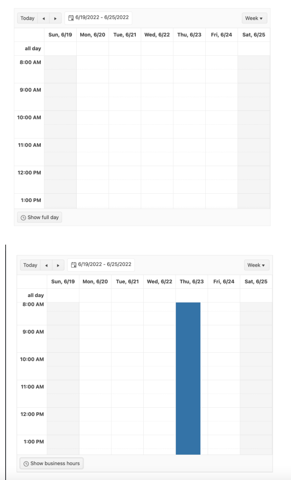
The issue is described here:
Currently, the category value in the tooltip does not display the formatted value and the only option for changing this is by using the "render" and defining custom rendering. The formatted value should be used by default.
Hi Team,
There is some unexpected behavior when resizing events after switching the Scheduler to 'Show Full Day'. Take a look at my sandbox, you'll notice, its barely anything, let alone anything fancy.
Replicate:
1. Create a new event that starts at 8am.
2. Switch the view to 'Show Full Day'
3. Using the start time resize handle and drag it up, to start earlier. And you will notice the dragItem actually drags down, and when you release the handle, the event appears in the correct place
This will only happen on the first resize when switching to 'Show full day'. You can replicate it more by switching back and forth between full day and business hours.
Similar Scenarios include:
1. Placing the event to end at 8am, switching to business hours and back, then drag the end time down, the dragItem will be positioned to start at 8am, but say its 7am and you will see the rest.
2. Placing the event to overlap 8am, will yield both problems.
Again this only happens on the first resize after switching views, and I've only tested it in DayView, so it might affect WeekView as well. There appears to be no issue when events overlap the endWorkTime.
Thanks,
Grant
Hi.
I would like to request the support of JsonSchema when creating a Form with the KendoReact Form component.
Maybe something along the lines of react-jsonschema-form, only with integration of the Kendo Form components, like inputs, dropdowns, buttons and other components that are possible to be used in a form.
The reason for the request is that we would like to be able to build our forms dynamically based on jsonSchema information that comes from a backend.
Thanks,
Greetings,
Bernd
What I want to achieve is something like:
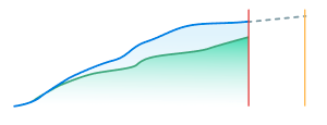
What I have so far:
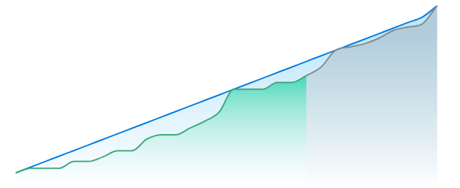
I just want to apply a dashed line on the the gray chart area.
The solid lines are applied using the following prop:
<ChartSeriesItem line={ style: 'smooth', color: '#888888', width: 2 } />
https://demos.telerik.com/kendo-ui/timeline/index
Hello,
Currently, it is possible to switch between both numeric and input types in Kendo grid pagination but in our application we have design to display both numeric and input control types on load. so request to please help with that feature.
Thanks