Data-attribute is missing on a NumericTextbox. Add it in a similar way as for example TextInput and Checkbox.
import * as React from 'react';
import * as ReactDOM from 'react-dom';
import {
  NumericTextBox,
  Checkbox,
  TextBox,
} from '@progress/kendo-react-inputs';

const App = () => {
  return (
    <div>
      <label>
        <TextBox data-test="5" />
      </label>
      <br />
      <label>
        <NumericTextBox data-test="5" />
      </label>
      <br />
      <label>
        <Checkbox data-test="5" />
      </label>
    </div>
  );
};

ReactDOM.render(<App />, document.querySelector('my-app'));
When I press on a day from the past the DatePicker automatically scrolls to the next/previous year. Please check the attached video.
Is there any workaround for this issue ?
After significant amounts of negative feedback we have now stopped using the KendoReact DatePicker as the calendar part of the control doesn't make it clear how to change the month/year. I am aware that you click on the {Month Year} label at the top, but this is obviously not intuitive at all based on the extensive user feedback (it took me a while to figure out the first time as well).
When you start using the control for older dates (e.g. Date of Birth), scrolling is just not feasible particularly on mobile and so users get incredibly frustrated as they just want to change the month/year in a more manual manner to go back in time significantly. Many other date picker controls use visual cues such as up/down carets next to the Month/Year to suggest it can be adjusted.
Please get your UX experts to look at improving this as it could be a really simple fix that would make a massive difference to users
Hi,
I would like to request a feature for the hovering to show tooltip behaviour in Kendo React Charts.
Currently, the tooltip on hover behavior for most or almost all Kendo React Charts is that it shows the tooltip only if you hover directly on a point or bar. This means that upon hovering on tiny data representation like dots or bars will be very difficult for the user to show a tooltip for.
For example the following sandboxes:
Bar graph with small and large data: https://stackblitz.com/edit/react-xtmkdz?file=app%2Fmain.jsx
Line graph with small data dots and large data dots: https://stackblitz.com/edit/react-wg75ag?file=app%2Fmain.jsx
In these sandboxes, hovering over the smallest bar is very difficult and is also the same for the line graph for tiny "marker" sizes.
I am requesting a feature where Kendo React Chart tooltip can:
- Hovering anywhere in chart plot area will show a tooltip, not only on point.
- Tooltip shown will the the nearest data to the point. Ie: on line graph would be closest point. On Bar graph will be nearest bar vertically.
I have seen this feature in other popular React Chart libraries like Recharts https://recharts.org/en-US
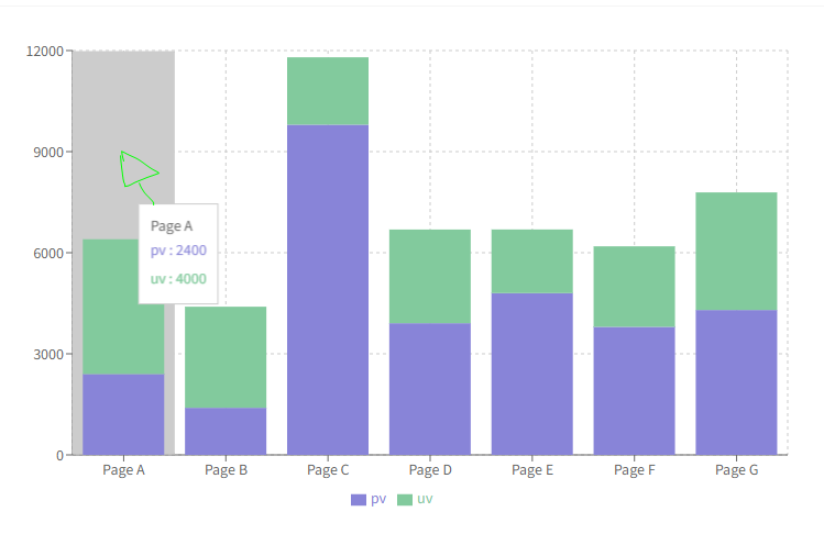
Bar chart:
https://recharts.org/en-US/examples/StackedBarChart
In this example, hovering anywhere inside that grey box area with mouse will show tooltip for that Page A:
For line charts in Recharts: https://recharts.org/en-US/examples/SimpleLineChart
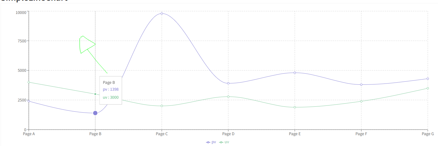
Hovering at the drawn mouse location in this chart shows tooltip for the point below.
I am hoping Kendo React in the future supports this feature as the current implementation of the tooltip is very rigid and clunky.
It would be nice if ListView could have the option of actually being a list (ul, ol or dl) element. In many cases, I believe this would be more semantically correct and it would help screen readers understand more about the content. My suggestion would to make this configurable if possible. I've seen some libraries allow you to pass in the element type so you can override / change the markup and I think this would be nice to have here (and possibly other places).
Hi Team,
There is some unexpected behavior when resizing events after switching the Scheduler to 'Show Full Day'. Take a look at my sandbox, you'll notice, its barely anything, let alone anything fancy.
Replicate:
1. Create a new event that starts at 8am.
2. Switch the view to 'Show Full Day'
3. Using the start time resize handle and drag it up, to start earlier. And you will notice the dragItem actually drags down, and when you release the handle, the event appears in the correct place
This will only happen on the first resize when switching to 'Show full day'. You can replicate it more by switching back and forth between full day and business hours.
Similar Scenarios include:
1. Placing the event to end at 8am, switching to business hours and back, then drag the end time down, the dragItem will be positioned to start at 8am, but say its 7am and you will see the rest.
2. Placing the event to overlap 8am, will yield both problems.
Again this only happens on the first resize after switching views, and I've only tested it in DayView, so it might affect WeekView as well. There appears to be no issue when events overlap the endWorkTime.
Thanks,
Grant
Hi,
Please see the following example of the dropdownlist with bootstrap theme applied:
https://stackblitz.com/edit/react-ejxe44?file=index.html
I have updated the bootstrap cdn to latest. Notice that bootstrap styling is applied to the dropdowns including focus shadowing.
Now please see the exact same example but with theme customisation using a custom scss file:
https://stackblitz.com/edit/react-tuq49c-g6ofwn?file=index.scss
Notice that bootstrap styling is no longer applied to the dropdowns, which do not have focus shadowing.
Kind regards,
David
Hi Team,
If you take a look at my demo, I have 2 scheduler events, and I've created a custom SchedulerItem that renders the background of one of them to be blue.
When dragging the items around, the dragItem mains the same color with a bit of opacity, cool.
When resizing, the orange (?) one works great, this is the default color theme. However when I resize the blue one, while resizing, the resizeItem is an opaque blue, but the SchedulerItem underneath reverts back to the original default color scheme thereby mixing the colors.
Please advise.
Thanks,
Grant
Hello,
we are using kendo-react-pdf and I am trying to see if it can generate tagged PDFs to make it accessible. Or can you tell me if there is another kendo pdf component that is capabable of creating these tags?
thanks so much,
Rebecca
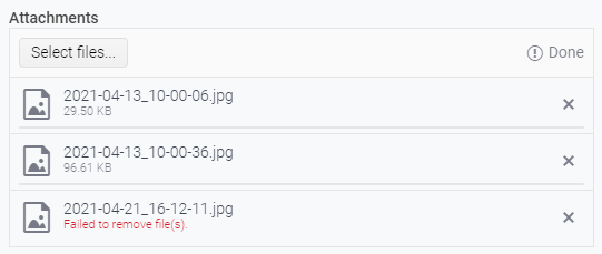
The KendoReact `Upload` component displays a "file validation message" when an upload/save attempt fails, as can be seen in the following screenshot.
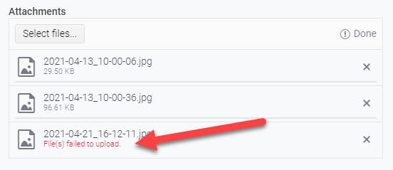
This message is provided by the `getFileValidationMessage()` method of the `UploadListSingleItem` class and is triggered when the passed parameter, `isUploadFailed` is `true`.
`isUploadFailed` is determined by the method `getFileStatus()` provided by the local-to-the-Upload-component utils file. This method is returning `isUploadFailed` as true only when the compared file status is set to `UploadFileStatus.UploadFailed`.
This is wonderful when uploading/saving - and it's great to show the user that something failed during the attempted upload/save.
I request similar functionality when performing file removal so we could similarly alert the user that the attempted removal of the file failed. Something similar to the below:
Hi, I am Lavanya
I am using kendo UI past few days the react-coffee warehouse is very useful to learn . But the finance application is in typescript so unable to learn the whole application. so kindly give any sample application in js or jsx .if possible.
thanks
];
this is my data I want to use a column chart using this data x-axis as month and y-axis sales how can i use this data
Hi, I am Lavanya!
in my dropdown list, there are horizontal layouts I need to change to the vertical dropdown list
and also I have attached bar data in that I need to make a dropdown filter of the month how can I use that
Current Behaviour
When I lock columns In data grid with resizable columns - for example 1st and 3th and resize the 1st one - after we scroll horizontally the 3th column goes on top of the 1st column. This happens when we haven't set a width prop.
Expected Behaviour
Resized columns not overflowing on each other when scrolling horizontally and don't have width prop.
MInimal Reproduction
I'm providing a reproduction from Kendo React code examples.
https://stackblitz.com/edit/react-xvxy59?file=app%2Fmain.jsx
I have attached files, in which there is an app bar content there is a dropdown in the dropdown there are four elements, in that I need four drawer container on the left side as I attached by clicking the single dropdown, how can I attach 4 drawer container in a single project
Thank you
Currently the React DateRangePicker component shows its calendar popup any time either of the date text inputs are focused.
It would be nice to have more control over this behavior buy providing a prop to customize what actions open the popup.
Our use case is that currently the DateRangePicker (as of v5.11.0) cannot be used to make a 508 accessibility compliant site (reference support ticket 1597095 : which IMO is a bug, but trying to also find a workaround that we can roll out quickly) due to the way the popup breaks tab order in the browser. If keyboard users could tab into the Start/End inputs without the popup opening, then they could type in a date and tab to the next control (currently they cannot because the popup breaks tab order). A mouse user clicking into the input would be fine to see the popup. So having a prop to specify the auto-open should happen in click, not on focus, with a keyboard shortcut to open the popup if they want it (which already exists as alt+down), would be an easy workaround to get us back into 508 compliance.
I could imagine such a pop to control auto-open of the calendar popup to take one of 3 values; 'focus' (same behavior as current) 'click' (open on click, but not on keyboard focus) 'none' (no auto open. user can press alt+down to open).

Hi,
If you use kendo-theme-bootstrap for most Kendo React inputs, it results in bootstrap styling being applied to the input e.g. https://www.telerik.com/kendo-react-ui/components/dateinputs/datepicker/ or https://www.telerik.com/kendo-react-ui/components/dropdowns/combobox/. With the Bootstrap theme selected the DatePicker and Combobox have blue shadows on focus.
This is not true for the DropDrownList: https://www.telerik.com/kendo-react-ui/components/dropdowns/dropdownlist/. The border on focus does not match Bootstrap styling.
Kind regards,
David
Hi,
Not sure what the preferred way to report a problem is. I have posted it on GitHub as well:
https://github.com/telerik/kendo-react/issues/1519
Could someone help me out with this issue?
Thank you in advance.