Add `layout` prop (https://www.telerik.com/kendo-react-ui/components/dialogs/api/DialogActionsBarProps/#toc-layout/) to `PopoverActionsBar`.
It would be useful to add the `title` prop to the `Button` and `Chip` components. So that we get extra information in the default browser tooltip or use the `Tooltip` component for a customized look.
When the listbox has many items (roughly 200 and growing) the item attribute makes the listbox act slow when you want to click the item.
Even if the item render only returns the same value as not setting the item attribute. It seems like all the items re-render when it gets clicked?
Also in this example https://www.telerik.com/kendo-react-ui/components/listbox/customization/ it is possible to drag and drop a custom item.
But this is not working when we copy exactly the same code from the example. The drag event gets triggered but nothing happens.
Both lists have items to avoid this bug: https://github.com/telerik/kendo-react/issues/1300
I can post my source code but it is literally the same as the example. When we remove the item attribute the drag and drop works again.
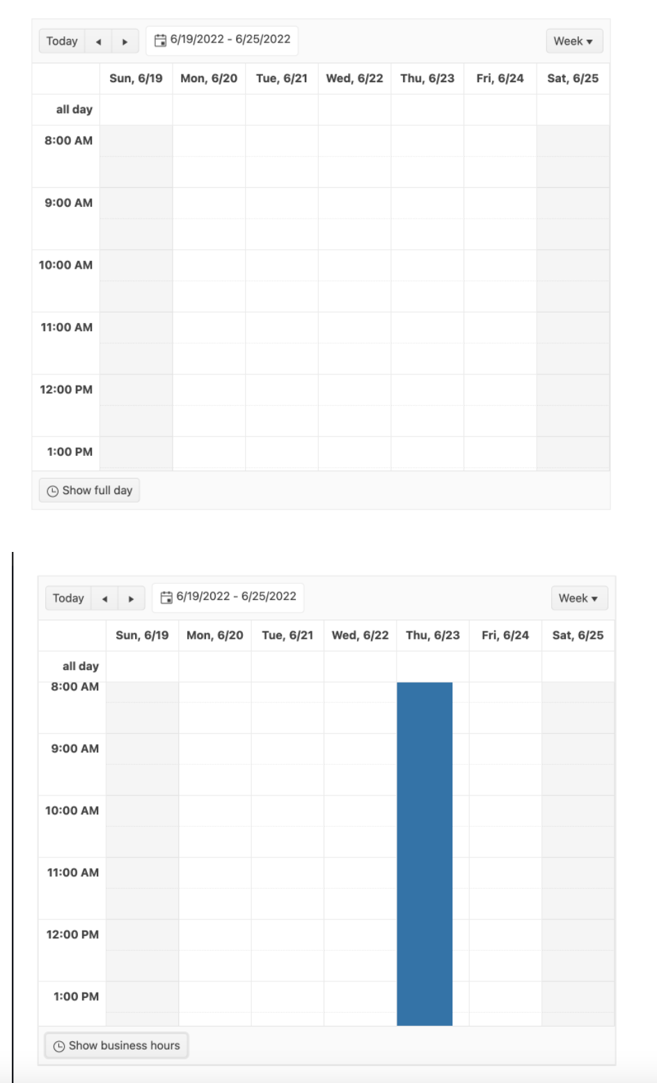
Having the endTime set to the next day (in regards to the startTime) for example, should allow the Day view to show the entire period.
The same functionality is available in Kendo UI for jQuery Scheduler:
Currently, the Scheduler accepts only "HH:MM" format as string values.
As it happens, none of the existing ways of setting icons in the Button component work with either of the icon libraries we are using, which are:
- Google Material Symbols, which uses ligatures to select icons rather than class names.
- Material Design Icons via @mdi/react and @mdi/js, which renders programmatically generated inline SVGs. These icons technically can be downloaded as finished SVGs for use with the
imageUrlproperty, but only a single icon at a time, which is significantly less convenient than having access to the entire library at once when using the @mdi packages.
Rather than try to separately add specific support for these (and a thousand other) icon strategies, however, you could add support for both (and a thousand others) at once by just having something like an iconJsx property. It would accept JSX.Element, and whatever it is given gets rendered inside the span.k-button-icon.k-icon.
So you could do something like this...
<h1>How will you attack?</h1>
{/* Google Material Symbols */}
<Button iconJsx={<span className="material-symbols-outlined">local_fire_department</span>}>Fire Breath</Button>
{/* @mdi/react + @mdi/js */}
<Button iconJsx={<Icon path={mdiKabaddi} />}>Target Weak Spot</Button>
{/* A poop emoji */}
<Button iconJsx={<span role="img" aria-label="poop">💩</span>}>Bio Weapon</Button>
To get something like this...
<h1>How will you attack?</h1>
<button class="k-button k-button-md k-button-rectangle k-button-solid k-button-solid-base k-rounded-md">
  <span role="presentation" class="k-button-icon k-icon">
    <span class="material-symbols-outlined">local_fire_department</span>
  </span>
  <span class="k-button-text">Fire Breath</span>
</button>
<button class="k-button k-button-md k-button-rectangle k-button-solid k-button-solid-base k-rounded-md">
  <span role="presentation" class="k-button-icon k-icon">
    <svg viewBox="0 0 24 24">
      <path d="M11.2 10.6C12.2 11.6 13.4 12.1 14.8 12.1L14.9 14.2C13 14.2 11.3 13.5 9.8 12.1L9.1 11.4L6.8 13.8L9 15.9V21.9H7V16.7L5.7 15.5V17.7L1.5 22L.1 20.6L3.7 17L2.5 13.5C2.3 12.9 2.6 12.4 3.1 12L6.4 8.7C6.8 8.2 7.3 8 7.8 8C8.3 8 8.6 8.1 8.9 8.3L11.2 10.6M24 11.9H22V8.5L20.2 7.8L21.1 12.2L22.1 17.4L23 21.8H20.9L19.1 13.8L17 15.8V21.8H15V14.3L17.1 12.3L16.5 9.3C15.9 9.9 15.2 10.5 14.4 10.9C13.5 10.8 12.6 10.4 11.9 9.7C13.5 9.4 14.6 8.6 15.3 7.4L16.3 5.8C16.9 4.8 17.8 4.5 18.9 5L24 7.2V11.9M11.4 4.4C12.5 4.4 13.4 5.3 13.4 6.4C13.4 7.5 12.5 8.4 11.4 8.4C10.3 8.4 9.4 7.5 9.4 6.4C9.4 5.3 10.3 4.4 11.4 4.4M16.5 .3C17.6 .3 18.5 1.2 18.5 2.3C18.5 3.4 17.6 4.3 16.5 4.3C15.4 4.3 14.5 3.4 14.5 2.3C14.5 1.2 15.4 .3 16.5 .3Z" style="fill: currentcolor;"></path>
    </svg>
  </span>
  <span class="k-button-text">Target Weak Spot</span>
</button>
<button class="k-button k-button-md k-button-rectangle k-button-solid k-button-solid-base k-rounded-md">
  <span role="presentation" class="k-button-icon k-icon">
    <span role="img" aria-label="poop">💩</span>
  </span>
  <span class="k-button-text">Bio Weapon</span>
</button>
We currently keep an image library for our customers where we allow them to upload images for use in the editor. Our existing implementation uses something called tinymce and MoxieManager. I see that the jQuery implementation has something similar, but it is not included in the react toolset.
Can we get the ImageBrowser / FileBrowser part of the jQuery Kendo ported over to the react version?
I have attached an image for example.
I've already log an issue on Github -> https://github.com/telerik/kendo-react/issues/1303
Submitting here as it is an important regression with React 18 and ReactDom.createRoot breaking Time picker.
Submitting here as it is an important regression with React 18 breaking all popup animations.
To Whom It May Concern,
I am requesting the Kendo team to implement a new feature of programmatically setting a Grid's page for the Kendo React Grid.
This can be accomplished by having a listener for the Grid's state. For example, when the Grid's skip props is changed, the Grid's page will also change to the number of elements skipped.
Please consider implementing this feature.
Thank you.
Sincerely,
Andrew J. Yang
Keysight Technologies
Currently the MultiSelectTree Component doesn't have Virtualization therefore is unable to provide infinite scrolling.
Please can this be added.
Thank you,
The footer cell is not accessible. I cant be navigated with the keyboard and isn't read out by the screen reader. Ideally, we would have all the attributes that the header and content cells have to make this work in the same way.
If you show a Grid with no rows, the Kendo Grid displays a `k-grid-norecords` row. The generated HTML for this is:
<tr class="k-grid-norecords" aria-rowindex="2"><td colspan="5">No records available</td></tr>If you run Axe accessibility checks (axe-core 4.4.1) against this, it reports:
Impact: critical
Elements must only use allowed ARIA attributes
ARIA attribute is not allowed: aria-rowindex="2"
- It seems that according to Axe, this <tr> element should have `role="row"` to make it compliant.
- Normal data rows, where there is data, do include `role="row"`. Only the 'no records' row seems to be missing it. Can this role be added?
A little thing, but users remember position of UI elements more than anything else. The filter buttons on the grid by default are not in the same place though for all filter types.
It would be preferable if the filter buttons were all on the same side, regardless of the filter type (e.g., some types put it on the left, while others put it on the right). Pictures below for context.
The React Dropdown and Multiselect components are difficult to use in a <Form> because they return an object instead of the value that would be part of a form.
Maybe there is already a way to handle it, but the docs for the MultiSelect do not include any way to map the value Object to just the primitive, and the Form docs have no example with a MultiSelect.
In my experience, when loading and saving data to/from an API, they very rarely take objects with an ID and Text properties. They usually expect just the primitive values (IDs) of the selected items. The Angular MultiSelect control has a `valuePrimitive` attribute that can be used to control this behavior. The React version does not seem to support this use case at all, or it is hard to find in the docs if it does exist.
Example code: https://stackblitz.com/edit/react-xroafa?file=app/main.jsx
Essentially, it would have been nice if you could do:
<MultiSelect
  data={[
    { id: 1, text: 'One' },
    { id: 2, text: 'Two' },
  ]}
  value={[2]} // just a primitive value, not an object  onChange={(value) => /* value should just be the `id`s not the objects */ }
/>
Which would enable MultiSelect to be usable in a <Form>. Since the <Field> component does not allow overriding the `value` or `onChange` events, mapping these primitives to object form is frustrating and a bunch of extra code.
In the Angular version this is easily achievable, with an example in the docs: https://www.telerik.com/kendo-angular-ui/components/dropdowns/multiselect/value-binding/#toc-primitive-values-from-object-fields
Hi Team,
I am facing one challenge to create a Calendar view with multiple date selection with multiple colors.
Please suggest and share class component references to achieve the same.
Please refer attached video or do let me know if you have any questions.
Thanks.
The feature request:
Kendo react scheduler: in a week/work week view if an event created with start time at 01:00 and ends at 23:00 for example and displayed only working hours:
the event will not visible until we enable all days hours visible:
The issue is described here:
Hello Support Team,
We are migrating our ASP MVC application to React JS and need your help in scheduler time-line view. In ASP MVC you provided the functionality to render the custom template for Resource Title or we can say for the user name. But we are unable to implement the same functionality in react js, and this is the important module of our application. Our application client strictly say he needs 100% same application as it is in ASP MVC version.
We request you to please add this feature to the Scheduler in the coming updates & this would be useful to the other users also.
Thank You.
In our unit tests, we sometimes want to be able to use the ByTestId methods of the React Testing Library to find bits of DOM created by a Kendo component. However, setting a data-testid attribute (or really any data- attribute) on a Kendo component does not always result in the attribute appearing anywhere in the final DOM.
To demonstrate, below is a test suite (also included in the zip) where I tried putting a data-testid attribute on the Kendo components Input, TextArea, Checkbox, Slider, SliderLabel, MultiSelect, and DatePicker, then checked if the attribute appeared in the rendered DOM. The tests for Input, TextArea, and Checkbox are successful. The ones for Slider, SliderLabel, MultiSelect, and DatePicker are not.
import { render, screen } from '@testing-library/react';
import { Input, TextArea, Checkbox, Slider, SliderLabel } from '@progress/kendo-react-inputs';
import { MultiSelect } from '@progress/kendo-react-dropdowns';
import { DatePicker } from '@progress/kendo-react-dateinputs';

// SUCCEEDS
describe('Kendo Input', () => {
    it('supports data attributes', () => {
        render(
            <Input data-testid="the-input" />
        );

        const input = screen.queryByTestId('the-input');
        expect(input).toBeTruthy();
    });
});

// SUCCEEDS
describe('Kendo TextArea', () => {
    it('supports data attributes', () => {
        render(
            <TextArea data-testid="the-text-area" />
        );

        const textarea = screen.queryByTestId('the-text-area');
        expect(textarea).toBeTruthy();
    });
});

// SUCCEEDS
describe('Kendo Checkbox', () => {
    it('supports data attributes', () => {
        render(
            <Checkbox label={"Chad"} data-testid="the-checkbox" />
        );

        const checkbox = screen.queryByTestId('the-checkbox');
        expect(checkbox).toBeTruthy();
    });
});

// FAILS
describe('Kendo Slider & SliderLabel', () => {
    it('supports data attributes', () => {
        render(
            <Slider min={1} max={2} data-testid="slider-root">
                <SliderLabel position={1} data-testid="slider-label-1">One Fish</SliderLabel>
                <SliderLabel position={2} data-testid="slider-label-2">Two Fish</SliderLabel>
            </Slider>
        );

        const sliderRoot = screen.queryByTestId('slider-root');
        const sliderLabel1 = screen.queryByTestId('slider-label-1');
        const sliderLabel2 = screen.queryByTestId('slider-label-2');

        // test them all at once so we can know the full scope of our failure/success
        expect({
            sliderRoot,
            sliderLabel1,
            sliderLabel2
        }).toMatchObject({
            sliderRoot:   expect.anything(), // don't be null or undefined
            sliderLabel1: expect.anything(), // don't be null or undefined
            sliderLabel2: expect.anything()  // don't be null or undefined
        });
    });
});

// FAILS
describe('Kendo MultiSelect', () => {
    it('supports data attributes', () => {
        render(
            <MultiSelect data-testid="the-multi-select" />
        );

        const multiselect = screen.queryByTestId('the-multi-select');
        expect(multiselect).toBeTruthy();
    });
});

// FAILS
describe('Kendo DatePicker', () => {
    it('supports data attributes', () => {
        render(
            <DatePicker data-testid="the-date-picker" />
        );

        const datepicker = screen.queryByTestId('the-date-picker');
        expect(datepicker).toBeTruthy();
    });
});
Hello
I'm using the menu component version 4.13
I'd like to change the style of the active menu item but could not find any examples. Here's one of my menu items
i'm following your example to do the routing
I'm using react router dom.
Do you have an example for how to change the css of the active menu item?
Thank you.
Fabian