Bug report
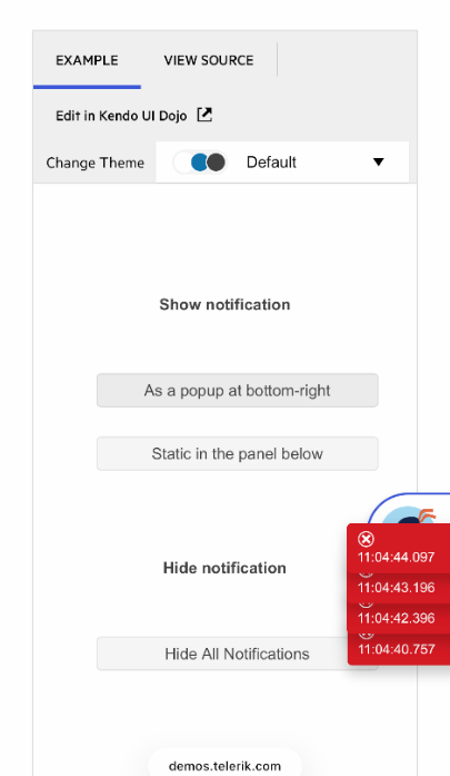
Notifications overlap when multiple invoked on mobile. Tested on iPad Air 13 2025 v18.6 and iPhone 26.3.1
Regression with v.2023.1.314
Reproduction of the problem
https://demos.telerik.com/kendo-ui/notification/index
Click on "As a popup at bottom-right" multiple times
The notifications are overlapping and broken into multiple lines
Expected/desired behavior
Notifications should not overlap and rendering on a single line
Environment
Kendo UI version: 2026.1.415
Browser: [ ipadOS 17.1.1 Safari ]
Bug report
When a Notification is rendered on the same page as popups (Window, Dialog, etc), it is displayed behind the popup.
Reproduction of the problem
- Open the Dojo examples - https://dojo.telerik.com/rvoPVbqK and https://dojo.telerik.com/mXdTrXpa
Current behavior
Notification is displayed behind the popups.
Expected/desired behavior
The Notification should be displayed on top of the popups
Workaround
$('.k-notification').parents('.k-animation-container').css('z-index', 12500)
Dojo - https://dojo.telerik.com/TnVHKzQc
The issue is a regression starting with 2025.4.1111 version.
Environment
- Kendo UI version: 2025.4.1111
- Browser: [all ]
Bug report
When showing a notification with closeButton set to false, the closeButton is still displayedReproduction of the problem
Dojo: https://dojo.telerik.com/koWkSInz
Expected/desired behavior
The notification should default to options.button, but should use args.closeButton to decide to show the close button in the notification.
Environment
**Kendo UI version: 2025.2.520
**jQuery version: 3.7.1
**Browser: [all]
Bug report
Regression with v.2023.2.606
Notification left position is calculated wrong, hides button when enabled
Reproduction of the problem
Run example from API: https://docs.telerik.com/kendo-ui/api/javascript/ui/notification/configuration/button
Expected/desired behavior
The button shall not be cropped.
Environment
Kendo UI version: 2023.2.606
Browser: [all]
The Notification is not entirely displayed when Default or Classic themes are selected and scroller appears on the page.
To reproduce
Steps to reproduce the behavior:
- Open the demos - https://demos.telerik.com/kendo-ui/notification/index
- Click on the 'As a popup at bottom-right' button.
Expected behavior
The Notification seems to be cut at the end.
With versions prior 6.4.0, the Notification was displayed with a slight distance on the right
Affected package (please remove the unneeded items)
- theme-default
- theme-classic
Affected suites (please remove the unneeded items)
- Kendo UI for jQuery
Affected browsers (please remove the unneeded items)
- All
Bug report
When there is "appendTo" in the Notification, the hide event fires multiple times.
Reproduction of the problem
- Open this dojo example and observe the console.
Current behavior
There are too many fired hide events for notifications. More than one event for every notification
Expected/desired behavior
Hide event should be fired single time per Notification.
Workaround
To see how should it work, here is the sample dojo example.
Environment
- Kendo UI version: 2022.3.913
- Browser: [all]
I'm testing https://demos.telerik.com/kendo-ui/notification/index with the NVDA screen reader.
1. Notifications are not announced by the screen reader, violating success Criterion 4.1.3.
2. Notifications are not accessible by keyboard.
3. The "close" button is not semantically a button.
4. The "close" button is not focusable by keyboard.
5. Auto-hiding notifications violate the 2.2 guideline (enough time). I can give my user an option to see notifications for a longer time, say 100 seconds instead of 10, but unable to close them by keyboard, they can end up with an overflow of messages.
6. The color contrasts are insufficient (4.26 for the red ones, only 2.73 for the green ones).
Notifications are listed on https://docs.telerik.com/kendo-ui/accessibility/section-508-wcag as AA-level compliant, and while I understand they're one of the hardest component to make accessible due to their asynchronous nature, the current implementation is closer to a bad practices example than a correct solution.
Reproduction
Run dojo at https://dojo.telerik.com/@GaloisGirl/UtuZIyOd
Current behavior
All three notifications are removed after one second
Expected behavior
The blue notification should be removed after 2 seconds, the orange one after 1 second, the red one never.
Analysis
The bug only occurs with the appendTo option.
In the showStatic method, we clearly see all displayed notifications are iterated over and being attached the _hideStatic method. In my example:
- the blue notification is shown and scheduled to be hidden after 2s
- the red notification is shown, none is scheduler do be hidden, because autoHideAfter is 0
- the orange notification is shown, and the blue one, the red one, and the orange one are scheduled to be hidden after 1s.
The 2018.1.117 code does not feature this loop and the bug is not present.
At present, popup notifications stay in one place on the screen and if you resize the browser while there is a visible notification, it will no longer be in the expected corner of the viewport (e.g., the bottom right) - they may be somewhere around the middle or outside of the visible viewport.
The following article shows how you can reposition them with your own by calculating the new position rules: https://docs.telerik.com/kendo-ui/controls/layout/notification/how-to/move-on-window-resize.
An alternative that may be simpler is to use your own container with fixed positioning and use inline notifications in it, instead of popup notifications. With this this, you can define such a fixed position on your div that satisfies the layout and the notifications will add content to it. An example is available in the following article: https://docs.telerik.com/kendo-ui/controls/layout/notification/how-to/move-on-notification-hide.
Ideally, this feature will be built-in behind a property that will have the notification attach a handler to window.resize and will reposition the popupts automatically, maybe with a configurable delay (that is, how often after resizing the code should run). Perhaps a property like "resizeRepositionTimeout: number" can be used for both - if unset, it will default to undefined and no repositioning will occur, if set to a number, it will be used to throttle the resize event.


